That problem rarely comes from a lack of drawing skill. It usually comes from making visual decisions in the wrong order. Strong fantasy character design starts with intent, then builds recognition through shape, anatomy, costume, color, personality, and repeatable production rules. That order matters even more when AI-assisted tools are involved, because a model can produce an attractive image while changing the character from panel to panel.
Why Most Fantasy Characters Look Generic
A fantasy character can have polished armor, luminous runes, and an elaborate weapon yet remain interchangeable with dozens of others. The problem usually begins before the drawing stage. A mood board gathers attractive fragments, but without a clear purpose those fragments produce a costume that signals “fantasy” while revealing little about the person inside it.
Start with the character's situation, not the props. A staff does not establish wisdom, and horns do not establish cruelty. Personality appears through silhouette, movement, proportion, and repeated visual choices. A guarded healer might keep their shoulders closed, protect one side of the body, and place tools where anxious hands can reach them. Those decisions communicate more than decorative symbols.
Start with a one-line identity
Before sketching, write one sentence containing a role, a contradiction, and a pressure point:
A cautious battlefield medic wears ceremonial armor because their family expects a warrior, but they keep modifying it for speed and access to tools.
The sentence gives every design choice a job. The armor reflects family pressure, the altered fastenings reflect medical practice, and the pose can show combat training interrupted by constant attention to the wounded. It also gives AI-assisted production a stable brief. A prompt can repeat the role and contradiction across concept art and comic panels instead of describing each image from scratch.
Reference gathering should answer a design question. Study archetypes, clothing, animals, architecture, and materials, then take specific traits from separate sources rather than copying one complete visual. Build several rough directions before rendering. Early thumbnails should test body shape, costume mass, and the location of identity markers. Detail cannot rescue a weak direction.
Treat the process as a production system
Keep these decisions separate:
- Intent: What does the character want, fear, or conceal?
- Shape language: What should the body communicate at a glance?
- Structure: How do anatomy and costume support that shape?
- Identity markers: Which features must survive a small panel?
- Generation controls: Which prompt terms and references prevent drift?
A practical workflow guide recommends exploring multiple early design sketches and pose or silhouette variations before committing to color and detail, as described in this fantasy character artwork workflow guide.
This order reduces redraws. A character who looks distinctive in one illustration but changes face, clothing, or proportions from panel to panel is not ready for production. Record the fixed features, flexible features, camera limits, and recurring prompt language. The character sheet should constrain later drawings while leaving enough room for acting, foreshortening, and scene-specific movement.
Researching Archetypes Without Copying Them
Reference gathering works best as a scouting phase with a written purpose. Don't open ArtStation and save images until the folder becomes a collage of unrelated aesthetics. Decide what you need to learn, record the useful trait, and leave the original reference behind before you start designing.
Begin with role references. Mythology, folklore, and tabletop RPG classes can clarify what a character does in the story. A ranger, oracle, artificer, and oath-bound knight each carry different expectations around movement, equipment, and social position. You aren't copying their costumes. You're identifying the reader's starting assumptions so you can reinforce, redirect, or challenge them.
Next, study historical clothing and material culture. Look at how garments fasten, where fabric gathers, which parts protect the body, and what a person could realistically carry. Historical references give a costume weight and logic that a fantasy mood board often lacks. They also help you avoid treating every culture as a collection of ornamental motifs.
Build a reference log
Use contemporary character art on platforms such as ArtStation and Behance to study current presentation language, but separate style from design. Nature and animal references can contribute proportion, rhythm, texture, or movement without producing a literal animal costume. Written fiction, lore notes, and your own scene summaries then anchor those visual discoveries in the character's behavior.
A simple research log can use five fields:
- Role: What function does the character serve?
- Era or material cue: What technology, craft, or environment shapes the clothing?
- Cultural signal: Which social or regional details belong in the world?
- Signature object: What tool or item has a story reason to exist?
- Contrasting trait: What visual expectation should the design resist?
Suppose the role is a temple archivist. Historical costume might suggest layered sleeves and protective cases for documents. A moth could inspire powdery surface texture or a nocturnal posture. A contradiction, such as physical courage paired with social hesitation, could keep the character from becoming a passive “bookish mage.”
You can deepen the setting work with this guide to fantasy world-building, but keep the design log focused on choices you can draw repeatedly. The final test is a one-sentence identity statement. If the sentence could describe several unrelated characters, keep researching until it produces specific visual consequences.
Research rule: Borrow principles from many references, never the complete surface of one reference.
Building a Silhouette That Reads Instantly
A character can have excellent anatomy and costume design yet fail at thumbnail size. Fill the figure with flat black, hide the interior details, and reduce it until it is small enough to read beside a comic panel. Can you still identify the role, mood, and movement? If the answer is no, rendering will only make the problem slower and more expensive to revise.
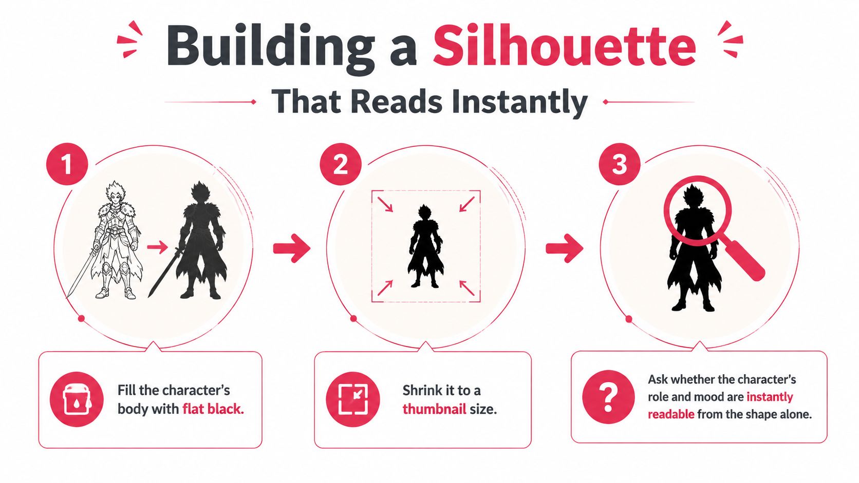
Block the major masses first
Build the first pass from three broad groups:
- Torso mass: Establish the central weight, ribcage direction, and overall balance.
- Limb structure: Place the arms and legs so the stance communicates attitude and function.
- Signature elements: Add one or two large features, such as a split cloak, oversized satchel, crest, or unusual weapon profile.
Keep this pass plain. Buckles, hair strands, filigree, and tiny straps can wait until the body and pose work. Small details may make a weak shape look busy, but they cannot give it a clear read.
Create 3–5 variation sketches before committing to one design. Push each version toward a distinct silhouette rather than producing near-duplicates. This matters even more for comic production, where the same character must remain identifiable across different poses, crops, and panels.
Use deliberate changes:
- Change proportion: Widen the shoulders and tighten the waist for a forceful, top-heavy figure.
- Change stance: Shift the pelvis and feet to suggest guarded, relaxed, predatory, or unstable balance.
- Extend one element: Use a staff, coat tail, banner, braid, or hanging tool as a vertical or diagonal accent.
- Contrast masses: Pair an angular form, such as a shield or shoulder plate, with a curved one, such as a cloak or bundled satchel.
- Reduce competition: Remove props that interrupt the body line without adding identity.
For AI-assisted pages, save the chosen silhouette as a visual reference before writing prompts. A prompt can describe a cloak or weapon, but the reference image helps preserve its placement and proportion from panel to panel. Test the design in a neutral pose, an action pose, and a partially obscured shot before building a full character sheet.
Choose the strongest version
Select the variation that remains recognizable while standing still, moving, or partly hidden. Check the separation between head and shoulders, the visibility of the hands, and the survival of the signature element when the character turns.
The strongest silhouette is the one that gives you clear drawing instructions for every later stage. If you cannot explain why its shapes work, keep revising before adding surface detail.
Layering Anatomy, Costume, and Color
Anatomy, costume, and color should behave like a connected system. Each layer must reinforce the same character idea before you spend time rendering surfaces. If the anatomy suggests speed, the costume shouldn't bury the joints under immovable plates, and the palette shouldn't make the figure visually heavy unless that tension is intentional.
Start with anatomy that supports the silhouette. A broad-shouldered axe wielder needs a frame and forearms that can plausibly support the weapon. A rangy archer benefits from longer lines, a narrower waist, and an open shoulder arrangement that makes drawing the bow readable. These aren't rules about real bodies. They're choices about visual communication.
Costume comes next. Place armor plates, belts, capes, pouches, and other structures at joints or transitions that already matter in the silhouette. A belt can divide the torso into readable masses. A cape can clarify the back line. A bracer can make the active arm legible. If costume merely covers the anatomy, it may add texture while reducing recognition.
Use a restrained palette
Color is where otherwise coherent designs often lose control. Choose a dominant hue, a supporting hue, and an accent, then repeat them at stable anchor points such as cuffs, weapon grips, insignia, or hair ties. The repetition gives the reader something to track when lighting, pose, or background changes.
Tint the black silhouette with several palette options and view each at a tiny size. Ask whether the colors preserve the same character identity or create a different visual role. A palette that looks beautiful in a large portrait may collapse into a gray-brown middle at comic scale.
| Layer | Decision role | Common mistake |
|---|---|---|
| Anatomy | Sets proportion, balance, and physical behavior | Choosing a body type that contradicts the intended movement |
| Costume | Explains culture, function, status, and silhouette breaks | Adding detail that hides the major forms |
| Color | Establishes hierarchy and recurring recognition cues | Using too many unrelated hues or relying on color alone |
For a broader treatment of designing comic characters, apply the same logic to expressions and repeated poses. A strong character design must work as a full figure, a face, and a moving participant in a page composition.
Turning Your Design Into AI Prompts
AI-assisted production becomes unreliable when the prompt describes a genre instead of a character. “Fantasy warrior, cinematic lighting, detailed armor” can produce an attractive image, but it gives the model no stable identity to preserve. The fix is to convert the locked design into a prompt kit with reusable language and reference images.
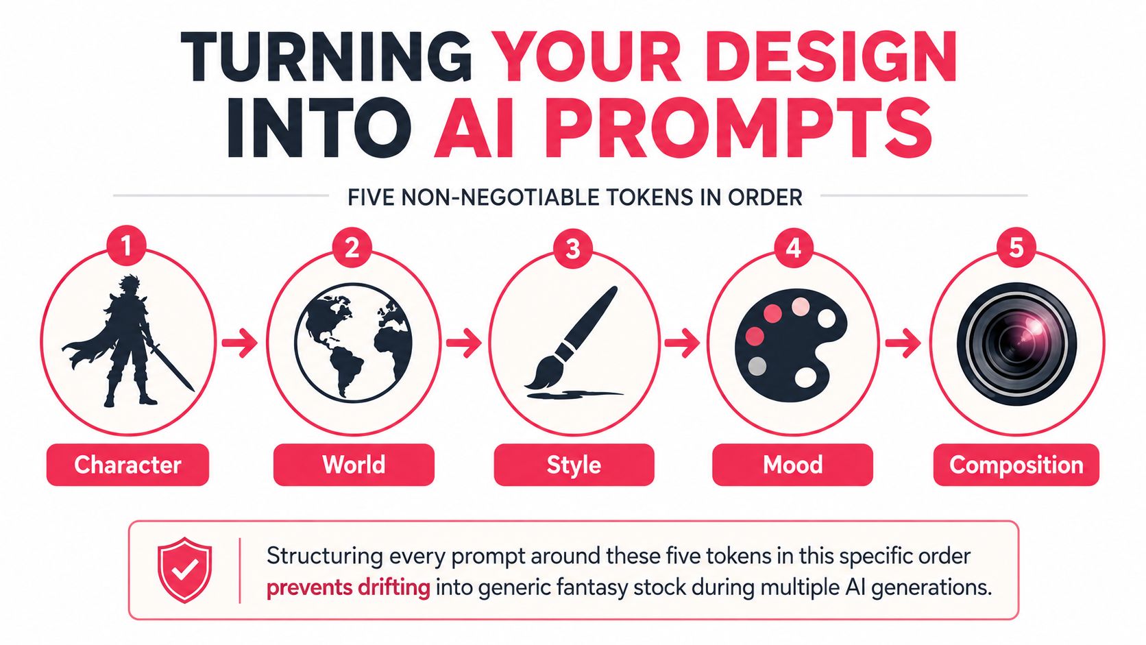
Use five prompt tokens in a fixed order:
- Character identity anchor: A short description you paste unchanged.
- World or scene context: The location, era, and relevant environmental cues.
- Art style: The rendering language, such as graphic novel ink or painterly fantasy.
- Mood and lighting: The emotional temperature, value structure, and light direction.
- Composition: Pose, framing, camera distance, and panel function.
The infographic below summarizes that linear conversion process.
Build a reusable identity block
A useful identity anchor might read:
Ashwood ranger, silver-streaked braid, narrow athletic frame, chipped green greaves, crescent scar through the left eyebrow, red thread tied around the right wrist.
Keep that wording identical across scenes. Change the action and framing after the identity block, not the descriptive core.
A neutral example would be:
Ashwood ranger, silver-streaked braid, narrow athletic frame, chipped green greaves, crescent scar through the left eyebrow, red thread tied around the right wrist. Standing full body in a quiet forest clearing, graphic novel fantasy style, cool overcast lighting, character reference attached, same character as reference.
Then test a scene:
Ashwood ranger, silver-streaked braid, narrow athletic frame, chipped green greaves, crescent scar through the left eyebrow, red thread tied around the right wrist. Drawing a bow while turning toward an unseen threat, three-quarter view, graphic novel fantasy style, sharp rim light through wet branches, character reference attached, same character as reference.
Don't combine conflicting instructions such as “slim but heavily armored” or “relaxed and aggressively tense.” Models resolve contradictions unpredictably. Decide which visual fact has priority, then use the image reference and prompt log to preserve it.
Run a small identity test before generating a sequence:
- Neutral full body: Confirms proportions and costume structure.
- Three-quarter action pose: Shows whether clothing remains legible under movement.
- Face close-up: Tests eyes, scars, markings, and hair placement.
Record the exact prompt strings, reference images, model settings, and successful corrections. The purpose is not one impressive image. It's a repeatable character block that can support a comic sequence. A tool such as PersonalizedComics' AI story generator can support prompt-driven comic creation, but you should still treat identity anchors and visual checks as part of the art direction.
Encoding Personality and Identity Into the Look
Personality becomes visible when it changes a design decision. Writing that a character is anxious doesn't help the reader unless the anxiety affects posture, clothing, grooming, object placement, or behavior. Backstory earns space on the character sheet only when it changes what the audience can see.
Choose two or three sharp behavioral traits before touching the palette or props. A compulsive planner might repeatedly adjust gloves, maintain worn fingertips, and keep maps folded into accessible pockets. A reluctant hero might wear ordinary civilian layers beneath conspicuous magical equipment, as though the heroic role was imposed rather than chosen.
Translate traits into evidence
Use a direct conversion from behavior to visual evidence:
- Suspicious: Keeps the chin lowered, leaves the neck covered, and positions tools where they can be reached without turning.
- Protective: Wears repaired equipment, carries supplies for others, and angles the body between danger and companions.
- Proud but insecure: Maintains formal grooming while hiding damaged or improvised parts of the costume.
- Curious: Collects small specimens, marks surfaces, or wears equipment modified for observation.
The strongest cues aren't always obvious symbols. A repeated adjustment, a guarded hand position, or a repaired seam can communicate more than a large emblem. Subtlety gives the reader something to discover, while one exaggerated feature ensures the character remains readable in a crowded panel.
Keep one signature silhouette feature and one signature color anchor. They should survive shadow, distance, and partial cropping. The feature might be a split collar or an unusually long braid. The color anchor could be a red wrist thread, a pale scarf, or a recurring brass detail.
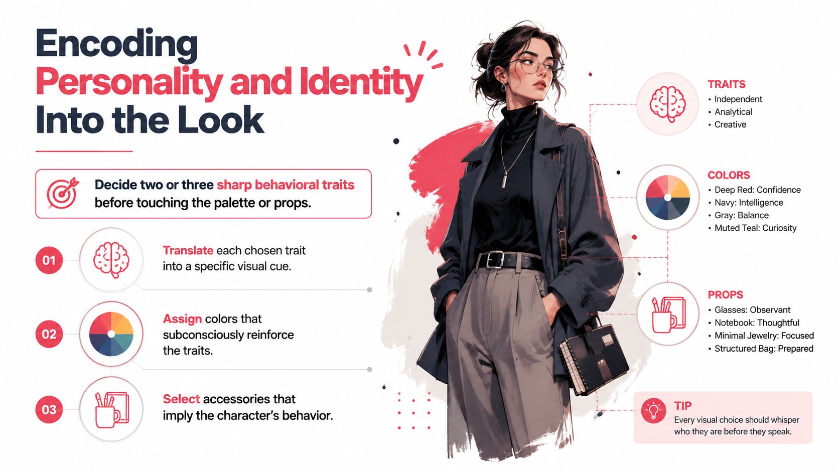
Test the finished art without captions or names. Describe what you think the character wants, avoids, and does under pressure. If the image communicates none of those traits, adding more lore probably won't help. Make a clearer visual decision instead.
Choosing Style and Polishing the Final Pages
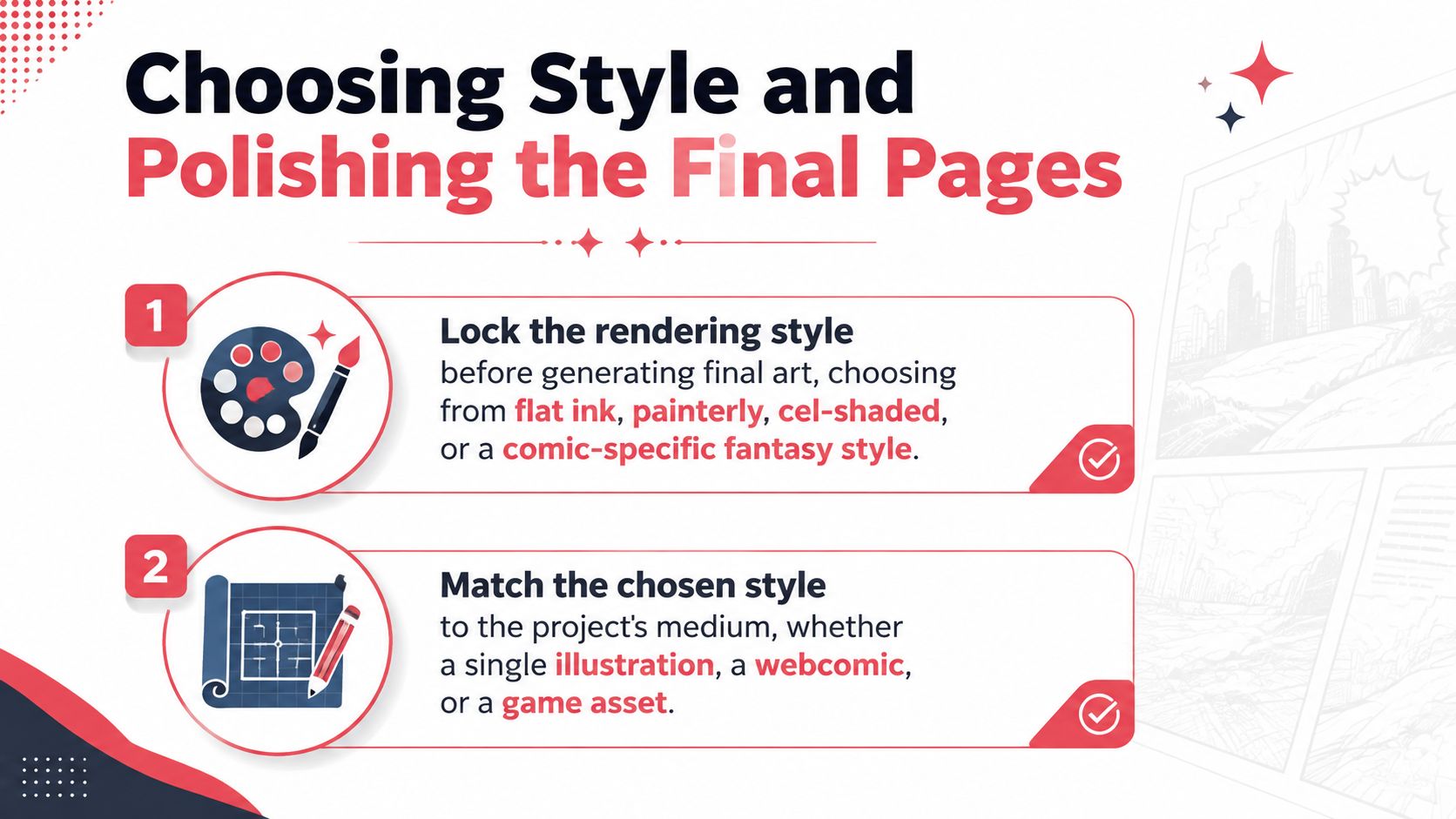
Choose the rendering style before producing final pages. Flat ink, painterly fantasy, cel shading, and comic-focused rendering each handle line weight, texture, value, and color differently. A style that works for a single cover illustration may create unnecessary labor across a webcomic, while a simplified page style may not provide enough atmosphere for a standalone character portrait.
Match the choice to the medium. Web pages need strong small-scale contrast and clean speech-bubble areas. Print pages need dependable margins, controlled detail, and a color workflow that survives reproduction. Game assets need clear views and repeatable material treatment. PersonalizedComics' fantasy style offers one reference point for evaluating line weight, saturation, and rim lighting before you commit to a visual direction.
Polish for sequence consistency
Final-page cleanup is less about adding effects and more about removing contradictions. Compare adjacent panels and check the eyes, hairline, costume anchors, weapon scale, and color relationships. AI-generated pages often drift in small ways that become obvious when the reader sees the same character repeatedly.
Use this pre-publish checklist:
- Value contrast: Separate the character from the background before adding atmosphere.
- Panel cropping: Make sure hands, weapons, and important costume features aren't cut accidentally.
- Bubble safety: Keep faces and action areas clear of speech balloons and narration.
- Bleed and margins: Confirm that background art extends correctly and important details stay inside the safe area.
- Color conversion: Prepare the final file for the intended print process, including CMYK conversion when required.
- Export review: Open the final exported pages, not just the working file, and inspect them at the size readers will see.
Fix common failures
Muddy mid-tones usually mean the palette lacks a clear light-dark hierarchy. Push the focal face, hands, or action prop toward the strongest contrast and simplify competing textures. Inconsistent eye placement often comes from generating each panel independently, so reuse the identity reference and compare face guides before accepting a result.
When a background overwhelms the figure, lower its contrast, simplify its edges, or reserve a clean value shape behind the silhouette. A polished fantasy page still fails if the reader can't identify the character during the action.
Fantasy character design also has value beyond a single illustration. The global character licensing market was valued at about $32.4 billion in 2025 and is projected to reach $56.8 billion by 2034, with a 6.4% CAGR across 2026–2034, while merchandise licenses represented 38.5% of total revenue in 2025, according to this character licensing market report. Distinctive silhouettes, symbols, outfits, and visual identities help characters travel across comics, games, apparel, and collectibles, so consistency is both an artistic concern and an intellectual-property concern.
PersonalizedComics lets you describe original heroes, choose its fantasy art style, and generate illustrated comic pages with panels, dialogue, narration, and sound effects, without requiring drawing skills. Use PersonalizedComics to turn your character sheet and prompt kit into a finished fantasy comic, then review each page for the silhouette, identity anchors, and panel-to-panel consistency covered here.
Filed under Comic Craft