That feeling is normal. Most beginners don't fail because they lack imagination. They stall because the blank page on screen asks for too many decisions at once. Story, art style, panels, dialogue, file setup, printing, all of it lands on day one.
The fix is structure. Professional comic workflows tend to follow a five-step framework: concept outline, character and worldbuilding, thumbnails and page layout, script-to-art, and final artwork plus publishing, as outlined in Automateed's graphic novel workflow guide. That sequence works whether you draw everything by hand in Clip Studio Paint, build pages in Photoshop, or use AI-assisted tools to speed up ideation and consistency.
If you're learning how to make graphic novels on computer, treat the process like production, not inspiration. Inspiration starts the book. Workflow finishes it. And if you're comparing digital and AI-assisted options, this roundup of AI tools for content creators is a useful place to see how newer tools fit into a creator's pipeline.
Introduction to Digital Graphic Novel Creation
A computer is a great place to make comics because it lets you revise fast, test layouts cheaply, and keep every piece of your project organized in one workspace. It also makes it easy to overwork pages, redraw scenes endlessly, and change your mind so often that the book never moves forward.
That's why the strongest digital workflow is built in phases. First, define the story. Then lock your characters and visual language. Then thumbnail pages before any polished drawing. Then finish art and lettering. Last, prepare files for the format you're publishing.
A graphic novel rarely falls apart because one panel is bad. It falls apart because the creator started rendering before making decisions.
For newcomers, that order matters even more. Digital tools are forgiving, but they also make it easy to hide weak planning under layers, effects, and revisions. If you solve the story and page flow early, every later step gets easier.
The rest of this guide follows the standard production order that working cartoonists use. It also addresses one problem most beginner guides barely solve: keeping characters visually consistent across many pages, especially if you're not a trained illustrator.
Plan and Script Your Story
A beginner mistake shows up early. You draft three polished pages, generate character art, start lettering, and then realize the chapter has no clear turn on page eight. On a computer, that kind of restart feels cheap at first. By page twenty, it becomes expensive in hours, revisions, and continuity problems.
A script prevents that drift. It gives every scene a job, and it gives you a way to test pacing before you spend time on finished art. For non-artists using AI image tools, planning matters even more. If the script is vague, you will prompt vague images. Vague prompts produce shifting clothes, changing faces, and page-to-page inconsistency.
Start with a short outline
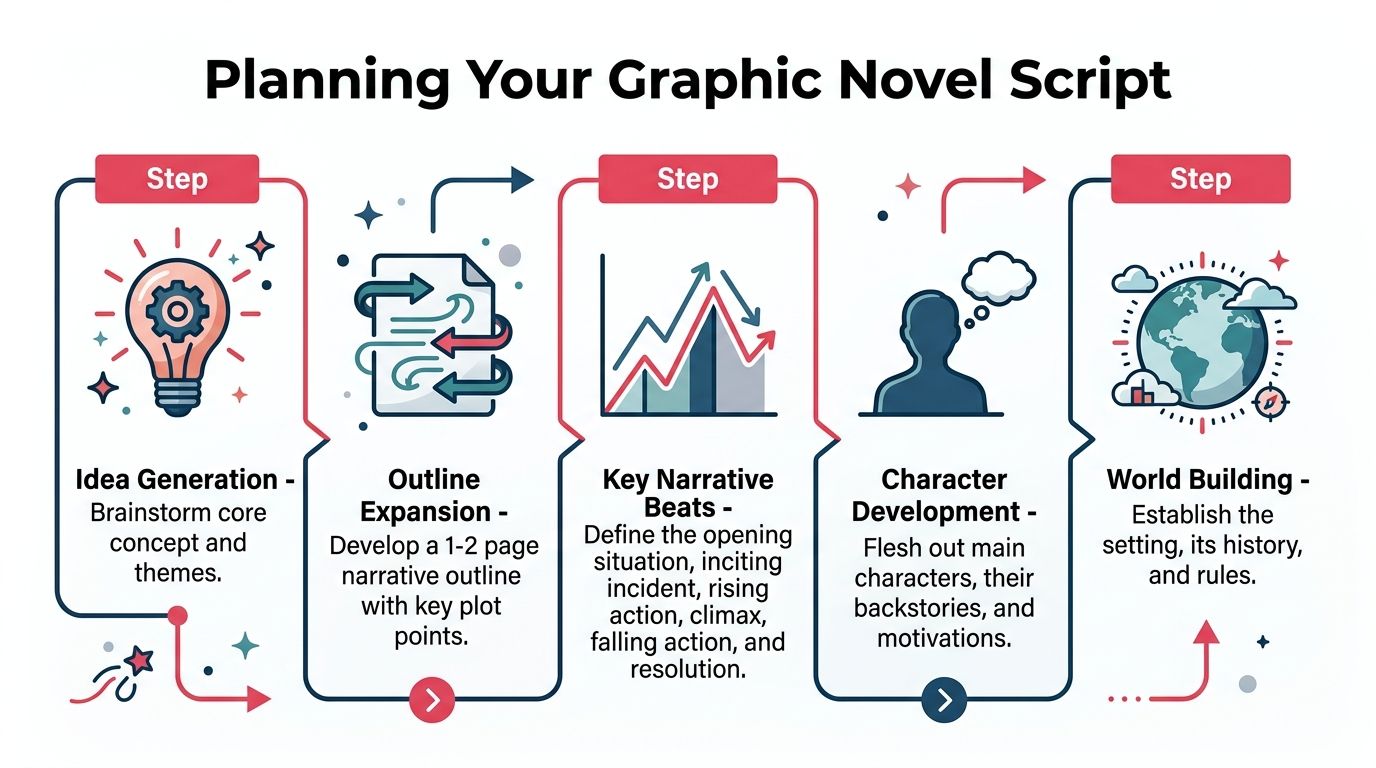
Write a 1 to 2 page outline before you script panels. Keep it plain. You are building a production map, not trying to impress anyone with prose.
Include the beats that control the book:
Opening situation
Show the protagonist's normal state before pressure hits.Inciting incident
Introduce the event that forces a change.Major turns
Mark the points where the plan fails, the stakes rise, or the character changes course.Climax and resolution
Decide what the final confrontation is and what emotional result the reader should leave with.
The Scott McCloud resources page is useful here because it points back to core comics craft: clarity, sequence, and deliberate page decisions. That is the right mindset at outline stage.
Turn the outline into a page beat sheet
Prose can hide pacing problems. A beat sheet exposes them.
List the story page by page, or scene by scene with rough page counts. Keep each beat to one line. For example: “Mira finds the missing ledger.” “Brother denies knowing anything.” “Guard enters before she can escape.” Short entries force clear decisions.
This step solves a problem that hits digital comic makers hard. They often write too much because typing is easy, then try to squeeze those lines into balloons later. A beat sheet puts pressure on the story early, where cuts are painless.
Use a simple process:
List each scene in order
Give every scene an action, conflict, or reveal.Accurately estimate space
Fights, chases, and location reveals usually need more room than new creators expect. Quiet exchanges often read better with fewer panels.Mark page turns on purpose
Surprises, entrances, and reversals usually work best after a turn.Note what must be shown
If a character's coat, scar, or tool matters later, flag it now. This helps AI-assisted workflows stay consistent because you know which visual details must repeat.
If you want a panel-by-panel format, this guide on how to write a graphic novel script gives a clear structure for scripting dialogue, captions, and panel descriptions.
Practical rule: If a speech balloon needs three commas and a line break to function, the line is probably too long.
Write panel descriptions for production, not for literature
A comic script is a working document. It should tell you, or an artist, what the reader needs to see.
Good panel descriptions answer practical questions:
| Script question | Why it matters |
|---|---|
| Who is in the panel? | Prevents missing characters and continuity mistakes |
| What changes in this moment? | Keeps the panel from becoming decorative |
| What must the reader notice first? | Supports clear composition later |
| What recurring visual details matter? | Helps maintain character consistency across pages |
This matters a lot if you use AI to generate some or all of the artwork. The script becomes part of your reference system. If page two says “long red coat, cracked round glasses, messenger bag” and page fourteen says only “she runs,” the tool will start inventing. Consistency problems usually start in the script, not in the final render.
The Clip Studio Paint guide to comic creation is helpful on this point because it treats comics as a sequence of readable visual decisions, not just illustrations lined up on a page.
Thumbnail before you commit
Thumbnailing is where the script proves itself. Keep the drawings tiny and ugly if needed. The goal is to test flow, rhythm, and space.
Check each page for these points:
- Reading order is obvious
- Important beats have enough room
- Dialogue fits without choking the art
- Page turns happen in the right places
- Character acting stays clear from panel to panel
I tell new creators to treat thumbnails as the cheapest place to fail. Redrawing a thumbnail takes minutes. Redoing polished digital art, revised AI prompts, and finished lettering can burn an entire weekend.
Write for pages, not paragraphs
Graphic novels are built from turns, pauses, reveals, and reactions. A strong script respects page space from the start.
That habit closes a big gap for non-artists. If you plan the story around pages, define repeatable visual details in the script, and thumbnail before rendering, you give yourself a real chance of keeping characters uniform across the whole book, even if you are using a computer and AI tools instead of drawing everything by hand.
Develop Characters and Visual Style
Readers forgive rough drawing more easily than they forgive inconsistent characters. If your lead looks tall on one page, young on the next, and off-model every time they smile, the story starts to feel unstable.
That's why character development in comics isn't only about personality. It's also about repeatable visual decisions.
Build a character sheet you can actually use
A useful character sheet is not a glamour illustration. It's a reference document. Keep it practical and production-ready.
Include these views for each major character:
- Front view for proportions and outfit shapes
- Side view for silhouette and nose, jaw, hair volume
- Three-quarter view for the angle you'll use most often in panels
- Expression row for neutral, anger, joy, fear, and thinking
- Outfit variations if the story spans multiple locations or times
The goal is consistency under pressure. When you're drawing page eighteen late at night, you don't want to re-invent the character.
Choose a limited visual language
Visual style isn't just “manga” or “western comic.” It's the sum of repeatable choices. Line weight, eye shape, rendering style, color handling, texture, and background density all affect whether pages feel like they belong to the same book.
One of the easiest ways to keep style stable is to define a few rules early.
| Style choice | Good rule to set early |
|---|---|
| Line art | Clean and thin, or rough and textured |
| Shading | Flat colors, cel shading, or painterly |
| Backgrounds | Minimal, selective, or detailed |
| Facial design | Simplified features or realistic structure |
| Color mood | Warm, muted, high-contrast, or noir |
Don't make every page a style experiment. Pick an approach your skills can sustain across the whole project.
Create a visual bible
A visual bible is a folder or document that stores the decisions you want to stop rethinking. It can include:
- reference boards for architecture, clothing, and lighting
- labeled color swatches for recurring characters
- sample balloon styles and caption boxes
- notes on scars, jewelry, props, and recurring symbols
- naming rules for files and layers
Documenting character details often saves beginners from “character drift.” If a secondary character always wears the same jacket with the same sleeve stripes, document that once and stop trusting memory.
Consistency comes from documentation more than talent.
Use AI carefully if you don't draw confidently
For non-artists, the hard part isn't often imagination. It's maintaining the same face, body type, and outfit details across many scenes. AI can help here, but only if you use it as a controlled reference system instead of a random image slot machine.
The practical approach is:
- lock a character design early
- save approved outputs in a reference sheet
- keep prompts or generation settings documented
- reuse the same visual descriptors every time
- correct drift early instead of “fixing it later”
AI is strongest at prototyping and reference generation when you give it a narrow lane. It becomes unreliable when every page starts from scratch with different wording and no style guide.
Layout Panels and Composition
Good panel layout is invisible. The reader doesn't pause to decode it. Their eye moves naturally, the reveal lands where it should, and the page carries the emotion you intended.
Bad layout announces itself immediately. Readers jump to the wrong panel, miss a line of dialogue, or stop to figure out where the action went.
Control reading order first
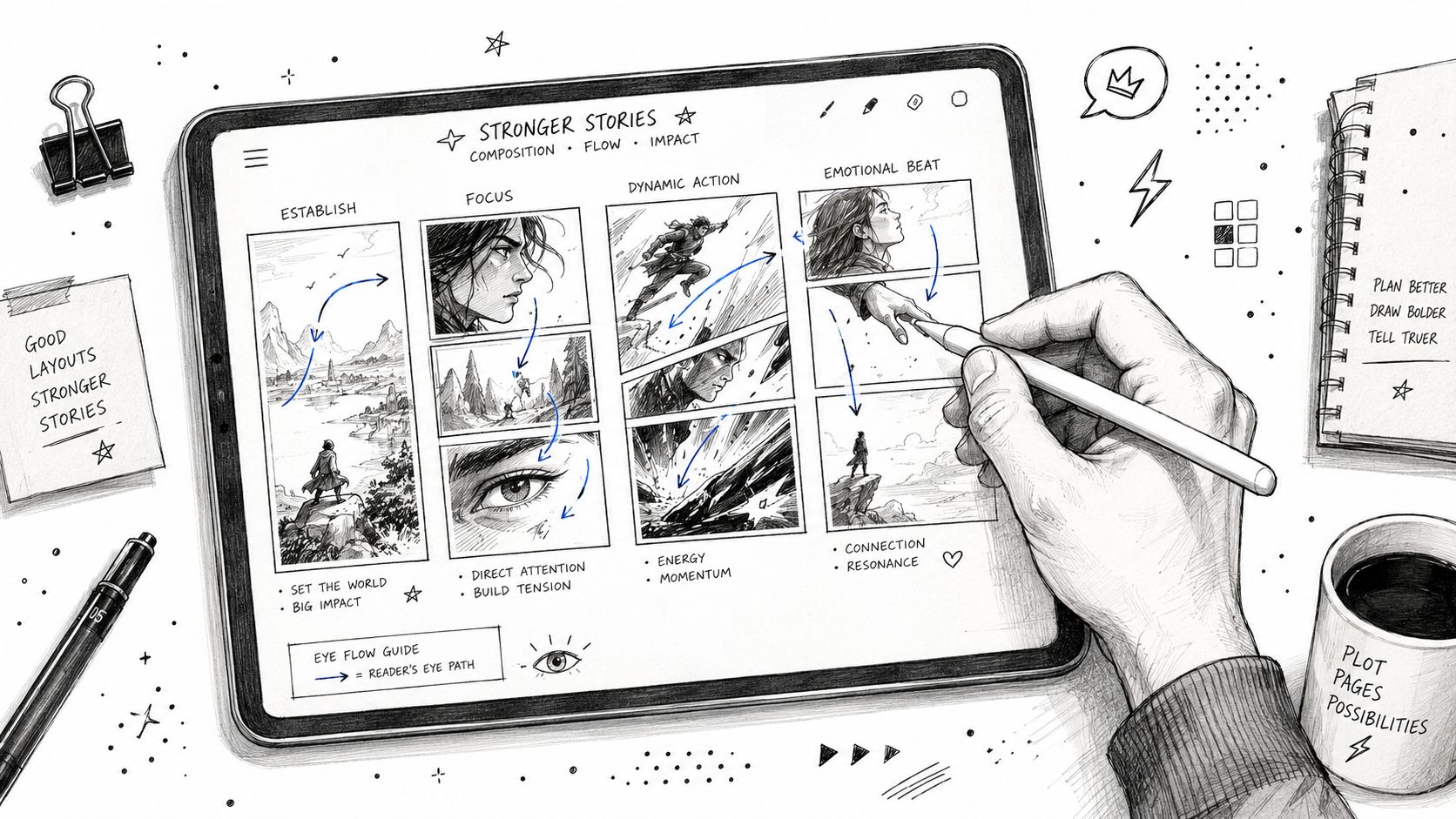
If you only remember one layout principle, remember this one: clarity beats cleverness. Experimental pages can be exciting, but they must still guide the eye.
A clean page usually does these things well:
Keeps panel order obvious
Left to right, top to bottom for English-language comics, unless you have a very deliberate reason to break that flow.Uses size for emphasis
Bigger panels slow the reader down or highlight an important beat.Leaves gutters readable
Tight gutters can work for tension, but they shouldn't make panels blend together accidentally.Protects balloon space
Dialogue needs room before final art gets dense.
Match panel structure to story rhythm
Not every page should have the same number of panels. Repetition can create rhythm, but overuse makes the book feel flat.
Here's a practical breakdown:
| Page type | When it works |
|---|---|
| Regular grid | Dialogue scenes, clear exposition, stable pacing |
| Wide cinematic panel | Establishing shots, pauses, travel, mood |
| Tall vertical panel | Falls, entrances, architectural scale |
| Splash image | Major reveal, emotional peak, spectacle |
| Overlapping elements | Chaos, speed, dream logic, impact |
A grid is often the safest home base. It's easier to read and easier to letter. Splashy layouts should be earned. If every page screams, nothing sounds important.
Compose for focus, not decoration
A lot of beginners treat panel composition like illustration. They chase dramatic camera angles before deciding what the panel needs to communicate. In comics, the function comes first.
Ask these questions while thumbnailing:
- What must the reader notice first?
- What emotion should the panel carry?
- What can be omitted without losing the beat?
- Can the panel still read at a quick glance?
That last question matters more than people think. Shrink your thumbnail view. If the page still reads clearly, your composition is probably working.
If a panel needs a paragraph of explanation outside the page, the composition isn't doing its job.
Leave room for production realities
Panels don't exist in a vacuum. They need to survive lettering, export, and sometimes print trimming. So when you rough layouts, don't fill every edge with irreplaceable detail.
Keep important faces, hands, props, and text away from areas likely to get crowded by balloons or cut too close during finishing. That habit saves hours later.
Illustrate and Letter Your Pages
This is often the stage rushed toward. It's also where many projects bog down. The secret isn't drawing faster. It's choosing a method you can sustain for the whole book.
If your process produces one beautiful page and leaves you exhausted, it's the wrong process for a graphic novel.
Pick the right illustration method
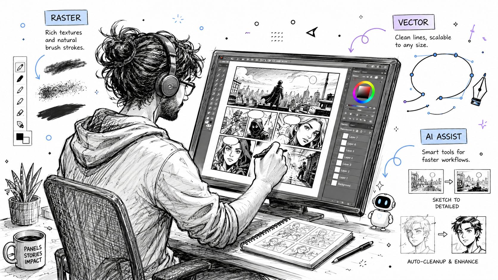
There are three broad approaches for digital comic art.
| Method | Works well for | Trade-off |
|---|---|---|
| Raster tools like Clip Studio Paint or Photoshop | Hand-drawn organic pages, expressive line work | Harder to resize line art cleanly later |
| Vector tools like Illustrator or Affinity Designer | Sharp shapes, clean graphic styles, scalable lettering | Can feel stiff for character-heavy comics |
| AI-assisted workflow | Prototyping, reference generation, non-artists solving consistency | Needs strong direction and editing discipline |
Most creators mix methods. They might thumbnail in Procreate, ink in Clip Studio Paint, color in Photoshop, and letter in Adobe Illustrator or directly in Clip Studio. The exact tool matters less than whether your files stay organized and your style stays consistent.
Solve the consistency trap directly
For non-artists, this is the point where many projects collapse. The pages begin, but the protagonist's face keeps drifting. Hair length changes. Jackets change shape. Proportions swing wildly from panel to panel.
The problem is real. As noted in wikiHow's guide to creating a graphic novel, character consistency is the most cited barrier for non-artists creating comics; hobbyists often abandon projects because models look different every page, yet AI tools can automate uniform design.
That matters if you're learning how to make graphic novels on computer without formal drawing training. You need a repeatable system, not just enthusiasm.
What works
Approved model sheets
Generate or draw one accepted version of each main character, then use it as the source of truth.Scene presets
Keep notes for lighting, costume state, hair arrangement, and age cues in each chapter.Prompt discipline
If you use AI, don't improvise the description every time. Reuse the same core descriptors.Manual correction passes
Even with AI, check ears, eye spacing, accessories, and clothing details before moving on.
What doesn't work
- Generating every panel from scratch with loose prompts
- Changing art style mid-book because one page looked cool
- Skipping references because the character feels “simple”
- Trying to fix consistency only at the coloring stage
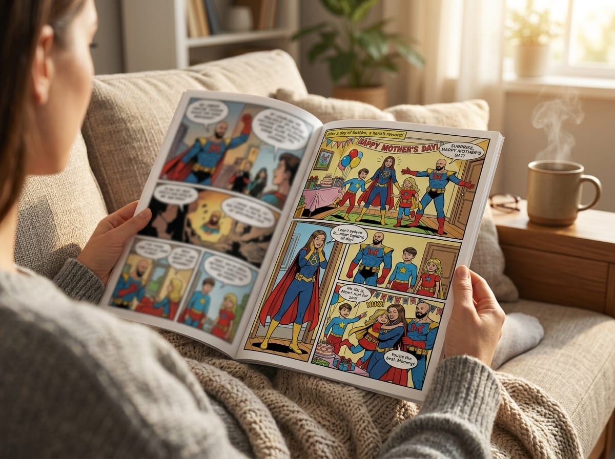
One practical option in this category is PersonalizedComics' speech bubble design resources alongside its comic creation workflow, which can generate pages with panels, dialogue placement, and character-based visuals from uploaded photos or story prompts. For non-artists, systems like that are most useful in prototyping, gift comics, and early page development, especially when visual uniformity matters more than hand-drawn line individuality.
Letter earlier than beginners expect
A common mistake is saving all lettering for the very end. That sounds efficient, but it often leads to crowded art and awkward balloon placement.
Instead, letter during the page-finishing stage while you can still adjust composition. Keep these rules in mind:
Use readable fonts
Comic lettering should disappear into the reading experience, not advertise itself.Keep balloons off key art
Don't place balloons on top of faces, hands, or emotional focal points.Group dialogue by flow
The order of balloons should support the reading path naturally.Match balloon size to actual dialogue
If the balloon is huge, the script may be too wordy or the panel too small.
Sound effects need the same discipline. They shouldn't just decorate the page. They should support impact, timing, or mood.
A strong comic page reads clearly even before the reader consciously notices the lettering.
Build a repeatable page pipeline
The cleanest digital page workflow usually looks like this:
- import thumbnail
- lower opacity and lock it
- draw roughs on a new layer
- ink or refine
- place flat colors
- add shading or texture
- letter and add SFX
- export a review file
- make final corrections
- archive working files carefully
This kind of consistency in production matters as much as consistency in drawing. If each page is built differently, revisions become messy fast.
Prepare Files for Print and Web Publishing
A page that looks sharp on your monitor can still print badly. That gap catches a lot of first-time creators. They finish the comic, export a file, and assume the last step is just uploading it somewhere.
It isn't. Print has technical requirements, and ignoring them can ruin otherwise solid artwork.
Set files up for print quality
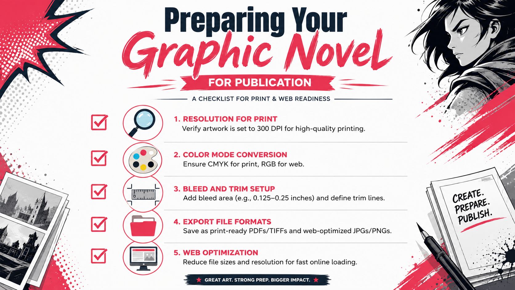
For professional print output, images must be at least 300 dpi with correct bleed and trim settings and calibrated monitors to ensure color accuracy and avoid costly reprints, according to Blurb's guide to making a graphic novel.
Those aren't optional polish details. They're baseline production requirements.
Here's what each one means in practice:
300 dpi
This is the print-quality threshold. Lower resolution can look acceptable on screen and still turn visibly pixelated in print.Bleed
Artwork that extends past the trim edge so printed pages don't show accidental white slivers.Trim
The final cut edge of the page. Important content should sit safely inside it.Monitor calibration
Your screen needs to show color accurately enough that print output doesn't come back unexpectedly shifted.
Export with the destination in mind
Web and print are different products. Don't treat them as the same export.
| Destination | What to prioritize |
|---|---|
| Print edition | Full resolution, print-safe margins, bleed, high-quality export |
| Webcomic or storefront preview | Smaller file size, fast loading, readable text on screens |
| Social posts | Cropped excerpts, vertical readability, legible balloons on phones |
For print, many creators export high-quality page files and then assemble them into the printer's preferred package. For web, you usually need smaller dimensions and lighter files so pages load quickly.
Check color before final export
Color shifts are where digital-only creators often get surprised. A page with rich glowing blues on screen can print much duller if you haven't prepared for physical output.
Use a checklist before exporting:
- Confirm the page size matches the printer's template
- Verify all pages are at 300 dpi
- Check that bleed artwork extends beyond trim
- Review blacks, dark shadows, and saturated colors carefully
- Proofread every balloon and caption one more time
- Export a sample page and inspect it before sending the whole book
Print problems usually start long before the export button. They start when the working file was built carelessly.
Keep a web version separate
If you plan to post pages online, make a second set of exports just for digital reading. That gives you control over compression, scrolling format, and platform-specific presentation without touching your print masters.
This is one of the least glamorous habits in comic production, but it saves real trouble. Your archival print files should stay untouched. Your web files can be resized, compressed, cropped, and optimized freely.
Conclusion and Next Steps
A graphic novel made on a computer still succeeds the old-fashioned way. Strong planning, clear page design, repeatable production habits, and the discipline to keep moving. The software helps. The workflow finishes the book.
The smartest first project isn't a huge saga. Make a short sample comic and run the entire process once. Script it properly. Build character references. Thumbnail every page. Finish the art. Letter it. Export it for both screen and print. That small trial will show you where your real bottlenecks are.
If drawing skill is the obstacle, don't treat that as the end of the road. Use AI-assisted tools carefully to prototype pages, lock character designs, and test visual storytelling before committing to a longer book. For many beginners, that's the difference between an abandoned folder and a finished comic.
Then scale up. One scene becomes four pages. Four pages become a chapter. That's how books get made.
If you want a faster way to prototype or produce a comic without drawing everything yourself, PersonalizedComics lets you turn photos and story ideas into illustrated comic pages with consistent characters, dialogue, and ready-made layouts. It's a practical option for gifts, early graphic novel concepts, classroom projects, or anyone who wants to test a story visually before building a larger book.
Filed under Comic Craft