That disconnect is where a lot of beginner comics lose their momentum.
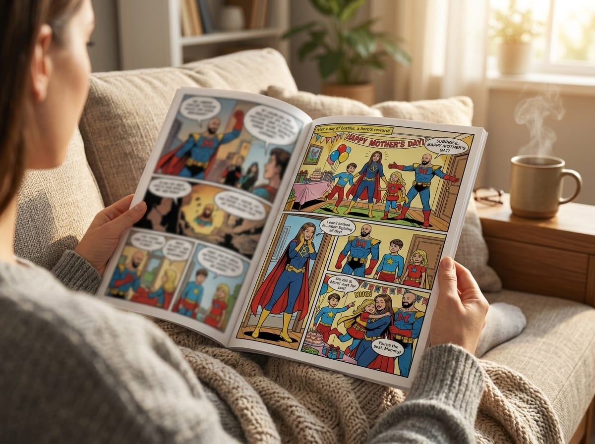
Speech bubble design looks simple because readers process it fast. That speed is the trick. A good bubble disappears just enough to let the story flow. A bad one slows the eye, muddies who's speaking, and flattens a line that should have hit harder. If you care about comics as storytelling, not just illustration, you can't treat bubbles as an afterthought.
The Unseen Art of Comic Dialogue
A speech bubble isn't just a container for words. It's part of the performance.
Before a reader fully parses a sentence, they've already reacted to the bubble's size, shape, placement, and tail. They know whether a line feels calm, urgent, hesitant, loud, private, or unstable. That means speech bubble design does two jobs at once. It delivers information, and it sets tone.
Why great art can still read badly
A common beginner mistake is finishing the art first and squeezing dialogue into whatever space remains. That usually creates one of three problems:
- Cramped lettering that feels hard to read
- Confusing speaker attribution because the tail points vaguely into space
- Broken pacing because the eye has to hunt for the next line
None of those issues come from weak drawing. They come from weak planning.
Practical rule: If the reader has to stop and decode your bubbles, the page is doing extra work it shouldn't be doing.
Good dialogue presentation controls rhythm. A wide, open bubble can make a line feel measured. A compact burst can make a shout hit like an interruption. Two stacked bubbles can imply a pause without writing “…” five times. This is design doing narrative work.
What speech bubbles really control
When creators start paying attention to bubble design, they usually focus on appearance first. That matters, but the bigger gains come from function.
A solid bubble system helps you manage:
Clarity
The reader knows who is speaking and in what order.Pacing
The panel breathes at the right speed.Emotion
The visual form supports the line delivery.Composition
Text becomes part of the panel instead of fighting it.
That's why professional pages feel effortless to read even when they're visually dense. The bubbles are carrying structure behind the scenes. Once you understand that, speech bubble design stops feeling like mysterious lettering craft and starts feeling like practical storytelling you can learn, test, and improve.
The Core Principles of Good Bubble Design
A speech bubble succeeds when the reader barely notices it. They read the line, hear the tone, and move to the next beat without friction. That sounds simple. On the page, it takes discipline.
Three principles do most of the work: readability, flow, and emotional fit. If one slips, the whole panel feels weaker.
Readability comes first
Readers should never have to wrestle with a balloon. If the text feels crowded, the bubble is too small. If the line breaks feel awkward, the lettering was forced to fit a shape instead of the other way around.
A reliable production habit is to letter the dialogue first, then build the bubble around the text. That gives the words enough inner margin and keeps the shape honest. New creators often do the reverse because drawing the balloon feels faster. It usually creates extra revision later.
Keep the fundamentals plain and consistent:
- Use clear, readable lettering
- Leave enough interior space around the text
- Break lines naturally
- Save special treatments for lines that need emphasis
Plain is good here. Readers notice bubble mechanics only when something has gone wrong.
Flow controls how the panel reads
Good bubble design also manages sequence. A panel can be beautifully drawn and still read badly if the balloons send the eye in the wrong direction.
For left-to-right English reading, the eye usually wants the next line higher and to the right before it drops lower in the panel. Fight that pattern and the reader pauses to decode order. On a dense page, even a small pause can flatten a joke, soften a reaction shot, or blur who answered whom.
I tell beginners to check flow with the art half-ignored. Squint at the panel. If the balloons still create a clean path, the structure is doing its job. AI comic tools can speed this test up too. Generate two or three layout variations from the same script, then compare which one reads fastest before you polish the art.
A strong reading path feels natural. A weak one turns dialogue into traffic.
Emotion has to match the line
Bubble design is part of performance. Before a reader studies the words, they register the container. Shape, size, and spacing all affect delivery.
A line inside a roomy, rounded balloon feels calm or conversational. A tighter balloon can add pressure. More white space can make a character sound hesitant, quiet, or reflective. Those choices work best in moderation. If every line gets a dramatic treatment, the page loses contrast.
This principle has deep roots in comics history. The form developed over time from earlier visual devices for spoken words into the standardized balloon systems used in print comics. The point for working artists is practical: speech has always needed a visual wrapper, and that wrapper always influences tone. Modern tools just make that experimentation faster. With AI comic generators, you can test prompts such as “soft rounded speech bubble for uncertain dialogue” or “compact tense balloon with restrained emotional pressure” and see which treatment supports the scene before you commit.
A quick test for every bubble
Before you finalize any balloon, check three things:
- Can the reader understand it at a glance
- Does it support the intended reading order
- Does the form match the emotional delivery of the line
If one answer is no, fix the bubble first. In production, that is often the fastest way to improve the panel.
Choosing Your Bubble and Tail for Impact
A common production mistake shows up the moment a conversation gets tense. Every line gets the same oval balloon, the same tail, and the same visual weight. The dialogue may be written well, but the page stops helping the reader hear it.
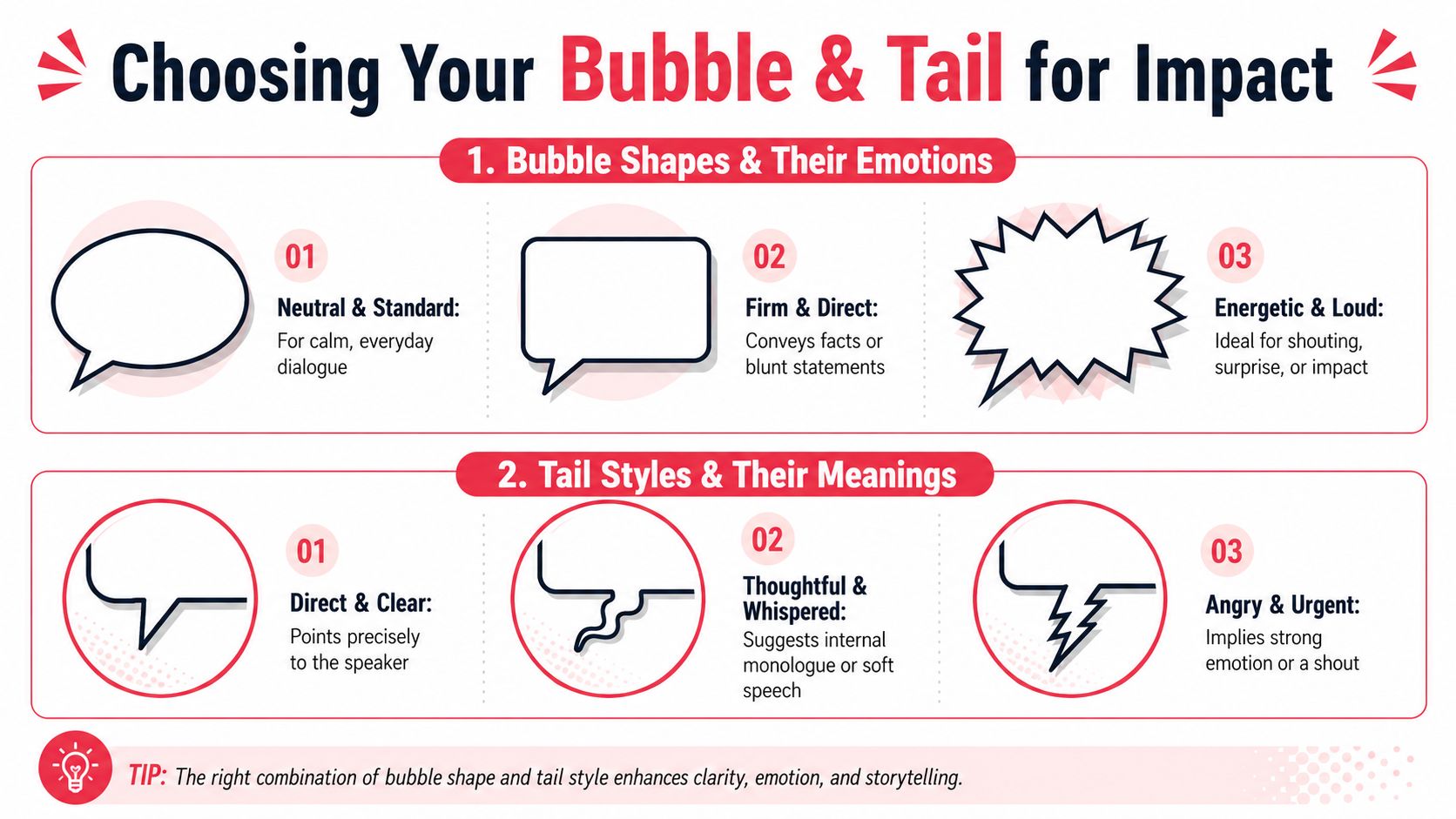
Bubble choice should solve two jobs at once. It should tell the reader what kind of speech they are looking at, and it should do it fast enough that reading never stalls.
Shape changes meaning before the words land
A small visual vocabulary goes a long way. In practice, five dependable balloon types cover most scenes.
| Style | Appearance | Common Meaning |
|---|---|---|
| Standard oval | Rounded, balanced shape | Everyday dialogue, neutral delivery |
| Rectangular | Straighter sides, firmer feel | Direct statements, formal speech, blunt lines |
| Cloud-like | Soft, puffy outline | Thoughts, internal monologue, dreamy tone |
| Jagged burst | Explosive outer edge | Shouting, alarm, sudden impact |
| Wobbly outline | Uneven or shaky border | Fear, weakness, uncertainty, instability |
The trade-off is contrast. Special balloon shapes work because the page has a normal baseline. If every speaker gets a jagged, trembling, highly stylized container, the emotional signal flattens out and the page starts to look noisy.
This is also where AI tools save time. Instead of redrawing the same panel three ways, test direction early with prompts like “rounded dialogue balloon for calm conversation,” “rectangular speech bubble for blunt formal line,” or “wobbly balloon for anxious whispered confession.” You get faster visual options, then refine by hand where the scene needs more control.
Tail design decides who owns the line
Readers forgive a plain balloon. They do not forgive confusion about who is speaking.
A good tail points cleanly to the speaker, usually toward the mouth area or the clearest part of the head silhouette. It should feel deliberate, not approximate. If two characters are close together, tail angle matters as much as balloon shape.
Use tail styles with the same restraint you use for balloon shapes:
- Straight tail for normal spoken dialogue
- Small trailing bubbles for thought, distance, or very soft delivery
- Wavy tail for weak, eerie, breathy, or unstable speech
- Jagged tail for force, rage, static, or synthetic intensity
Stylized tails can add flavor, but clarity comes first.
Match the balloon to the script beat
The script usually tells you more than the line itself. A clipped order, a private thought, a panicked warning, and a shaky confession should not all look identical on the page. If you are still scripting, it helps to mark those shifts before lettering starts. A clean comic book script format for dialogue and panel beats makes balloon decisions easier because tone changes are already visible in the draft.
That planning matters even more when AI is part of the workflow. If the prompt only says “speech bubble,” the tool will often default to a generic result. If the prompt says “tight rectangular balloon for cold official dialogue” or “small wavering balloon with hesitant tail for a frightened reply,” the output gets closer to story intent on the first pass.
What holds up on the page
The strongest pages usually follow a simple hierarchy. Standard dialogue stays visually quiet. Special treatment appears only where the scene earns it.
Works well
- Neutral bubbles carrying most conversation
- Tails aimed clearly at the correct speaker
- Distinct shapes reserved for real tonal shifts
- Balloon drawn around the text, with breathing room intact
Usually fails
- Tiny or decorative tails that create speaker confusion
- Expressive outlines used on routine lines
- Balloons packed too tightly around the lettering
- Shouting effects stacked all at once, such as burst shape, oversized text, bold emphasis, and excessive punctuation
Pick one dominant signal for emphasis and let it do the work. That choice reads cleaner, looks more professional, and gives the big moments somewhere to go.
Typography and Lettering That Speaks Volumes
If bubble shape is body language, lettering is voice.
A line can read as robotic, elegant, exhausted, childish, ceremonial, or threatening before the reader fully absorbs the wording. That effect comes from typography choices. In practice, the best approach is simple. Pick a readable default, use it consistently, then break that pattern only when the story needs it.
Keep the default stable
Consistency makes the page feel professional. In comic lettering, standard dialogue should usually keep the same font size from line to line, and changes in size are best saved for moments like shouting or whispering. That stability helps readers focus on story instead of constantly recalibrating to a new text treatment.
A few dependable rules:
Choose clarity over novelty
A decorative font might look fun in a title card and become exhausting in dialogue.Limit character-specific fonts
A robot, spellcaster, or alien voice can justify a different style, but keep it legible and rare.Use emphasis with restraint
Bold, italics, and capitalization all work better when they aren't piled on every page.
Match voice to character
Typography should support characterization, not replace it. If a magical being uses ornate lettering in every line, the font becomes costume. That can work, but only if the text remains easy to read at comic size.
For most creators, sentence case versus all caps is a style decision tied to the overall book. What matters more is internal consistency. Once readers learn how your comic sounds on the page, don't keep changing the rules.
A readable font with strong placement beats a clever font with weak legibility every time.
Script and lettering should support each other
A lot of lettering problems start in the script. If every dialogue beat runs long, no bubble system will save the page gracefully. Tight writing gives lettering room to breathe.
That's why it helps to think about balloon space while scripting. If you want a stronger foundation before lettering, this guide on how to write a comic book script is a useful companion to the design side.
Use styling as a signal, not a crutch. Whisper smaller. Shout larger. Stress one word, not half the sentence. When typography behaves like performance direction, the page starts sounding alive.
Strategic Placement and Panel Composition
A perfect bubble can still wreck a panel if it sits in the wrong place.
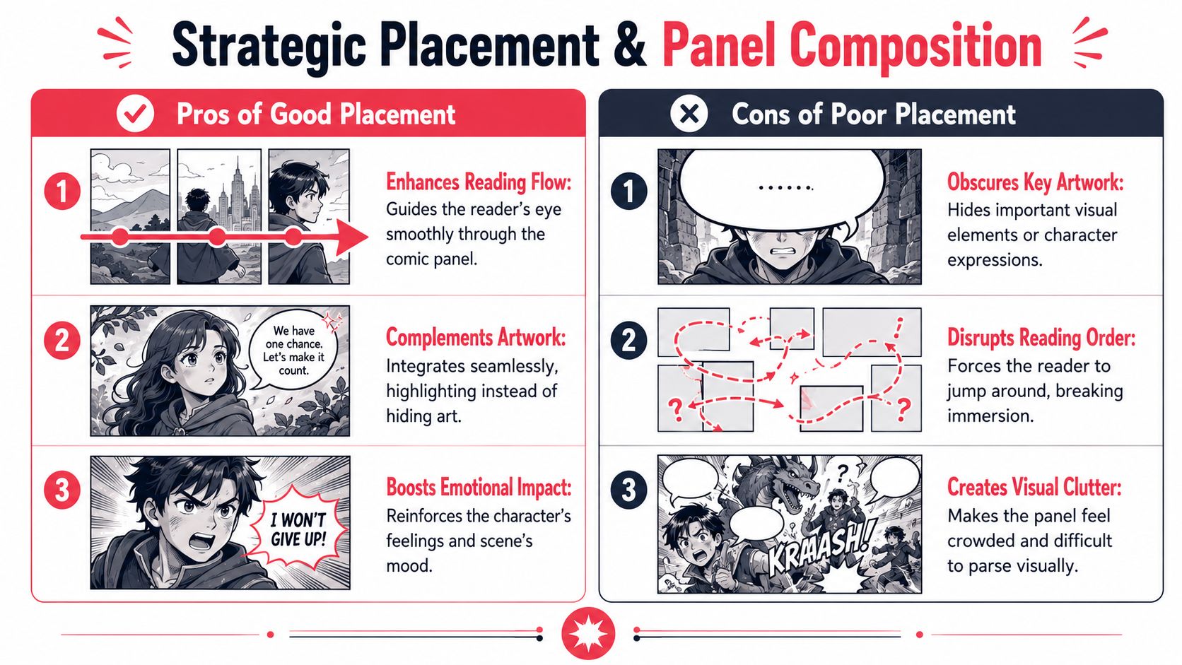
Placement is where speech bubble design becomes page architecture. Bubbles take up real estate, and they take up more of it than beginners expect. If you don't account for that early, you end up covering hands, faces, background clues, or the one expression the scene needed.
Plan bubble space in thumbnails
Professional artists often sketch the approximate size and placement of speech bubbles during thumbnailing, before the exact final wording is settled, because bubble size has a major effect on page layout. A common beginner tip is to place bubbles along the top of the page or panel so they interfere less with the artwork, according to this guide to planning speech bubbles during thumbnailing.
That workflow solves a problem before it exists.
If your panel contains an important face, gesture, prop, or background reveal, reserve that area immediately. Don't trust yourself to “find room later.” Later usually means compromise.
Build a reading path, not a pile of text
Good placement creates a path through the panel. Poor placement creates detours.
Try this checklist when arranging balloons:
Start high when possible
Upper placement usually helps the reader enter the dialogue cleanly.Move in natural reading order
Each bubble should lead to the next without forcing the eye backward.Protect focal art
Don't cover expressions unless the joke or effect depends on it.Group related lines
If two characters are exchanging fast dialogue, keep their balloons visually connected.
A lot of clutter comes from treating each bubble as an isolated object. On the page, balloons behave more like a chain. The shape of one affects the readability of the next.
Separate layers save time
Digital creators have one huge advantage. In modern workflows, many artists keep speech bubbles on a separate layer from the art so they can move or resize them later without redrawing the page, as noted in the same thumbnailing guide above.
That flexibility matters more than people think. Dialogue changes. A line gets trimmed. A sentence becomes funnier. A dramatic pause turns into two balloons instead of one. If your bubbles are trapped in the art layer, every revision gets expensive.
For creators who want help thinking through panel flow before finalizing pages, a comic panel layout generator can help you map visual rhythm before lettering starts.
Good bubble placement protects the art. Great bubble placement makes the art read better.
Using AI for Smarter Speech Bubble Design
AI works best in comics when it handles friction, not authorship. Speech bubble design is a good example.
Most creators don't struggle because they lack ideas. They struggle because small production decisions stack up fast. Which bubble fits this line? How much room does this panel need? Should this thought feel private or eerie? That's where AI tools can speed up iteration. You can test options quickly, compare versions, and keep moving instead of redrawing the same page structure over and over.
What AI should handle for you
The useful role of AI isn't “make all my creative choices.” It's “give me fast, editable starting points.”
That means letting the tool assist with:
- Bubble rough-ins based on dialogue length
- Tone variations for the same line
- Placement experiments that preserve art visibility
- Typography suggestions matched to scene mood
- Versioning so you can compare calm, tense, and loud deliveries
Used well, AI behaves like a fast assistant letterer. You still decide what the scene needs.
Prompts that actually help
Specific prompts get better results than broad ones. Ask for tone, shape logic, and placement intent.
Try prompts like these:
- “Use a neutral rounded speech bubble for casual conversation. Keep the text spacious and easy to read.”
- “Make this line feel nervous. Use a slightly shaky bubble outline and a hesitant tail style.”
- “Turn this into an internal thought. Use a cloud-like bubble and softer visual treatment.”
- “This line is a sharp interruption. Use a compact, forceful bubble that lands quickly.”
- “Design this shout with an explosive burst shape, but keep the lettering readable.”
- “Place the balloons high in the panel so the character expressions stay visible.”
- “Create two linked bubbles for a short pause between phrases.”
- “Give this villain dialogue a firmer, colder bubble style without making it hard to read.”
If you're experimenting with AI-assisted comic creation more broadly, this guide to a create your own comic book kit is a practical next step.
The trick is to prompt for storytelling effect, not decoration. “Make it cool” is vague. “Make this line sound tired, private, and slightly uncertain” gives the tool something usable. That's the same standard a human letterer would need.
Essential FAQs for Speech Bubble Design
A few speech bubble design questions come up again and again once you start making real pages.
How should I handle right-to-left languages
Match bubble order to the reading direction of the language. In English, readers generally move left to right. In Japanese, bubbles are read right to left within the panel. Your bubble arrangement should follow the language's natural reading structure rather than forcing one universal layout.
Can I use custom fonts for each character
You can, but most comics improve when custom fonts are limited to special cases. Too many font changes make the page feel noisy. Use custom lettering when a voice needs distinction, such as a machine, supernatural voice, or broadcast effect, then keep the rest of the dialogue unified.
What makes a bubble more accessible
Clarity beats style. Choose strong contrast between text and bubble, keep the lettering easy to parse, and avoid squeezing lines close to the border. If a font looks clever but takes extra effort to read, it isn't helping the story.
How do I show multiple characters speaking at once
You have a few options, and each creates a different feel:
- Shared burst energy for a synchronized shout
- Separate adjacent balloons when each voice still matters individually
- Overlapping placement if the scene needs interruption or crowd pressure
What if two people are talking over each other
Don't rely on overlap alone. Build the interruption into the bubble shapes and line breaks. A cut-off balloon, a sharp edge, or a compact interruption balloon often reads more clearly than visually tangled text.
Should speech bubbles ever cover artwork
Yes, but only with intent. Covering empty background space is standard. Covering a hand, prop, or even part of a face can work if that trade-off preserves reading flow and the hidden detail isn't carrying the scene. If the covered art contains the emotional payoff, move the bubble.
If you want to turn ideas, dialogue, and character photos into polished comic pages without wrestling every production step by hand, PersonalizedComics makes that process much easier. You can generate full comic pages in multiple art styles, create custom characters, add dialogue and story beats, and even order a premium physical copy when you're done. It's a practical option for hobbyists, gift-makers, and writers who want to prototype a comic fast without a subscription.
Filed under Comic Craft