That question stops a lot of people. They know the mood they want. Funny, heroic, eerie, romantic, futuristic. But once they start looking at comic drawing styles, everything blurs together. One style feels too dramatic. Another looks beautiful but doesn't fit the story. A third captures the mood, but they have no idea how to describe it to an artist or an AI tool.
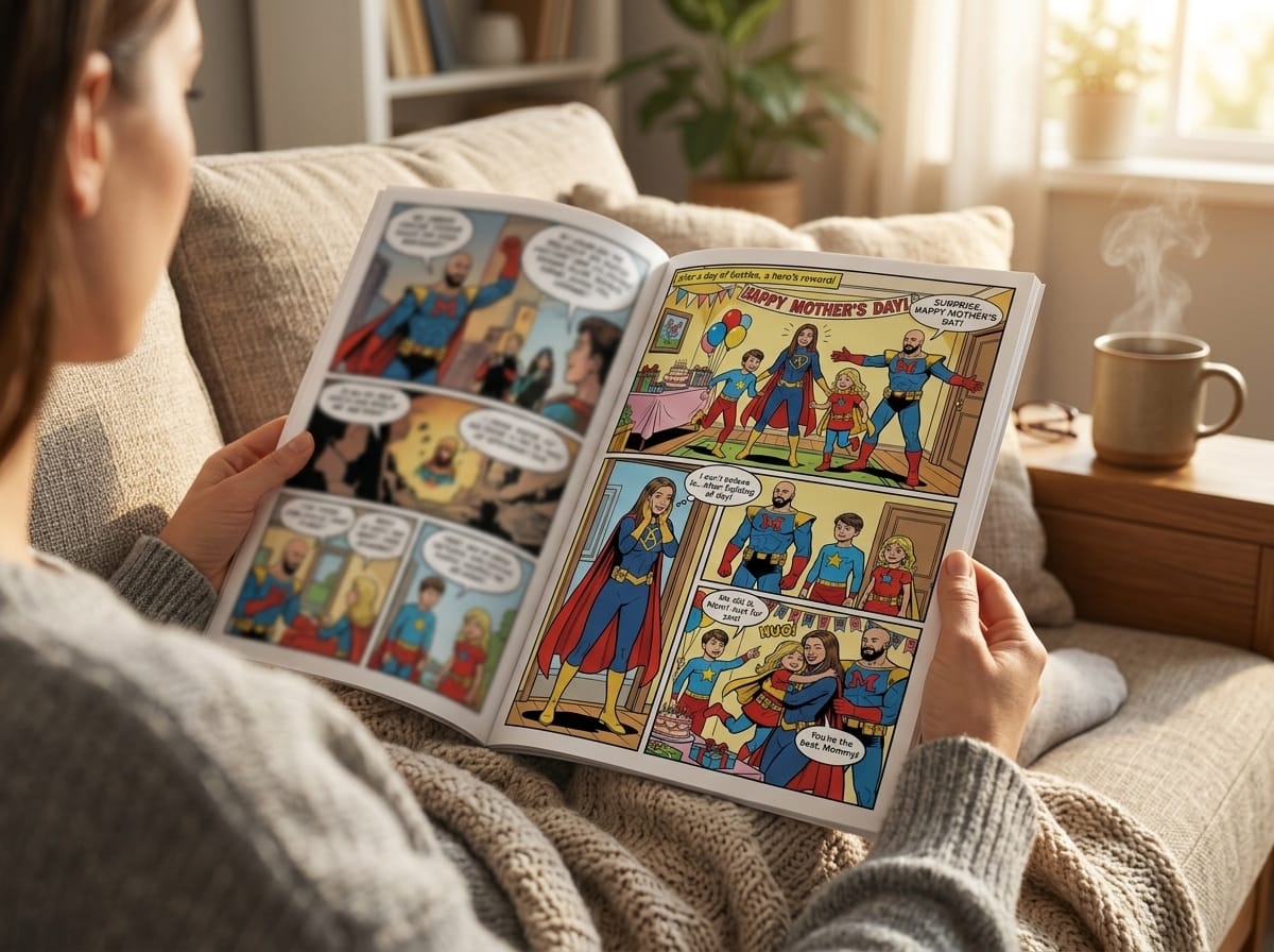
That confusion makes sense. Style isn't decoration. It changes how readers feel about a character before the first line of dialogue lands. A detective story drawn like a bright Saturday-morning cartoon says one thing. The same plot in high-contrast noir says something else entirely. Even a personalized gift comic works better when the style matches the occasion, the personality of the subject, and the tone of the scenes.
Beginners often think style choice is mostly about taste. It's partly taste, but it's also function. A style controls line quality, anatomy, color handling, shadow shape, panel energy, and even which camera angles feel natural. That matters whether you're sketching by hand, briefing an illustrator, or turning family photos into a custom comic.
Introduction to Comic Drawing Styles
A student once asked me a question I hear all the time: “I want to make a comic for my partner, but I don't know if it should look like manga, superhero art, or something softer.”
That's the primary beginner problem. Not drawing hands. Not perspective. Choosing a visual language that helps the story speak clearly. If the style and the story don't match, the comic can feel off even when each panel is technically fine.
What a style actually does
Think of style like wardrobe and lighting in film. The script may stay the same, but the presentation changes the emotional signal. In comics, style does that job through line, color, shape, and contrast.
A few examples make this easier:
- A reunion gift comic: Softer edges, gentler color transitions, and expressive faces often fit better than aggressive action anatomy.
- A revenge story: Harsh shadows, dramatic angles, and tighter value contrast usually help more than delicate pastel handling.
- A superhero parody: Big poses and exaggerated body language tell the joke faster than restrained realism.
Practical rule: If you can describe the feeling of your comic in one sentence, you're already halfway to choosing the right style.
Why beginners get stuck
Audiences can recognize styles, but they can't name the ingredients. They'll say, “I want it to feel cinematic,” when what they really mean is one or more of these:
- Dynamic framing
- Bold silhouettes
- Consistent facial likeness
- Heavy shadow design
- Fast action energy
- Soft storybook color
Once you break style into visible traits, it becomes easier to direct. You stop saying “make it cool” and start saying “use bold outlines, dramatic perspective, and heavier shadows around the jawline.”
That shift helps whether you're working with a human artist or an image model. The same thinking also helps when you browse examples such as these different comic art styles, because you begin comparing style by function, not just by surface appearance.
Evolution of Comic Drawing Styles
Comic art didn't develop randomly. According to Book Riot's overview of comic book art styles, comic book art styles are historically categorized into six distinct eras, and the Modern Age began in 1996 and continues to the present. That framework matters because every major style carries habits from the era that shaped it.
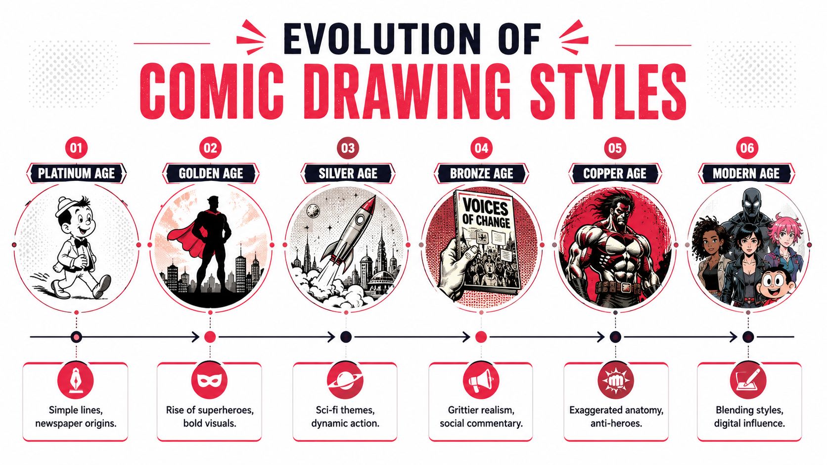
The six-era timeline
Here's the useful beginner version of that history:
| Era | Core shift | What it changed visually |
|---|---|---|
| Platinum Age | Newspaper and early comic foundations | Simple lines and the earliest visual grammar |
| Golden Age | Superhero rise | Dynamic poses, stronger anatomy, realistic shading |
| Silver Age | Expanding imagination | More energetic action and broader narrative range |
| Bronze Age | Social complexity | More grounded moods and more mature tone |
| Dark Age | Grittier storytelling | Heavier realism and rougher emotional atmosphere |
| Modern Age | Hybrid influence | Diverse styles without one single dominant inspiration |
The big lesson is this: artists kept changing the look of comics because readers, printing methods, genres, and cultural tastes kept changing too.
Why history still helps your style choice
Beginners sometimes treat style like a menu of isolated options. History shows they're connected. The mainstream American superhero look still carries the legacy of earlier eras that emphasized dramatic anatomy and forceful action. Manga's global influence pushed many modern artists toward hybrids that mix Eastern and Western cues. Noir-inspired pages often borrow from darker, more realistic comic traditions even when the subject matter isn't crime.
A style isn't only a look. It's a bundle of storytelling habits that came from a specific period, audience, and production method.
That's why copying surface features can fall flat. If you borrow the visual grit of darker eras but write light comedy, the result may feel mismatched. If you borrow the heightened anatomy of superhero art for a quiet family memoir, the emotional tone can become unintentionally theatrical.
The modern habit of mixing styles
The current era is especially useful for non-artists because it's flexible. The Modern Age is defined by diverse influences rather than one single inspiration. That gives you room to say, for example, “I want manga-style expressiveness with noir lighting,” or “Give me superhero framing with a softer watercolor finish.”
That kind of hybrid request makes sense today because comic art already lives in a blended visual culture. You're not breaking rules. You're choosing from traditions that artists have already been combining for years.
Overview of Major Comic Drawing Styles
Most beginners don't need a museum-level taxonomy. They need a working map. For personalized comics, eight styles give you a practical range: manga, American superhero, graphic novel, noir, watercolor, cyberpunk, retro pop, and fantasy.
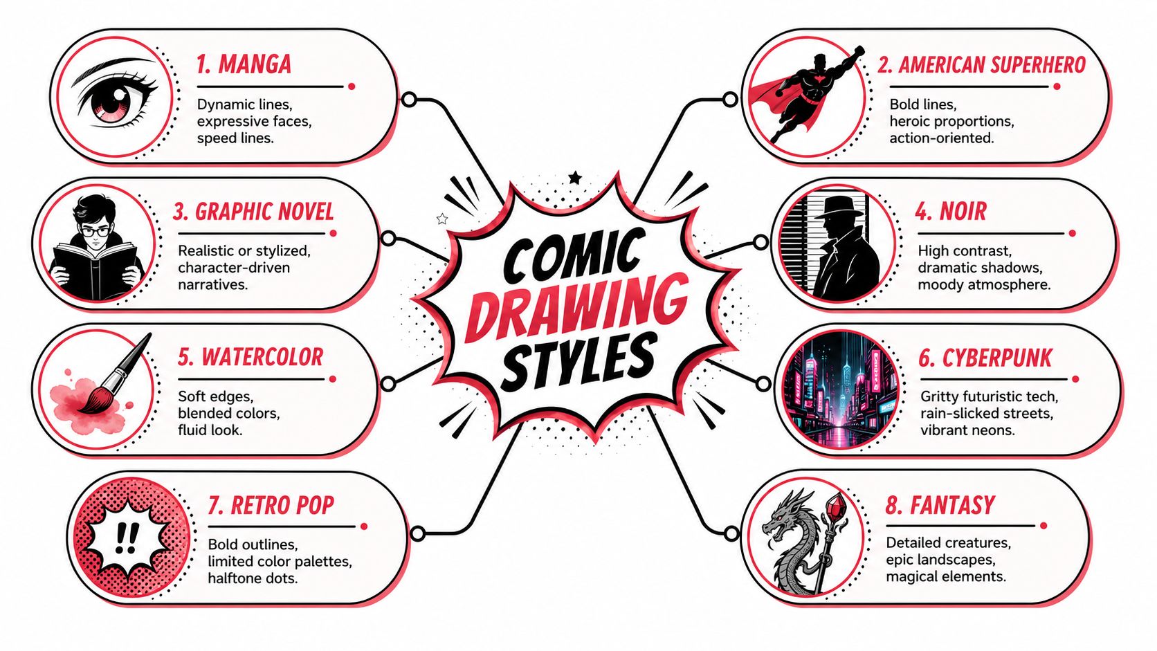
Three broad families
I like to group these styles into three easy buckets.
High-energy styles
These styles push motion, drama, and immediate visual impact.
Manga often uses realistic proportions mixed with exaggerated features, especially large eyes and expressive line work. It tends to communicate feeling quickly. Motion can feel sharp and emotional at the same time.
American superhero art leans on dynamic poses, filmic perspective, and bold anatomy. It's built for impact. Even a standing figure often looks ready to move.
These two styles are often confused by beginners because both can feel dramatic. The difference is where the drama sits. Manga often puts more emphasis on rhythm, expression, and emotional beats. Superhero art often puts more emphasis on force, scale, and physical power.
Story-driven styles
These styles usually put character mood, pacing, and scene atmosphere in front of spectacle.
Graphic novel is the broadest category here. It can run realistic or stylized, but it usually serves character and tone before flash. It works well when you want the art to support the writing instead of overpowering it.
Noir is narrower and moodier. Expect strong contrast, shadow-heavy scenes, and a sense of secrecy or danger. It's useful when setting matters as much as action.
Watercolor softens the page. It often feels reflective, lyrical, or memory-like. If superhero art is a trumpet, watercolor is a violin.
World-building styles
These styles shine when the environment needs to carry part of the story.
- Cyberpunk fits neon cities, tech-heavy worlds, rainy streets, and dense atmosphere.
- Retro pop works with bold outlines, limited-feeling palettes, and playful comic-book energy.
- Fantasy suits magic, creatures, ornate costumes, and sweeping vistas.
Each of these does more than change decoration. It changes what readers expect. A cyberpunk page signals systems, tech, and urban tension. A fantasy page invites myth, wonder, and larger-than-life stakes.
How to narrow your choice fast
Ask three questions:
- What should the reader feel first? Excitement, warmth, suspense, awe.
- What matters most in the scene? Faces, motion, setting, mood.
- Does the comic need likeness, spectacle, or atmosphere?
If you answer those, your options narrow quickly. A heartfelt anniversary comic may want watercolor or graphic novel. A custom hero origin may want manga or American superhero. A private-joke detective comic may snap into focus once you choose noir.
Comparing Visual Traits and Use Cases
A style choice gets easier when you compare visible traits side by side. Don't ask, “Which style is best?” Ask, “Which style solves my storytelling problem?”
Style characteristics and best use cases
| Style | Characteristics | Best Use Case |
|---|---|---|
| Manga | Expressive faces, strong emotion, fast motion cues, black-and-white traditions with screen-tone influence | Character-centered stories, romance, school drama, action with emotional beats |
| American superhero | Dynamic poses, filmic angles, exaggerated anatomy, bold power-focused energy | Hero stories, action scenes, origin stories, celebratory gift comics with spectacle |
| Graphic novel | Flexible realism or stylization, controlled pacing, character-led mood | Memoirs, slice-of-life stories, serious adaptations, dialogue-heavy scenes |
| Noir | High contrast, dramatic shadows, tense framing, moody atmosphere | Detective stories, mystery gifts, psychological scenes, nighttime urban settings |
| Watercolor | Soft edges, blended color feeling, gentle transitions, airy mood | Dream sequences, childhood memories, sentimental gifts, poetic storytelling |
| Cyberpunk | Futuristic tech cues, dense environments, vivid neon feeling, gritty city mood | Sci-fi worlds, hacker stories, dystopian settings, high-tech character intros |
| Retro pop | Bold outlines, halftone-inspired energy, punchy graphic look | Party invitations, comedy, parody, upbeat short comics, vintage-inspired pages |
| Fantasy | Decorative detail, magical creatures, epic settings, stylized grandeur | Adventure quests, fairytale gifts, roleplaying stories, world-heavy narratives |
The line work question most beginners miss
One of the clearest technical differences in Western comic art is line hierarchy. According to CGItems on comic style line work, Western comic styles rely on deliberate line-weight modulation, with thick outer lines and thin internal lines to create depth and dynamism before color is even added.
That matters because beginners often focus on color first. Professionals usually notice line behavior first.
If a brief says “superhero style” but the line work stays thin and even everywhere, the result often feels flat. Thick outer contours help major shapes read quickly. Thinner internal lines keep facial detail and anatomy from turning muddy.
Matching trait to project
Here are concrete pairings that usually make sense:
- Birthday comedy comic: Retro pop works because the graphic boldness supports jokes and keeps the page lively.
- Personal memoir: Graphic novel style often helps because it doesn't shout over quiet scenes.
- Action-heavy self-insert hero story: American superhero style carries dramatic anatomy and kinetic framing naturally.
- Melancholy memory piece: Watercolor can support tenderness better than hard-edged action rendering.
- Detective gift comic: Noir gives you shadow, secrecy, and strong mood almost immediately.
If the environment is the star, choose a style that can carry setting detail. If the faces are the star, choose a style that prioritizes expression and consistency.
A quick diagnostic for indecision
If you're torn between two styles, compare them through one sample scene.
Take the same moment. A person opens a door and finds a surprise party.
- In retro pop, the page becomes bright, punchy, and playful.
- In graphic novel, the reaction may feel more personal and grounded.
- In watercolor, the moment can read as tender or nostalgic.
- In manga, the emotional reaction becomes larger and more immediate.
The event hasn't changed. The storytelling contract has.
Describing Styles for AI and Artists
Most failed commissions and weak AI outputs come from one issue: the request is too vague. “Make it manga” or “make it cinematic” leaves too much room for guessing.
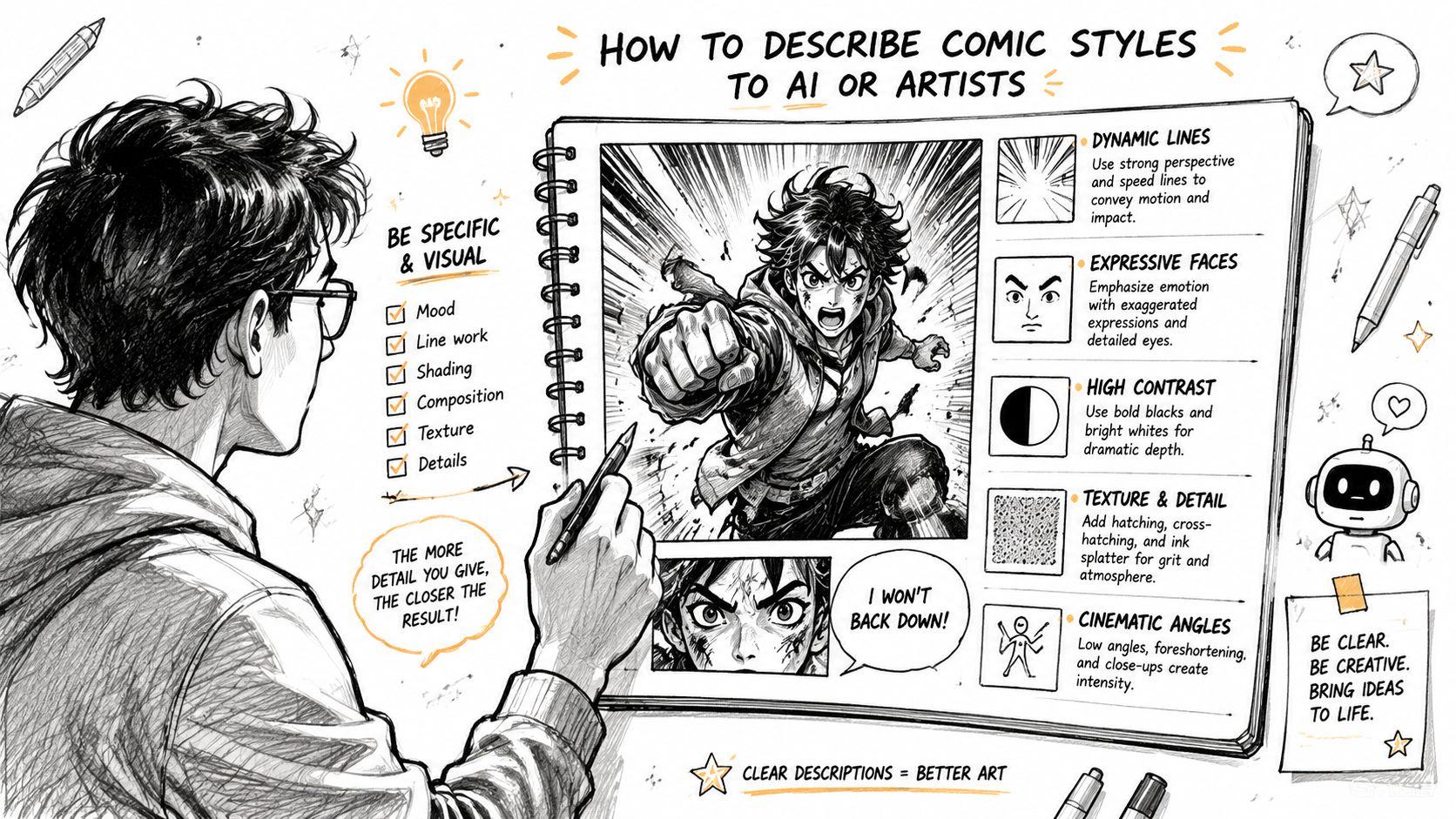
Build a usable brief in five parts
A clear prompt or artist brief usually needs five ingredients:
- Style name
- Visual traits
- Character priorities
- Camera direction
- Mood and scene purpose
That structure keeps the request specific without turning it into a tangled paragraph.
Here's a simple template:
Style: noir comic art
Visual traits: high contrast shadows, sharp silhouettes, restrained palette feeling, rain-slick city mood
Character priorities: preserve the subject's jawline, glasses, and hairstyle from the uploaded photo
Camera direction: low angle for tension, close-up on hand opening the letter
Scene purpose: reveal suspicion and unease
Why camera direction matters
A major gap for non-artists is knowing how framing should support style. Rivkah's discussion of camera conventions in graphic novels notes that users often struggle to pair angle choices with tone, such as Dutch angles for unease or high angles for vulnerability.
That's exactly where many prompts break down. The style might be right, but the camera language fights it.
Try these pairings:
- Noir: eye-level suspicion shots, low-key close-ups, off-balance angles for distrust
- Manga: close reactions, speed-oriented action framing, dramatic push-ins
- Superhero: low angles, foreshortened limbs, wide action shots
- Watercolor: calmer framing, room to breathe, softer scene transitions
Prompt examples that actually communicate
Don't write this:
- “Make it cool manga style with drama.”
Write this instead:
- Manga example: “Draw this scene in manga style with expressive eyes, clean line work, motion energy, and strong emotional reaction. Keep the subject's hairstyle and face shape close to the photo. Use a close-up for the discovery moment and a wider action panel for the run.”
- Superhero example: “Use American superhero comic styling with bold outlines, exaggerated heroic anatomy, and dramatic perspective. Keep the costume red and black. Frame the landing with a low camera angle and a wide panel.”
- Noir example: “Render this as a noir comic scene with deep shadows, strong contrast, and tense city atmosphere. Preserve the trench coat and sharp cheekbones. Use a Dutch angle in the alley panel to create unease.”
Photo guidance for likeness
When using real photos, give the tool or the artist images that help consistency.
- Use repeatable reference photos: Include one clear front view and one side or three-quarter view.
- Keep defining features stable: Mention hairline, nose shape, glasses, beard, freckles, or distinctive smile.
- Separate style from identity: The style can change, but the facial landmarks shouldn't drift casually.
If you want help turning rough ideas into stronger instructions, a prompt-focused workflow like this AI story generator based on prompt can help you think in scenes, mood, and panel intent instead of random keywords. One option in this space is PersonalizedComics, which lets users choose from eight comic styles, upload photos, and generate full comic pages from prompts.
Common Pitfalls in Applying Styles
Beginners often assume that once they pick a style, consistency will happen automatically. It won't. Style can drift panel to panel, especially when photos, multiple angles, and scene changes get involved.
A common trouble spot is character identity. This discussion of visual consistency in photo-based comic creation points out that maintaining a stable look across panels is hard, and AI style transfer often struggles to preserve character features across angle changes without targeted prompts.
Mistakes that cause style drift
The first mistake is mixing incompatible instructions. A prompt that asks for “soft watercolor, dark noir contrast, manga speed lines, and realistic documentary tone” may produce a confused page because the visual priorities are fighting each other.
The second mistake is describing style but not structure. People ask for “cyberpunk style” and forget to define shot scale, lighting mood, or facial consistency. That leaves the renderer improvising too much.
Don't stack every visual idea you like into one prompt. Pick a primary style, then add one or two supporting traits.
Before and after fixes
Before: “Make me in comic style, dramatic, cool, colorful, realistic, anime, dark.”
After: “Use cyberpunk comic styling with neon city lighting, gritty urban detail, and focused dramatic shadows. Keep my face shape, eyebrow thickness, and undercut hairstyle consistent across panels. Use a medium shot for dialogue and a wide shot for the rooftop reveal.”
That revised version works better because it chooses one lane.
Here are a few more corrections:
- If the face changes too much: Repeat the same identity markers in every scene brief.
- If the page feels visually noisy: Reduce style modifiers and simplify the color mood.
- If action panels feel weak: Add camera intent, such as low angle, wide shot, or close-up impact frame.
One habit that saves time
Review your brief like an art director. Ask:
- Is there one dominant style?
- Have I named the features that must stay consistent?
- Did I describe the shot, not just the mood?
- Did I overload the prompt with conflicting adjectives?
If you need more visual vocabulary before writing prompts, studying examples of drawing comic book style can help you spot what you mean by bold, gritty, soft, or dynamic.
Conclusion and Next Steps
Comic drawing styles become much easier to use once you stop treating them as labels and start treating them as storytelling tools. The right style helps with mood. The right traits support pacing. The right brief makes an artist or AI output far more consistent.
A simple checklist goes a long way:
- Choose the feeling first
- Match the style to the scene's real job
- Name visible traits, not vague adjectives
- Specify camera angle and shot type
- Protect likeness with repeatable character markers
- Review for conflicting instructions before generating
You don't need formal training to make good choices. You need a clear eye, a few reliable terms, and the discipline to describe what you want panel by panel.
If you want to turn photos and story ideas into a custom comic without drawing everything yourself, PersonalizedComics lets you choose from eight art styles, generate pages from prompts, and start experimenting with a free 3-page preview before committing to a larger project.
Filed under Comic Craft