Different Comic Art Styles: Your 2026 Visual Guide
You’re probably here because you have a story in mind, but the art part feels slippery.
Maybe you want to turn a birthday memory into a superhero adventure. Maybe you’re building a comic for a partner, a child, a class project, or your own long-simmering story idea. You can picture the mood, maybe even a few scenes, but regarding different comic art styles, everything starts to blur together. Why does one comic feel punchy and heroic while another feels intimate, dreamy, or unsettling?
That difference isn’t random. It comes from style.
When you hold a comic that grabs you instantly, the art is doing a lot of invisible work. It’s telling your eye where to go. It’s setting the emotional temperature. It’s deciding whether a hallway feels ordinary, mysterious, or dangerous. A scene of two friends talking can look funny, tender, dramatic, or epic depending on the visual language wrapped around it.
The good news is that you don’t need to be a lifelong illustrator to understand this. If you can learn what each style is trying to do, you can choose one with confidence. And once you know what you’re looking at, modern AI tools become much easier to direct. You stop asking for “a cool comic look” and start asking for the exact feeling your story needs.
The Power of Style in Visual Storytelling
A comic page can tell you what kind of world you’ve entered before you read a single word balloon.
Think about the difference between two versions of the same scene. In one, a character stands on a rooftop under sharp black shadows, with angular buildings and tense body language. In another, the same character appears in soft colors with rounded lines and open space around them. The plot may be identical, but the first feels like danger and resolve, while the second feels reflective or hopeful.
That’s why style matters so much. In comics, style is part of the storytelling, not decoration added at the end.
Style changes the emotional meaning
A beginner often looks at comic art and notices the obvious things first. Big eyes. Bold ink. Realistic anatomy. Flat colors. Painterly backgrounds. Those details matter, but they matter because of what they do to the reader’s experience.
A bold superhero style can make everyday people feel larger than life. A scratchy, shadow-heavy style can make even a quiet conversation feel uneasy. A clean, orderly style can make a fictional world easier to explore and understand.
Practical rule: If you’re stuck choosing a style, don’t ask what looks coolest. Ask what makes your story feel the way you want.
Style can elevate ordinary moments
Beginners often find it surprising. You don’t need an alien invasion or masked vigilante to justify comic art. A family vacation can become a retro adventure. A proposal story can become a watercolor romance. A funny office mishap can work as a clean, expressive strip with exaggerated reactions.
The right visual treatment gives the moment shape. It tells readers, “This is the kind of memory you should have while reading this.”
That’s also why modern AI generation matters. Once you understand the emotional job of a style, you can guide a tool toward a finished result that fits your story instead of settling for something generic.
The Building Blocks of Every Comic Art Style
If different comic art styles seem hard to compare, it helps to break them into parts. Most styles change the same core ingredients. Once you can spot those ingredients, comic art becomes much easier to read and describe.
Linework
Linework is the voice of the drawing.
Heavy, dark outlines feel assertive. They push characters forward and make actions feel direct. Thin, delicate lines feel quieter and often invite closer attention. Rough, broken lines can feel nervous, handmade, or emotionally raw. Clean lines feel controlled and confident.
If you’ve ever looked at a page and thought, “This artist makes everything feel energetic,” linework is probably part of the reason.
A practical way to study this is to compare how three artists might draw the same face. One uses thick contour lines and simplified features. Another builds the face with careful small marks. A third uses loose strokes that suggest form without pinning down every detail. Same subject, three different emotional signals.
Color palette
Color is the page’s emotional atmosphere.
Bright, saturated colors often feel playful, adventurous, or larger than life. Muted palettes can feel nostalgic, serious, or intimate. Limited color choices can create unity and mood. Harsh contrast can turn a simple panel into a moment of shock or drama.
Beginners sometimes think color is mostly about beauty. In comics, it’s also about clarity. Color separates foreground from background, supports pacing, and helps you understand where to look first.
A good palette doesn’t just decorate the page. It tells the reader how the scene should feel before the dialogue lands.
Paneling
Paneling controls time.
That’s one of the biggest lightbulb moments for new readers and creators. A panel isn’t only a box for art. It’s a decision about rhythm. Small, repeated panels can slow a moment down and make you notice tiny changes in expression. A wide panel can open up a world. Jagged or overlapping panels can create chaos and speed.
You can think of paneling as editing in a film. It decides what gets held, what gets cut, and where the dramatic emphasis falls.
Here’s a simple way to read panel choices:
- Tight repeated panels help with awkward comedy, suspense, or emotional nuance.
- Large splash-like moments make reveals feel important.
- Orderly grids create calm, structure, or a classic reading rhythm.
- More experimental layouts can make action feel unstable or dreamlike.
Character design
Character design tells you who a person is before they speak.
Some styles simplify the body into clear shapes. Broad shoulders, square jaws, tiny waists, oversized gloves, giant hair, or huge eyes all carry meaning. Other styles keep anatomy grounded and let posture, clothing, and subtle expression do more of the work.
A beginner mistake is to treat character design like a costume problem. It’s broader than that. It includes silhouette, proportion, facial exaggeration, and how much realism the world expects from the figure.
How the pieces work together
These four parts rarely act alone. A style isn’t “just linework” or “just color.” It’s a system.
Here’s a quick guide:
| Building block | What it controls | What a beginner should notice |
|---|---|---|
| Linework | Energy, clarity, intensity | Are the lines bold, neat, rough, or delicate? |
| Color palette | Mood and readability | Does the page feel loud, calm, warm, cold, dreamy, or grim? |
| Paneling | Pacing and focus | Does the story move quickly, slowly, smoothly, or abruptly? |
| Character design | Personality and genre | Do people look iconic, cute, realistic, exaggerated, or stylized? |
If you want a useful practice exercise, take one scene from your life and describe it in these four categories before you think about drawing. That alone will sharpen your taste.
And if character design is the piece that confuses you most, this guide on how to draw comic characters gives a helpful starting point for thinking about shape, expression, and readability.
A Visual Tour of Iconic Comic Art Traditions
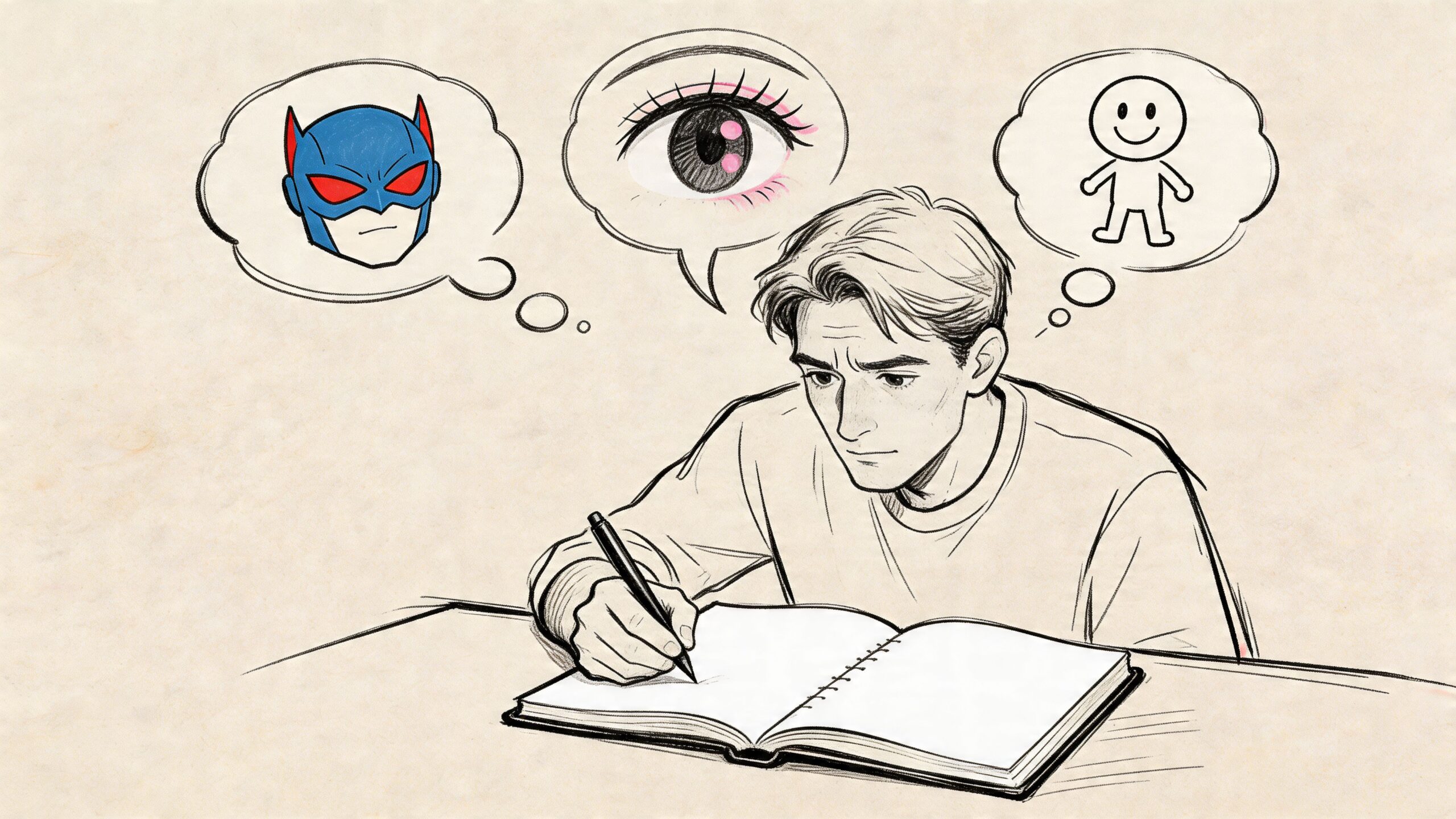
You open an AI comic generator with a scene in mind: a masked hero on a rooftop, a quiet confession in the rain, or a child wandering through a strange city. The prompt can name the same plot each time, but the result changes completely when you change the visual tradition behind it. Style decides whether the scene lands like a trumpet blast, a diary page, or a carefully drawn travel journal.
That is why these traditions still matter. They are not museum labels. They are working visual languages you can still use, whether you draw by hand or build pages with a tool like PersonalizedComics. If you know the flavor of the tradition you want, your prompt gets sharper and your finished comic feels more intentional.
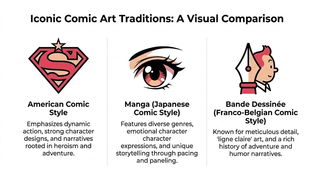
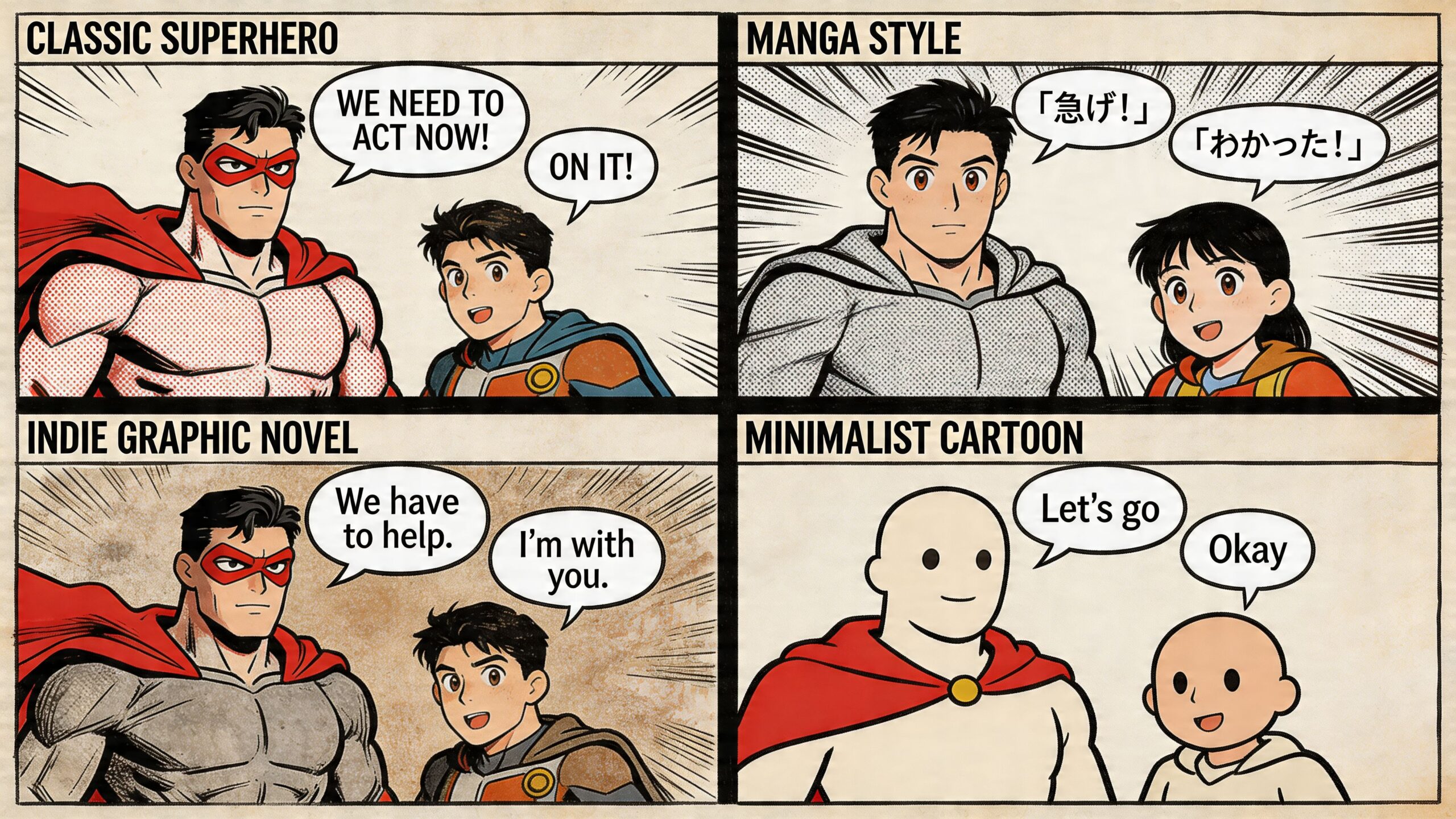
American comics
American comic art often hits the eye first with force and clarity. It was shaped by newsprint printing, pulp adventure, superhero mythology, and a need to grab attention fast. You can feel that history in the poses, the silhouettes, and the way action is staged for instant reading.
The early superhero era helped define that visual grammar. Artists in the Golden Age of Comics (1938-1956) used direct panel layouts, strong anatomy, and bold compositions to make characters feel larger than ordinary life, as described in this history of comic book art styles.
What it looks like
American styles often favor:
- Clear heroic silhouettes that read in a split second
- Strong line weight that separates foreground action from background detail
- Big poses and readable motion that make impact visible
- High contrast staging that keeps the page easy to follow
A good beginner comparison is movie poster design. The image usually announces the main idea right away. Hero. Threat. Conflict. Energy.
What it feels like
American comic traditions often feel public and declarative. Characters do not just exist on the page. They perform. Even quieter stories in this tradition often keep a clean sense of staging, so the reader always knows where to look.
That makes this approach a strong fit for superheroes, pulp adventure, crime stories, military action, and any project that needs characters to feel iconic.
For AI generation, this tradition responds well to prompt language such as bold inks, dynamic superhero composition, dramatic foreshortening, graphic shadows, high-impact panel storytelling. Those terms give the model a clear target instead of the vague request, "make it look like a comic."
Manga
Manga is often reduced to surface features, especially by beginners. Its defining characteristic is its control of rhythm. A manga page can stretch a glance, a pause, or a breath, then snap into speed and force a moment later. It handles feeling the way music handles tempo.
That flexibility is why manga covers such a wide emotional range. It can make a volleyball match feel like warfare, a lunch break feel tender, or a fantasy battle feel intensely personal.
What it looks like
Across many genres, manga often uses:
- Expressive faces and eyes to carry emotion clearly
- Flexible pacing that gives reactions and silence room to matter
- Motion effects such as speed lines, impact framing, and directional composition
- Selective rendering where detail appears where attention should go
Beginners sometimes get confused here because manga is not one fixed look. Shonen action, shojo romance, seinen drama, and slice-of-life work can look very different from one another. The shared thread is the storytelling approach, especially the attention to emotional timing and inner experience.
What it feels like
Manga often feels close to the character. The page invites you into embarrassment, determination, fear, longing, or excitement. External action matters, but internal reaction matters just as much.
That makes it especially effective for romance, coming-of-age stories, sports, fantasy quests, school stories, and character-led drama.
For AI tools, this tradition becomes much easier to control when your prompt names the emotional behavior of the page, not just the anatomy. Phrases like shoujo-inspired soft expressions, shonen action energy, cinematic speed lines, introspective pacing, black-and-white screentone feel usually produce stronger results than asking for "manga style."
European bande dessinée
Franco-Belgian comics, often grouped under bande dessinée, create a different kind of pleasure. They invite the reader to look around. Space matters. Architecture matters. Vehicles, clothing, natural settings, and weather often get the same careful attention as the cast.
A famous branch of this tradition is ligne claire, linked with Hergé’s Tintin. The style uses clean, even lines, controlled color, and highly readable environments. The Lambiek Comiclopedia’s overview of clear line, or ligne claire explains how that approach favors precision, readability, and a stable world the reader can move through.
What it looks like
European traditions often emphasize:
- Clean contours with steady visual control
- Detailed settings that feel believable and lived in
- Balanced page design that guides the eye calmly
- Restrained color and shading that preserve clarity
A useful comparison is architectural drawing mixed with adventure storytelling. The page often feels built, not just sketched.
What it feels like
This tradition often creates confidence and immersion. You understand the geography of the room, the street, or the environment. Travel scenes feel inviting. Historical settings feel researched. Speculative worlds feel solid enough to walk through.
That makes bande dessinée a strong choice for adventure, science fiction, historical fiction, mystery, travel stories, and any comic where setting is part of the pleasure.
For AI generation, prompts that mention ligne claire, clean contour lines, flat color, European album style, detailed background environments, precise panel clarity usually guide the model toward that polished, orderly feeling.
Why these traditions still matter
These traditions give you more than art history terms. They give you a decision-making tool.
If you want mythic impact, American comic language points you one way. If you want emotional elasticity and character intimacy, manga points you another. If you want environment, clarity, and calm visual control, bande dessinée points you somewhere else.
That is the bridge between classic comics and modern AI tools. A generator like PersonalizedComics works best when you describe the tradition behind your idea, not just the subject of the scene. A rooftop chase, first kiss, or alien marketplace can all succeed in any of these styles. The difference is the feeling you want the reader to carry away.
How to Choose the Right Art Style for Your Project
An art style is often chosen too late. The process involves writing the idea first, gathering photos, perhaps drafting dialogue, and then asking what style might fit. That usually leads to mismatch.
A style should be chosen the same way you choose music for a scene in a film. It affects meaning.
Start with mood, not genre
Genre helps, but mood helps more.
A superhero story can be playful, tragic, nostalgic, or gritty. A romance can be dreamy, comic, awkward, or elegant. If you choose the genre label first, you may grab the most obvious visual style and miss the emotional tone that matters.
Ask these questions:
- What should the reader feel first?
- Should the world feel heightened or grounded?
- Is the story warm, tense, funny, wistful, or triumphant?
If the answer is heroic and energetic, bold American-inspired visuals fit naturally. If the answer is emotionally charged and character-led, manga language often works well. If the answer is exploratory, polished, or immersive, a European-inspired direction may serve the story better.
Match the audience’s reading comfort
Different comic art styles change how easy a comic feels to read.
A child usually benefits from clear silhouettes, expressive faces, and visual simplicity. An adult gift comic about a shared memory may benefit from softer color and a more personal visual tone. A concept project for a fantasy world may need environment-heavy panels that show place as clearly as action.
Here’s a simple decision guide:
| If your project is… | A strong style direction is… | Because it helps the story feel… |
|---|---|---|
| A superhero birthday gift | Classic American | Bold, celebratory, larger than life |
| A teen friendship story | Manga-inspired | Emotional, kinetic, character-first |
| A travel or adventure story | European-inspired | Clear, exploratory, richly built |
| A dramatic memoir | Graphic novel or noir direction | Grounded, tense, reflective |
| A romantic keepsake | Watercolor or soft stylization | Gentle, intimate, heartfelt |
Choose the style that strengthens the occasion
A gift comic has different needs than a portfolio piece or prototype.
A retirement comic for a colleague can lean retro and playful. A wedding story might need warmth more than visual intensity. A classroom comic has to be readable fast. A world-building test for your own script can prioritize environmental clarity and consistency over exaggerated emotion.
The best style isn’t the one you admire most in isolation. It’s the one that gives your specific story the right emotional frame.
Three common mistakes
Beginners often fall into the same traps:
- Picking based on trend alone. If a style is popular but wrong for your story, the final comic feels off.
- Confusing realism with seriousness. A stylized comic can still carry grief, tenderness, or complexity.
- Ignoring pacing. Some styles support quick action. Others shine in slower scenes. Don’t force one to do the other’s job.
A good choice feels inevitable once you see it. The art and the story stop competing with each other.
Bringing Your Vision to Life with AI Comic Styles
AI tools become much more useful once you stop treating style as a vague aesthetic label. If you know the tradition behind the look you want, you can guide the output with far more precision.
That matters because many people using AI for comics aren’t trying to become pencillers or inkers. They’re trying to turn an idea, memory, script, or gift concept into pages that feel cohesive. The actual challenge isn’t pressing a button. It’s translating taste into direction.
What AI does well
Modern comic generation tools are especially helpful for three kinds of creators:
- Gift makers who want to transform real people and real events into a polished visual story
- Writers who need to prototype scenes, characters, and world tone without hiring a full art team first
- Hobbyists and educators who want clear, repeatable visual results without advanced drawing skills
The biggest advantage is accessibility. You can focus on story decisions such as tone, panel intent, and character presentation while the system handles illustration.
The bridge between classic traditions and digital tools
Within the context of AI-generated comics, earlier traditions become practical. The strongest AI-generated comics usually start with a clear stylistic target.
If you want Golden Age energy, you don’t ask for “vintage comic.” You ask for bold linework, heroic proportions, readable action, and bright, clear staging. If you want a manga feel, you emphasize expressive faces, dynamic pacing, and emotionally focused framing. If you want a European flavor, you push for clean contour lines, environment detail, and cinematic clarity.
The same idea applies to digital platforms that offer preset styles. Those presets aren’t random filters. They work best when you understand what visual tradition they echo.
For a broader look at how AI tools turn ideas into pages, this article on an AI book maker is a useful companion read.
Matching style families to platform options
A platform with multiple comic looks gives you a practical menu of storytelling moods. Here’s a simple way to think about those options.
| PersonalizedComics Style | Looks Like | Best For Genres | Perfect For a Gift That Is… |
|---|---|---|---|
| Manga | Expressive faces, kinetic action, emotional pacing | Coming-of-age, adventure, friendship, romance | High-energy and character-driven |
| Classic American | Bold heroes, strong silhouettes, punchy action | Superhero stories, celebrations, origin stories | Exciting and triumphant |
| Graphic Novel | More grounded and contemporary | Memoir, drama, literary fiction, slice of life | Thoughtful and personal |
| Noir | Dark contrast, tension, moody staging | Mystery, crime, dramatic backstory | Stylish and intense |
| Watercolor | Soft edges, gentle atmosphere, painterly warmth | Romance, family stories, keepsakes | Tender and sentimental |
| Cyberpunk | Futuristic detail, neon mood, tech-heavy settings | Sci-fi, dystopia, speculative world-building | Sleek and immersive |
| Retro Pop | Playful color, vintage energy, bold design cues | Humor, party comics, nostalgic stories | Fun and eye-catching |
| Fantasy | Mythic setting, magical environments, epic tone | Quests, legends, fairy-tale adventures | Imaginative and expansive |
How to prompt more clearly
If your results feel generic, the issue usually isn’t the model. It’s the instruction.
Try building your request from four pieces:
- Story mood. “Warm and funny,” “tense and shadowy,” “heroic and upbeat.”
- Visual tradition. “Classic American superhero,” “manga-inspired emotional pacing,” “clear-line European adventure feel.”
- Character treatment. “Exaggerated expressions,” “grounded anatomy,” “iconic silhouette.”
- World treatment. “Minimal backgrounds,” “detailed cityscapes,” “soft watercolor interiors.”
That level of direction gives AI something to aim at.
A style prompt works best when it describes how the page should read, not just how it should look.
Why consistency matters
A single striking image isn’t enough for comics. You need visual continuity across panels and pages. Readers should feel that they’re still in the same world, following the same people, under the same storytelling logic.
That’s why style choice matters so much in AI-assisted comic making. It creates the visual rules that hold the project together. Once those rules are clear, the comic feels authored rather than assembled.
Inspiring Examples from Different Art Styles
A strong style choice can turn the same life event into a completely different reading experience. It works a lot like casting in film. The script may stay the same, but the mood, energy, and meaning shift the moment you change the visual language.
A child’s birthday as a superhero origin story
A parent starts with ordinary details from the child’s life. Favorite hoodie. Bike helmet. Family dog. School backpack. Then those objects get recast as symbols of courage and adventure.
In a classic American style, the child reads as bold and capable. The bike feels like a hero vehicle. The schoolyard starts to resemble a training ground. A simple jump off the curb suddenly carries the energy of page one in an origin issue.
That emotional shift matters. The style tells the child, “You belong at the center of the action.” If you are building this with AI, that gives you a clear target. You are not asking for a generic birthday comic. You are asking for strong poses, clean action beats, confident expressions, and colors that support triumph.
An anniversary story as a soft romantic comic
Now take a very different memory. A first date. A terrible meal. Rain on the walk home. One private joke that still makes both people laugh years later.
A watercolor treatment suits that kind of story because memory rarely feels sharp-edged. It blurs a little. It glows a little. Soft color transitions and gentler outlines make the page feel intimate, almost like a scrapbook painted from feeling instead of fact.
That is useful for AI prompting too. If you want tenderness, ask for softened edges, warm light, expressive faces, and a memory-like atmosphere. Those choices guide the model toward emotion rather than spectacle.
A mystery gift with noir shadows
A friend who loves detective fiction will respond to a different set of signals. In noir, shadows do part of the storytelling. Alleyways look narrower. Faces look more guarded. Silence feels heavier between panels.
The events themselves can stay simple. A walk home. A missing object. A note slipped under a door. Yet the style adds suspicion and tension, the way minor-key music changes an ordinary scene in a movie.
For beginners, this is a helpful lesson. Style does not only decorate a story. It changes what the reader expects to happen next.
A sci-fi world prototype for a writer
Writers often need to test a setting before writing fifty pages of it. A futuristic city, a drifting ship, an enchanted ruin, or a machine-filled skyline can look exciting in your head and flat on the page if the style is wrong.
A clear-line European-inspired approach can help here. Precise outlines and readable environments give the world room to breathe. The reader can take in the architecture, props, and geography without getting lost in visual noise. In a cyberpunk version, that clarity makes neon streets and layered tech easier to follow. In a fantasy version, it helps castles, forests, and relics feel explorable rather than crowded.
This is one of the most practical uses of AI comic generation. You can test the same story seed in multiple traditions and compare the result. One prompt might reveal that your idea wants polished adventure energy. Another might show that it works better as moody sci-fi or dreamlike fantasy. Platforms like PersonalizedComics make that comparison faster because you can describe the same scene, swap the style direction, and judge which version supports the story.
If you want more visual reference for how style shapes first impressions, this roundup of the best comic book covers ever is a useful study.
Sometimes the right art style does not change the story idea. It helps you see the story’s natural form.
Your Story Your Style Start Creating Today
Comic art styles aren’t just surface decoration. They shape mood, pacing, character presence, and the reader’s emotional response. Once you understand that, the idea of choosing between different comic art styles stops feeling intimidating and starts feeling creative.
You don’t have to master anatomy, inks, or page composition to make strong style decisions. You only need to know what kind of experience you want the reader to have. Heroic. Funny. Tender. Suspenseful. Expansive. Personal.
That shift matters. It means style is no longer something locked inside professional studios or years of formal drawing practice. It becomes a tool you can use deliberately, whether you’re making a gift, testing a story concept, building a classroom project, or finally turning your own idea into pages.
The best way to learn is to make something small. One scene. One page. One memory turned into panels. Once you see how a style changes the feeling of that moment, your eye gets sharper fast.
If you’re ready to turn an idea into an actual comic, PersonalizedComics makes the process approachable. You can choose from eight art styles, upload photos or describe characters, and generate complete comic pages without drawing them by hand. New users get four free credits, which is enough to start experimenting with style and see which visual direction fits your story best.