Strong villain character design starts with purpose, then silhouette, then style adaptation, then execution. Those four choices do most of the heavy lifting because they answer different questions, and they need to stay in that order if you want the villain to feel intentional instead of overdecorated. A memorable antagonist isn't just “more evil” or “more detailed,” it's a design that keeps the same core idea visible from a thumbnail to a full page.
What Makes a Villain Actually Unforgettable
A lot of creators draw the mask before they know what the mask is protecting. That's why the villain comes out looking busy, but not distinct. If you've ever finished a sketch and thought, “I can't tell who this person is without the cape,” you've already hit the core problem.
The four choices that matter most
Start with purpose. Then decide the silhouette, lock the style language, and only after that add costume pieces, scars, props, and ornament.
Practical rule: if the design is still understandable as a black shape, you're still on track.
That order matters because readers don't meet your villain as a file full of details. They meet the character in motion, at a glance, often at a small size. Research on character design backs up that visual logic, because a controlled study of video game antagonists found that visual features had strong predictive power for perceived moral badness, and the final model explained 66.9% of the variance (Frontiers in Computer Science). In other words, a few legible cues carry far more weight than random exaggeration.
The best villains feel like one clear decision, not ten competing ones. If you can sketch the outline from memory, name the motive in one sentence, and point to one visual cue that carries the idea, you're already ahead of the common “looks cool but forgettable” trap.
Defining Motivation, Stakes, and Story Function
A villain without a clear function becomes decorative opposition. The reader can tell you designed a bad guy, but not why this person belongs in this story instead of any other one. That's why I teach writers to answer five questions before they draw a single line.
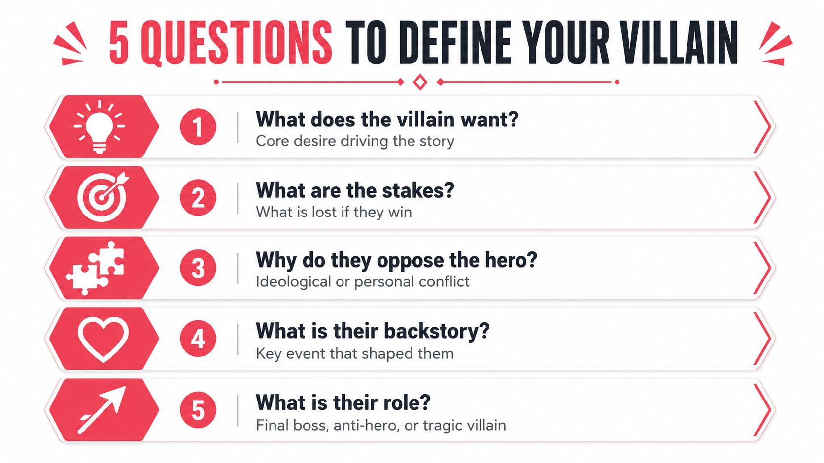
Turn one want into a full design system
Take a villain whose core want is control of a city's memory. That's specific enough to generate everything else. If the villain wants memory, then the stakes are not just physical defeat, they're erasure, revision, and social control.
Now run the five-question test from working villain-design methods. What does the villain want, what assets do they control, what environment expresses them, how do they maintain presence between scenes, and what signature mechanics or moves reinforce their identity. The point is consistency, because the villain's abilities, lair, minions, and social influence should all express the same core desire, or the character starts to feel split in two.
A memory-control villain might keep records, erase witnesses, use archivist-like assistants, and move through spaces that feel curated rather than lived in. If you give that same villain flashy chaos powers with no link to memory, the design loses force. The coolest power in the world still feels wrong if it doesn't support the motive.
Watch the conflict point: cool powers that don't support the villain's goal usually make the character feel noisy, not dangerous.
The biggest mistake is starting from biography or surface details, then trying to force a story role on top. That approach tends to drown in trivia and leaves you with a backstory that never shows up on the page. A cleaner test is simple. If you remove the powers, lair, or costume, do you still understand what this villain is trying to do?
For a practical design workflow, the hierarchy taught in comic character design guidance is useful because it keeps the character readable before you chase polish. That's the same reason the five-question method works. It forces every choice to point back to one desire.
Building the Silhouette and Visual Identity
Once the motive is clear, the villain can finally become visible. This is the point where many artists overcomplicate things, but strong silhouette work usually comes from restraint, not decoration. The outline should tell the story before the costume starts negotiating with it.
Shape language does the first round of storytelling
Pick two or three shape languages and stick to them. Spikes suggest aggression, circles suggest softness or containment, jagged edges suggest instability, and curves can imply control, seduction, or ease. If you mix too many families, the design starts to blur, especially at thumbnail scale.
That's not just intuition. Comparative design research has found recurring visual patterns in heroic and villainous characters, with villains typically drawn larger and older than heroes, while heroes more often have rounder faces and eyes, and villains more often have narrow eyes and faces (Diva Portal review). A separate review also reported a statistically significant higher incidence of dermatologic findings among villains than heroes in classic movie design, which shows how long these visual signals have been used to communicate moral difference.
So when you block in the character, don't ask first, “What costume details can I add?” Ask, “What shape is this person from across the room?” A hunched stance, a dominant vertical silhouette, or an outline broken by sharp protrusions can do more work than a pile of accessories. If the villain's motive is control, a rigid, upright silhouette may fit better than a wild, explosive one.
The thumbnail test catches weak designs early
I tell students to reduce the design to three layers. Primary shape first, key silhouette elements second, visual identity third. That means the base body shape, then the handful of features that make the outline recognizable, then the palette, textures, and props that turn the idea into a character.
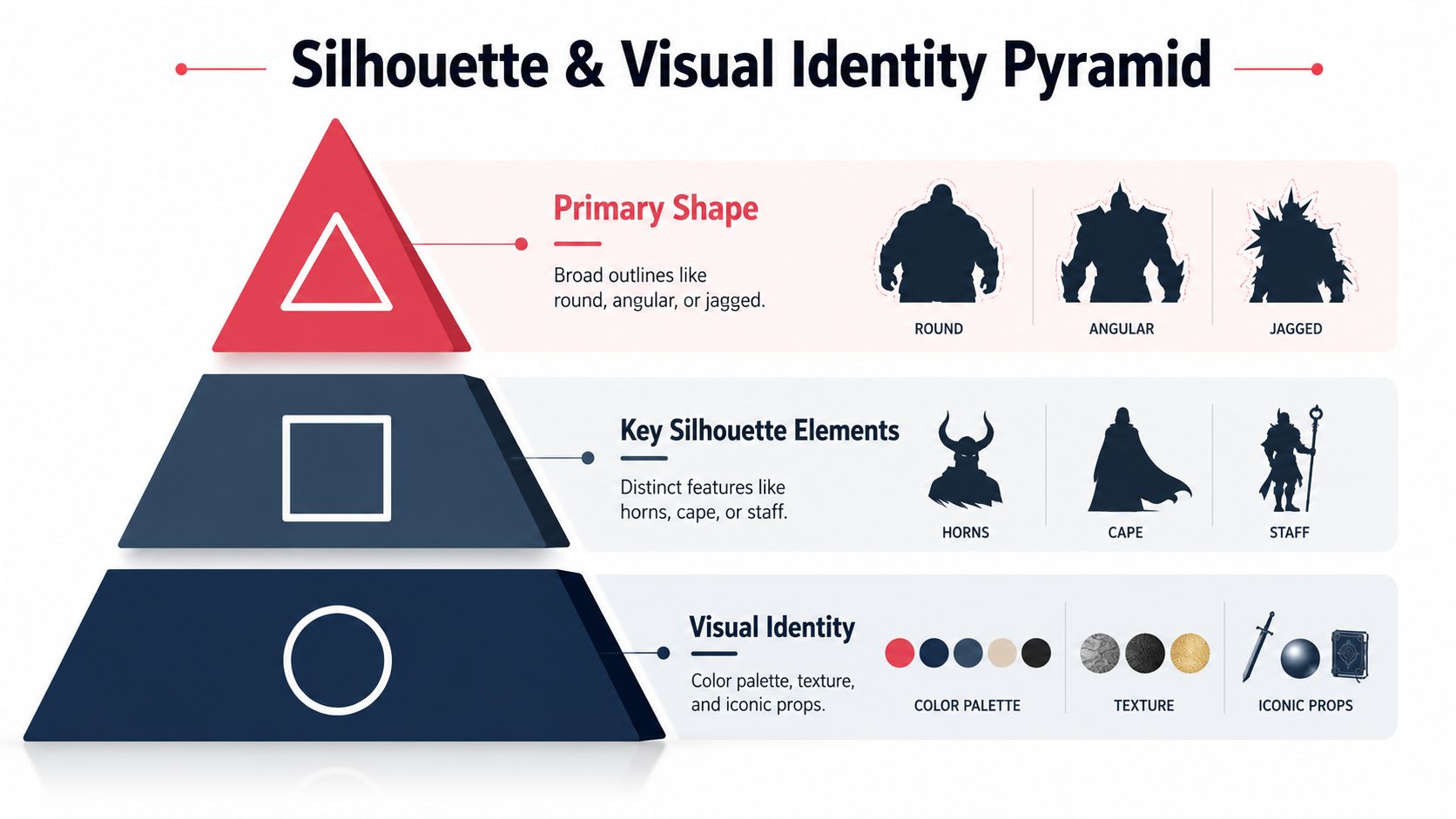
A villain with a strong silhouette can survive almost any costume change. A villain with a weak silhouette depends on the costume to do the job, and that makes the design brittle. If you want a fast check, shrink the drawing until the face disappears. If you still know who it is, the shape language is doing real work.
Adapting the Same Villain Across Comic Art Styles
A solid villain concept should survive style changes without losing identity. The silhouette carries the continuity, but line weight, texture, and color do the heavy adaptation work. That's why a single villain can feel frightening in manga, cold in noir, sleek in cyberpunk, or ceremonial in fantasy without becoming a different person.
One core villain, five visual languages
Take the memory-control villain from the earlier section. In manga, I'd push screentone contrast, sharper ink weight, and a cleaner shape break between the eyes and the rest of the face. The design should read fast, with emotional emphasis landing in the stare and the hands.
In classic American comics, the same villain can take on bolder color blocks and cleaner outlines. This style tolerates stronger costume symbols, so a memory motif might appear as repeated archive marks, sealed pages, or a formal emblem. The shape language still matters, but the lines are friendlier and the palette can carry more of the identity.
Noir changes the temperature completely. Hard shadows, restrained color holds, and angular composition make the villain feel less flamboyant and more inevitable. The silhouette should stay crisp, but the design leans into contrast rather than spectacle. That works especially well if the character is manipulative, secretive, or socially embedded.
Cyberpunk gives you a different toolkit. Neon accents, circuit motifs, reflective surfaces, and sharper tech edges turn the same villain into someone who feels connected to systems and surveillance. The idea of controlling memory becomes a physical design choice, not just a plot idea. You can let glowing elements cluster around the head, wrists, or archive tools so the identity stays visually tied to information control.
Fantasy can go ornate without getting vague. Heraldic motifs, formal robes, relic-like props, and a more ceremonial silhouette make the villain feel like part of a larger mythic order. If the want is control, fantasy works well when the costume suggests authority, lineage, or ritual rather than mere combat.
For a broader style reference, the visual approach documented in different comic art styles is useful because it reminds you that style isn't just decoration. It changes how the same idea reads.
| Art Style | Dominant Shape Language | Color Approach | Signature Prop or Motif |
|---|---|---|---|
| Manga | Sharp, readable, high-contrast | Screentone, limited emphasis color | Expressive eyes, hands, symbolic object |
| Classic American | Bold, clean, balanced | Strong primary blocks, clear separation | Emblem, weapon, costume insignia |
| Noir | Angular, restrained, shadow-heavy | Dark palette, selective highlights | Hat, coat, cigarette, file, or key |
| Cyberpunk | Sleek, mechanical, segmented | Neon accents against dark surfaces | Circuit pattern, implant, visor, holo device |
| Fantasy | Ornate, vertical, ceremonial | Rich, symbolic, often layered | Relic, cloak, sigil, staff |
The useful question isn't “Which style is best?” It's “Which parts of the same core design need to change so the reader still recognizes the villain in a new visual grammar?”
Crafting Voice, Behavior, and Trope Subversion
A villain can look excellent and still feel flat if the dialogue sounds generic. Readers notice when every line is a threat, every laugh is a sneer, and every movement screams “I am evil.” The problem isn't that the villain is dramatic, it's that the character has no personal texture.
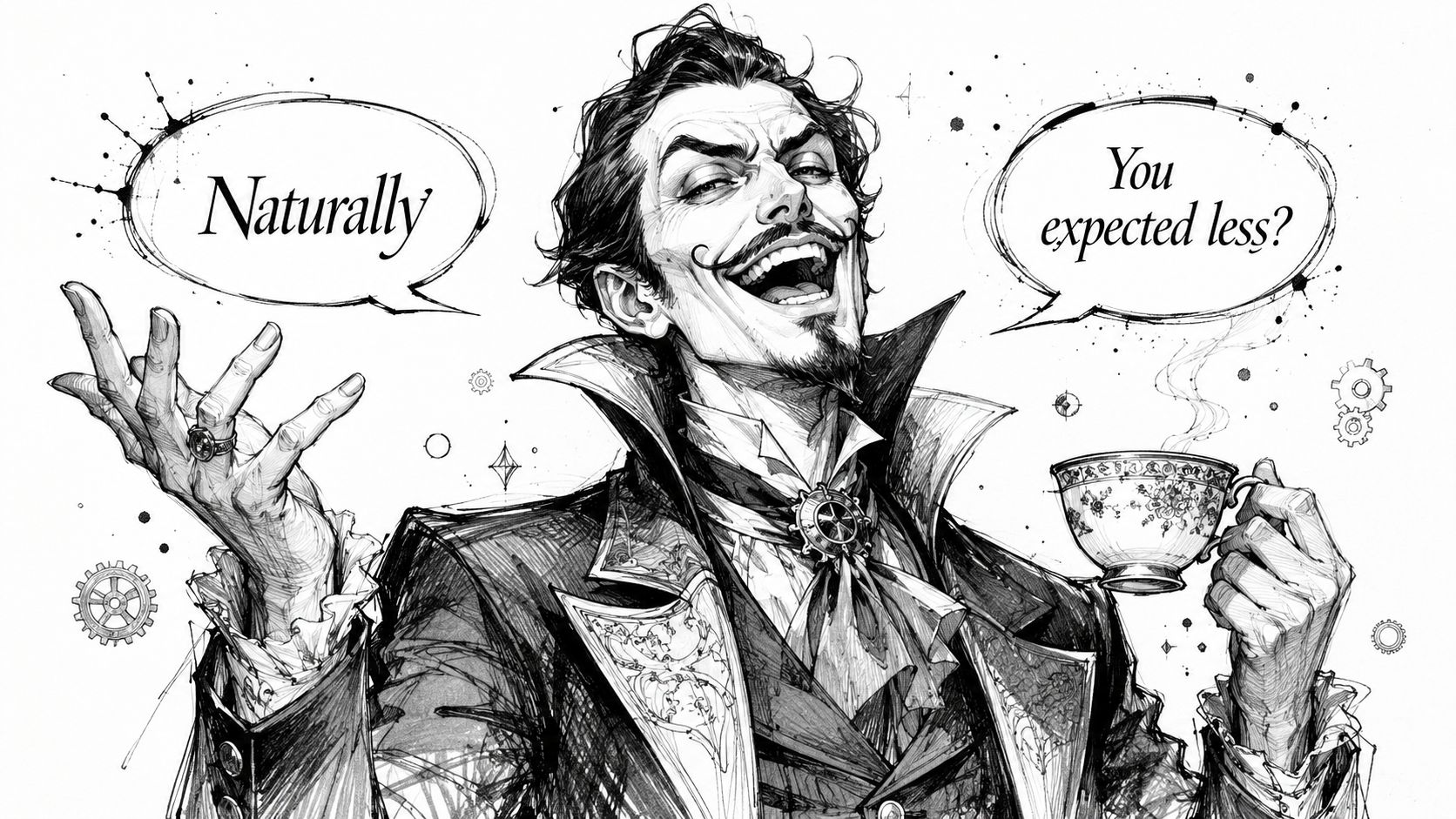
Let motive shape the way the villain speaks
A villain who controls archives will sound different from one who controls a gang, a church, or a prison. The first may speak with precision and patience, the second with territorial bluntness, the third with moral certainty. Voice should match the environment and the method.
Generic version, “You can't stop me. I will crush you.”
Sharper version, “You don't even know what was taken. That's the part I prefer.”
The second line works better because it carries intent, not just hostility. It also gives the actor something to play besides rage. If you want a useful contrast, make the villain polite in one scene, devastatingly specific in another, and oddly calm when the plan starts to fail.
Subversion works best when it cuts against expectation
A villain who is funny, helpful, or gracious can be more unsettling than one who growls through every scene. Politeness can feel threatening when it hides control. Comedy can feel cruel when it lands too easily. A villain doesn't need to be loud to be dangerous.
A small crack in the armor creates more curiosity than a wall of menace.
The trap is turning subversion into a gimmick. If the villain is nice but secretly evil, the niceness still has to connect to motive. If they're helpful, the help should advance their own control. If they're quiet, the silence should feel deliberate, not empty.
A simple do-versus-don't check helps here:
- Do give the villain a speaking pattern that fits their status and strategy.
- Don't make every line a generic threat.
- Do let behavior change when the plan succeeds versus when it collapses.
- Don't keep the same sneer in every scene.
- Do make one unexpected trait support the character.
- Don't add quirkiness that fights the core role.
Using AI Tools to Generate and Refine the Villain
AI tools give better results when the brief is clear. A vague mood board asks the model to guess your intent. A clean prompt, built after you have already fixed motive, silhouette, and style, works more like a translation layer. It keeps the design focused and makes each revision easier to judge.
A prompt template you can copy and adapt
Build the prompt from five parts, motive, silhouette, style, palette, and mood.
Prompt template:
Create a villain character design for a comic. The villain's motive is [core desire]. Use a [primary silhouette] with [2 to 3 shape language cues]. Style it in [chosen comic style]. Use a palette of [colors]. Add [one signature prop or motif]. The mood should feel [adjective trio], with strong readability, clear face shape, and a memorable outline.
Check the fundamentals before you generate anything. The stance should match the personality. The lighting should support the mood. The prop should reinforce the motive instead of competing with it.
A useful habit is to generate one version, then inspect the parts that matter most on a page. Look first at the silhouette and the face, because those are the features a reader reads before the details. If the outline collapses at thumbnail size, the design needs a stronger shape. If the face is busy, the villain may feel harder to remember than the prompt promised.
If you want to build the villain inside a comic workflow, the AI story generator prompt workflow shows how to move from a character brief to a page-ready concept without losing the original idea. A platform like PersonalizedComics can still be useful for testing the same villain in different art styles, but the prompt has to do the heavy lifting first.
The practical method is simple. Draft the villain prompt, generate one page, judge the silhouette and facial read, then change only one variable at a time. That keeps the design from drifting into something generic. If the villain still reads clearly after a style change, the core concept is doing its job.
Putting It All Together and Avoiding Common Traps
A strong villain usually passes through four checkpoints, purpose, silhouette, style, execution. The fastest way to fail is to reverse that order and let trivia, props, or random coolness decide the design. The other common traps are mixing too many shape languages, giving powers that contradict the goal, and picking a style that undercuts the character's tone.
The fix is disciplined repetition. Write the villain's want in one sentence, sketch a silhouette that reads at a glance, adapt it to the comic style you've chosen, then test the result on a page. If the character still feels memorable when shrunk down, you've got a design worth keeping.
A CTA for PersonalizedComics.
Filed under Comic Craft