How to Create Graphic Novel Online: No Art Skills Needed
You probably already have the raw material: a plot thread in your notes app, a character voice saved as a voice memo, or a personal story that has outgrown the idea stage. The gap is not imagination. It is knowing how to turn that idea into 80, 120, or 200 pages that still feel like one book.
A full graphic novel asks for two kinds of control at once. You need storytelling control, so scenes build cleanly from page to page, and production control, so the finished files hold up on a screen and on paper. Online tools have made the first draft far more accessible, but many of them still gloss over the parts that trip up new creators: keeping characters visually consistent across dozens of pages, and setting up files that will not fall apart when you print.
That is the significant shift.
You are not just making a clever comic page. You are building a repeatable visual system for a long-form story. Panels, dialogue, captions, and sound effects still do the heavy lifting, but the challenge is larger now. A side character introduced on page 12 has to look like the same person on page 94. A dramatic nighttime scene has to match the world you established earlier. Page dimensions, bleed, margins, and export settings start to matter once you want a physical book instead of a loose stack of images.
The good news is that this process is learnable. You do not need years of drawing practice before you begin. You do need a clear story, a workable character reference process, and enough production discipline to keep your book coherent from draft to print. That is what makes creating a graphic novel online feel achievable, and what separates a finished book from a collection of disconnected scenes.
Your Story Idea Deserves a Bigger Canvas
A lot of first-time creators think the hard part is art. It usually isn't. The hard part is deciding to treat your idea like a real project.
If you want to create a graphic novel online, your job is closer to a director than a draftsman. You're choosing the cast, defining scenes, setting tone, and controlling pacing. That shift matters because it moves the focus from “Can I draw this?” to “Can I tell this clearly?”
That's a much more approachable problem.
Graphic novels have grown far beyond a niche format. The Library of Congress notes that comics and graphic novels now span tens of thousands of stories across many topics. So if your idea doesn't look like a superhero origin story, that's fine. Memoir, romance, horror, comedy, classroom projects, gifts, and family histories all fit the form.
Practical rule: Don't wait for a perfect art style before you start. Start when your story feels emotionally clear.
Think of your role in three parts:
- Story lead: You decide what happens, why it matters, and where the emotional beats land.
- Visual editor: You choose what each panel needs to show. Not every detail. Just the important detail.
- Production manager: You keep the book coherent from page to page so it reads like one complete work, not a stack of disconnected scenes.
That's what makes a full graphic novel different from making a novelty comic strip. A single page can survive on a funny punchline or one clever visual. A book has to hold together over many pages. Characters need to look like themselves. Rooms need to feel like the same rooms. Dialogue has to flow. The final files need to be clean enough for screens, sharing, and possibly print.
If that sounds like a lot, it is. But it's manageable when you break it into stages and make decisions in the right order.
Planning Your Story from Concept to Script
The fastest way to ruin a promising comic is to generate art too early. New creators often start with character images because that feels fun and tangible. Then they try to build a story backward from the pictures. The result usually looks polished and reads badly.
A stronger workflow starts with the script.
A practitioner workflow for online comics recommends that you lock the script first, then create thumbnails or storyboards, then finalize lettering and page borders before rendering polished art. The same workflow notes that starting from a finished script helps keep page pacing clear and organizes pages for consistency, as described in this comic creation process guide.
Start with a story spine
Before you write panels, reduce your idea to a short spine:
- Who is the main character
- What do they want
- What gets in the way
- What changes by the end
If you can't answer those in plain language, the story is still foggy. Fix that first.
A simple example:
- A shy student wants to impress her older brother.
- She joins a neighborhood monster hunt.
- She keeps making mistakes that put the team at risk.
- She learns that courage isn't the same as confidence.
That's enough to start building scenes.
Build character sheets that help the page
Character bios shouldn't read like encyclopedia entries. They should help you write behavior and visuals.
Use a working sheet for each important character:
| Item | What to include |
|---|---|
| Role | Protagonist, rival, mentor, comic relief |
| Visual anchor | Red scarf, shaved head, oversized coat, square glasses |
| Core trait | Impulsive, guarded, warm, vain |
| Speech habit | Short sentences, formal language, sarcasm, rambling |
| Motivation | Revenge, belonging, safety, recognition |
| Stress behavior | Avoids eye contact, jokes too much, clenches fists |
This kind of sheet pays off later when you're trying to keep scenes consistent across many pages.
Outline pages before panels
Don't script panel one of page one until you know the major turns of the story. A rough page outline is enough.
For each page, write one line about what changes.
- Page 1: Introduce the town and the hero's problem.
- Page 2: Show the challenge she can't ignore.
- Page 3: She joins the hunt for the wrong reason.
- Page 4: The first plan fails.
This gives your story momentum. It also helps you avoid a common beginner problem: spending too many pages on setup, then rushing the ending.
A comic page is not just a container for events. It controls timing. A page turn can reveal a shock, a joke, a confession, or a monster.
Write a panel-by-panel script
Once your page outline works, script each page panel by panel. At this point, online graphic novel creation becomes much easier, because the visual instructions are already embedded in your writing.
A useful script page often includes:
- Panel number
- What the reader sees
- Who is speaking
- Exact dialogue
- Any caption or sound effect
- Mood or camera note if necessary
Example:
Page 5, Panel 1
Rooftop at dusk. Mara crouches behind a chimney, peeking over the edge. The street below is empty except for one flickering streetlamp.
Caption: Ten minutes late. Bad sign.Panel 2
Close on Mara's face. She hears something behind her.
SFX: KRRKPanel 3
Wide shot. A huge creature unfolds from the shadow of a water tower.
Mara: That is not a dog.
Notice what's happening here. The script isn't overloaded with decorative detail. It tells the image generator or artist what matters most.
If you want a stronger framework for scripting pages, this guide on how to write a graphic novel script is a useful companion.
Write dialogue for balloons, not novels
A line that sounds fine in a document can become unusable once it sits inside a speech balloon.
Keep these rules in mind:
- Cut throat-clearing. People rarely need “Well, I just wanted to say that maybe…”
- Read it out loud. If it feels slow spoken aloud, it will feel slower on the page.
- Leave air in the panel. Readers need room to see the art.
- Give each character a distinct rhythm. One may speak in fragments, another in complete polished thoughts.
Bad comic dialogue often explains what the art already shows. If the panel clearly shows a character running through fire, don't make them say, “I am running through a burning building right now!”
Better options:
- “Too hot.”
- “Where is she?”
- “Move!”
Make rough thumbnails before any polished art
Thumbnails are tiny rough page sketches. They don't need to be pretty. They need to answer practical questions:
- Where does the eye go first?
- Which panel gets the most space?
- Where do the balloons fit?
- Is the page too crowded?
Even rough boxes on paper work. A full graphic novel benefits from this stage more than a one-page comic does, because consistency starts here. If your page rhythm is chaotic in thumbnail form, polished art won't save it.
Designing Your Visual World and Consistent Characters
The first big visual decision isn't “What looks coolest?” It's “What helps this particular story read clearly for many pages?”
A moody detective story can fall flat in a playful cartoon treatment. A family comedy can become stiff if you force it into a grim, hyper-detailed style. Tone and readability matter more than novelty.
This is also where longer projects get harder than short comics. A single striking cover image is easy. Holding a character's face, clothing, proportions, and attitude together across a whole book takes discipline.
Choose one style and stay loyal to it
If your platform offers multiple looks, pick one style for the main book and stick with it. Don't change visual language halfway through because one page looked fun in another mode.
When choosing a style, judge it on these criteria:
- Facial clarity: Can readers read emotion quickly?
- Background control: Are environments detailed enough without drowning the characters?
- Action readability: Can motion stay clear in small panels?
- Mood fit: Does it support your genre?
A simple way to test is to generate the same scene in a few styles: one close-up conversation, one action moment, and one environmental shot. The winner is the style that handles all three without feeling forced.
Create a character bible before page production
If you skip this, you'll spend the entire project fixing drift.
Your character bible should include:
- Front-facing description
- Side-profile note
- Key outfit pieces
- Hair shape and length
- Build and posture
- Emotional default expression
- Color cues if relevant
- Age impression and vibe
Keep the descriptions specific. “Cool woman with dark hair” is too loose. “Mid-30s, sharp bob haircut, heavy-lidded eyes, long trench coat, narrow shoulders, always looks half-annoyed” is much more usable.
For a deeper look at visual planning, this article on comic character design is worth studying.
Consistency doesn't happen because the software is smart. It happens because your inputs are stable.
Use anchor traits instead of crowded prompts
New users often over-describe characters. They add every detail they can think of, hoping precision will produce consistency. Usually it creates noise.
Pick three to five anchor traits that absolutely define each major character.
For example:
- Hero: curly black hair, round glasses, green bomber jacket, nervous smile
- Rival: shaved sides haircut, tall frame, heavy boots, scar on left eyebrow
- Mentor: silver braid, broad shoulders, patched coat, calm expression
Those anchors should appear in every prompt, script note, and revision pass unless the story intentionally changes them.
Lock environments too
Character consistency gets more attention, but environment consistency matters almost as much in a graphic novel. If the bedroom changes shape every time it appears, readers feel the instability even if they can't name it.
Create a short location sheet for recurring places:
| Location | Visual anchors |
|---|---|
| Apartment kitchen | yellow tile, crooked plant shelf, tiny round table |
| School hallway | green lockers, harsh ceiling lights, trophy case |
| Villain lair | cracked concrete, hanging chains, one red monitor |
This gives your pages a repeatable visual world.
Accept that continuity needs supervision
A common challenge in longer AI comics is maintaining character and layout consistency. Tutorials show creators manually compositing characters and rebuilding scenes panel by panel, which highlights that multi-page continuity is a real pain point rather than a solved problem, as seen in this AI comic workflow tutorial.
That's the trade-off many beginners miss. Online creation removes a lot of technical barriers, but it does not eliminate editorial judgment.
What works:
- Reusing the same base descriptions
- Saving approved looks
- Keeping a reference board open while generating
- Correcting one problem at a time
What doesn't:
- Rewriting the character from scratch every page
- Chasing novelty in every panel
- Letting costumes, hair, and proportions drift because “it's close enough”
If you're making a gift comic of a few pages, “close enough” might be fine. In a full graphic novel, drift compounds. By page twenty, your lead can look like their cousin.
Bringing Pages to Life with AI Generation and Refinement
Once the script, style, and character bible are locked, page production gets much smoother. This is the stage often envisioned when considering AI comics, but it works best when the earlier planning is already done.
Treat the first generated version of any page as a draft, not a verdict.
That mindset saves a lot of frustration.
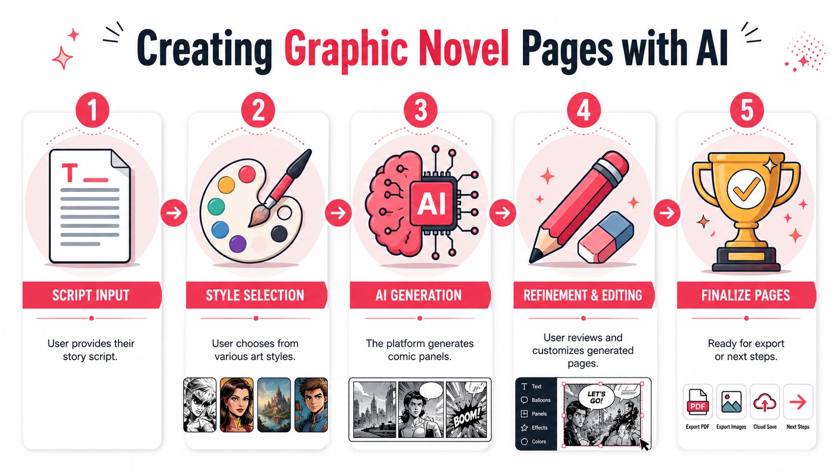
Feed the system one clear page at a time
Don't dump the entire novel into the generator and hope for cohesion. Work page by page, and sometimes panel by panel for difficult scenes.
A practical page brief usually includes:
Page purpose
Example: confrontation, reveal, quiet emotional beat, transitionPanel count
Fewer panels usually create a slower, more cinematic page. More panels speed things up.Essential actions
What absolutely must be shownCharacter references
Reuse your approved descriptionsDialogue and captions
Keep them final or close to final
This helps the system prioritize story clarity over random visual flourishes.
Control pacing through layout choices
A common beginner instinct is to cram every page with equal-sized panels. That usually makes the book feel flat.
Try using layout as part of storytelling:
- Large panel: for reveals, dramatic entrances, emotional pauses
- Medium panels: for standard scene progression
- Small panels: for quick reactions, rapid action, repeated beats
A chase scene and a confession scene shouldn't have the same page rhythm.
If you're experimenting with AI-assisted long-form storytelling beyond comics, this broader guide to an AI book maker can help you think about project structure and output.
Refine the page in passes
Trying to fix everything at once leads to muddy results. Use passes.
Pass one for composition
Ask:
- Are the characters placed clearly?
- Is the action readable?
- Does the eye move naturally?
- Is any panel confusing at a glance?
If the composition is weak, don't waste time polishing dialogue balloons.
Pass two for acting
Here, pages come alive.
Check:
- Facial expressions
- Body language
- Eye lines
- Gesture intensity
A lot of generated pages fail here. The characters technically appear, but they don't seem to feel anything. Fixing expressions often matters more than adding background detail.
Field note: Readers forgive simplified backgrounds much faster than they forgive dead faces.
Pass three for lettering and narration
Lettering shapes reading speed. It also controls tone.
Keep these habits:
- Put the first balloon where the eye naturally starts
- Don't cross tails unless there's no alternative
- Leave enough margin inside the balloon
- Keep narration boxes visually distinct from spoken dialogue
- Use sound effects sparingly, where they help rhythm
Common examples:
- Quiet suspense: small caption, minimal dialogue
- Action impact: one bold sound effect, short line of dialogue
- Comedy beat: reaction panel with a small final balloon
Regenerate selectively, not destructively
One of the biggest workflow mistakes is nuking an entire page because one panel failed. If your tool allows targeted revision, use it. If not, save iterations so you can preserve what already works.
A good rule is to diagnose the problem before regenerating:
| Problem | Likely fix |
|---|---|
| Face looks off | Tighten character description, request closer match |
| Scene feels static | Change camera angle or add stronger action verb |
| Panel is cluttered | Reduce action in that panel, split it into two |
| Dialogue overwhelms art | Shorten text, enlarge panel, move exposition elsewhere |
That last one comes up constantly. Graphic novels are visual first. If a panel needs a paragraph of explanation, the problem is usually upstream in the script.
Keep a living continuity sheet during production
As you generate pages, update a working continuity file. Include:
- outfit changes
- injuries
- props gained or lost
- weather and time of day
- room layouts
- emotional state by scene
This sounds obsessive until you hit the midpoint of the book and realize a character is carrying an object they haven't found yet, or has magically healed from an earlier injury.
Full-length comics reward this level of care.
Know when to stop refining
Perfectionism can stall a book just as effectively as lack of skill. The goal is not for every panel to become a portfolio piece. The goal is for the whole book to read smoothly.
A page is usually ready when:
- the action is clear
- the characters look recognizably like themselves
- the dialogue reads naturally
- the emotional beat lands
- no technical flaw yanks the reader out of the story
That's enough. Move on.
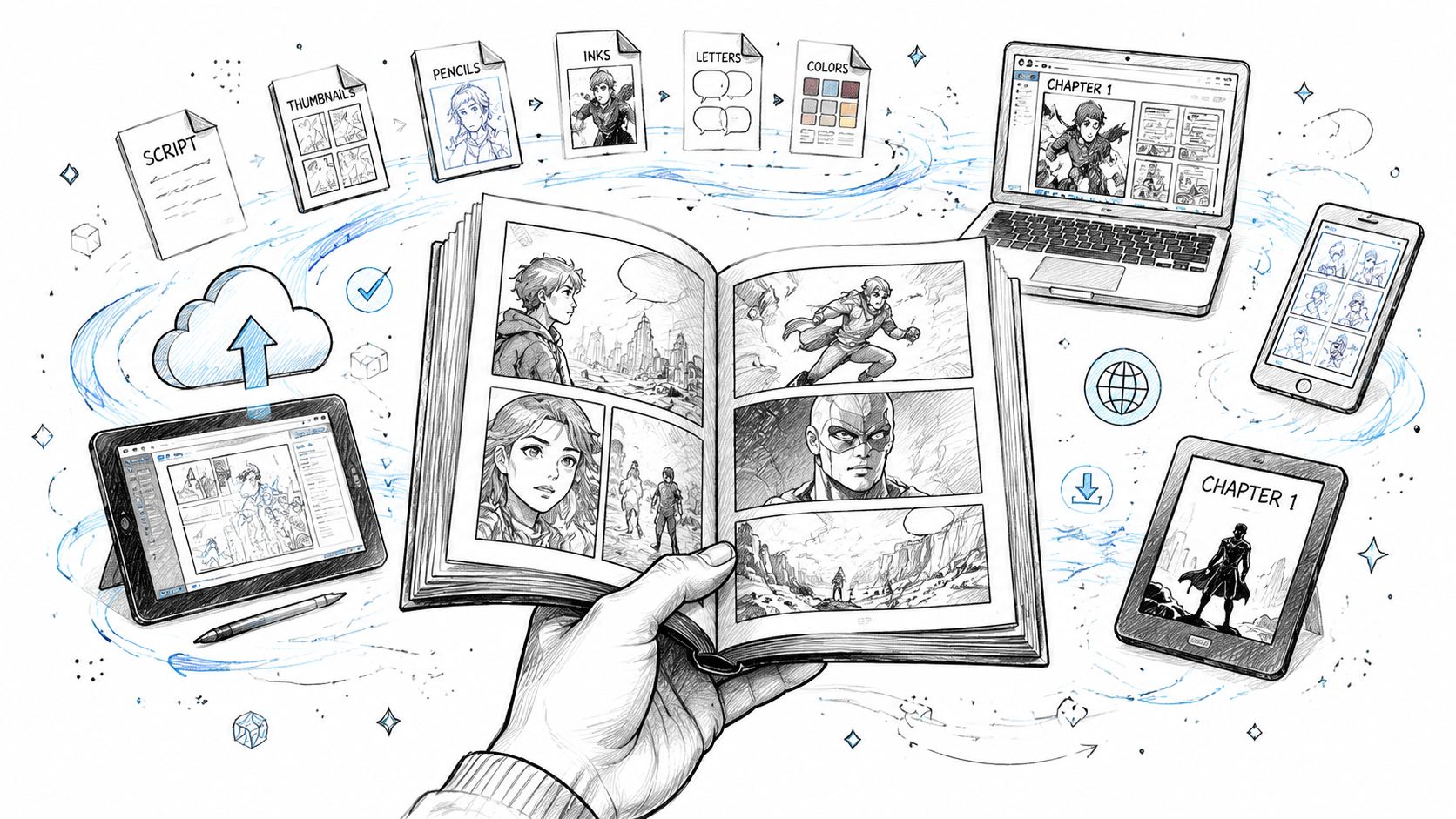
Formatting Your Graphic Novel for Print and Digital
Finishing the art is not the same as finishing the book. A lot of online comic tools focus on creation and skip the last mile, which is where many first-time projects lose quality.
If you want your book to look sharp on a screen and still hold up as a physical object, formatting decisions matter.
Understand resolution in plain language
DPI means dots per inch. For creators, the practical question is simple: will the page still look crisp when printed?
Established guidance cited by Writer's Digest notes 300 dpi minimum for print and 450 to 600 dpi for higher-end pages in graphic novel production, in this publishing discussion on writing graphic novels. Independent comic workflows also commonly recommend 600 dpi, especially for line art preservation and cleanup, as shown in this digital comic production guide.
You don't need to become a prepress expert. You do need to remember this:
- Screen-friendly is not always print-ready
- Low-resolution exports may look fine on a phone and soft in print
- Higher-resolution files give you more flexibility for cleanup and assembly
Build pages with print in mind
A professional-looking graphic novel usually accounts for more than panel images. It also needs margins, borders, safe areas, and sometimes bleed.
Here's the plain-English version:
- Trim size is the final size of the printed page.
- Bleed is extra image area that extends past the trim edge so printing doesn't leave accidental white slivers.
- Safe area is where important text and faces should stay so they won't get cut off.
If you place dialogue too close to the edge, you're asking for trouble. What looked balanced on your laptop can become cramped or clipped in print.
Separate digital reading from print reading
These are different experiences.
A digital-first file needs:
- readable text on smaller screens
- clean page order
- strong contrast
- export formats that are easy to share and archive
A print-first file needs:
- sufficient resolution
- proper page dimensions
- attention to trim and bleed
- consistent borders and lettering placement
Clean production is invisible. Readers only notice it when it goes wrong.
Use a final preflight checklist
Before exporting your full book, review every page against the same checklist.
- Text check: balloons readable, spelling clean, tails point correctly
- Art check: no accidental panel crops, no duplicated limbs, no continuity errors
- Layout check: margins consistent, page numbers if needed, chapter openings intentional
- Output check: correct resolution, correct page size, correct export type for your destination
Many online comic makers don't explain these technical steps. Independent workflows emphasize 600 dpi scanning and digital cleanup, which shows that production-quality output involves more than generating pages, as noted in this print-readiness discussion for comic tools.
That gap catches a lot of creators. They think the hard part ended when the pages looked good. In reality, the book becomes real when the files can survive export, proofing, and printing without falling apart.
Pricing Credits Promotional Options and Common Pitfalls
Once the book exists, practical questions show up fast. How many pages should you make first? How do you avoid wasting credits or time? Should you publish digitally, print a copy, or share it privately?
The smart move is to treat your first project like a controlled production, not a maximalist masterpiece.
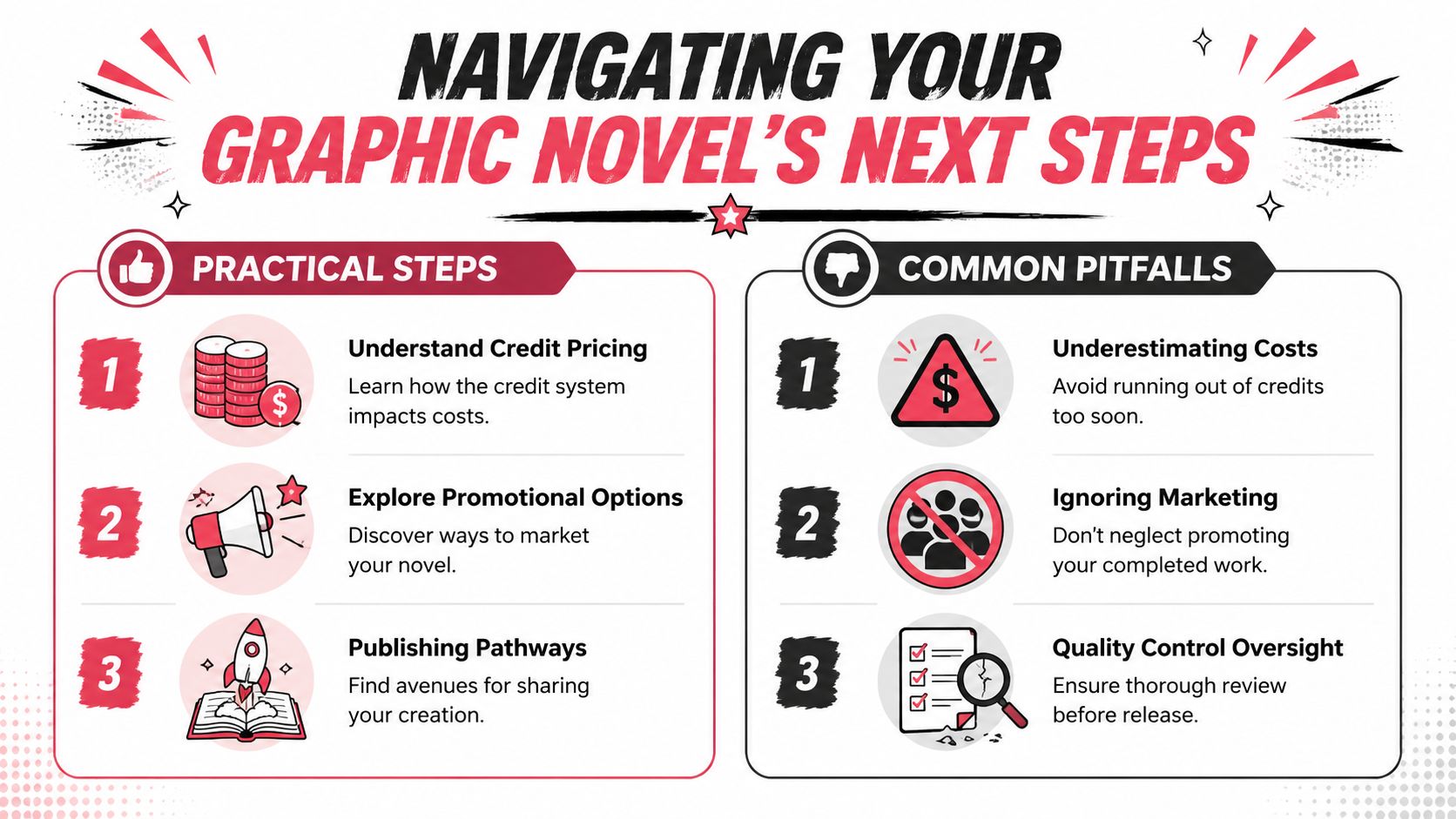
Think in pages, not abstract ambition
Credit-based platforms are easiest to manage when you estimate your project by page count, then build a buffer for revisions.
A short gift comic, a chapter sample, and a full graphic novel are different jobs. If you're new, start smaller than your ego wants. A polished opening chapter teaches you more than an unfinished epic.
Useful project types:
- Proof-of-concept chapter: Good for testing tone, style, and workflow
- Short complete story: Best for learning pacing and ending a project
- Long-form book: Best attempted after you've solved your consistency process
The practical benefit of a page-based model is that it forces editorial choices. You stop adding scenes just because they sound cool and start asking whether each page earns its place.
Promotion starts with positioning
A graphic novel doesn't need a full marketing campaign to find readers. It does need a clear identity.
Decide what kind of project it is:
| Type of project | Best sharing angle |
|---|---|
| Personal gift | emotional surprise, private print copy |
| Creator sample | portfolio piece, pitch proof, social excerpts |
| Classroom or family project | keepsake, educational share, event memento |
| Indie comic launch | teaser pages, character reveals, preorder-style interest building |
If you want people to care, make it easy to explain in one sentence. “A haunted coming-of-age mystery set in a dying mall” is stronger than “It's kind of fantasy but also comedy and maybe sci-fi.”
Avoid the most common beginner mistakes
Most weak first graphic novels fail in familiar ways.
- Overpacked pages: Too many beats in one page creates visual traffic. Split the moment.
- Dialogue bloat: If everyone speaks in paragraphs, the reading rhythm dies.
- Style drift: Characters and environments slowly mutate because no one is policing continuity.
- Flat page rhythm: Every page has the same density and panel size.
- Weak endings: The creator spends all their energy on setup and rushes the payoff.
- No production review: The pages look good individually but haven't been checked as a complete book.
A clean fix is to run three separate reviews:
- Story review
- Visual continuity review
- Export and print review
Don't do all three at once. Your brain will miss obvious problems.
Quality control beats novelty
There's a temptation with AI-assisted creation to keep generating more because it feels productive. It often isn't. More pages do not automatically create a better graphic novel.
What works better is a disciplined loop:
- draft
- review
- correct
- lock
- move on
Finish the page that serves the story. Don't chase the page that merely shows off the tool.
That advice matters even more if your project is intended as a printed keepsake or saleable book. Readers remember clarity, character, and emotional payoff. They rarely reward unnecessary complexity.
Share in stages if you need feedback
You don't have to reveal the whole book at once.
Safer early sharing options:
- one chapter with trusted readers
- three to five sample pages
- a silent action sequence to test readability
- a dialogue-heavy scene to test voice
Ask focused questions:
- Did you understand what happened?
- Did any page feel crowded?
- Did the main character stay visually consistent?
- Was there a point where you lost interest?
Those answers are more useful than “Did you like it?”
Frequently Asked Questions About Creating Your Comic
Do I need drawing skills to create a graphic novel online
You do not need traditional drawing skills to finish a graphic novel online. You do need to make good creative decisions.
That means writing scenes clearly, choosing a style that can survive across a full book, directing each panel with intent, and correcting weak outputs instead of accepting them just because they appeared fast. For a single-page comic, rough consistency can slide. For a graphic novel, it shows up as visual drift, muddy storytelling, and extra revision time later.
What's the difference between a comic book and a graphic novel
The practical difference is scope, structure, and reading experience. A comic book often feels like an issue in a series. A graphic novel usually reads as a longer, more complete work with a beginning, middle, and ending that holds together in one volume.
That distinction matters during production. A full graphic novel asks you to manage pacing across chapters, keep characters recognizable for dozens of pages, and prepare files that can work as a real book, not just a handful of good-looking pages.
How long should my first graphic novel be
Start smaller than your outline suggests. A tight short graphic novel or a complete first chapter teaches the right lessons faster than an ambitious book you never finish.
I usually recommend choosing a story length you can fully script, thumbnail, review, and export without losing control of the project. Finishing one contained arc will teach you more about pacing and continuity than building a huge world with no ending.
How do I keep characters consistent across many pages
Build a character bible before you generate too many pages. Include front and side reference looks, age, proportions, hairstyle, clothing rules, color notes, expressions, and any details that must never change.
Then get strict. Save approved images, reuse the same descriptive anchors in prompts, and review every new page against earlier locked pages. Online tools can help you create quickly, but consistency across a full graphic novel still comes from active art direction and frequent corrections.
Can I print a graphic novel I made online
Yes, if you prepare it like a book instead of a gallery of images. Printing exposes mistakes that are easy to miss on screen.
Check trim size, bleed, safe margins, resolution, black levels, spine width, and text size before you export final files. I also recommend printing a proof copy, even for a personal project. It is the fastest way to catch dialogue that reads too small, panels that feel cramped, and color choices that looked fine on a monitor but flatten on paper.
What makes a graphic novel feel professional
Professional work feels controlled. The panels read in the right order. Dialogue fits naturally. Character designs stay stable. Scene transitions make sense. The files are clean enough to print without surprises.
Readers may never mention trim, gutter loss, or continuity sheets. They will notice when a face changes shape every six pages or when a dramatic spread disappears into the binding. Professional quality is usually the result of many small decisions made consistently.
Is this medium only for fiction
No. Graphic novels work well for memoir, education, history, internal brand storytelling, biography, and how-to content.
The format stays effective because it combines pacing, image sequencing, dialogue, and narration in a way that helps readers move through complex material without feeling buried in text. The same production rules still apply. Clear storytelling, stable character design, and print-ready files matter whether your project is fantasy, nonfiction, or something in between.
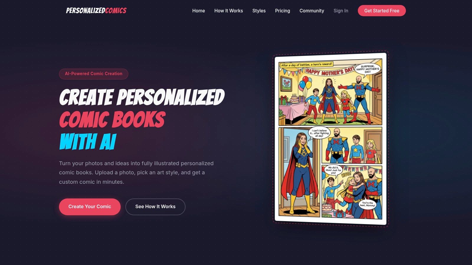
If you're ready to stop thinking about your comic and make it, PersonalizedComics gives you a practical way to turn scripts, photos, and story ideas into finished comic pages without needing to draw everything by hand. It's especially useful when you want to move from concept to a polished, shareable graphic novel with less technical friction.