The tricky part is that noir looks simple until you try to make it readable. Too much black, and faces vanish. Too little contrast, and the page loses its pressure. The craft lives in that narrow lane between mood and clarity, which is why beginners often feel like their pages look “dark” but not noir.
Entering the World of Noir Comic Book Style
A lot of people meet noir through a single image first. Maybe it's a detective under a streetlamp, maybe it's a silhouette framed by blinds, maybe it's your own photo converted into a comic panel and suddenly looking like it belongs in a crime story. The appeal is immediate because noir doesn't just show a scene, it suggests that something is hidden in it.
That's also why beginners get hooked fast. Noir comic book style gives ordinary settings, a hallway, a diner, a parking lot, a kitchen at night, a sense of secrecy and consequence. It makes a personal story feel larger without needing elaborate costumes or fantasy worldbuilding.
Why it feels so different from other comic looks
The style works because it strips away softness. Instead of relying on color to guide the eye, it uses shadow, sharp edges, and strong silhouette shapes. That means the page has to do more with less, and that limitation is part of the charm.
If you're working from a photo, the transformation can be almost startling. A casual selfie can become a tense character portrait once the light is narrowed and the blacks are placed with intent. If you want a starting point for comparing styles, the style overview on comic strip styles is a useful companion read.
Practical rule: if the image still looks like a normal photo with a black filter on top, it isn't noir yet. You need contrast, shape, and negative space working together.
The bigger promise of noir is story. Even before you write dialogue, the visual language tells the reader that choices matter and that the world is morally complicated. That's why it remains such a useful style for mystery scenes, personal keepsakes, and photo-based comics that need emotional weight.
Origins and Definition of Noir Comic Book Style
Noir comic book style didn't appear out of nowhere. It grew from mid-20th-century crime comics and detective strips, with Chester Gould's Dick Tracy helping popularize the hard-boiled look and Charles Biro's Crime Does Not Pay often treated as an early marker of the darker comic tradition source material. By the late 1940s, the market had become a major publishing force, which tells you the style wasn't a niche experiment anymore, it was a widely recognized visual language.
| 1940s Crime Comics Market Snapshot | Value |
|---|---|
| Comic books purchased monthly in 1948 | about 80–100 million copies source material |
| Annual revenue in 1948 | roughly $72 million source material |
| Crime Does Not Pay monthly readers | more than 6 million source material |
| Crime-comics market share in 1948 | as high as 14% source material |
That history matters because it separates noir from the vague idea of “anything dark.” Noir is not just a gloomy palette. It's a specific storytelling mood built from crime, suspense, hard edges, and visual restraint. If a comic is dark but still soft, colorful, or visually open, it may be moody, but it isn't really noir in the classic sense.
A beginner-friendly definition
A good working definition is this. Noir comic book style is a high-contrast black-and-white approach that uses shadow to shape mood, stage action, and sharpen the story. It comes from detective and crime traditions, not from general darkness for its own sake.
That's why the page design matters so much. The style depends on value contrast, meaning the relationship between black, white, and the space between them. Readers should be able to follow the action from the silhouette and the composition before they notice small details.
Practical rule: if a page only feels noir when you zoom in, the design is too busy. Noir needs to read clearly at a glance.
For creators who want to build this look into a workflow rather than hand-draw every panel, black and white comics are the natural next reference point, because the visual grammar depends on the same value-first thinking.
Key Visual and Narrative Traits
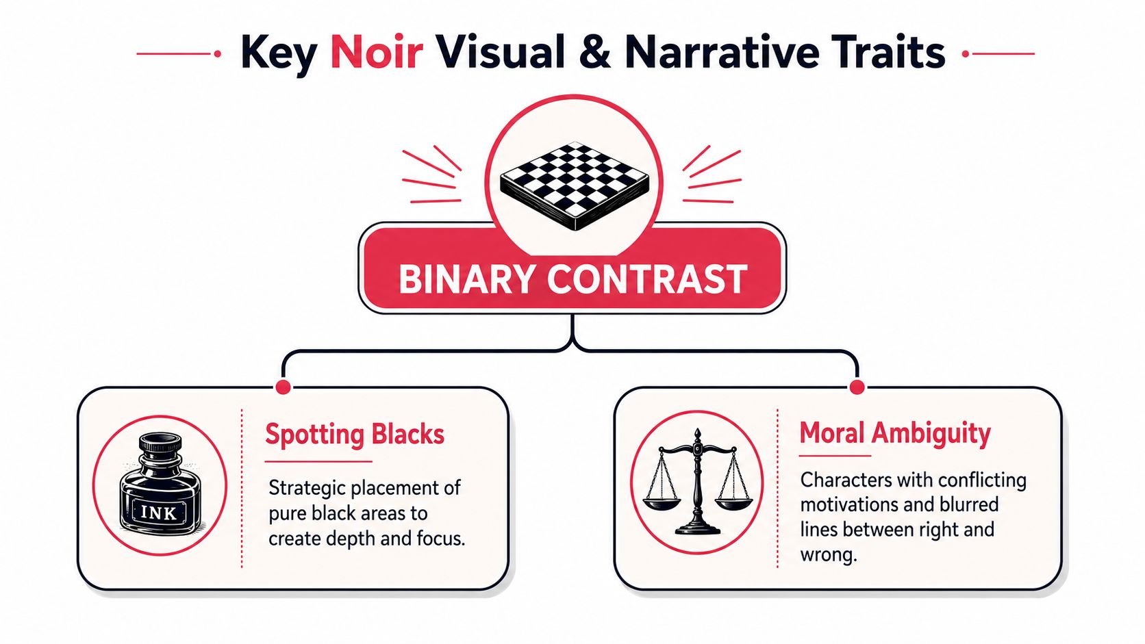
The first thing to understand is that noir is built on stark binary contrast. The page works through pure black and white with minimal midtones, and shadows aren't leftover darkness, they're active parts of the composition source material. That's why chiaroscuro-inspired lighting, venetian-blind casts, overhead spotlights, cigarette glow, and streetlamp silhouettes show up so often. They create clear figure-ground separation, which is exactly what keeps the page legible.
What the eye is actually reading
In a strong noir page, the reader is not hunting for every texture. The reader is reading the big shapes first. A coat, a doorway, a face, and a window blind can all become separate visual blocks if the contrast is handled well. That's also why the style works so well for panel-heavy pages, because thumbnail readability improves when the composition depends on large shapes instead of microscopic detail source material.
The narrative side usually matches the visual side. Noir tends to carry a sense of pressure, distrust, and moral uncertainty. That doesn't mean every character is cruel. It means the world doesn't hand out clean answers.
The two pillars that beginners should watch
- Spotting blacks. This is the deliberate choice of where solid black should go, so the page has weight and focus.
- Moral ambiguity. Characters can still be sympathetic, but their choices should feel conflicted, compromised, or costly.
The production side matters too. Expert noir instruction emphasizes filling exterior page space and key negative spaces with black, while using white sparingly for highlights and form definition source material. Cross-hatching and limited gray washes are better used for atmosphere or rain, not as a default filler for every surface source material.
That balance is the core craft move. Too many beginners think noir means flooding the page with black. In practice, the black shapes have to be placed with intention or the whole scene loses depth.
Illustrative Examples of Noir Comics
A detective stands in a rain-soaked alley, and the first thing you notice isn't the bricks or the puddles. It's the silhouette. The coat cuts a clear shape against the light, and the streetlamp throws a hard edge across the pavement. That's classic noir storytelling, because the image is telling you where to look before the dialogue even starts.
Now shift to a doorway scene. A woman framed by bright interior light stands half in shadow, half in reveal. The room behind her is reduced to a shape, not a distraction, and the tension comes from what the reader can't fully see. That kind of image works because noir values omission as much as description.
What makes these scenes work
The technique is less about subject matter and more about control. A cigarette glow can isolate a face. A blind cast can break a wall into bars of light and dark. A streetlamp silhouette can turn a public street into a private stage. Each of these choices sharpens the storytelling by separating the important figure from the background.
A good noir page often feels like a scene under interrogation. The reader gets only the facts the image wants to reveal. That doesn't mean the art is empty. It means the art is selective.
The strongest noir images don't show everything. They choose what deserves the light.
For beginners, the useful habit is to ask one question about every panel. What is the one thing the reader must notice first? If the answer is unclear, the panel will usually become muddy, even if the rendering looks technically polished.
You can also think of noir as a kind of visual editing. A clean silhouette is a close-up on meaning. A blocked-out doorway is a cut away from clutter. A pool of black under a table can make a room feel deeper without drawing every chair leg. That's the grammar you're aiming for when you want the page to feel atmospheric but still easy to follow.
Practical Tips for Creating Noir Comics
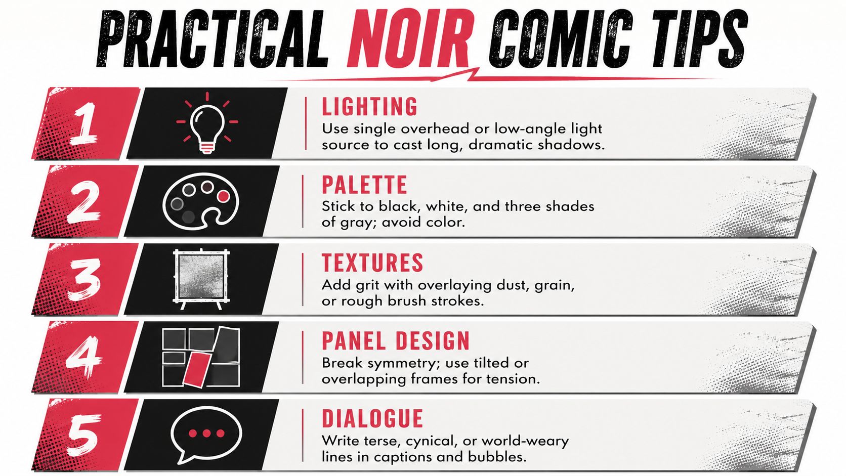
The fastest way to improve a noir page is to think in black shapes before you think in details. Start with the light source, then decide which areas should fall into solid black, and only then add texture. That order matters because noir lives or dies on the page's overall read, not on whether every fold and brick has been rendered.
Build the page around the light
Pick one dominant light source, overhead, low-angle, or side-lit, and let it cast long shadows. If you use several lights at once, the page can lose its tension and start looking evenly lit, which flattens the mood. The classic noir look uses lighting to imply danger or secrecy, not comfort.
Keep the palette narrow
Black, white, and restrained grays are enough for most noir pages. If you're drawing digitally, it's tempting to soften everything with gray gradients, but the style gets weaker when contrast is diluted. The point isn't to make the page pretty in a generic way, it's to make the forms read instantly.
Use texture as seasoning, not soup
Dust, grain, rough brushwork, and rain can all help, but they should support the composition. If texture starts covering everything, the black shapes lose clarity. The expert advice on spotting blacks is useful here, because it recommends placing black with purpose, using white for highlights, and keeping gray washes mostly for atmosphere or weather source material.
Don't suffocate the page
Practical rule: when every corner is dark, nothing feels important.
That warning matters even more in panel sequences. A noir page needs breathing room, because the reader has to track faces, hands, props, and word balloons without fighting the background. Reducing background detail strategically usually works better than eliminating it everywhere at once source material.
Dialogue should support the visuals too. Terse, guarded, and world-weary lines fit the style because they match the compressed visual language. If the art is whispering, the captions shouldn't be shouting.
Applying Noir Style in PersonalizedComics

Noir becomes especially useful for photo-based comics. A person uploads real faces, writes a plot, and asks the page to feel cinematic, but the AI still has to keep the characters readable from panel to panel. That's the exact problem many classic tutorials skip, because they focus on hand-drawn rendering rather than fast, personalized generation source material.
Why AI and photo-based pages need extra care
When a comic is built from user photos or mixed settings, the background can get busy fast. Shadows can also stack up until faces disappear into the page. Shawn Martinbrough's guidance makes the key point plainly, black placement has to be balanced across the page, and background detail should be reduced strategically rather than wiped out everywhere source material.
That means the best noir prompt or layout decision is often not “make it darker.” It's “make the important shapes clearer.” A detective's face needs enough white to separate it from the coat. A doorway needs enough open space to frame the figure. A car interior needs enough contrast to keep hands and eyes visible.
A simple workflow that keeps the style readable
Use the noir style option, upload your photos, describe the plot, and let the page generation do the paneling. If the result starts to feel overloaded, reduce the number of dark areas in your prompt language and keep the scene description focused on one or two strong light sources. That's a workflow adjustment, not a drawing trick.
For creators who want a platform built around that kind of photo-to-comic process, PersonalizedComics offers one practical route. It turns user photos and story ideas into complete comic pages with panels, speech bubbles, sound effects, and narration, so noir can be explored without starting from a blank page.
Practical rule: in personalized noir, clarity beats drama every time. If the face reads cleanly and the silhouette holds, the mood will follow.
The challenge is consistency. One page can look great in isolation, but the story still has to stay legible across multiple pages, especially when different photos, locations, or poses enter the mix. Noir works best here when it behaves like a system, not a filter.
Your Next Steps with Noir Comic Book Style
Noir holds up because it's both stylish and disciplined. The style asks you to simplify, to spot blacks on purpose, and to let shadows support the story instead of swallowing it. That combination makes it a strong fit for comics built from personal photos, short scenes, or quick ideas that still deserve a cinematic feel.
The easiest way to improve is to start small. Build one panel with a strong silhouette, one clear light source, and a readable face. Then check whether the scene still makes sense when you glance at it quickly, because that quick read is where noir either succeeds or falls apart.
If you keep the blacks balanced and the negative space working for you, the page stays sharp instead of turning muddy. That's the lesson behind every good noir page, from the classic crime tradition to modern personalized comics.
PersonalizedComics lets you turn photos and story ideas into fully illustrated comic pages, including the noir style with its shadow-heavy look and sharp contrast. If you want to try a personal detective scene, a moody gift comic, or a short black-and-white story, visit PersonalizedComics and build a first page with your own photos.
Filed under Comic Craft