Comic Strip Styles: A Guide to Visual Storytelling
You've got a story in your head already.
Maybe it's a funny family memory that would work better as a comic than a photo album. Maybe it's a fantasy quest, a classroom project, or a gift where your friend becomes the hero. Maybe it's even a comic about your cat — plenty of people plan one as a National Cat Day surprise for the cat lover in their life. The plot feels clear enough until you hit the visual question that freezes almost everyone: what should this comic look like?
That question sounds artistic, but it's really a storytelling question. Comic strip styles don't just decorate a story. They shape how the reader feels before they process a single line of dialogue. A round, simplified character design can make a dramatic scene feel approachable. Heavy shadows can make a simple hallway look dangerous. A bright palette can turn ordinary banter into something playful and fast.
A lot of beginners think the problem is drawing skill. Usually it isn't. The problem is choosing a visual language without knowing what each one does. If you've ever stared at references and thought, “I like all of these, but I don't know which one fits,” that's a normal place to start.
If you're still shaping the narrative itself, it helps to sort the story before worrying about the look. This beginner-friendly guide on how to write a story for beginners pairs well with the visual decisions you'll make next.
Your Story Needs More Than Just Pictures
A student once told me she wanted to make a comic about her grandparents meeting for the first time. She had the scenes, the dialogue, even the ending. But she kept restarting the first page because she was stuck between “cute,” “realistic,” and “vintage.”
That kind of indecision happens because style is often treated like a fashion choice. It's closer to casting in a film. The wrong actor can flatten a strong script. The wrong visual style can do the same thing to a comic.
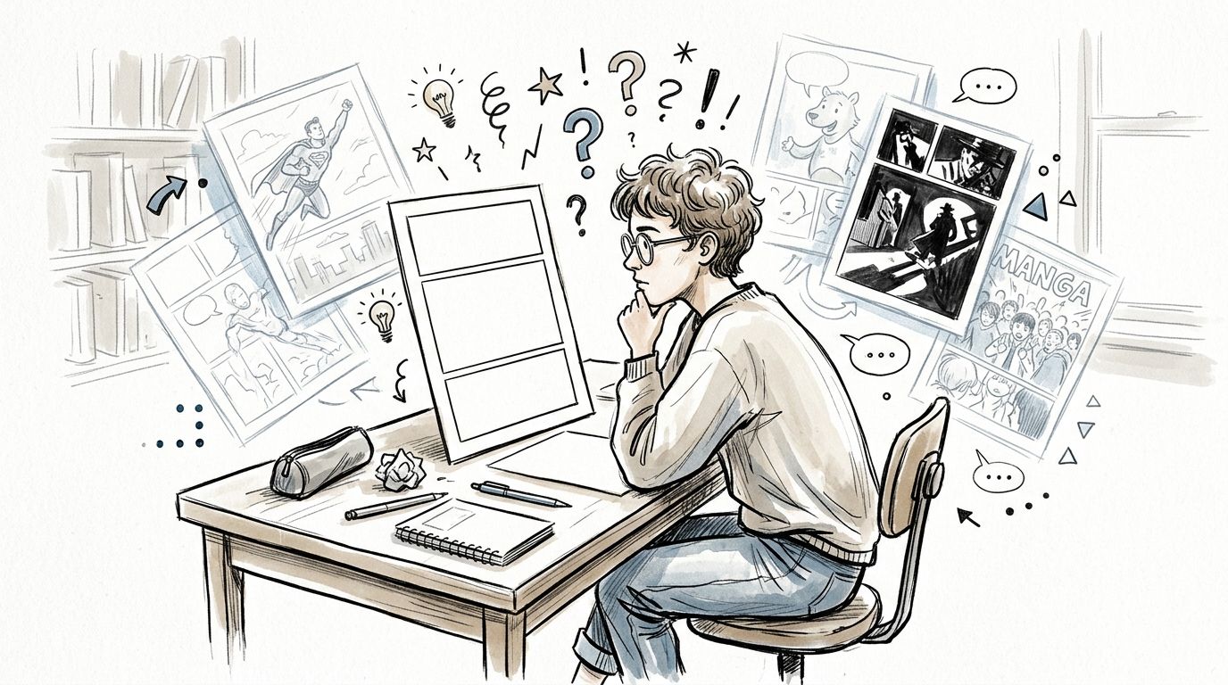
Take one simple scene: a kid standing outside a new school. In a cartoony style with soft shapes, that scene feels nervous but manageable. In a noir style with deep black shadows, it feels isolating. In a manga-inspired style, the same moment can swing toward emotional intensity through expression and pacing.
Practical rule: If you can describe the feeling of a scene in one sentence, you can start narrowing the right style.
This is why comic strip styles matter so much. They control tone, rhythm, clarity, and emphasis. They tell the reader whether to brace for a joke, a confession, a chase, or a mystery. Even when two comics use similar plots, their styles can make them feel like completely different stories.
Style also helps people who say, “I can't draw.” You don't need to master every visual tradition before making choices. You need to recognize what each tradition is good at. Once you see style as a tool instead of a test, the process gets lighter. You stop asking, “Am I good enough to make this?” and start asking, “What kind of line, color, and layout will help this scene land?”
That shift changes everything.
The Anatomy of a Comic Strip Style
When readers say a comic “has a great style,” they usually mean several visual decisions working together. Style isn't one thing. It's a stack of choices that support the story.
The easiest way to understand comic strip styles is to break them into parts you can see and control.
Start with line weight
If you study enough comics, one pattern jumps out fast. Line quality does a huge amount of the storytelling work. As explained in this breakdown of comic book art styles, the visual grammar of comic styles is primarily shaped by ink line weight and dot pattern type, with traditional work often using Ben-Day dots for shading and modern digital work using variable-weight brush lines.
Think of line weight like a voice.
A thick, even outline speaks loudly and clearly. It makes forms readable at a glance. That's useful for action, humor, and younger audiences. A thin, delicate line has a different effect. It invites the reader to slow down and inspect. It can feel intimate, fragile, or observational.
Here's a simple way to read line choices:
- Bold uniform lines make characters feel iconic and immediate.
- Thin detailed lines make worlds feel textured and specific.
- Variable brush lines add motion and give figures more energy.
- Scratchy or broken lines can make a page feel anxious or raw.
If you want more examples, this gallery of different comic art styles is useful for training your eye.
Color and shading change the emotional weather
Once the line is set, color and shading start doing mood work.
A comic can use bright flat color and feel clean, fast, and readable. Another can use muted tones and soft transitions to feel reflective. A black-and-white page with cross-hatching feels different again. Not just visually, but emotionally.
Traditional comic shading often used Ben-Day dots. Those dots don't just fill space. They create a printed texture that instantly suggests a certain era and production history. Modern digital styles often swap that look for smoother gradients, painterly rendering, or brush-based shadow shapes.
A useful question is, “Does this story need clarity first, atmosphere first, or texture first?”
That question helps you choose between flat color, dot-based shading, cross-hatching, or more painterly approaches.
Shapes do hidden character work
Beginners often focus on “good drawing” and miss shape language.
Round shapes tend to feel friendly, soft, or comedic. Sharp angles feel tense, dangerous, or clever. Tall narrow silhouettes can feel elegant or eerie. Squat blocky ones can feel sturdy or stubborn.
A quick comparison helps:
| Visual choice | What it often suggests |
|---|---|
| Thick round outlines | Warmth, comedy, accessibility |
| Angular silhouettes | Conflict, intensity, menace |
| Flat color blocks | Speed, readability, graphic punch |
| Cross-hatching | Grit, depth, seriousness |
Once you notice these building blocks, comic strip styles stop feeling mysterious. You can point to what's working. Of greater significance, you can decide on purpose.
A Visual Tour of Major Comic Styles
Some styles became familiar because readers saw them everywhere. Others grew by reacting against the old rules. That history matters, because each style carries storytelling habits with it.
According to Britannica's overview of the form, the foundational conventions of the modern comic strip were established in the United States in 1895 with R. F. Outcault's Hogan's Alley, which combined speech balloons and images into a continuous narrative. The same source notes that major innovations after 1965 pushed the medium toward more satirical and surrealistic forms and helped the graphic novel become a dominant style in comics history. You can read that background in Britannica's discussion of the evolution of the comic strip form.
That long shift explains why today's comic strip styles feel so different from one another. They were built for different reading experiences.
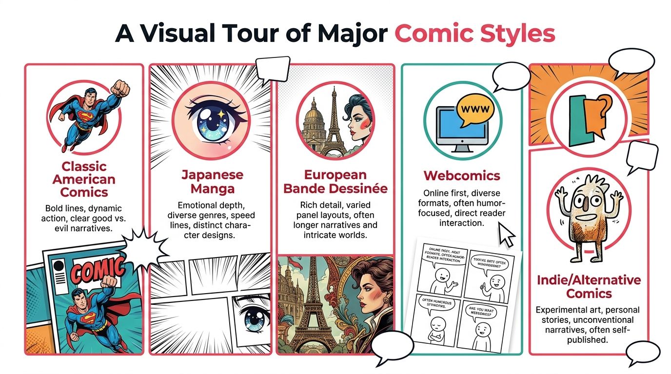
Classic American
This is the style many people picture first. Clean contours, readable silhouettes, direct staging, and strong visual contrast. It grew naturally from newspaper and commercial printing needs, so clarity sits at the center.
Its strength is immediacy. Action reads quickly. Character roles feel clear. Facial reactions land fast. If your story needs energy, punch, and a sense of visual confidence, this style does a lot of heavy lifting.
It works especially well for:
- Adventure stories with clean stakes and visible momentum
- Comedy where expression has to read instantly
- Tribute projects that want a familiar comic-book flavor
If you enjoy that lineage, you might like browsing comic strip classics.
Manga-inspired
Manga isn't one single look, which is where beginners often get confused. But many manga-influenced comics share a focus on expressive faces, selective detail, emotional pacing, and dramatic motion devices like speed lines or impact framing.
Its special power is subjectivity. It's excellent at making the reader feel what a character feels. A quiet pause can stretch. A reaction can become the whole beat. A fight can feel explosive without needing hyper-detailed rendering in every panel.
This style often suits:
- Character-driven drama
- Romance and coming-of-age stories
- High-energy action with strong emotional beats
A common mistake is copying surface traits, like big eyes, without borrowing the underlying pacing. Manga's true lesson is often about rhythm, not anatomy.
Noir
Noir style narrows the world. It uses shadow, contrast, and negative space to create pressure.
You don't need a detective trench coat for noir to work. A breakup scene can be noir. A memory comic can be noir. What defines it is the emotional logic of the page. Hidden information, hard light, silhouettes, cramped framing, and a sense that every room contains tension.
Noir is strong when your story needs:
- Suspense
- Moral ambiguity
- Urban loneliness
- Psychological pressure
If Classic American style says, “Look at the action,” noir says, “Look at what the light is refusing to show you.”
Noir isn't just dark coloring. It's a way of controlling what the reader can trust.
Modern graphic novel
This category is broad on purpose. Many contemporary graphic novels mix influences rather than staying loyal to one house style. You'll see cinematic layouts, quieter color palettes, varied lettering choices, and character acting that borrows from film, illustration, editorial art, or animation.
Its main advantage is range. It can hold memoir, history, fantasy, satire, and family drama without feeling trapped by newspaper conventions. It also gives creators more freedom to pace scenes with wide panels, silent beats, and shifting page design.
This makes it useful for stories that need emotional nuance or a less formula-driven look.
Other major branches
A few more categories show up often in current comic strip styles:
| Style | Best at | Watch out for |
|---|---|---|
| European-inspired detailed work | Worldbuilding, architecture, travel, long-form atmosphere | Over-detail can slow the page |
| Webcomic-friendly simplified style | Fast reading, humor, frequent updates | Too little variation can flatten dramatic scenes |
| Indie or alternative style | Personal voice, experimentation, unusual themes | If readability slips, readers may disconnect |
The point isn't to memorize a museum catalog. It's to notice function. Each style guides the eye differently, handles emotion differently, and gives your story a different kind of body.
How to Choose the Right Style for Your Story
A beautiful style can still be the wrong style.
I see this all the time when someone falls in love with an aesthetic before asking what the story needs. A tragic memory comic rendered like a loud superhero splash page may feel emotionally off. A chaotic parody drawn with heavy realism may lose its timing. Readers usually can't explain why a mismatch feels awkward, but they feel it immediately.
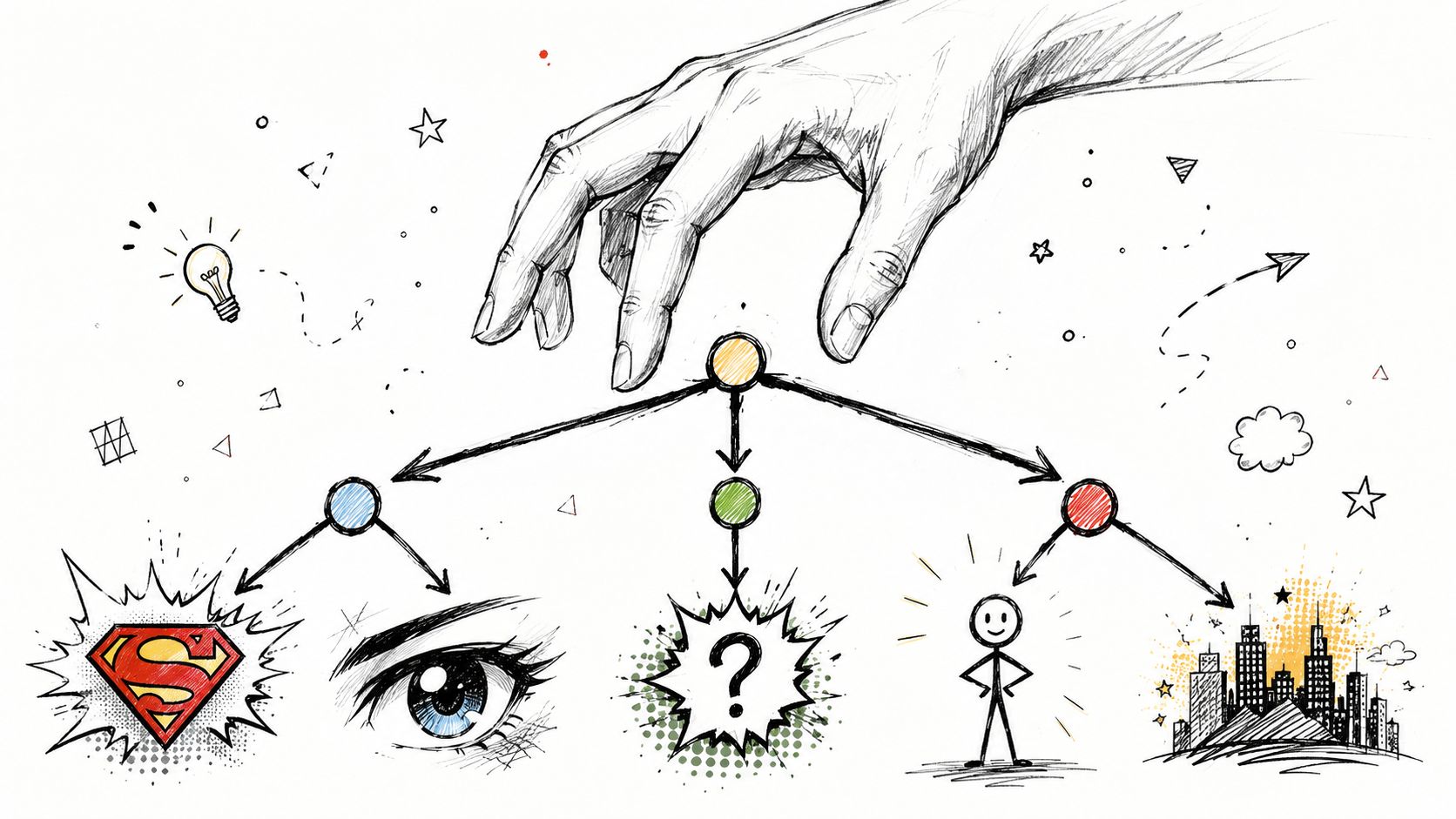
Match genre before taste
Start with the story's job.
A mystery needs controlled information. A comedy needs timing and readable reactions. A fantasy quest needs enough visual richness to make the world feel worth entering. Genre doesn't dictate one style, but it does narrow the field.
Ask yourself:
- What must the reader feel first? Curiosity, warmth, dread, excitement?
- What has to read fastest? Expressions, action, setting details, atmosphere?
- What can stay understated? Not every story needs elaborate rendering.
If you answer those, many style options eliminate themselves.
Think about audience and reading comfort
Audience isn't just age. It's reading behavior.
A child, a casual gift recipient, and a dedicated comics reader don't all decode images the same way. Dense pages with subtle acting can be rewarding for one reader and tiring for another. Clear silhouettes and simpler staging may serve a broader audience better.
That doesn't mean “simple” equals shallow. It means readable choices are often generous choices.
A good style doesn't show everything the artist can do. It shows what the story needs the reader to understand.
Use tone as the tie-breaker
Sometimes two styles could both work on paper. Tone settles the decision.
Try this quick exercise with one scene. Draw or describe it in three visual directions:
- Soft and playful
- Harsh and dramatic
- Quiet and cinematic
Whichever version makes the scene feel most truthful is usually your answer.
A brief framework can help:
| Story element | Style cue to consider |
|---|---|
| Light comedy | Open shapes, readable faces, brighter palette |
| Intimate drama | Controlled expressions, quieter color, less visual noise |
| Thriller | Contrast, tighter framing, selective detail |
| Epic fantasy | Rich environments, varied scale, atmospheric color |
When readers struggle to choose among comic strip styles, they usually ask, “Which one do I like best?” A better question is, “Which one makes this story easiest to feel?”
That's the style worth pursuing.
Storytelling Beyond the Art Style
Many beginners think style lives in the character design alone. It doesn't. Style also lives in where you place the reader.
A panel is a camera choice, even when no physical camera exists. A close-up, a distant shot, a low angle, a flat side view, a tilted horizon. Each one changes the emotional meaning of the same drawing.
Research on graphic novel staging points out that many discussions of comic styles stay at the level of aesthetics and don't explain how camera conventions, such as Dutch angles or static side-on shots, shape the perceived style and emotional tone of a panel. That gap is described well in this piece on camera conventions in graphic novels.
Layout is part of style
A noir page with open, airy panels won't feel very noir for long. A fantasy escape scene trapped in tiny equal boxes may lose its sense of scale. Layout affects emotion before the reader consciously notices it.
Consider what panel shape does:
- Tall narrow panels can feel claustrophobic or suspenseful
- Wide panels can create relief, grandeur, or emotional distance
- Dense grids slow the reader and emphasize routine or pressure
- Broken layouts can suggest chaos, impact, or dream logic
That means style is not only how you draw a character's coat. It's how much room you give that coat to exist inside the page.
Camera angle changes power
A low angle makes a figure feel dominant. A high angle can make them look vulnerable, small, or observed. A straight-on shot feels stable and honest. A Dutch angle tilts the world and introduces unease.
Those choices matter because they create emotional subtext without extra dialogue.
If a panel feels wrong, the problem may not be the drawing. It may be the distance, angle, or framing.
One reason two “manga-style” pages can feel completely different is camera logic. One artist may use intense close-ups and aggressive angle shifts. Another may use quiet side views and wide environmental pauses. Same broad style label, very different reading experience.
Sequencing creates the final effect
A single panel can be beautiful and still fail inside a sequence.
Comics are read in rhythm. Tight close-up, then wider reveal. Stable shot, then sudden tilt. Silent reaction, then explosive page turn. The style becomes fully visible only when those decisions stack together.
That's what makes a comic feel authored rather than merely illustrated.
Adapting and Executing Your Chosen Style
You pick a style because it fits the story in your head. Then you try to make page two match page one, and suddenly the core job appears.
A comic style only works if you can repeat it under pressure. Readers do not experience your process. They experience consistency. If the hero's face shape shifts, the shadows follow a different logic in every panel, or the lettering mood changes from scene to scene, the story starts to feel less believable even when each individual image looks good.
That is why experienced artists externalize their choices. They do not rely on memory alone.
Build a style sheet before you make pages
A style sheet works like model sheets in animation or a recipe card in a kitchen. It records the decisions you want to repeat so you are not reinventing the comic every time you draw a panel.
Include the visual rules that affect reading, not just decoration:
- Line rules such as thick outer contours, brushy blacks, or fine interior detail
- Color behavior such as restrained backgrounds with saturated focal points
- Shadow logic such as flat black shapes, soft rendering, or minimal shading
- Lettering choices including balloon shape, font tone, caption treatment, and sound effects
- Character anchors such as hair silhouette, nose shape, body proportions, and signature clothing forms
Character anchors matter even more with AI-assisted workflows. Current research describes character consistency across style changes as an open problem, especially when creators want the same person to remain recognizable while the rendering style shifts. That issue is examined in this survey on AI comics generation and style transfer challenges.
Make AI follow your decisions
AI tools respond better to direction than to broad labels. “Manga” and “noir” are starting points, not instructions. They name a family of visual habits, not a finished page.
A stronger prompt describes the parts that control the reading experience: line weight, edge sharpness, palette limits, shadow treatment, facial proportions, wardrobe silhouette, and shot distance. If a character must stay identifiable, keep those core descriptors stable every time. Then vary the scene-level choices such as lighting, mood, or rendering texture.
That sequence matters. Identity first. Styling second.
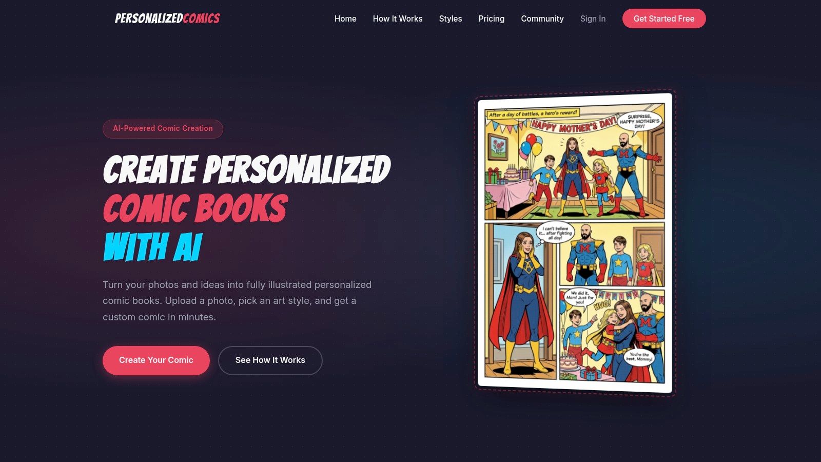
For instance, PersonalizedComics lets users choose among eight professional art styles, upload photos to turn real people into stylized characters, and generate full comic pages with panels, dialogue, narration, and speech bubbles. Used well, a tool like that is less like an automatic artist and more like a fast visual workshop. You still need to decide what should stay fixed and what should change.
Don't ignore production basics
Execution also includes the file itself. Clean line art can fall apart in print if the page is built at the wrong size or resolution.
For professional U.S. comic production, the standard trim size is 6.625″ × 10.1875″ with 300 DPI for color art, according to this reference on comic strip print sizes. If the file resolution drops too low, thin lines soften, color edges break down, and details that felt controlled on screen can print muddy.
Style lives in those technical choices too. A crisp, minimal drawing style depends on crisp reproduction. A heavily textured style depends on the texture surviving output. If your production setup fights your visual language, the reader will feel that friction even if they cannot name it.
Start Telling Your Story Today
You are staring at the same scene drawn three different ways. In one version, the joke lands. In another, the moment feels tense. In the third, the reader notices the rendering more than the story. That is what style does. It changes how the reader reads.
Comic strip style works like an actor's delivery of the same line. The words may stay the same, but timing, tone, framing, and expression change the meaning. In comics, those choices include line weight, color, shading, panel layout, camera angle, lettering, and how consistently those choices repeat from page to page. Style is not decoration sitting on top of the story. It is part of the storytelling system.
That is good news for beginners, because it means you do not need to solve everything at once.
Start with one short scene. Try it in a few different visual approaches. Draw or generate it once with simple, open shapes and wider panels. Then try tighter close-ups, heavier shadows, or a more exaggerated character design. Compare the reading experience, not just the picture. Which version makes the pause feel longer? Which one makes the emotion easier to read? Which one guides the eye without effort? That comparison teaches more than memorizing style labels ever will.
If you are using AI tools, the same rule applies. Do not ask only, “Which style looks cool?” Ask, “Which style helps this scene do its job?” AI can produce surface variation fast, but storytelling still depends on your choices about clarity, emphasis, pacing, and point of view.
The best way to learn style is to make small decisions on purpose, then watch how those decisions change the story.
If you want a simple place to experiment, PersonalizedComics lets you test different comic strip styles, turn photos into characters, and build complete comic pages from your own ideas without needing to draw every element by hand. Used that way, it becomes a fast practice space for learning how visual language shapes the reader's experience.