The good news is that the process is more accessible than it used to be. You still need story judgment, page sense, and patience. But you no longer need to do every part of the pipeline by hand to create graphic novel pages that read cleanly and look intentional.
What matters most is choosing the right workflow at the right stage. Script first when your plot is fragile. Thumbnail early before you commit to finished art. Use AI tools for prototyping when speed or draft exploration matters. Print a test copy before you trust what looked fine on a screen.
Developing Your Core Story and Script
A workable graphic novel usually starts smaller than people expect. Not with lore. Not with worldbuilding documents. It starts with a dramatic engine you can return to page after page: a promise, a conflict, a relationship under pressure.
If you want to create graphic novel work that survives production, write down three things first:
- Who wants something
- What blocks them
- Why that conflict belongs in pictures
That third point matters. A graphic novel isn't a prose novel with illustrations dropped in. The medium rewards visible action, body language, setting shifts, page turns, and silence. If a key emotional beat only works as internal monologue, you probably haven't translated it into comics yet.
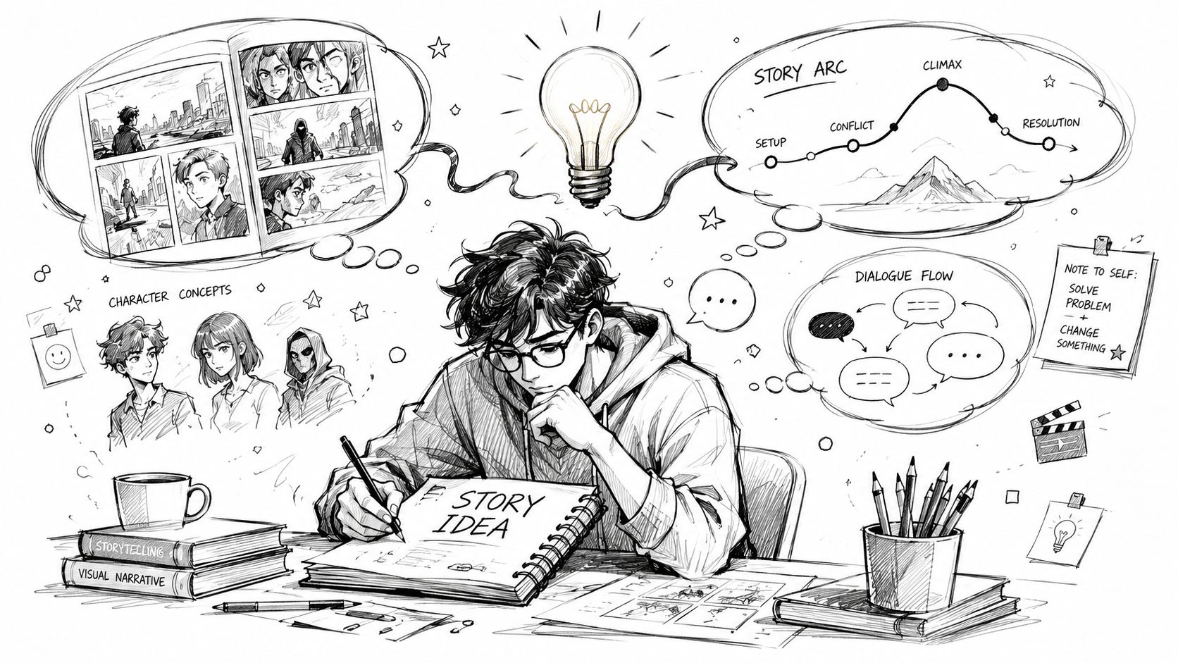
Write scenes that can be drawn
A clean comics script doesn't need to be fancy. It needs to answer practical questions for each page. What happens? Who is in frame? What must the reader notice? What dialogue earns its space?
A simple working format looks like this:
- Page number
- Panel number
- Visual description
- Dialogue or caption
- Important emphasis for pacing or reveal
That forces discipline. Instead of writing, “She reflects on her difficult childhood,” you write, “Panel 3. She stares at the untouched birthday cake while her phone screen shows missed calls from her mother.” One can be drawn. The other is a note to yourself.
If you want a more concrete model, this guide on how to write a graphic novel script is useful for seeing how page and panel descriptions can stay functional without becoming bloated.
Practical rule: If an emotion can be shown through action, posture, prop choice, or panel sequence, cut the explanatory dialogue first.
Plot first isn't the only valid method
Most tutorials push a plot-first workflow. That works, and for many books it's the safest route. But not every creator thinks that way. A smaller group of indie creators use a dialogue-first or theme-first method, where the characters emerge from conversations rather than fixed bios. One source puts that at 12% of successful indie creators in a discussion of alternative comics process on Ben Argon's philosophy comics process.
That approach can work well when your story depends on tension in voice rather than action spectacle. It's especially useful for memoir, relationship drama, philosophical comics, or quieter books driven by subtext.
The trade-off is real:
| Approach | Works well when | Usually breaks when |
|---|---|---|
| Plot-first | You need firm structure, reveals, and clean pacing | Characters start sounding mechanical |
| Dialogue-first | Voice and theme are your strongest assets | Visual planning gets postponed too long |
| Theme-first | You know what the book is about emotionally | Scenes stay abstract and never dramatize |
A practical compromise is to draft a few pages of raw dialogue, then reverse-engineer the scenes. Ask: where are they standing, what are they doing, what changes by the end of the exchange, and what deserves a page turn?
That's how the script starts becoming comics instead of notes for a future comic.
Crafting a Cohesive Visual Style
A visual style isn't decoration. It's a production decision. It affects speed, readability, emotional tone, and whether the book feels like one world or a pile of disconnected images.
A lot of beginners chase “good art” in the abstract. That usually wastes time. The better question is whether the art style fits the story and can be repeated across dozens or hundreds of pages without collapsing.
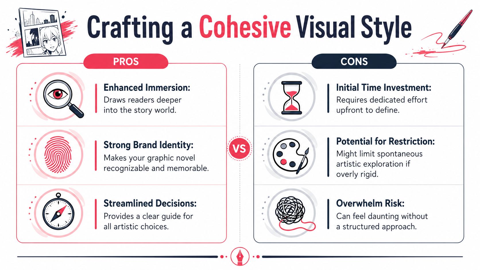
Pick a style you can sustain
If your story is intimate and character-driven, ultra-detailed rendering may hurt more than help. If your book relies on atmosphere, a flatter cartoon style may need stronger lighting and shape design to carry mood. The right style is the one that survives repetition.
Use a reference sheet before you build pages. Keep:
- Front, profile, and three-quarter character views
- A small library of expressions
- Recurring props and costume details
- A short color and texture note for each setting
This matters even if you're using digital tools or AI-assisted generation. Consistency doesn't happen because software exists. It happens because you define what counts as “on model.”
Thumbnailing is not optional
Most production mistakes happen before the “pretty” stage. They happen when the page hasn't been tested small.
Thumbnailing fixes that. Tiny rough page sketches reveal whether a scene reads left to right, whether a reveal lands too early, whether a dialogue-heavy page needs breathing room, and whether a dramatic beat deserves a larger panel.
The speed argument is strong. One workflow study cited in a practical guide found that creators who thumbnail before inking achieve 30–40% faster production cycles, while skipping thumbnails can lead to 2–3x more revision rounds during lettering and coloring, according to Automateed's guide to creating a graphic novel.
Small ugly thumbnails save beautiful finished pages from becoming expensive mistakes.
That matches what working cartoonists learn the hard way. A page can have great drawing and still fail because the reader doesn't know where to look next.
What works and what doesn't
Here's the blunt version.
Works
- Limited style choices: A controlled visual language helps the whole book feel deliberate.
- Clear silhouettes: Readers should identify characters instantly, even when panels get small.
- Early page rhythm testing: You catch pacing problems before they harden into production debt.
Doesn't work
- Inventing style page by page: The book starts to look inconsistent fast.
- Skipping environmental reference: Backgrounds turn generic, then confusing.
- Starting finished art before layout proof: You end up redrawing around structural problems.
If you're not naturally visual, spend more time in thumbnails than you think you need. That's where non-artists often gain the most control.
Speed Up Your Workflow with AI Prototyping
Traditional comics production asks one person, or a very small team, to handle writing, acting, cinematography, design, layout, and production. That's a lot. Even experienced artists can get slowed down by character consistency, background generation, or the simple time cost of rendering page after page.
AI-assisted workflow changes the early and middle stages most. It doesn't replace judgment. It compresses iteration.
Where AI actually helps
The strongest use case is prototyping. You can test whether a scene works before sinking hours into polished art. You can try alternate costume directions, camera angles, or even whole style families and quickly see what supports the script.
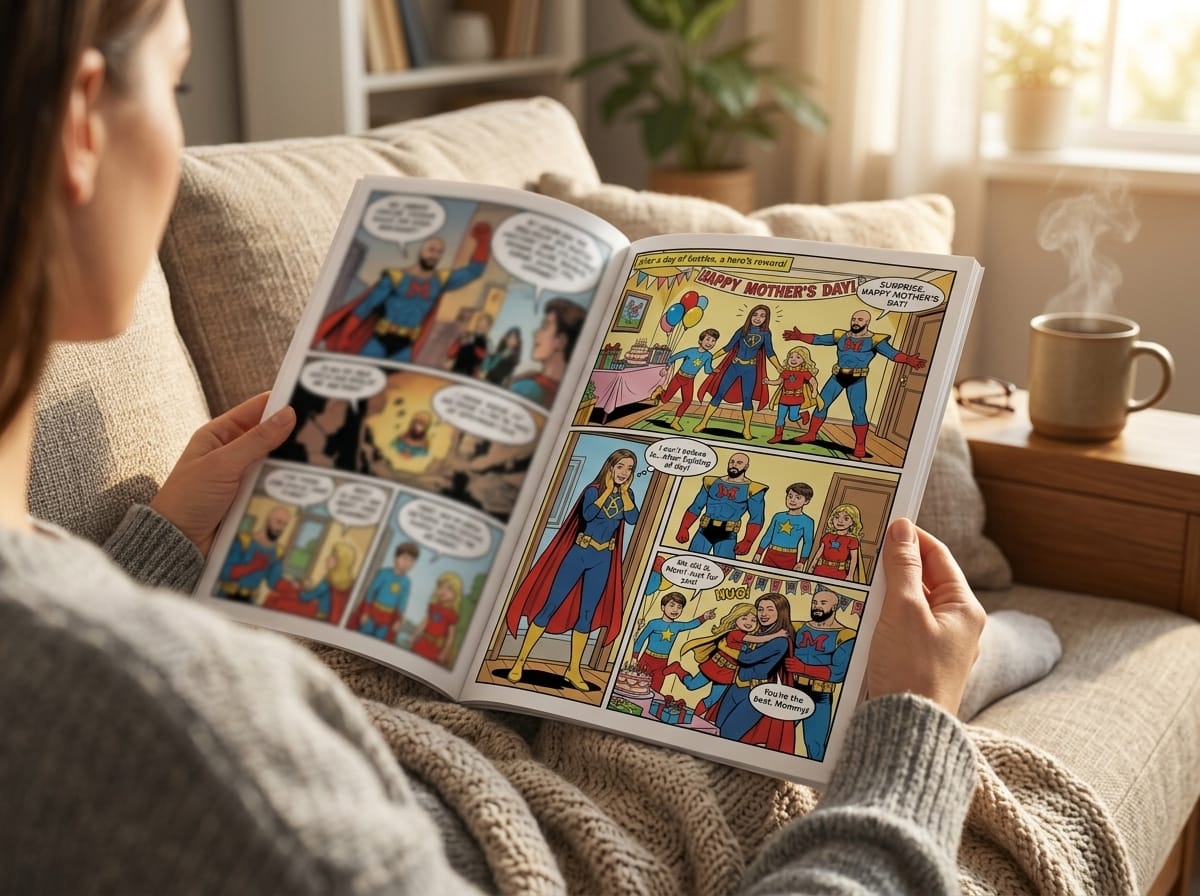
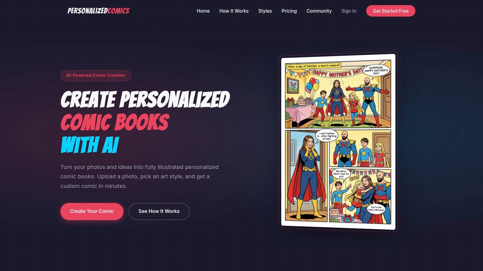
That's especially valuable for people who can write but can't draw at a professional level. A platform like PersonalizedComics' AI story generator based on prompt can turn photos or written character concepts into comic pages with panels, dialogue placement, and stylized visuals. Used well, that gives non-artists a way to build draft pages, pitch samples, gifts, or proof-of-concept chapters without waiting until they can illustrate everything manually.
The key is how you use it. Don't ask the tool to “make a whole book” and hope for coherence. Use it scene by scene, with a locked script, page intent, and recurring reference logic.
Traditional versus AI-assisted workflow
| Stage | Traditional Workflow | AI-Assisted Workflow |
|---|---|---|
| Concept art | Hand sketch multiple passes | Generate variations from prompts or photos |
| Character consistency | Build model sheets manually | Reuse defined character inputs and style settings |
| Background exploration | Research, sketch, redraw | Rapid scene visualization and environment testing |
| Page draft | Pencil thumbnails, then layouts | Generate rough page concepts, then refine |
| Dialogue placement | Add during lettering stage | Preview page with speech bubbles early |
| Revision | Redraw affected panels | Regenerate or revise targeted scenes |
This doesn't mean AI output is production-ready by default. It often isn't. Hands, continuity, eye lines, and panel logic still need checking. But for exploration, previsualization, and first-pass assembly, it removes a lot of friction.
Good use versus bad use
Field note: AI is most helpful when you already know what the page needs to do.
Good use looks like this:
- You have a script page
- You know the emotional beat
- You define style, characters, and setting clearly
- You review output for continuity and pacing
Bad use is treating the tool like a substitute for story decisions. If the script is vague, the page will feel vague. If your cast design changes every scene, the book will feel unstable no matter how fast it was generated.
For many creators, AI is not the final artist. It's the fastest way to get from idea to visible draft, which is often the hardest leap in the whole process.
Composing Pages for Maximum Impact
A graphic novel succeeds panel by panel, but readers remember pages. The page is where rhythm becomes visible. It's where you decide whether a moment lands as a whisper, a collision, or a reveal.
When people struggle to create graphic novel pages that feel professional, the problem usually isn't drawing skill alone. It's page composition. Good composition tells the reader where to look, how fast to move, and what emotional weight to assign each beat.
Control pace with panel size and density
More panels usually create a faster, tighter rhythm. Fewer panels slow the reader down and increase emphasis. A large panel can create wonder, dread, isolation, or spectacle depending on context.
Use that deliberately:
- Rapid exchange: several smaller panels, tight crops, minimal background
- Emotional pause: medium panel with room around the figure
- Reveal or impact: one large panel or splash used sparingly
- Confusion or instability: irregular shapes only if readability survives
A page shouldn't look random. Even chaotic scenes need a clear reading path.
If you want a practical tool for exploring arrangements before committing, this comic panel layout generator guide is useful for thinking through structure and variation.
Guide the eye before you decorate the page
The reader's eye usually follows a natural reading direction, but composition can interrupt or reinforce that movement. Faces, gestures, speech balloons, contrast, and perspective lines all act like arrows.
Here's a quick page check I use:
| Check | What to look for |
|---|---|
| Entry point | Is the first panel obvious? |
| Balloon order | Can dialogue be read without hesitation? |
| Focal hierarchy | Does the most important element read first? |
| Panel transitions | Does each panel clearly connect to the next? |
If any answer is no, fix that before adding texture, lighting, or effects.
A beautiful page that reads out of order is still a broken page.
Lettering is part of storytelling
Beginners often treat lettering as a final technical task. It isn't. Lettering controls emphasis, tone, and breathing room. A balloon placed badly can ruin a panel. A font that doesn't fit the book can make the whole page feel amateur.
Keep these principles in mind:
- Balloon placement first, text polishing second. If the balloon doesn't fit naturally, rewrite the line shorter.
- Leave room around important art. Don't trap expressions under dialogue.
- Use sound effects with intent. They should support action or mood, not act like stickers.
- Avoid overstuffed narration. Comics can carry meaning through sequence. Let them.
The cleanest pages usually come from restraint. Good comics composition feels inevitable. Readers don't stop to decode it. They just move through it.
Preparing Your Book for Print and Digital Readers
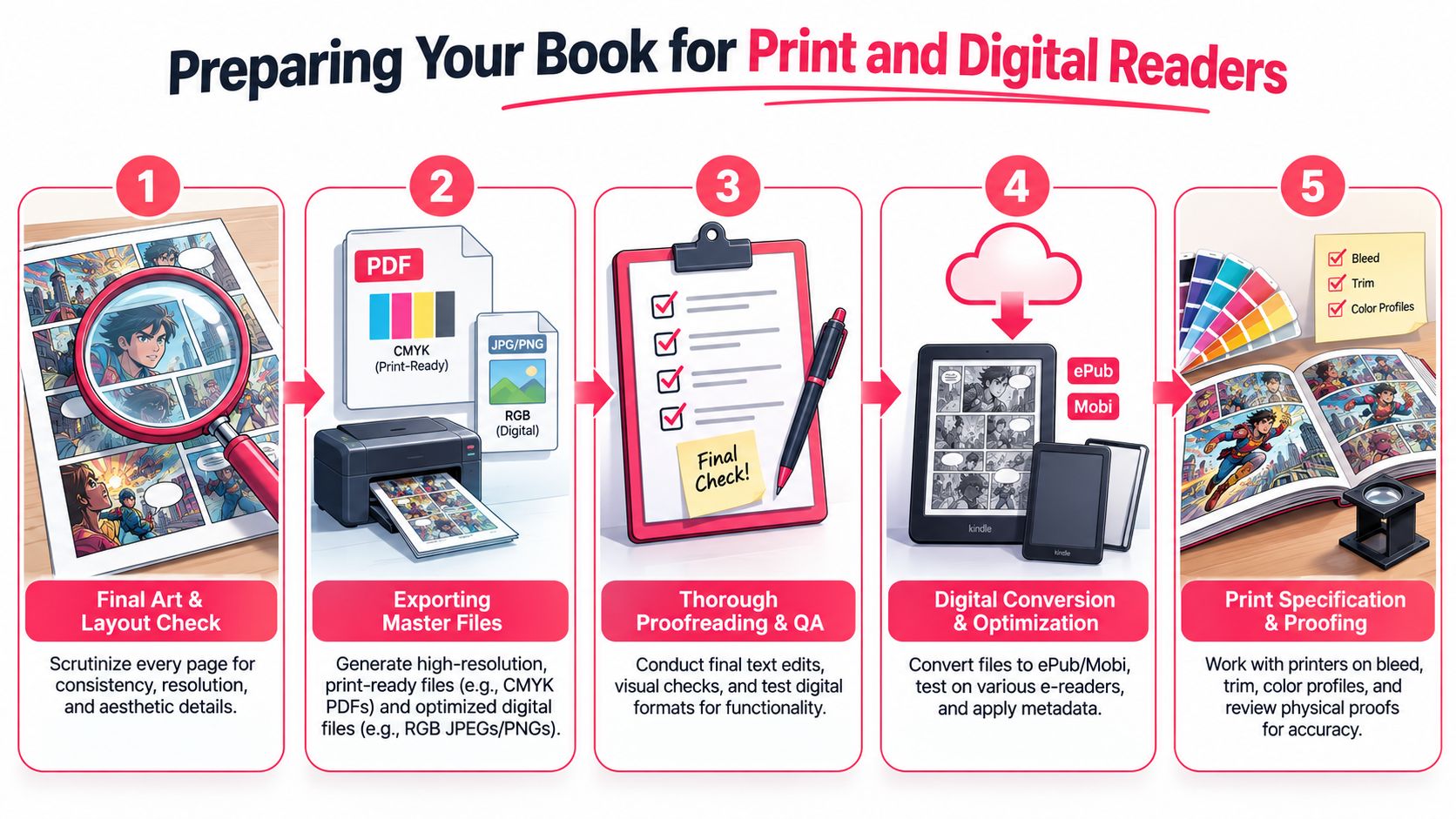
Finishing the pages is a creative milestone. Preparing them for release is a production discipline. During this stage, creators either preserve the quality of their work or accidentally sabotage it with preventable technical mistakes.
The first decision is format. Digital release is flexible and fast. Print gives the work physical authority and exposes flaws that screens forgive. Neither path is automatically better. They punish different kinds of sloppiness.
Meet the technical baseline
Professional print work has minimum technical standards. A practical production guide notes that penciling and inking should be done at 1200 dpi for print-safe line art, and finished art should be scanned at a minimum of 600 dpi to catch color and clarity issues before release, as described in Barker Books' graphic novel creator workflow.
Those numbers matter because line art that looks fine on a screen can break down in print. Edges soften. blacks lose crispness. Fine details muddy together.
A final export pass should include:
- Resolution check: confirm line art and scans meet print needs
- Color review: look for muddy shadows, oversaturated skin, and weak contrast
- Text audit: confirm balloon text is legible at actual print size
- Trim awareness: keep critical art and dialogue away from edges
Why physical proofing catches what screens miss
A notable trend in 2024–2025 is that 34% of new creators order premium physical copies early to test panel readability and color mood before final digital release, according to Clara Lieu's discussion of starting with graphic novels.
That makes sense. Screens flatten certain problems. Printed pages expose cramped gutters, balloons that feel larger than expected, and values that looked distinct digitally but merge in ink.
“Physical-first” prototyping proves its worth. Order one high-quality proof before you commit to a wider release. Hold it at reading distance. Turn pages at normal speed. Watch where your eye snags.
Production checkpoint: A printed proof is not a souvenir. It's a diagnostic tool.
Print versus digital decisions
| Format | Strength | Risk |
|---|---|---|
| Digital | Fast distribution, easy updates | Pages may be designed too screen-dependent |
| Print-on-demand | Low barrier for physical copies | Weak files become obvious immediately |
| Offset or larger print runs | Strongest unit presentation | Mistakes get multiplied at scale |
If you're using AI-assisted art, physical proofing matters even more. Screen output can hide repetition, soft detail, or color imbalance. Print is unforgiving in a useful way.
The creators who take this phase seriously usually end up with books people trust to hold, gift, and reread.
Your Journey as a Published Creator
By the time you've written the script, built the visual language, tested thumbnails, composed readable pages, and proofed the files, you've already done something substantial. You didn't just “have an idea.” You built a reading experience.
That matters because graphic novels are no longer a side format for a narrow audience. The business case is strong. The global graphic novel market was estimated at USD 18.1 billion in 2026 and is projected to reach USD 45.16 billion by 2035, with a 7.2% CAGR during that forecast period, according to Business Research Insights' graphic novel market report. That projection should be read as a market forecast, not a guarantee for any one creator, but it does show that the format has real momentum.
The practical takeaway isn't “rush to publish.” It's that the audience for this medium is broad enough to support many kinds of books. Personal memoirs. Fiction prototypes. Gift comics. Educational stories. Family keepsakes. Stylized experiments that would never have made it through a traditional art pipeline a few years ago.
The modern path is more open
The old bottleneck was simple. If you couldn't draw at a high level, you often stopped before page one. Now the path is more modular. Writers can prototype. Hobbyists can test styles. Parents can turn family stories into comics. Artists can offload rough ideation and focus their energy on decisions that matter more.
That doesn't remove craft. It redistributes it.
Here's what still counts most:
- Story clarity: readers forgive rough edges faster than confusion
- Page readability: the eye has to move cleanly
- Consistency: even a stylized or AI-assisted book needs internal logic
- Revision discipline: first outputs are rarely final outputs
What published creators learn
Most creators don't finish because they lack ideas. They don't finish because they chose a workflow that fought them. They over-rendered too early. They avoided thumbnails. They kept rewriting while pages were already in progress. They trusted the screen and skipped the proof.
A better approach is plain and durable. Lock the core story. Build a visual system you can sustain. Prototype fast when needed. Print before release. Then ship the thing.
If your goal is to create graphic novel work that people can read, hold, gift, or buy, that workflow gives you a real chance.
If you want a fast way to turn a script, character idea, or even personal photos into draft comic pages, PersonalizedComics is one practical option. It lets you generate illustrated comic pages in different art styles, maintain character consistency from photos or descriptions, and order a physical copy once you're ready to test or share the book.
Filed under Making Your Comic