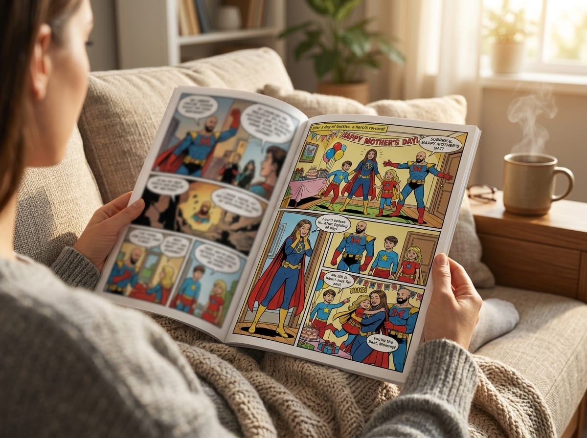
Learning how to make a photo comic is less about applying a cartoon filter and more about managing a complete visual pipeline. You'll plan the story, prepare reference images, choose an art direction, generate panels, build readable pages, check continuity, and export files for screens or print. The workflow below focuses on the part that beginner tutorials often skip, keeping real people recognizable across multiple pages while preserving wardrobe, lighting, props, and setting.
What a Photo Comic Is and Why It Works
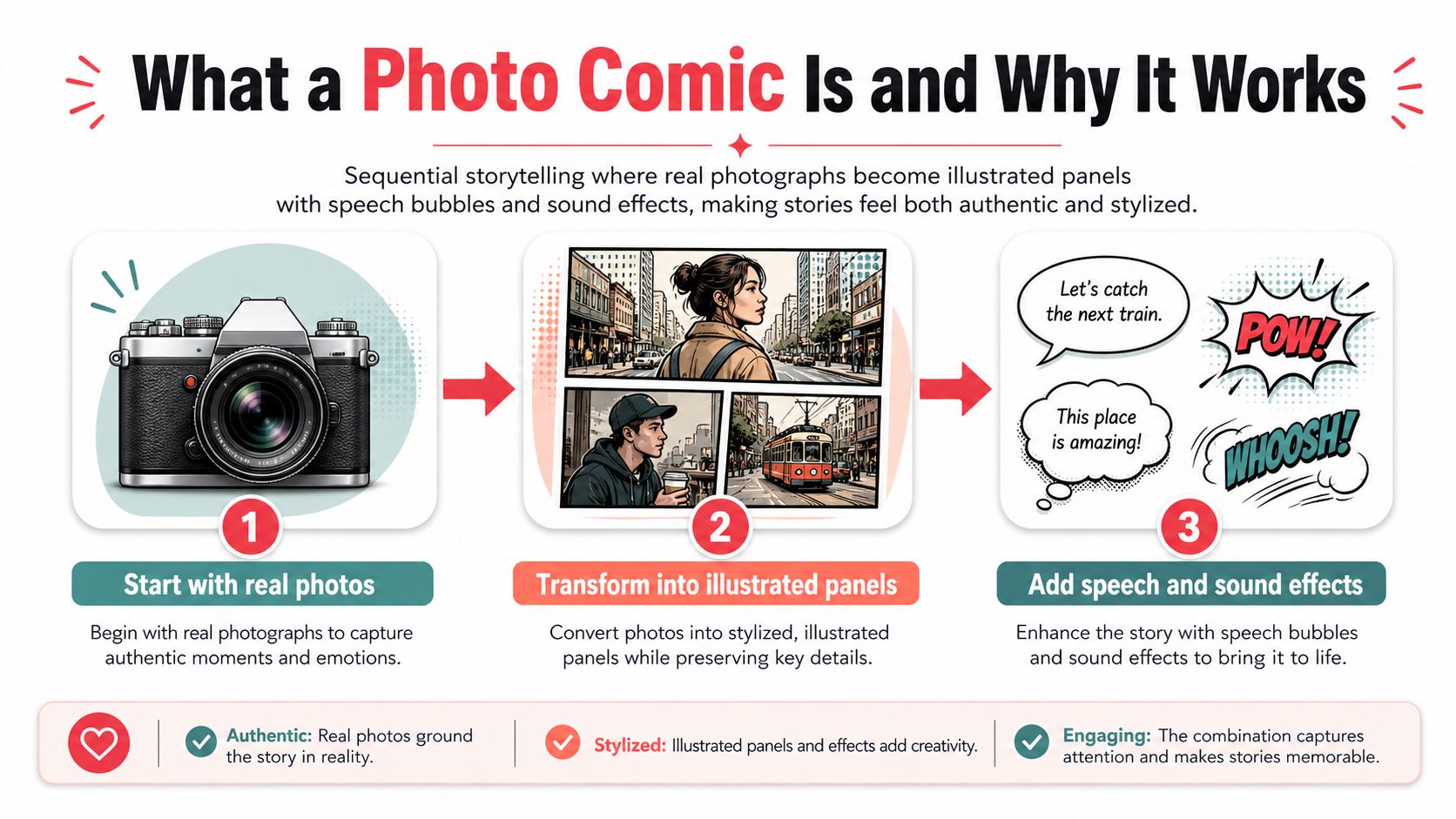
A photo comic turns photographs into a sequential story through illustrated or stylized panels. The page keeps recognizable people, places, pets, and objects while adding the visual grammar of comics: speech balloons, captions, narration, panel borders, and sound effects. The treatment may resemble hand-drawn art, paint, ink, film stills, or something deliberately artificial. The reader still understands the story by moving from panel to panel.
That recognition gives the format much of its impact. A familiar face or bedroom can establish character and place before any dialogue appears. Style then controls the distance from reality, making the same source image feel playful, dramatic, nostalgic, or commemorative. This makes a photo comic suitable for a birthday gift, memoir, classroom project, humorous social post, or early version of a longer graphic story.
Its history also explains why the form feels so direct. A historical study hosted by the University of Málaga traces links between comics and photography to the 1870s and 1880s, including A. B. Frost's strips from 1879 to 1883, which were influenced by Eadweard Muybridge's motion studies. It also identifies an early two-panel photo comic printed around 1900 in Album Noël historical study of comics and photography. Later, photo novels and photo comics became commercial genres, especially in Italy and France, then spread to Latin America and North America photo-comic history and distribution.
The pipeline in plain terms
- Plan the story. Define the characters, setting, conflict, tone, and page beats.
- Prepare the photos. Choose useful references, remove distractions, and build character sheets.
- Choose the style. Match the visual treatment to the story, not just to an attractive sample.
- Generate and refine panels. Work panel by panel when likeness and continuity are important.
- Lay out the page. Add balloons, captions, sound effects, borders, and enough open space for reading.
- Export and review. Check digital files at reading size, then prepare a print-ready version when needed.
The recurring failures are easy to recognize. Likeness drifts, clothing changes, props vanish, and locations turn generic when references are inconsistent or prompts are loosely controlled. Across several pages, a usable character needs more than a similar face. The wardrobe, hair, body proportions, lighting, key props, and setting must continue to support the same person and scene.
A successful photo comic is therefore a connected sequence, not a gallery of attractive images. Each panel should look like the same character inhabits the same story.
Planning Your Story and Prepping Your Photos
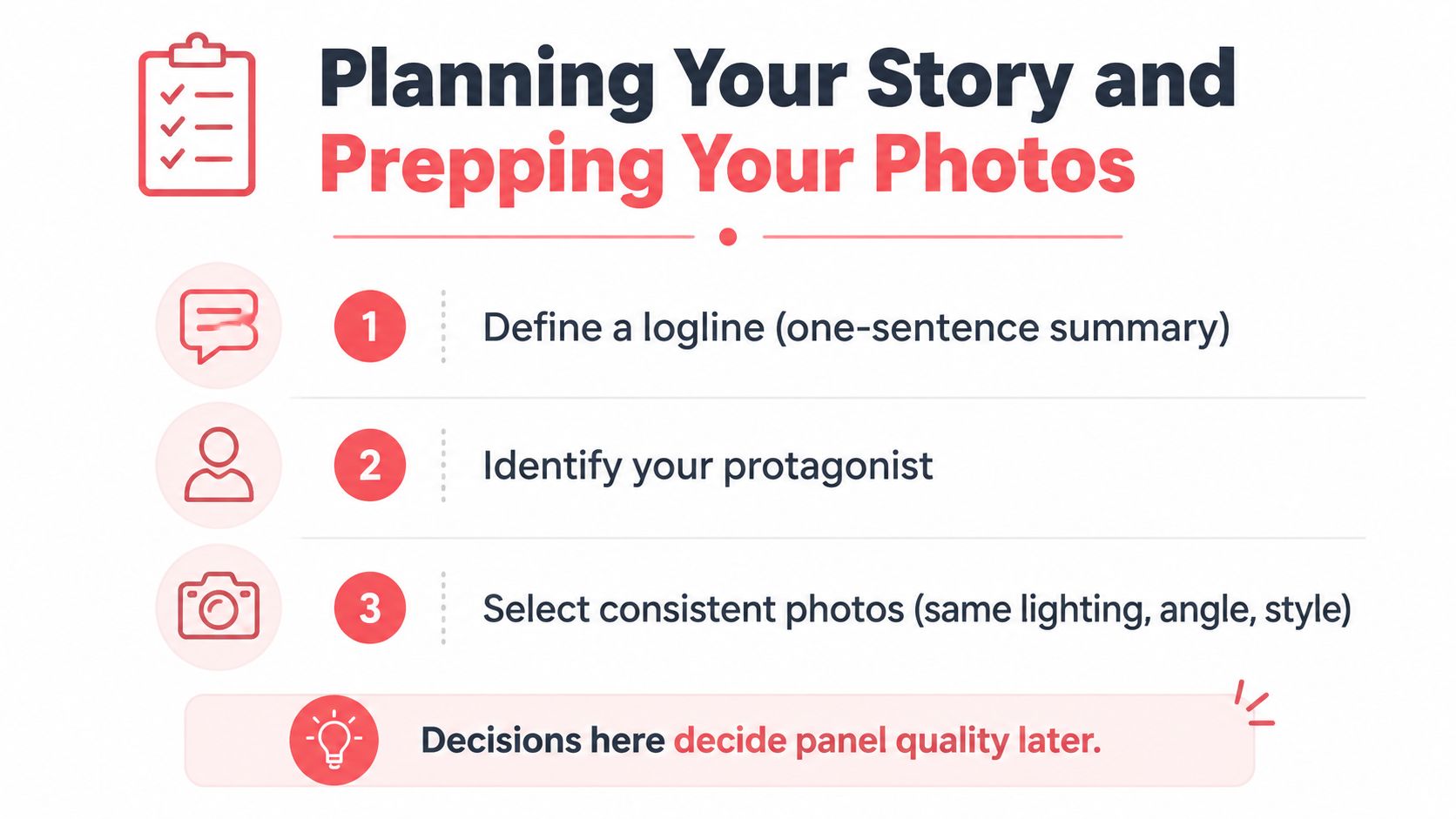
A strong photo comic is usually decided before any image reaches a generator. Write a short story with clear beats, then give each panel a specific job. Improvised sequences often produce attractive frames that fail to connect, especially once the character's face, clothing, or surroundings begin changing from page to page.
Start with a one-sentence logline. State who the story follows, what that person wants, and what blocks the goal. Identify the protagonist, opposing force, recurring setting, and emotional change. The opposing force can be a deadline, misunderstanding, locked door, or the character's own reluctance.
Turn the idea into page beats
Divide the plot into a beginning, middle, and end, then assign each page one change in the situation. List only the panels needed to show that change. Record the details that will affect production:
- Page purpose: What information or decision changes here?
- Panel action: What must the reader see rather than infer?
- Text requirement: Is dialogue, a caption, or silence the clearest choice?
- Continuity anchors: Which outfit, prop, room, weather condition, or light direction must match earlier panels?
- Reference need: Does this panel require a new pose, angle, expression, or location photo?
That last item prevents a common waste of time. If you wait until layout to discover that a needed gesture or room view was never photographed, you may have to rebuild several panels around a substitute. Keep the first beat sheet lean. If an image needs a paragraph of explanation, revise the visual action until the reader can follow it directly.
Build a dependable photo set
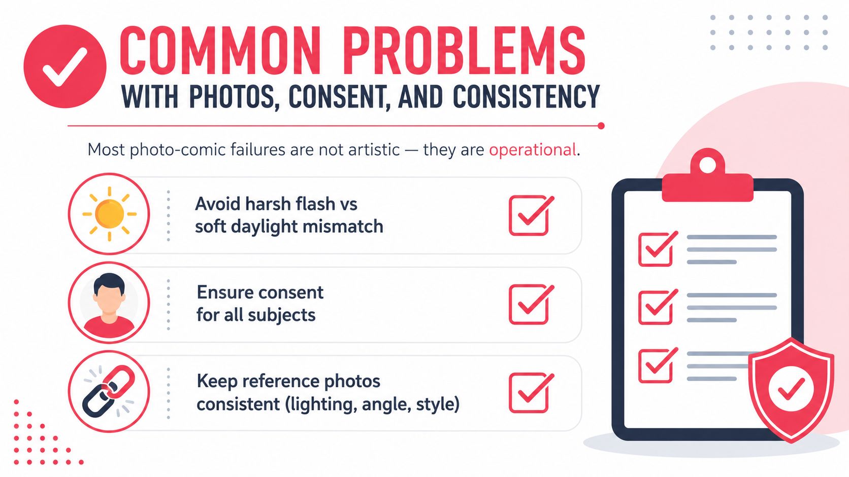
Select references with consistent lighting direction, camera distance, and background treatment. A harsh flash portrait beside a soft daylight image can make one person appear to be two subjects. Neutral backgrounds reduce visual noise in character references, while location photos preserve the rooms, streets, and landmarks that make the story recognizable.
Collect views that solve different production problems:
- A face close-up for eyes, nose, mouth, and hair.
- A three-quarter view for profile and jaw structure.
- A full-body image for height, silhouette, shoes, and clothing.
- A neutral expression as a stable identity anchor.
- Separate images of recurring props, pets, rooms, or landmarks.
Before generation, remove clutter, correct exposure, and crop distractions. Keep the originals untouched, then make cleaned working copies. For a recurring character, assemble a reference sheet with the face, hairstyle, outfit, accessories, identifying features, and alternate expressions. Add a short written description, but let the images carry the identity. Record wardrobe changes and label which outfit belongs to each page, since a model may otherwise blend separate looks.
Practical rule: Lock the character design before solving panel composition. A polished page is expensive to rebuild when the character no longer resembles the person introduced at the start.
Choosing an Art Style That Fits Your Story
Style should clarify the story's mood, not compete with it. A soft watercolor treatment may support a family memory, while noir shadows can make an ordinary hallway feel suspicious. Choose a visual system you can maintain across every page, because style inconsistency is especially noticeable when the source subject is a real person.
| Style | Mood & Look | Best For |
|---|---|---|
| Manga | High-contrast inks, expressive eyes, energetic framing | Coming-of-age stories, action, emotional reactions |
| Classic American superhero | Bold outlines, saturated primary colors, muscular silhouettes | Superhero plots, fights, ensemble casts |
| Graphic novel | Muted realism, painterly texture, restrained color | Memoir, literary stories, slice-of-life |
| Noir | Heavy shadows, halftone texture, limited palette | Detective stories, crime, suspense |
| Watercolor | Soft washes, visible brushwork, gentle edges | Nostalgia, children's stories, quiet personal moments |
| Cyberpunk | Neon glow, hard edges, dense technical detail | Dystopian fiction, science fiction, urban adventures |
| Retro pop | Ben-Day dots, flat colors, vintage typography | Satire, period pieces, comic gags |
| Fantasy | Detailed linework, ornate clothing, lush environments | Myth, quests, adventure, magical realism |
Compare style against production risk
Manga and superhero styles often make expressions and action easy to read, but strong stylization can alter facial proportions. Graphic novel and watercolor approaches may preserve a person's general appearance more gently, though subtle expressions can become less clear. Noir can unify mismatched backgrounds through darkness, while cyberpunk and fantasy introduce many details that can drift from panel to panel.
Retro pop is useful when you want typography and color to carry some of the storytelling. It can also expose weak lettering quickly, so plan the title treatment and sound effects rather than adding them as an afterthought.
For a visual reference when selecting a treatment, compare the approaches in this guide to comic book style artwork. Whichever style you choose, write a fixed style description for every generation prompt. Keep the line quality, palette, texture, and rendering language stable, then vary only the scene action and camera direction.
Laying Out Panels, Speech Bubbles, and Sound Effects
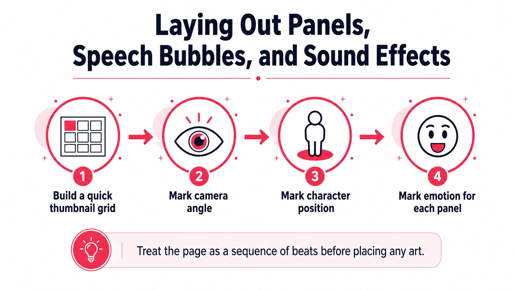
A page needs a clear reading path. Before generating finished art, sketch a thumbnail grid and mark each character's position, gaze direction, camera view, and emotional beat. Rough boxes on paper are enough. This quick pass solves pacing before you spend time correcting faces, clothing, or backgrounds that may later need to remain consistent across pages.
Research on comic layouts found an average of 5.32 panels per page, with a median of 5 panels, so five panels make a useful pacing benchmark comic panel-count research. A practical five-panel rhythm is:
- Establish the place or situation.
- Show the character's immediate goal.
- Introduce a turn, interruption, or discovery.
- Give the character room to react.
- Close the beat with a decision, joke, reveal, or visual consequence.
Use this as a starting point, not a fixed template. A full-width panel can slow the reader for a reveal. A narrow vertical panel can make a fall, glance, or sudden movement feel abrupt. Five equal rectangles are easy to generate, but they often flatten the page. Change panel size when the story beat supports it, and keep recurring locations or wardrobe details large enough to check for continuity.
Write text before locking the art
Draft dialogue before finalising panel dimensions. Word count changes the usable image area, and a late balloon can cover a face, hand, prop, or clothing detail needed for likeness. Research on comic reading found that viewing time increased with word count per panel, while blockage and separation affected navigation research on words, blockage, and comic navigation. Keep dialogue concise and let the image carry information where possible.
Use balloon shapes as visual instructions:
- Rounded balloons for ordinary speech.
- Jagged balloons for shouting or alarm.
- Cloud balloons for thoughts.
- Dashed balloons for whispers or uncertain sound.
Place each balloon near its speaker, with the tail pointing clearly toward the mouth or body. Readers should identify the speaker without tracing lines across the panel. Reserve empty space before approving an image, especially above heads and in the direction a character faces.
Sound effects should belong to the scene. A large BAM, WHOOSH, or CRACK can follow the perspective, overlap an object, and share the panel's lighting. Flat lettering pasted over a carefully rendered image often looks disconnected. Plan the lettering with the composition. For balloon shape, placement, and readability, use this speech bubble design reference.
Generating Pages and Refining Character Likeness
Treat generation as an iterative photography and editing process, not a single command. First, select a stable identity reference from your prepared set. A front-facing or near-front-facing image with clean lighting and a neutral expression usually gives the system a clearer anchor than a heavily posed or obstructed photograph.
Create a fixed character block for your prompts. Include the person's hair, face shape, age impression, wardrobe, accessories, and any distinctive feature. Add a fixed style block, such as a consistent manga ink treatment or graphic-novel rendering, and keep that wording unchanged across panels. Only alter the action, location, camera angle, and emotional beat.
Generate the difficult parts separately
When likeness matters, generate one panel at a time. A single subject and a focused prompt make it easier to identify whether a failure came from the face, clothing, pose, background, or style. Full-page generation can be convenient for a rough storyboard, but it often makes continuity errors harder to isolate and correct.
If the result has the wrong jacket or a changed nose, rerun the same prompt before making broad revisions. Small wording changes can create larger visual changes than expected. Save each successful frame with its prompt, reference filename, and generation settings. A simple folder structure can prevent hours of searching later:
01_references02_storyboard03_panel_generations04_approved_panels05_layouts06_exports
Don't approve a panel because the face looks good in isolation. Compare it against the previous and next panel at the same viewing size. Check hairstyle, eye shape, clothing, accessories, body proportions, background landmarks, shadow direction, and the position of recurring props.
The fastest workflow is often the one that makes fewer irreversible decisions.
Use a continuity gate
Before placing a panel into the page, mark it approved or rejected against a short checklist. If one detail breaks, regenerate or edit that panel while the surrounding work is still flexible. Once the page is assembled, correcting a single face may require moving balloons, captions, and neighboring panels.
AI-assisted photo-to-comic services increasingly offer reusable characters, style selection, and paneled scripts from one or a few clear front-facing photographs photo-to-comic character and comic-generation workflow. That convenience is useful for testing ideas, but a multi-page story still needs human review. Verify that the same person remains recognisable, that wardrobe changes happen only when the plot calls for them, and that the setting doesn't jump without a narrative reason.
Common Problems With Photos, Consent, and Consistency
Many failed photo comics don't fail because the creator lacks artistic taste. They fail because the source material and production rules were never standardised. Likeness drift often begins with a reference set containing different lighting, distances, expressions, and backgrounds. The model receives conflicting signals, then produces a plausible character who no longer matches the person.
Standardise what you can before uploading. Use similar lighting, clean crops, and a consistent description. If the character changes clothes during the story, record the change as part of the plot. If the jacket must remain the same, repeat its exact description in the character block instead of assuming the generator will remember.
Treat consent as part of the creative brief
Get written permission before using a recognisable person's face, especially when you plan to share, sell, or print the comic. For minors, obtain permission from a parent or guardian. Review the background as well. A visible logo, artwork, branded product, or private document can create a separate rights or privacy issue even when the main subject has agreed to the project.
Store release forms with the source-photo folder, not in a separate place you may lose later. Record who appears in each image and what uses they approved. If a friend agrees to a private birthday gift but not public posting, respect that boundary.
Run a final operational check
Zoom to actual reading size and inspect every face. Then check:
- Lighting: Does the direction of the light remain plausible?
- Wardrobe: Are clothing colors, layers, shoes, and accessories correct?
- Setting: Do backgrounds match the scene or provide a deliberate transition?
- Props: Are important objects present, shaped correctly, and held consistently?
- Rights: Are permissions documented and unwanted logos removed?
- Text: Are balloons readable without covering eyes, hands, or key action?
Print preparation also exposes technical mistakes. Ask the printer for its current file specifications, including color space, resolution, bleed, and safe areas, because requirements vary between services. Never assume that a file that looks sharp on a phone will reproduce cleanly on paper.
Exporting Digital Files and Ordering a Physical Comic
Exporting is part of making the comic, not an administrative task at the end. Keep a layered working file when possible, then create separate versions for digital reading and print. Digital readers need clear text at ordinary screen size, while print requires attention to trim, bleed, color conversion, and the way a bound page sits near the gutter.
For a print project, follow the printer's specification rather than relying on a universal preset. Confirm the required PDF standard, image resolution, color space, bleed, trim marks, and safe margins. For a digital share, a high-quality PDF or image export may be sufficient, but check the file on a phone, tablet, and desktop if the comic will be distributed across screens.
Inspect the proof before ordering
A proof is your last chance to catch an expensive mistake. Check page order, cover alignment, gutter safety, text size, panel borders, color balance, and every placed photograph. Look at faces at full size, then view the entire spread to make sure the page still reads as a sequence.
Binding should follow the physical experience you want. A lightweight stapled format suits a short zine, while a more substantial binding works better for a longer narrative or an heirloom gift. Cover finish and paper choice also affect how the art feels, especially with dark noir palettes, watercolor textures, or large areas of saturated color.
The practical publishing checks in this guide to self-publishing a comic book are useful when you move from a finished digital file to a physical edition. Order a proof before committing to a larger print run, and request corrections if the trim, color, or text doesn't match your approved file.
Archive the original photographs, cleaned references, prompts, approved panels, layered layouts, fonts, and export settings. That archive protects your ability to create a sequel, replace a damaged page, or order another copy without rebuilding the project from memory.
PersonalizedComics lets you upload photos, choose from eight professional art styles, and generate illustrated comic pages with panels, speech bubbles, sound effects, and narration, which can simplify the panel-generation and print workflow described above. Visit PersonalizedComics to turn your prepared references and story beats into a personalized comic, then review the pages carefully for likeness and continuity before ordering a physical copy.
Filed under Making Your Comic