Unforgettable Ink: 12 Of The Best Comic Book Covers Ever Made
A great comic book cover does more than just advertise; it’s a gateway. This single, static image has the immense task of capturing a universe of action, emotion, and story, all while compelling you to turn the page. The truly great ones become cultural touchstones. From the explosive debut of a new hero to a quiet, symbolic image that redefines a genre, the best comic book covers ever are masterclasses in visual communication. They establish tone, introduce legendary characters, and sometimes, change the entire course of the industry.
In this detailed roundup, we will dissect 12 of these legendary covers, from Action Comics #1 to Saga #1. Our focus extends beyond just their historical importance. We will break down the specific design principles that make them immortal, such as:
- Composition: How elements are arranged to guide the eye and create impact.
- Color Theory: The use of palettes to set a mood and generate an emotional response.
- Symbolism: The hidden meanings and conceptual depth behind the visuals.
For each iconic example, we will provide clear, actionable takeaways. These insights are designed to show you how to apply these classic techniques to your own creative projects. Whether you are designing a gift for a friend or storyboarding your own graphic novel, you can use these lessons to bring your unique vision to life. This guide will help you understand the art of the cover, turning admiration into practical skill.
1. Action Comics #1 (1938) – Superman's Debut
No list of the best comic book covers ever could begin anywhere else. The cover for Action Comics #1, illustrated by Joe Shuster, is the genesis of the superhero genre as we know it. It presents a single, powerful moment: Superman, in his first appearance, effortlessly lifting a green car as terrified onlookers flee. This wasn't just a drawing; it was a statement.
The image established the visual vocabulary for superheroism. Its genius lies in its simplicity and directness. Shuster didn’t need a complex scene to show Superman’s strength. The central action of lifting the car says everything. The bright primary colors of Superman’s costume against the chaotic background ensure he is the immediate focal point, a technique that would become a standard for decades. This cover is a masterclass in demonstrating character through one defining act.
Creating Your Own Iconic Moment
To capture this energy for your personalized comic, focus on a single, defining action. What one movement perfectly communicates your character's core ability or personality?
- Define a Central Action: Instead of a static pose, show your character doing something. Are they stopping a runaway train, commanding lightning, or outsmarting a foe? The action is the story.
- Use Bold Color Theory: Employ a simple, high-contrast color palette to make your hero pop. Think about how Superman’s red and blue stand out against the muted greens and grays of the background.
- Center Your Hero: Place your main character in a dominant position on the cover. This immediately tells the reader who the story is about and establishes their importance.
- Convey Clear Emotion: The reactions of the background characters on the Action Comics #1 cover add to the drama. Use onlookers to show the impact of your hero's actions, whether it’s awe, fear, or inspiration.
This approach is perfect when you need to introduce a new character and immediately establish their power and purpose. By focusing on one dynamic, visually arresting moment, your cover will not just attract attention but tell a story before the first page is even turned.
2. The Amazing Spider-Man #300 (1988) – Todd McFarlane's Venom
Todd McFarlane’s cover for The Amazing Spider-Man #300 is a landmark in comic book art, introducing the terrifying villain Venom in a pose that oozes menace. The composition is a masterwork of tension, with Spider-Man caught off-guard in the foreground while the massive, muscular form of Venom looms behind him, a toothy grin promising chaos. This cover is an exceptional piece and easily one of the best comic book covers ever.
McFarlane’s intricate line work and dynamic anatomy broke from the cleaner styles of the past, bringing a new level of detail and energy to the page. The stark black of Venom's costume, punctuated only by the jagged white spider emblem, creates a powerful visual that dominates the scene. This wasn't just a character reveal; it was the arrival of a new, darker aesthetic that would define the look of comics for years to come.
Creating Your Own Menacing Antagonist
To generate the same sense of dread and conflict for your personalized comic, focus on making your villain visually and psychologically intimidating. Use character placement and detail to build a narrative of conflict.
- Layer Characters for Tension: Position your antagonist behind or above your hero to create an immediate sense of dominance and threat. This simple layering technique tells a story of an impending confrontation.
- Employ Dramatic Lighting: Use strong shadows and high-contrast lighting to sculpt your villain’s form and obscure parts of their face. What you don't see can often be more frightening than what you do.
- Focus on Intricate Details: Add specific textures, expressions, or costume elements that suggest a complex and dangerous personality. Venom’s monstrous grin and lolling tongue aren’t just details; they are character traits.
- Tell the Story from a Villain’s Perspective: Frame the cover so the villain appears to be the central figure, with the hero reacting to their presence. This establishes the antagonist as a powerful force driving the story.
This approach is ideal for introducing a significant new threat or for a story arc centered on a powerful antagonist. By making your villain the focal point of the conflict on the cover, you promise a high-stakes story that readers will be eager to explore.
3. Watchmen #1 (1986) – The Comedian's Badge
Dave Gibbons’ cover for Watchmen #1 is a masterwork of minimalist design that forever changed what a superhero comic cover could be. It features a tight, extreme close-up of a single object: a yellow smiley-face badge, its cheerful grin corrupted by a single, ominous drop of blood. This deceptively simple image rejected the era's bombastic, action-heavy trends in favor of quiet, symbolic storytelling.
The genius of this cover is its ability to communicate the entire tone and thesis of the series. The blood smear on the optimistic symbol perfectly represents the story's deconstruction of the superhero myth, hinting at the dark, violent reality beneath a simplistic, "happy" facade. Colored by John Higgins, the stark yellow and red against the black background is immediately arresting. It proves that one of the best comic book covers ever doesn't need a hero in a dynamic pose; it can tell a deeper story with a single, potent symbol.
Creating Your Own Symbolic Moment
To channel this minimalist power for your personalized comic, focus on a single object or symbol that encapsulates your entire narrative. This approach works especially well for complex, character-driven, or literary stories.
- Define a Central Symbol: What single object tells your story? It could be a shattered locket, a forgotten toy, or a cryptic message. The item should carry significant emotional or narrative weight.
- Use Color Strategically: Employ a limited color palette to create a specific mood. The bright yellow of the badge makes the blood spatter even more shocking. A stark, high-contrast design can be more powerful than a full-color scene.
- Embrace Negative Space: Let the empty space around your central object build tension and draw the reader's eye. The black void surrounding the badge on the Watchmen cover is just as important as the badge itself.
- Imply, Don't Show: Hint at the story's core conflict without giving everything away. The blood tells us something terrible has happened, inviting us to open the book and discover what it was. This is a great way to generate ideas for comic strips that feel mysterious and sophisticated.
This method is ideal for creating a cover with intellectual and emotional depth. By focusing on a single, meaningful symbol, you promise a story that rewards close attention and invites the reader to look beyond the surface.
4. X-Men #1 (1963) – Stan Lee and Jack Kirby's Revolutionary Team
While Action Comics #1 introduced the solitary hero, Jack Kirby’s cover for X-Men #1 mastered the art of the ensemble. This piece established the blueprint for team-based superhero covers, skillfully arranging multiple powerful characters into one cohesive, dynamic scene. The composition presents the original X-Men team springing into action against their formidable foe, Magneto, who dominates the upper portion of the cover.
Kirby's genius was in creating controlled chaos. Each character has a distinct pose and a clear trajectory, showcasing their individual powers and personalities, from Angel's aerial grace to Beast's powerful leap. The intricate positioning creates a sense of depth and movement, proving that a crowded cover could still maintain clarity and dramatic impact. This composition set the standard for countless team books, including The Avengers and Justice League, and remains a cornerstone of comic book design.
Creating Your Own Team Dynamic
To design a cover for your group of heroes or friends, focus on balancing individual action with group unity. The goal is to show a team, not just a crowd.
- Establish a Focal Point: Even with multiple characters, one element should draw the eye. This could be a central hero, the main villain, or a powerful energy effect that unites the scene.
- Overlap to Create Depth: Position characters in front of and behind one another. This simple technique, used expertly by Kirby, adds a three-dimensional quality and makes the scene feel more alive.
- Vary Poses and Expressions: Give each character a unique pose that reflects their personality or abilities. This tells a mini-story about each individual and adds diversity to the overall image.
- Use the Background Strategically: The background should support the action without overwhelming it. On the X-Men #1 cover, the "X" logo and Magneto’s presence frame the team perfectly.
This approach is ideal for telling a story about collaboration, friendship, or a shared challenge. By thoughtfully arranging your characters, you can create a cover that highlights both the individuals and the power of the team as a whole.
5. Maus #1 (1980) – Art Spiegelman's Holocaust Narrative
Art Spiegelman’s cover for Maus #1 is a somber, profound statement that cemented comics as a medium for serious literary work. The image presents a haunting portrait of mice huddled together beneath a stark swastika, which has a stylized cat’s face at its center representing Hitler. It is a masterwork of visual metaphor, using the allegory of cats hunting mice to represent Nazis persecuting Jews during the Holocaust.
The power of this cover lies in its symbolic weight and artistic restraint. Spiegelman chose not to depict literal human suffering, instead using animal stand-ins to tell his father's story. The muted, almost monochrome color scheme and the stark, heavy lines convey a sense of dread and historical gravity. This is not a cover meant to excite; it is meant to make you think and feel the weight of the story within. It's rightfully considered one of the best comic book covers ever for its courage and conceptual brilliance.
Creating Your Own Symbolic Narrative
To channel the narrative depth of Maus for your personalized comic, think symbolically. A powerful metaphor can communicate complex themes more effectively than a literal depiction, especially for sensitive or mature subjects.
- Develop a Central Metaphor: What visual allegory can represent your story's core conflict or theme? Think about how Joe Sacco’s Palestine or Marjane Satrapi’s Persepolis use distinct visual styles to tell deeply personal and historical stories.
- Use Restraint in Your Design: For serious topics, less is often more. A simple, sophisticated color palette and clean lines can convey gravity and respect for the subject matter. Avoid loud colors or chaotic compositions that might distract from the story's emotional core.
- Ensure Visuals Respect the Story: The cover design should set the correct tone. For a personal history or a narrative with emotional weight, your cover is the first step in earning the reader's trust.
- Consider Artistic Styles: A graphic novel or watercolor style can add an artistic, poignant quality to your cover, signaling to the reader that the content is thoughtful and introspective.
This approach is ideal for autobiographical stories, historical narratives, or any project that deals with complex emotional themes. By using a strong central metaphor, your cover can communicate profound ideas with dignity and artistic impact.
6. Saga #1 (2012) – Fiona Staples' Modern Genre-Blending
Fiona Staples' cover for Saga #1 is a masterclass in modern comic art, representing a shift toward more literary and emotionally complex cover design. It presents Alana, a new mother, breastfeeding her child against a simple, pale blue background. This intimate, quiet moment is juxtaposed with the knowledge of the galactic war that forms the story’s backdrop, creating a powerful sense of defiant peace.
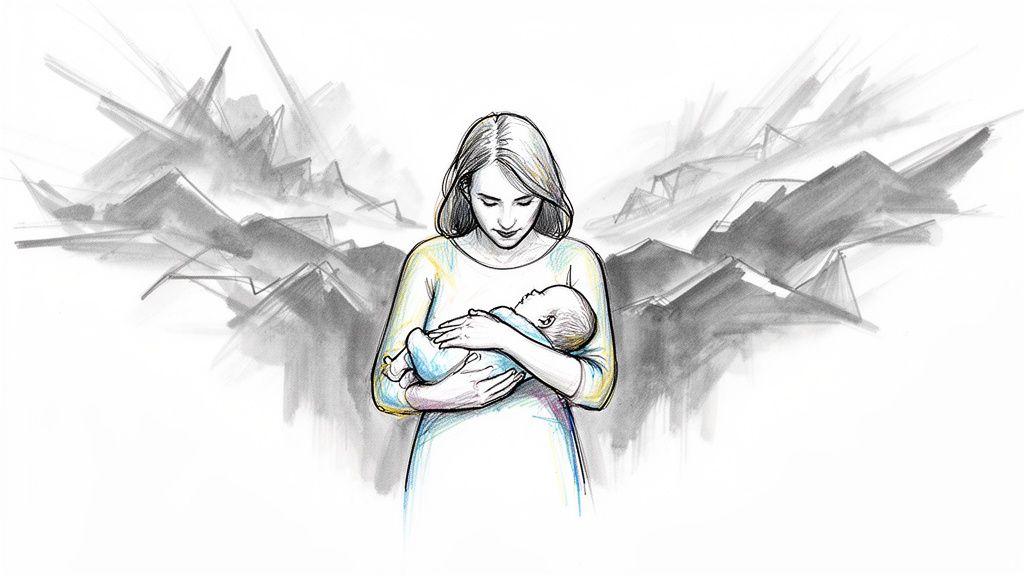
The brilliance of this cover is its subversion of sci-fi and fantasy tropes. Instead of spaceships or laser battles, the focus is on a deeply human connection. The clean, painted style and soft color palette give it the feel of a classic portrait, signaling to the reader that this story prioritizes character and emotion over spectacle. It’s one of the best comic book covers ever because it tells you the tone and heart of the series, not just the plot.
Creating Your Own Character-Focused Cover
This approach is perfect for stories where personal relationships and emotional stakes are central to the plot. It promises a deep, character-driven narrative.
- Combine the Intimate and the Epic: Place a quiet, personal moment against a backdrop that hints at a larger conflict or world. For example, two characters sharing a look while a city burns softly in the distance.
- Use a Painterly Style: Consider using a watercolor or digital painting effect for your cover. This gives the art a more "literary" feel, separating it from traditional action-oriented comics.
- Focus on a Visual Metaphor: The act of breastfeeding on the Saga cover is a metaphor for life and defiance in the face of war. What single image can symbolize your story's core theme?
- Employ Sophisticated Color: Move beyond simple primary colors. Use a nuanced palette to establish a specific mood, whether it’s melancholic, hopeful, or tense.
By prioritizing a poignant character moment, your cover can attract readers looking for a story with substance and emotional depth, promising a narrative that stays with them long after they’ve finished reading.
7. Batman: The Dark Knight Returns #1 (1986) – Frank Miller's Iconic Redesign
Frank Miller's cover for The Dark Knight Returns #1 did not just present a new Batman story; it introduced a new age of superhero comics. The image is pure, condensed atmosphere: an older, bulkier Batman in silhouette, leaping through the air as a bolt of lightning illuminates his form. This was not the campy hero of television but a grizzled, powerful force of nature returning to his element.
The genius of this cover is its use of absence and suggestion. We see only Batman’s silhouette, forcing our imagination to fill in the details of his age and fury. The single lightning strike against the dark, stormy sky creates immense drama and visual contrast, framing the moment with raw, elemental power. This design announced that comics had matured, capable of telling dark, psychologically complex stories for an adult audience. It's one of the best comic book covers ever because it completely changed the perception of a character.
Creating Your Own Mature Redesign
To give your character a grittier, more seasoned feel, focus on atmosphere and environmental storytelling. Let the world around your hero reflect their internal state.
- Embrace the Silhouette: Sometimes, what you don't show is more powerful than what you do. Use strong backlighting, like a lightning strike or a stark moon, to cast your character in silhouette, creating mystery and emphasizing their iconic shape.
- Use Weather as a Mood Ring: A stormy sky, a downpour of rain, or a dense fog can instantly set a noir or somber tone. The environment should reinforce the emotional weight of your character and their story.
- Show Age Through Form, Not Just Face: Miller's Batman is huge and imposing, his physical bulk conveying years of struggle and resilience. Think about how your character’s body language and physique can tell a story of their past experiences.
- Choose a Noir-Inspired Palette: Limit your colors to create a stark, high-contrast image. Deep blacks, bright whites, and a single splash of color (like the lightning) can produce a visually striking and mature look.
This approach is perfect for telling a story about a character's return, a darker chapter in their life, or an exploration of their more complex psychological side. By blending action with atmosphere, your cover will promise a story with depth and consequence.
8. The Walking Dead #193 (2019) – Emotional Series Conclusion
Proving that a cover's power can come from quiet reflection, the final issue of The Walking Dead features a deceptively simple image by Charlie Adlard. Instead of a bombastic action scene, we see a silhouetted figure, an older Carl Grimes, looking out over a landscape where nature is reclaiming a destroyed world. Its emotional weight doesn’t come from shock value, but from the immense narrative journey that precedes it.
This cover is the period at the end of a very long, brutal sentence. For a series defined by constant danger and visceral horror, the finale’s artwork offers a moment of serene contemplation. The silhouette allows any reader who followed the story for years to project their own feelings of loss, survival, and hope onto the character. It’s a masterclass in using visual storytelling to provide thematic closure, making it one of the best comic book covers ever for its narrative resonance.
Creating Your Own Emotional Conclusion
To channel this feeling for your personalized comic, especially for a milestone or finale, shift the focus from action to emotion and thematic summary.
- Focus on Emotional Resonance: For a concluding chapter, prioritize the feeling you want to leave with the reader. Is it hope, peace, or melancholy? The cover should set that final tone.
- Use Silhouettes for Universal Connection: A silhouette can represent anyone. This technique allows the reader to place themselves in the story's conclusion, making the final moment feel more personal and shared.
- Let the Environment Tell the Story: The background on the TWD #193 cover shows the result of the entire narrative arc: a world changed. Use your setting to visually summarize the journey your characters have undertaken.
- Mark Personal Milestones: Use a PersonalizedComics project to commemorate a personal achievement or the end of a significant chapter in your own life. A retrospective cover is a powerful way to honor that journey.
This approach is ideal for concluding a long-running story or marking a significant event. By letting the cover reflect on the entire narrative that came before it, you create a powerful, lasting impression that resonates long after the book is closed.
9. Ms. Marvel #1 (2014) – Kamala Khan's Cultural Representation
The cover for Ms. Marvel #1, by Jamie McKelvie and Matthew Wilson, captures the spirit of a new generation of superheroes. It shows Kamala Khan perched on a lamppost, notebook in hand, with Jersey City stretching out behind her. This isn't a dramatic battle scene; it's a quiet, relatable moment of a young woman balancing her superhero identity with her everyday life, reflecting the cover’s significant role in championing diversity.
McKelvie's design is a landmark in modern comic art, communicating a character’s identity through cultural specificity and contemporary style. The art blends the classic superhero pose with a decidedly casual, modern aesthetic. Kamala isn’t just a symbol of power, she is a person: a student, a fan, and a young Muslim-American woman. This cover proved that authenticity and cultural representation could be powerful, making it one of the best comic book covers ever for its social and artistic impact.
Creating Your Own Culturally Relevant Hero
To channel this modern, character-first approach, focus on what makes your hero unique beyond their powers. How does their background and culture shape their identity?
- Celebrate Cultural Identity: Integrate elements of your character’s heritage into their design. This could be through clothing, accessories, or the setting itself, just as Kamala's design subtly does.
- Use Vibrant, Contemporary Colors: The bright, almost pop-art color palette gives the cover a fresh, youthful energy. A bold color scheme can make a classic concept feel new again. Many modern digital stories, like those found in the best web comics, use this technique effectively.
- Show, Don't Just Tell: The setting of Jersey City is as much a part of the cover as Kamala. Placing your hero in a specific, detailed environment gives them a sense of place and belonging.
- Focus on Character Moments: Not every cover needs to be a fight scene. A moment of quiet reflection, study, or simple joy can be just as powerful in defining who your character is and making them relatable to readers.
This method is ideal for creating a character that feels grounded and real. By highlighting personal identity and culture, your cover can connect with audiences on a deeper, more personal level.
10. Daytripper #1 (2010) – Fábio Moon & Gabriel Bá's Experimental Art
The cover for Daytripper #1, by twin brothers Fábio Moon and Gabriel Bá, announced a new era of artistic expression in mainstream-adjacent comics. It’s a beautifully melancholic piece, using a flowing watercolor style to depict its protagonist, Brás, staring out at the reader while a second version of him appears to fall or float into a deep blue abyss. The image doesn't show a heroic punch; it communicates a complex feeling of life, death, and introspection.
This cover proved that artistic innovation could be a primary selling point. Its genius is in its quiet confidence. The composition is unconventional, and the painterly style moves it closer to fine art than to a typical commercial product. It challenges the reader to look beyond simple action and consider the emotional and thematic depth within. This cover is a masterclass in using form to reflect a story's core themes, making it one of the best comic book covers ever for its sheer artistic courage.
Creating Your Own Experimental Art Piece
To capture the energy of Daytripper, you must prioritize your unique artistic vision and let the form of your cover reflect the content of your story.
- Let Form Reflect Theme: Think about the central idea of your story. Is it about memory, loss, or joy? Use visual elements like color, line work, and composition to evoke that specific feeling before a single word is read.
- Embrace Experimental Layouts: Don't feel locked into a single, centered image. You can arrange panels on the cover itself, use negative space creatively, or create a composition that guides the eye in an unusual way.
- Prioritize Artistic Vision: Don't shy away from a style that feels personal and distinct, even if it isn't conventional. A unique watercolor, charcoal, or digital painting style can make your cover unforgettable. Our watercolor style filter is perfect for this.
- Convey Mood, Not Just Action: Sometimes, the most powerful statement is a quiet one. Focus on creating a specific mood, whether it's contemplative, somber, or joyful. Use posture, expression, and environment to tell an emotional story.
This approach is ideal for personal, character-driven narratives, graphic memoirs, or any story where emotional and thematic depth is more important than plot mechanics. By creating a cover that functions as a standalone piece of art, you invite readers to engage with your work on a much deeper level.
11. Hellboy #1 (1993) – Mike Mignola's Distinctive Visual Language
Mike Mignola’s cover for Hellboy #1 is a masterclass in establishing a unique artistic identity. It introduces a world defined not by hyper-realism but by bold ink work, heavy shadows, and a powerful sense of atmosphere. The image of Hellboy, a simplified and stylized figure, set against a detailed, gothic background created a new visual language for comics.
This cover’s brilliance is its confidence. Mignola proved that a strong, consistent style could be more memorable and impactful than technical perfection. Hellboy himself is composed of simple, powerful shapes, but the world around him is filled with intricate textures and ancient details. This balance makes the character pop while grounding the story in a rich, believable setting. The cover established the "Mignola-verse" aesthetic, a look so distinct it would define the character and his spin-offs, like B.P.R.D., for decades, proving that a cohesive world is one of the most powerful tools in storytelling.
Creating Your Own Distinctive Style
To give your personalized comic a signature look, focus on building a cohesive visual identity rather than just drawing a scene. What artistic choices can you make that will define your entire story?
- Develop a Consistent Visual Language: Decide on your core artistic rules and stick to them. This could be a specific approach to shadows, a limited color palette, or a way of drawing figures. A great place to start is by exploring different art styles to find a foundation for your signature look.
- Balance Simplicity and Detail: Simplify your main character’s design to make them instantly recognizable, but add detail to the world they inhabit. This contrast creates depth and visual interest.
- Use Bold Inks and Shadows: Don't be afraid of heavy black areas. Mignola uses shadows to sculpt forms and create a dramatic, moody atmosphere. This technique can instantly give your cover a professional and moody quality.
- Prioritize Identity Over Realism: Your cover doesn’t need to look photorealistic to be effective. A strong, memorable style will leave a more lasting impression on your reader and is a key part of what makes some of the best comic book covers ever so iconic.
This approach is ideal for character-driven adventures or fantasy stories where world-building is central. By focusing on a strong artistic identity, your cover will promise readers a unique and immersive experience.
12. Sandman #1 (1989) – Neil Gaiman's Literary Sophistication
While many covers grab your attention with explosive action, Sandman #1 does so with quiet, intellectual dread. Illustrated by Sam Kieth, with lettering and design by Todd Klein, this cover announced that comics could be a medium for literary fantasy. It presents Dream of the Endless, not as a hero, but as an arcane figure trapped and vulnerable, his iconic helmet displayed like a museum piece. The cover’s muted palette and elegant, almost classical composition signaled a different kind of story.
The design is a masterwork of thematic foreshadowing. It doesn't show a battle; it shows the aftermath of a profound loss of power. The focus on the helmet, a symbol of Dream's identity, tells the reader the story is about mythology, concepts, and the very nature of storytelling itself. This cover didn’t just sell a comic; it sold an idea, attracting a new audience that sought complex narratives and thematic depth, proving comics could stand shoulder-to-shoulder with literature.
Creating Your Own Literary Cover
To give your personalized comic cover a feeling of literary weight, focus on symbolism and atmosphere over direct action.
- Emphasize a Symbolic Object: Instead of showing your character, consider showcasing an object that represents their power, loss, or core identity. This creates mystery and invites the reader to ask questions.
- Use a Refined Color Palette: A muted, limited color scheme can create a serious, atmospheric tone. Think about how the somber colors of the Sandman #1 cover suggest a world of dreams and nightmares, not primary-colored heroics.
- Imply a Larger Story: Design your cover to feel like a piece of a much larger world. Use framing, composition, and subtle details to suggest a deep history and mythology behind the characters.
- Integrate Title and Design: Notice how the title on the Sandman cover feels like part of the art. Let your typography reflect the story’s mood, whether it’s elegant, ancient, or unsettling.
This approach is perfect for stories that deal with complex themes, mythology, or psychological drama. By focusing on symbolism and mood, your cover communicates intellectual and emotional depth before the reader even opens the book.
Top 12 Comic Book Covers Comparison
| Cover / Example | Implementation complexity | Resource requirements | Expected outcomes | Ideal use cases | Key advantages |
|---|---|---|---|---|---|
| Action Comics #1 (Superman) | Low — single bold figure | Strong character pose, bold palette | Instant hero recognition, high visibility | Single-hero debuts, personalized gift covers | Clear focal point; timeless, easy-to-recreate design |
| The Amazing Spider-Man #300 (Venom) | High — intricate linework & perspective | Highly skilled illustrator, time-consuming inking | Intense drama and technical showcase | Villain-centric narratives, dramatic conflict covers | High visual tension; demonstrates artistic mastery |
| Watchmen #1 (Comedian's Badge) | Low–Medium — concept-driven minimalism | Strong conceptual design, precise color use | Symbolic resonance; invites interpretation | Mature, thematic or literary comics | Extremely memorable; cross-cultural symbolism |
| X-Men #1 (Ensemble) | High — complex layered composition | Multiple character art, careful hierarchy planning | Introduces cast; conveys scale and dynamics | Team books, group or family gift comics | Efficiently showcases many characters; narrative breadth |
| Maus #1 (Symbolic representation) | Medium — symbolic but restrained | Thoughtful symbolism, restrained B/W art | Serious tone; educational and emotional impact | Historical, memoir, or educational narratives | Respects subject matter; universal symbolism |
| Saga #1 (Intimate + epic) | High — detailed world + emotional focus | Sophisticated color work, refined figure drawing | Emotional connection with epic scope | Literary, character-driven sci‑fi/fantasy | Balances intimacy and grandeur; contemporary appeal |
| Batman: The Dark Knight Returns #1 | Medium–High — gritty redesign | Bold contrast, noir staging, strong anatomy | Mature reimagining; psychological depth | Character redesigns, adult-oriented stories | Recontextualizes characters; gritty, impactful tone |
| The Walking Dead #193 (Finale) | Low — silhouette & environment focus | Strong environmental design, composition | Sense of finality; retrospective emotional weight | Series finales, milestone issues, commemorations | Universal identification; narrative-weighted impact |
| Ms. Marvel #1 (Kamala Khan) | Medium — contemporary, culturally informed | Cultural research, vibrant contemporary palette | Broader audience engagement; representation | Diverse debuts, youth-oriented inclusive stories | Cultural resonance; commercial and social relevance |
| Daytripper #1 (Experimental art) | High — unconventional techniques | Watercolor/experimental media, strong art vision | Fine‑art appeal; distinctive aesthetic | Experimental graphic novels, art-focused projects | Artistic legitimacy; visually distinctive covers |
| Hellboy #1 (Distinctive visual language) | Medium — style-driven consistency | Bold ink work, consistent stylistic rules | Strong brand identity; genre atmosphere | Ongoing series, genre-blending stories | Instantly recognizable style; reproducible identity |
| Sandman #1 (Literary sophistication) | Medium — symbolic and typographic focus | Typographic design, thematic visual symbolism | Literary credibility; thematic depth | Mythology-rich, literary comics, intellectual audiences | Timeless, elegant design; intellectual appeal |
From Page to Panel: Design Your Own Iconic Cover Story
Our journey through the best comic book covers ever reveals a powerful truth: a cover is not just a drawing, but a promise. It’s the first handshake between the creator and the reader, a single, silent panel that must convey action, emotion, and mystery all at once. From the raw power of Superman lifting a car in Action Comics #1 to the quiet, heartbreaking symbolism of the Comedian’s badge in Watchmen #1, these images have become cultural touchstones. They teach us that a legendary cover can be born from a single dynamic pose, a thought-provoking symbol, a complex character ensemble, or a radical new artistic style.
The common thread connecting these masterpieces is a clear vision and a deep understanding of the story held within the pages. Artists like Jack Kirby, Todd McFarlane, and Fiona Staples didn't just draw superheroes; they built worlds and defined characters with every line. They mastered the art of visual storytelling, a skill that you can now explore for your own personal projects. You don’t need to be a professional artist to create a cover with genuine impact. The key is to borrow from the best.
Deconstructing the Masters: Your Design Blueprint
Think of this list as more than just a gallery of greats; consider it a practical toolkit for your own creative endeavors. By internalizing the principles that make these covers work, you can apply them to tell your own stories, whether for a unique gift, a family keepsake, or the first step toward your own graphic novel.
Let's distill the core lessons into actionable takeaways:
Embody a Single, Defining Moment: Many of the best comic book covers ever capture one powerful action. Like Superman's debut or Frank Miller’s Batman leaping before a lightning bolt, this approach creates instant drama.
- Your Action Step: What is the single most important action your character can take? Is it a heroic leap, a quiet moment of reflection, or a defiant stand? Sketch this moment out, focusing on a pose that tells a story all by itself.
Harness the Power of Symbolism: A simple object can carry immense weight. The blood-spattered smiley face of Watchmen and the torn fabric of Ms. Marvel's original costume on her first cover speak volumes without showing a single fight.
- Your Action Step: Identify a key object in your story. A locket, a cracked phone screen, a specific flower. How can you frame this object to hint at conflict, love, or loss? Consider making it the central focus, using color and shadow to give it importance.
Master the Ensemble Shot: When your story is about a team, the cover must communicate their dynamic. The original X-Men #1 established a "heroes in peril" template, while the gatefold cover showed their unique powers and personalities in a way that felt fresh and exciting.
- Your Action Step: Arrange your characters in a way that reflects their relationships. Who is in front? Who is in the back? Do they look at each other or at the viewer? This composition defines the team’s identity before a word is read.
Choose a Style that Defines the Tone: The stark, high-contrast shadows of Mike Mignola's Hellboy immediately signal a world of gothic horror and pulp adventure. The clean, modern lines of Saga prepare you for a contemporary sci-fi fantasy. Your artistic style is a critical piece of the narrative puzzle.
- Your Action Step: Before you start, decide on the feeling you want to create. Is your story a gritty noir thriller? A bright, optimistic adventure? A somber historical account? Choose a visual style that aligns with that feeling, whether it’s through bold colors, muted tones, or sketchy, energetic linework.
By focusing on these core elements, you can move beyond simply creating a picture and start designing a true story. Your cover becomes the doorway to your world, inviting friends, family, or future fans to step inside.
Ready to turn your idea into a tangible, custom comic book? PersonalizedComics gives you the tools to apply these lessons and design a cover that tells your unique story. With a library of art styles and a simple, intuitive platform, you can bring your personal saga, gift idea, or creative project to life. Start creating your own iconic cover today with PersonalizedComics.