Narration in Comics: A Complete Guide for Creators
You can feel bad narration in comics before you can name it. A caption box lands on top of a dramatic panel, explains what the drawing already showed, and suddenly the page feels slow. A good page does the opposite. It guides your eye so smoothly that you forget anyone built the experience at all.
The Invisible Hand Guiding Your Comic
When readers talk about a comic “flowing,” they usually mean something larger than dialogue and larger than plot. They mean the comic knew where to place their attention, when to slow them down, when to let an image breathe, and when to whisper a thought into the scene. That guidance is narration in comics.
A lot of newer creators assume narration means caption boxes. Sometimes it does. But that's only one piece of the machine. Narration is the whole arrangement of cues that helps the reader build the story in their head. Pascal Lefèvre puts it this way in his discussion of comics and narratology: narration in comics is not solely the events themselves, but the organization of cues the reader interprets to construct a story.
That idea matters because it clears up a common confusion. The story is not the page. The page is a set of signals. A shadow across a hallway, a cramped panel border, a caption that says “Three hours earlier,” a character looking away before answering. Those pieces work together. The reader combines them into meaning.
Why readers feel narration before they notice it
Think about a classic superhero splash page versus a street-level noir page. In one, the city opens wide and the hero dominates the frame. In the other, the panels may be tighter, the captions drier, the lighting harsher. Even before you process the words, the comic has started narrating.
Batman is a useful analogy here. In one creative team's hands, Gotham feels operatic and mythic. In another, it feels like a damp alley and a bad conscience. Same broad character. Different narration.
Good narration doesn't just tell the reader what happened. It tells the reader how to receive what happened.
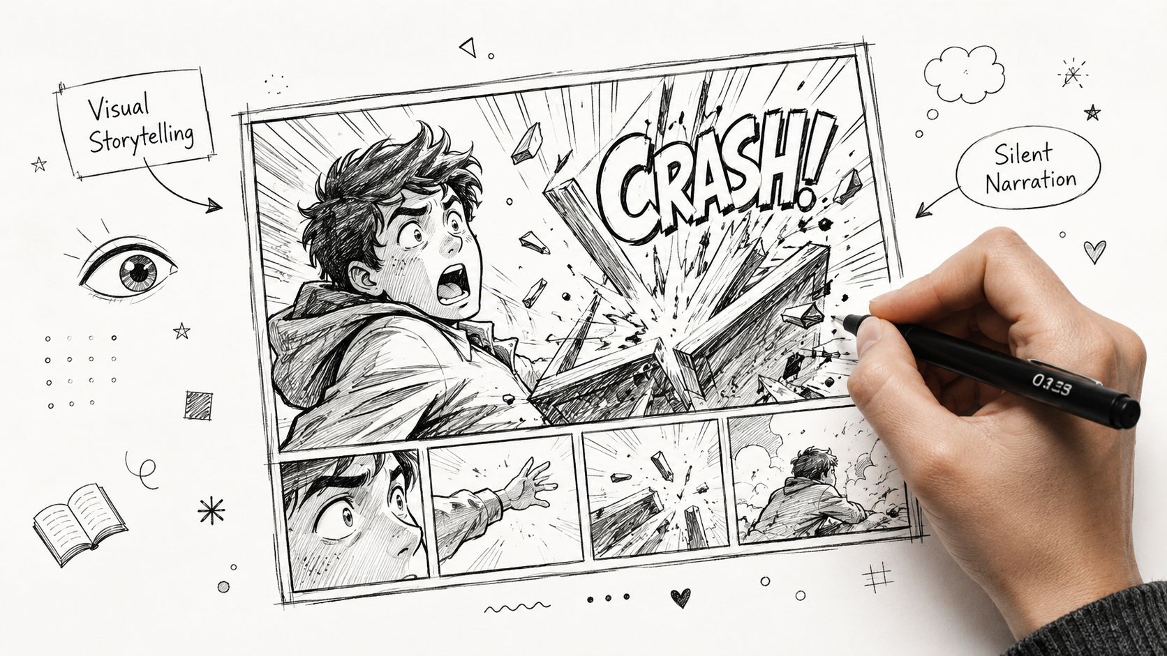
That's why a silent page can still be heavily narrated. The panel order, reaction shots, page turn, and visual emphasis all guide interpretation. Conversely, a page full of captions can feel almost unnated if those captions don't shape the reading experience.
Why this matters more when you use AI tools
If you're building comics with an AI generator, this gets practical fast. The tool can produce art, dialogue, captions, and layouts. But if those elements don't cooperate, the comic feels stitched together instead of told.
The problem isn't that AI adds narration. The problem is that it often adds the wrong kind. It tends to produce captions that summarize action instead of sharpening it. It fills space because it can, not because the page needs it.
So the core skill isn't “adding narration.” It's directing narration. You're deciding what the image handles, what the text handles, and what the reader gets to infer. That's the difference between a page that feels alive and a page that feels narrated at.
The Four Pillars of Comic Book Narration
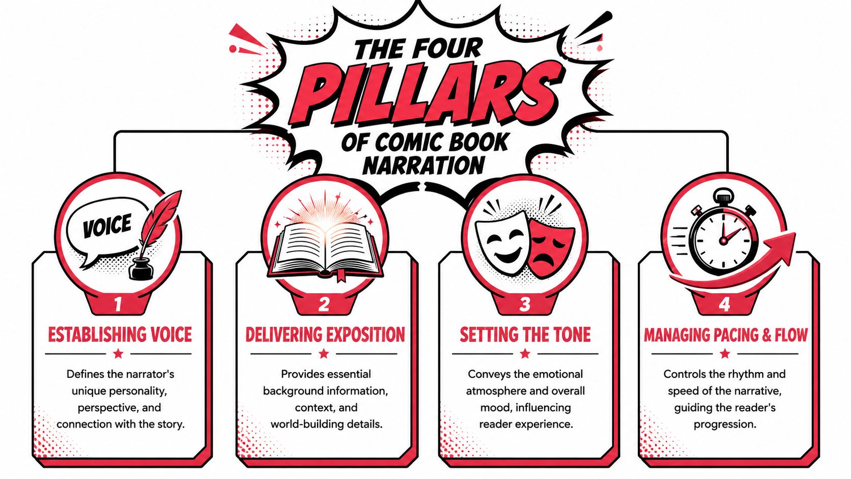
Film gives us a handy comparison. If you want to understand narration, think like a film crew. Different jobs shape the final scene in different ways. In comics, four jobs show up again and again: voice, exposition, tone, and pacing.
Voice leads the reader
Voice is the lead actor. It's the personality behind the telling.
A Spider-Man caption usually works best when it feels agile, anxious, funny, or self-aware. A Conan-style narration wants weight and grandeur. If the words could belong to anyone, the voice probably isn't doing enough work.
Ask yourself:
- Who is speaking: Is this a character, an outside narrator, or the comic's general storytelling voice?
- How do they think: Short, clipped phrases? Poetic reflections? Dry observation?
- What do they notice: Fear, architecture, memory, threat, beauty?
Voice turns information into character.
Exposition gives the reader footing
Exposition is the screenwriter. It provides the facts the reader needs so the story can move.
This might be time, place, context, or a quick piece of history. “Winter in Metropolis.” “The last train left an hour ago.” “No one enters this district after sunset.” Strong exposition is precise and economical. It gives the reader a floor to stand on.
Weak exposition clogs the page. It tries to explain the world before the reader cares about it.
Tone controls emotional weather
Tone is the director of photography. It shapes mood.
The same event can play as tragic, absurd, romantic, or threatening depending on word choice, composition, and rhythm. A caption like “He returned home” feels neutral. “By dusk, he came back to the house he swore he'd never see again” creates pressure. Tone doesn't just color the page. It steers expectation.
Practical rule: If you remove the text and the page still carries the right mood, your narration is supporting the art. If the mood collapses, the text may be doing too much lifting.
Pacing decides when the beat lands
Pacing is the editor. It determines speed and pause.
One caption across three small panels can create momentum. One quiet caption over a wide panel can slow the reader and make them linger. A page turn can become a narrative drumbeat if the setup and reveal are timed well.
Many creators often misunderstand this point. They think captions only deliver information. In practice, captions also meter out time. They create anticipation, compression, and delay.
When you keep these four pillars in mind, narration stops feeling abstract. It becomes a set of jobs. Each caption, panel transition, and visual beat should earn its place by doing one of them well.
A Creator's Toolkit of Narrative Devices
Comics matured into longer, more developed forms in a visible way when the term graphic novel was coined in the 1980s to describe extended comic narratives with deeper character work and more complex plots, as noted in this history of comics and graphic novels. Once stories had more room, creators needed more tools.
You don't need every device in every comic. You need the right one for the job.
The devices you'll reach for most often
Some tools are direct. Some are slippery. Each carries a different narrative weight.
First-person captions: Best when you want intimacy. The reader gets a character's private language, bias, and emotional filter. Think of the hardboiled internal monologue common in crime comics. The risk is tunnel vision. If the character couldn't know something, you need another way to show it.
Third-person narration: Best when you need distance, scope, or a storybook feel. This can set scenes quickly and cleanly. It's useful when the comic needs an outside intelligence shaping the tale.
Thought bubbles: Best for immediate interiority. They can feel old-school, but old-school isn't a flaw. They're clear, efficient, and honest about what they're doing.
Asynchronous captions: Best when you want tension between text and image. A character says in caption, “I was never afraid,” while the art shows shaking hands. That contrast creates energy.
Unreliable narration: Best when point of view is the point. The narrator omits, distorts, or misreads events. Great for memory stories, mystery, confession, and satire.
Choosing Your Narrative Device
| Device | Best For | Common Pitfall |
|---|---|---|
| First-person captions | Character intimacy and strong personal voice | Narrator explains too much or knows too much |
| Third-person narration | Scene-setting, mythic tone, broad perspective | Feels detached or overly literary |
| Thought bubbles | Immediate inner thought | Can clutter the page if overused |
| Asynchronous captions | Irony, tension, emotional contrast | Reader confusion if the contrast isn't clear |
| Unreliable narrator | Mystery, memory, subjective truth | Twist feels cheap if there's no fair setup |
A quick way to test the right tool
Take one simple beat: a hero opens a letter.
Now try it five ways.
- First-person caption: I recognized her handwriting before I let myself hope.
- Third-person narration: The letter arrived on the morning he'd decided to stop waiting.
- Thought bubble: Please don't be goodbye.
- Asynchronous caption: I told myself it meant nothing. while the art shows the character gripping the envelope too tightly.
- Unreliable narration: I opened it calmly. while every visual cue says otherwise.
Same event. Different story effect.
That's the heart of narration in comics. Devices aren't decorations. They're choices about access. Who gets to frame the moment, and from what angle?
The Silent Narrator How Art and Lettering Shape Story
On a rough page, a caption says, He felt alone. The panel shows a hero exploding through a window in a shower of glass, limbs wide, camera tilted, speed lines everywhere. The words whisper. The art shouts. The reader may not know the theory term for that clash, but they feel it at once.
That tension sits at the center of comic narration. Some theorists describe it as the split between the reciter and the monstrator. The reciter is the telling voice, the part that speaks through captions, labels, and other explicit text. The monstrator is the showing voice, the part that stages action, controls viewpoint, and guides the eye across the page. In a strong comic, those two voices work like two musicians in the same band. One can carry melody while the other handles rhythm, but they need to be in the same song.
This matters even more with AI comic tools. Platforms like PersonalizedComics can generate text boxes and dramatic imagery fast, but speed creates a new trap. The AI may give you polished captions and attractive art that do not agree about mood, timing, or emphasis. You end up with a reciter delivering one scene and a monstrator staging another.
Classic comics solved this with craft choices, not with more explanation. Look at how Frank Miller uses captions in The Dark Knight Returns. The words often add attitude, media noise, or inner pressure, while the art carries impact and motion. Or look at Maus, where the page design and restrained visuals do narrative work that extra captions would only weaken. Good narration does not pile onto the picture. It assigns jobs clearly.
Where visual narration resides
Visual narration lives in decisions the reader absorbs before they consciously name them.
- Panel size: A wide panel can slow time and invite reflection. A row of tight panels can make a moment feel clipped, breathless, or trapped.
- Character staging: Foreground placement, body angle, and eye direction tell us who holds power and who is withdrawing from it.
- Lettering choices: Caption shape, font texture, and placement affect tone as much as word choice does.
- Color and value: Soft ranges calm a page. Hard contrast can turn a quiet exchange into an alarm bell.
- Transitions: A held reaction shot, a jump in time, or a silent panel controls pacing in ways a caption never can.
If you are building pages with AI, spend extra time shaping layout prompts and revising the results. This guide to a comic panel layout generator is useful for checking page rhythm, eye path, and readability. Layout is part of narration from the first draft.
How to keep text and image from stepping on each other
A practical page test helps more than theory jargon.
Use this before you approve a page:
- Cover the captions. Check whether the panel sequence still delivers the emotional beat and basic action.
- Read only the captions. Check whether they add viewpoint, tension, or irony instead of restating what the art already shows.
- Trace the eye path. Make sure each caption sits where the reader naturally wants to look next.
- Cut one line. Pages often improve the moment one explanatory sentence disappears.
- Compare tone. If the scene is intimate, the framing, lettering, and text should all support intimacy.
That is the silent narrator at work. Art direction, panel flow, and lettering are not decoration around the story. They are part of the storytelling voice, and for creators using AI generators, learning to align the reciter with the monstrator is what turns a competent page into a readable, persuasive one.
Common Narration Mistakes and How to Fix Them
A young creator once showed me an AI-generated page that looked polished at first glance. The art was dramatic. The captions were fluent. But reading it felt like driving with one foot on the gas and one on the brake. The picture pushed the eye one way, while the text kept stopping to explain what the reader had already understood.
That is a common narration problem in comics, and AI tools can make it worse fast. Platforms such as PersonalizedComics can produce usable caption text in seconds, but speed creates a new editing job. You have to make sure the reciter, the text boxes and narration, is helping the monstrator, the visual storytelling, instead of arguing with it.
Most narration mistakes come from good instincts used in the wrong place. You want clarity, so you explain. You want depth, so you add history. You want range, so you switch voices. The repair is usually simple. Give each storytelling channel a clear assignment.
Mistake one, saying what the art already said
If a panel shows a slammed door, a rigid shoulder line, and a face burning with anger, a caption that says, He walked into the room angrily, does not add meaning. It repeats evidence the jury already has.
That weakens both parts of the page. The art loses force because the reader is told not to trust it. The caption feels like closed-captioning for a silent movie.
A better move is to let the drawing carry the action and let the caption carry what the drawing cannot. Inner conflict. Misinterpretation. Memory. Denial.
Before: He opened the letter with trembling hands.
After: I'd faced worse than paper. At least that's what I told myself.
Batman captions often work this way at their best. The panel gives you cape, alley, rain, and impact. The narration gives you obsession, guilt, or warped logic.
If you are scripting with AI assistance, this is a good checkpoint. Generate the page, then ask one hard question for every caption: is this adding a second layer, or just tracing the lines of the art?
Mistake two, losing control of narrator voice
A narrator needs identity. If one caption sounds hard-boiled, the next sounds like neutral summary, and the third sounds like a poet auditioning for a different comic, the reader starts to drift.
This problem shows up often in digital and AI-assisted comics because generated text tends to smooth voices into the same polished tone. Distinct characters start sounding like the platform instead of themselves.
You can fix that in two ways. First, define each narrator before drafting the page. Word choice, sentence rhythm, and attitude should differ on purpose. Second, mark narrator changes visually. Caption shape, color, border treatment, and placement can help the reader recognize a handoff quickly, as discussed in Nick Macari's guidance on point of view and captions.
A clean handoff should feel like switching radio stations, not like discovering halfway through the song that someone else has been singing.
For creators building pages from prompts, it helps to script those voice rules before generation. A short prep pass in a comic book script workflow can save you from rewriting every caption after the art is done.
Mistake three, dumping information in blocks
Long caption blocks usually come from fear. The creator worries the reader will miss the politics, the family history, the rules of the world, or the emotional stakes. So the page tries to explain all of it at once.
Comics rarely reward that impulse. Dense narration slows panel-to-panel movement and flattens dramatic energy. Even in comics famous for heavy captions, such as classic Claremont X-Men or Miller's noir monologues, the best passages arrive in shaped beats, not unbroken slabs.
Try these repairs:
- Break exposition into scene-sized pieces: One clear fact or pressure point per scene is usually enough.
- Move facts into behavior: Let a shrine on a shelf, a damaged uniform, or a character's hesitation carry part of the backstory.
- Assign each caption one job: Voice, context, irony, timing, or tension. If it has no job, cut it.
- Signal viewpoint changes immediately: New narrator, new visual treatment from the first caption box.
One practical edit trick works every time. Label each caption in the margin with its function. If you cannot name the function in a word or two, the caption is probably decoration, not story.
That discipline matters even more with AI pages, because generators are happy to produce competent-looking filler. Your job is to protect the reading experience. A strong page does not ask the reciter and monstrator to compete for control. It gives each one room to do its best work.
Actionable Tips for Writing Compelling Narration
Strong narration usually feels lighter than the draft that came before it. Not thinner. Lighter on its feet. It knows when to enter and when to get out of the way.
Write captions that do what art can't
If the drawing already shows the punch, don't caption the punch. Caption the regret, the memory, the lie, the fear, the time shift, or the contrast.
That one habit will improve most scripts quickly.
A clean test: after each caption, ask, “Could the artist show this without words?” If the answer is yes, cut or rework it.
Build a narrator, not a generic voice
A narrator needs a verbal fingerprint. Give them preferred sentence length, favorite kinds of images, and a bias.
One narrator says, The train was late again. Another says, By the time the train dragged itself in, the night had curdled. Same fact. Different person behind the line.
For script discipline, it helps to draft a short voice note before page one:
- Vocabulary range: Plainspoken, ornate, cynical, formal
- Emotional posture: Confessional, detached, amused, haunted
- Relationship to events: Witness, participant, historian, myth-maker
If you want a practical script workflow, this guide on how to write a comic book script pairs well with narration planning.
Let narration create questions
Captions are excellent bait. They can pull the reader forward by opening a question instead of closing one.
Compare these:
- I arrived at the house at midnight.
- By midnight, I understood why nobody in town would name the house out loud.
The second line creates curiosity. It doesn't hoard information forever. It invites the next panel to matter more.
Editing test: End a page with the caption that makes the reader lean, not the one that wraps the beat in plastic.
Keep it lean and read it aloud
Narration in comics shares space with drawings, balloons, sound effects, and panel borders. It doesn't get the endless runway prose gets. Compression is part of the craft.
Do a read-aloud pass. If a caption sounds stiff, overwritten, or too literary for the page it sits on, your ear will catch it faster than your eye.
A few habits help:
- Cut opening throat-clearing. Start on the strongest noun or verb.
- Favor cadence over explanation. A memorable rhythm often carries more than extra detail.
- Limit captions per page. Use silence as part of the score.
- Change one word, not five. Precision beats inflation.
Many creators become better narrators the moment they trust omission. Readers like making connections. Comics are built for that pleasure.
Bringing Narration to Life with PersonalizedComics
Say you want to make a short anniversary comic. Not a parody. Not a superhero send-up. Something warm, personal, and readable by someone who doesn't normally read comics.
That project is perfect for practicing narration because the emotional beats are simple but specific. You've got a first meeting, a turning point, a private joke, a difficult season, and a shared future. The question is how to frame those moments.
Start by deciding the narrative lens before you prompt anything else. If you choose a first-person nostalgic voice, your captions might read like memory: I still remember the coffee going cold because neither of us wanted the conversation to end. If you choose a fairy-tale third-person approach, the exact same beat becomes: And in the smallest café on the noisiest street, their story began. That same nostalgic register is why comics work so well as gifts for grandpa; captions that sound like family memory do half the emotional work.
Those are not cosmetic differences. They affect visual choices, pacing, and page feel.
A practical workflow for a short personal comic
When building a project like this, separate your inputs into three buckets:
- Story beats: First date, move-in day, rainy argument, reconciliation, proposal
- Dialogue moments: A joke, a promise, a repeated phrase you both use
- Narration lines: The emotional frame around each scene
That separation helps the system generate pages with less confusion. If you dump all three into one instruction, the result often becomes cluttered.
A gallery of use cases on personalized comic books can help you see how different stories benefit from different framing choices.
Prompt for the page, not just the picture
New creators often prompt for images and leave narration until the end. Reverse that. Write one sentence for what the page should make the reader feel, then shape the visuals around it.
For example:
- Page feeling: “A small beginning that mattered more than either person knew.”
- Visual direction: warm café, soft expressions, no crowded background, slow panel rhythm
- Caption style: reflective, concise, one box at the top of page
Or:
- Page feeling: “They nearly lost each other.”
- Visual direction: rain, separated framing, colder palette, more negative space
- Caption style: restrained, no melodrama, one line at the end rather than the start
That approach solves a lot of AI narration trouble. The text and image are being directed toward the same target instead of generated as separate layers.
The best result usually comes after one revision pass where you remove at least one caption per page. If the page still lands, you've probably found the right balance.
If you want to turn your own memories, jokes, characters, or gift ideas into a polished comic without drawing everything by hand, PersonalizedComics gives you a fast way to prototype pages, test narration styles, and create a finished book from your photos and story prompts. It's especially handy when you want to experiment with voice, pacing, and visual tone before committing to a longer project.