Turn Photos into Comic Book Art: AI for Full Stories
You already have the raw material. A phone gallery full of birthday photos, vacation snapshots, costume selfies, or family pictures that deserve more than a filter and a social post.
The problem is that most tutorials stop too early. They show how to stylize one image. They do not show how to turn photos into comic book art that reads like a story, page after page, with the same people looking like themselves from panel to panel. That is the difference between a novelty image and a comic someone keeps.
Beyond a Filter The Art of Comic Book Storytelling
A single transformed portrait can look great and still feel empty. The moment you try to make a birthday gift, an anniversary surprise, or a superhero adventure starring your kid, a significant challenge appears. You need continuity. You need pacing. You need the same character to feel consistent in panel one, panel six, and the final page.
That gap is often larger than anticipated. Existing content overwhelmingly focuses on single-image filters, but Google Trends data from 2025 shows that queries for “photo to comic book story” are up 45% year-over-year, which points to growing demand for full narrative creation rather than one-off effects (BeFunky’s photo-to-comic article).
What a real comic needs
A complete comic asks for a few things at once:
- A clear beginning: establish who the characters are and what is happening.
- A middle with movement: something changes, goes wrong, or gets revealed.
- An ending with payoff: funny, heartfelt, dramatic, or triumphant.
That sounds obvious, but it is exactly what most filter-based workflows skip. They can stylize a face. They do not solve panel sequencing, speech bubbles, page rhythm, or the way a reader tracks emotion across scenes.
Why story changes your photo choices
Once you think in pages instead of images, your photo folder starts to look different. The best image is not always the prettiest one. It is the one that helps sell a scene.
A slightly imperfect photo with a great expression often beats a polished portrait. A side angle can become a reaction panel. A laughing shot can carry an entire page better than a formal pose.
Tip: Before generating anything, decide what the comic is about in one sentence. “Two friends survive a chaotic road trip” is usable. “A bunch of fun memories” is not.
If you want help shaping that sentence into scenes and beats, this guide on how to write a graphic novel script is a strong place to start.
Laying the Groundwork Your Plot and Photo Selection
The strongest results usually come from the least glamorous step. Preparation.
Older Photoshop workflows made users obsess over technical settings like Posterize at 2 levels and Edge Intensity at 10 to imitate comic art (Envato tutorial reference). Modern AI removes much of that manual work, which means your biggest advantage is no longer filter knowledge. It is choosing the right story beats and the right source photos.
Build a short plot that can fit on a few pages
Short comics work best with a simple three-part structure:
| Story beat | What happens | What to prepare |
|---|---|---|
| Setup | Introduce the character and situation | Opening image, location, tone |
| Conflict | Add the surprise, obstacle, or joke | Reaction photos, action photos, key dialogue |
| Resolution | Land the payoff | Final pose, emotional close, callback |
Keep it lean. One central idea is enough.
A few examples:
- Anniversary gift: how you met, one challenge, why you still work.
- Kid superhero comic: ordinary day, villain/problem, heroic finish.
- Vacation recap: arrival, funniest mishap, best final memory.
Choose photos that carry emotion
When people try to turn photos into comic book art, they often pick images based on sharpness alone. Sharpness matters, but readable expression matters more.
Look for:
- Clear faces: avoid sunglasses, deep shadows, or hands covering features.
- Varied angles: front-facing shots get repetitive across multiple pages.
- Distinct moods: smiling, surprised, determined, confused.
- Separation from background: busy backgrounds make stylization harder.
- Full-body and medium shots: not every panel should be a close-up.
What usually fails:
- Group photos where one person is half hidden.
- Low-light restaurant photos with muddy skin tones.
- Photos where everyone has the same pose and expression.
- Screenshots compressed several times.
Tip: Build a small cast folder for each character. Include one “hero image” that defines the face, then a few backups showing different expressions and body angles.
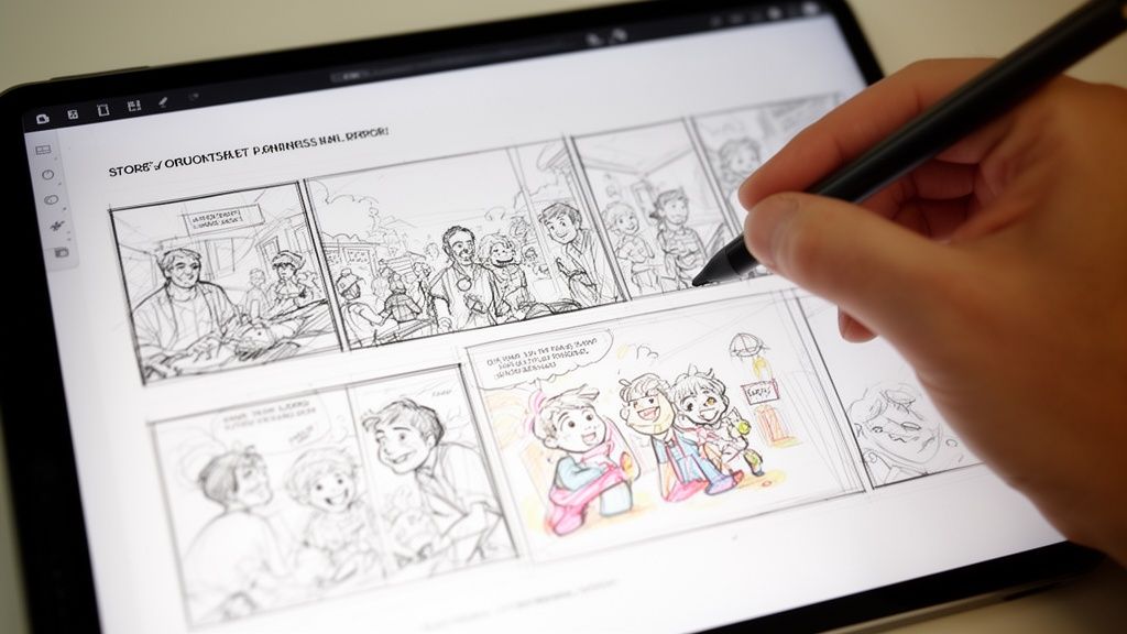
Make a scene sheet before you upload
A simple scene sheet keeps the project from drifting.
Try this format:
Page idea
“Mia discovers the old map in the attic.”Photos to use
One curious expression, one reaching pose, one room background.Dialogue fragment
“Wait. What is this?”Visual note
Dusty room, warm light, sense of mystery.
You do not need a full screenplay. You need enough intent that each page has a job.
Think like a reader, not just a creator
Readers move through comics by looking first, then reading. A page overloaded with explanation feels slow. A page with one strong image and one clear line feels confident.
That is why prep matters so much. If you choose photos that already suggest action and emotion, the finished comic will read more naturally. The artwork starts with the image, but the storytelling starts with your edit.
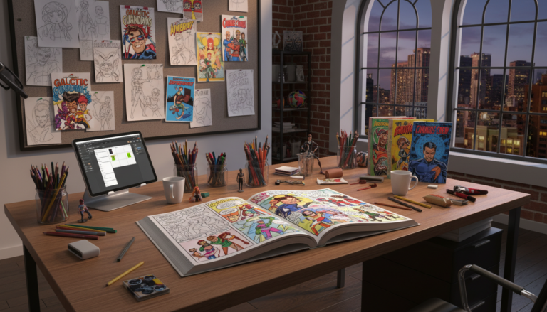
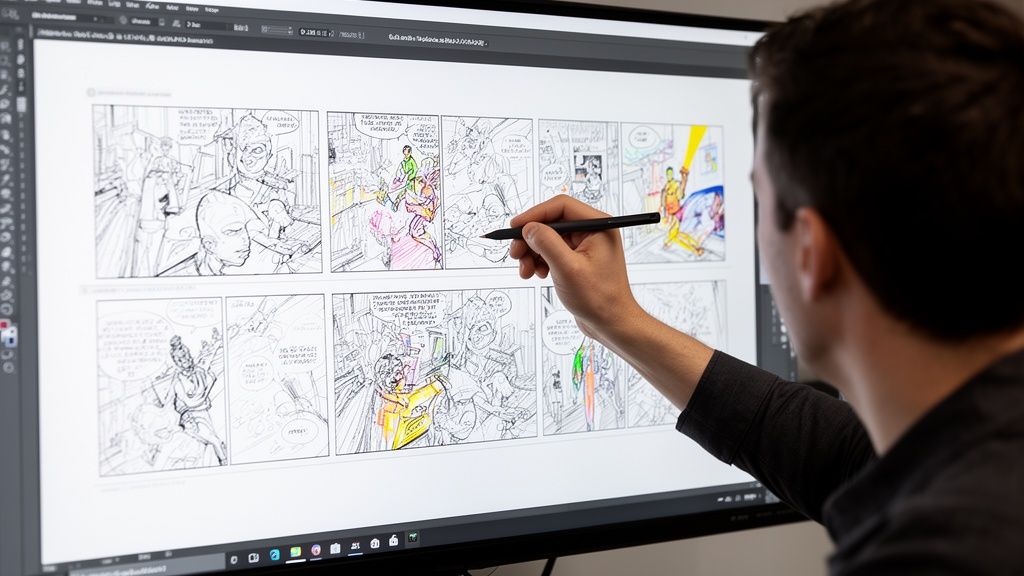
First Draft Magic From Upload to AI-Generated Pages
The first draft should feel fast. Not careless, just fast enough that you do not lose momentum.
This stage is about making strong creative choices without trying to perfect every panel. Get the comic on its feet first. Then direct it.
One useful starting point is learning how AI publishing workflows are structured more broadly. This overview of an AI book maker helps frame the process.
Pick the style before you write the final dialogue
Style controls how the same story feels. A family memory told in noir becomes moody and dramatic. The same pages in retro pop become playful.
Use the visual style to support the emotional tone, not just your favorite aesthetic.
Choosing your comic's art style
| Art Style | Key Characteristics | Best For |
|---|---|---|
| Manga | Expressive faces, energetic pacing, clean drama | Teen stories, adventure, emotional arcs |
| Classic American | Bold action, familiar superhero energy | Origin stories, gifts with punch |
| Graphic Novel | Balanced realism and mood | Memoir, drama, grounded fiction |
| Noir | High contrast, shadow-heavy scenes | Mystery, detective themes, stylish comedy |
| Watercolor | Soft edges, gentle atmosphere | Family keepsakes, sentimental stories |
| Cyberpunk | Neon mood, tech-heavy worldbuilding | Sci-fi, gaming, streamer personas |
| Retro Pop | Bright color attitude, playful impact | Funny recaps, party comics |
| Fantasy | Epic atmosphere, magical environments | Quests, children’s stories, cosplay concepts |
Upload like a casting director
Treat uploads as casting, not file management.
Pick the images that best define each person’s face first. Then add variety. If one person only appears in selfies and another only appears in full-body outdoor shots, the visual consistency gets harder to maintain.
A practical approach:
- Start with your main character.
- Add a second character only when the first one feels visually locked in.
- Use backgrounds that support the scene, not backgrounds that steal focus.
- Keep names simple and consistent if the platform allows labels.
Feed the story in scenes, not paragraphs
Many beginners paste a giant summary and hope the AI sorts it out. That usually creates generic pacing.
Better input looks like this:
- Page one: Sam finds a mysterious package at the front door.
- Mood: Curious, light suspense.
- Dialogue: “I definitely did not order this.”
- Visual cues: Morning light, suburban porch, close-up on label.
Then repeat for the next page.
What to expect from a first pass
The first generated pages are a draft. A good draft gives you:
- recognizable characters
- a readable sequence of events
- panel layouts that roughly match the beats
- dialogue placement you can refine
What it may not give you immediately:
- the exact expression you pictured
- perfect hand placement
- flawless text length
- ideal background detail in every panel
That is normal. The first pass is not the finish line. It is your storyboard, rough cut, and art direction starting point in one.
Key takeaway: Judge your first draft on story flow first. If the pages read clearly from top to bottom, the project is healthy. Small visual fixes are much easier than repairing a weak sequence.
Becoming the Director Refining Your Comic Panels
At this stage, the comic starts to look authored instead of merely generated.
The strongest creators do not regenerate everything. They make selective changes. One facial expression, one balloon rewrite, one background simplification. Small choices add up fast.
Professional comic conversion often relies on multi-pass rendering, where subjects and backgrounds get different treatment to preserve visual hierarchy. In manual workflows, images below 2400 pixels can suffer 40 to 60 percent quality degradation after filtering because edge detection has too little data to work with (multi-pass rendering reference). That matters because it explains why some panels feel muddy while others look crisp.
Fix the panel with the biggest storytelling problem first
Do not start with cosmetic edits. Start with the panel that breaks the page.
Common examples:
- a serious line paired with a cheerful expression
- a reveal panel that looks too similar to the setup panel
- a speech bubble obscuring the important action
- a background so busy it competes with the character
If one panel is confusing, readers slow down. That hurts the whole page more than a slightly imperfect hand or jacket fold.
Direct expressions and poses like an editor
When a panel misses emotionally, the best correction is usually specific and simple.
Try adjustments such as:
- “Make her look relieved, not surprised.”
- “Turn this into a medium shot with more confident posture.”
- “Reduce background detail so the character stands out.”
- “Keep the same outfit and hairstyle as the previous panel.”
Specific emotional language works better than abstract quality requests. “More cinematic” is vague. “Lower angle, stronger silhouette, determined face” gives the model something useful.
Edit the words after you see the art
A sentence that looks fine in a notes app can feel bloated once it lands inside a speech bubble.
Trim hard. Comics reward brevity.
Good dialogue habits
- Cut greetings unless they matter: people do not need to say “hi” in every scene.
- One balloon, one idea: readers process faster when each bubble has a clean purpose.
- Keep punchlines short: the panel should do some of the work.
- Let reactions breathe: silence can be a beat too.
Tip: If a bubble feels crowded, your first move should be rewriting the line, not shrinking the font.
Protect visual hierarchy
Readers should know where to look first. Usually that means face, action, then text.
A few reliable fixes:
- enlarge the most important character in the panel
- mute or simplify the background
- move the bubble away from the focal point
- save the widest, most detailed panel for the page’s emotional peak
When people talk about “professional-looking” pages, this is often what they mean. Not just cleaner art, but clearer visual decisions.
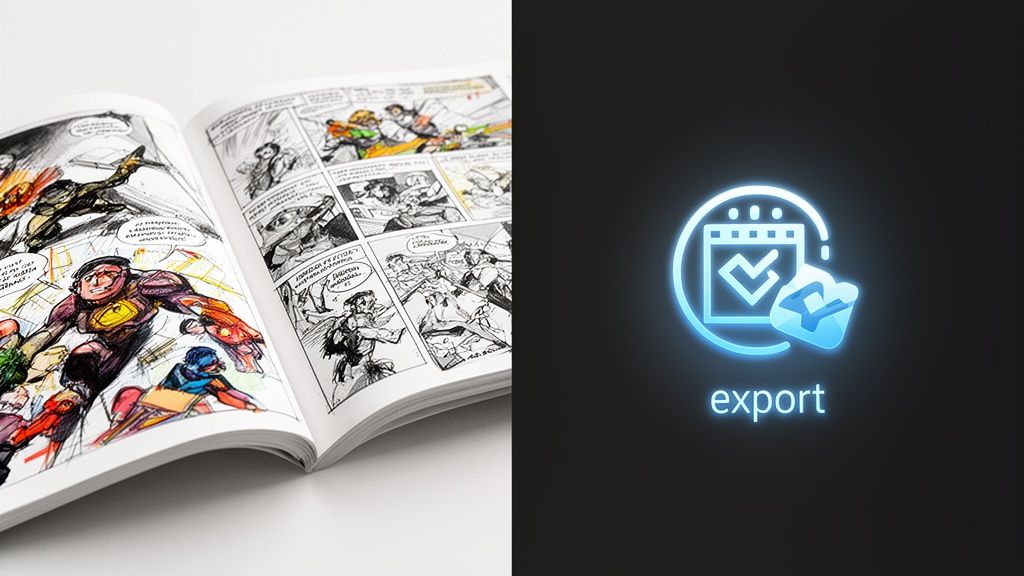
Exporting Printing and Sharing Your Finished Comic
The final step changes the project from a clever experiment into a finished object.
A digital export is useful. A printed comic feels complete. The page turns matter. The cover matters. The fact that someone can hold the story in their hands matters even more when the comic is personal.
There is also a strong market context for physical comics. North American sales of graphic novels and comics reached $2.07 billion in 2023, and holidays can account for over 30% of sales, which helps explain why personalized printed comics land so well as gifts (AMT Lab’s AI comic marketplace analysis).
Export for the use case, not just convenience
Think about where the comic will live.
| Format goal | Best priority | What to check |
|---|---|---|
| Digital sharing | Fast readability | Text size on phones |
| Social posting | Strong single-page moments | Cover and splash panels |
| Printing | Page resolution and bleed safety | Margins, spine, cover clarity |
If you are sharing online, check each page on a phone before sending it out. Tiny dialogue that looks fine on a desktop often becomes unreadable on mobile.
Why print changes the value
A printed comic does something screenshots cannot. It signals effort.
When someone opens a book built from real photos and a real story, they understand immediately that this was made for them. That is why print works so well for anniversaries, birthdays, graduation gifts, memorial pieces, and family jokes that deserve a better home than a group chat.
For a deeper look at finishing and preparing a physical edition, this guide on printing your own custom comic book is worth reviewing.
Final pre-print checklist
- Read every page aloud: awkward dialogue jumps out fast.
- Check names and continuity: outfit changes and spelling errors are easy to miss.
- Study the cover at thumbnail size: if it works small, it usually works large.
- Leave white space where needed: crowded pages feel cheaper than they are.
A comic becomes memorable when it feels intentional from first page to last page. Exporting and printing are not administrative chores. They are part of the craft.
Pro Tips for a High-Quality Comic Page
Good pages are rarely the ones with the most effects. They are the ones where the reader always knows what matters.
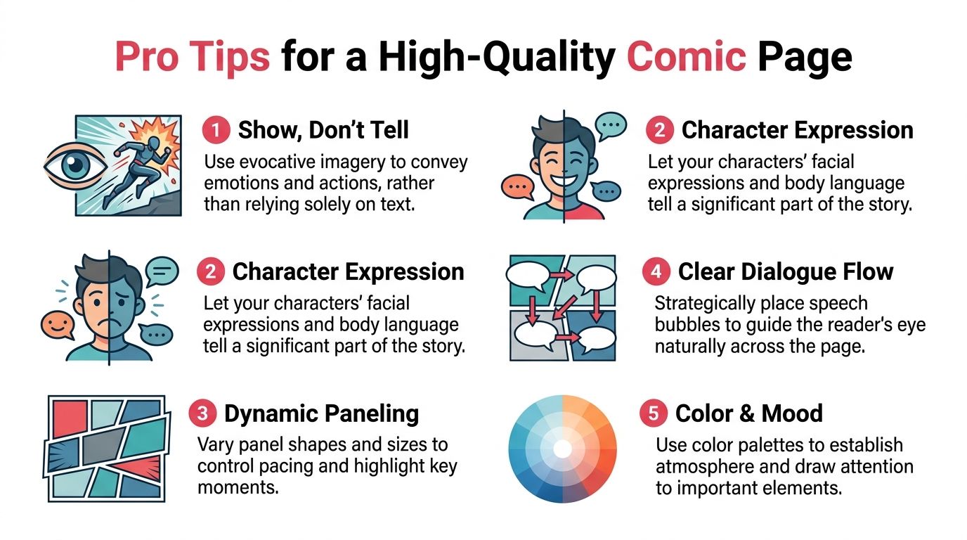
Manual comic stylization often relies on a three-filter stack. Poster Edges for line definition, Threshold for high-contrast value separation, and Oil Paint for stylization (three-filter workflow reference). You do not need to run those filters yourself, but understanding their logic helps you judge the page better. Strong comic art simplifies. It does not just decorate.
Use the image to carry meaning
If a panel already shows fear, surprise, or joy, the text can stay light.
Weak page:
- caption explains the emotion
- dialogue repeats the caption
- art merely illustrates the same statement
Better page:
- expression carries the emotion
- dialogue adds character
- caption appears only if it adds context or timing
Pace the page with contrast
Not every panel should have equal weight.
Try mixing:
- one wide panel for a reveal
- smaller reaction panels for quick humor
- a close-up after a busy scene
- a quiet final panel instead of another speech-heavy beat
That contrast is what makes pages feel rhythmic rather than mechanical.
Keep dialogue visual
The best comic dialogue looks written for the eye, not the ear.
A few habits help:
- use shorter sentences than you would in prose
- break long thoughts into separate balloons
- remove filler words that do not add personality
- avoid stuffing exposition into one panel
Tip: If a line sounds good but looks huge, split the idea across two beats. Comics reward timing more than density.
Control mood with restraint
Color and detail should support the moment.
For emotional scenes, softer palettes and simpler backgrounds usually work better than hyper-detailed environments. For action or comedy, stronger contrast and clearer silhouettes help the page read faster.
The same principle applies when you turn photos into comic book art. Readers do not need every original detail preserved. They need the right details preserved.
Frequently Asked Questions
Can I make a full story from personal photos, not just one image?
Yes. That is the strongest use case for this format. Start with a short plot, choose a small cast, and build page-by-page scenes instead of trying to transform a random folder all at once.
What photos work best?
Use images with clear faces, readable expressions, and decent lighting. Variety helps. Include close-ups, medium shots, and at least a few images where body language is visible.
How long should the first comic be?
Short is better for a first attempt. A compact story is easier to keep visually consistent and easier to revise.
Do I need drawing skills?
No. What matters more is taste and selection. If you can pick good photos, trim dialogue, and notice when a panel feels off, you can make a polished comic.
Should I print it or keep it digital?
Digital is great for quick sharing. Print is better when the comic is a gift, a keepsake, or something you want people to revisit like a real book.
If you want the easiest way to turn photos into comic book art as a complete, polished story, PersonalizedComics gives you a practical path from photo upload to finished pages. You can choose from eight art styles, build a multi-page comic with consistent characters, use four free credits to test your first pages, and order a premium printed copy when the story is ready.