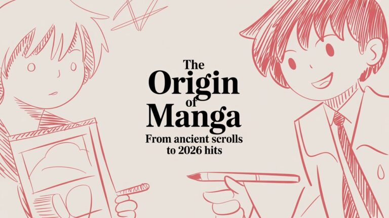
How to Draw a Comic Book Character: A Beginner’s Guide
You probably have a character in your head already.
Maybe it’s a street-level vigilante with a beat-up jacket, a cosmic queen with impossible armor, or a funny sidekick who keeps stealing every scene. You can see flashes of them clearly. The pose. The attitude. The voice. Then the pencil touches the page, and suddenly the whole thing feels slippery.
That gap between imagination and execution frustrates almost everyone at the start.
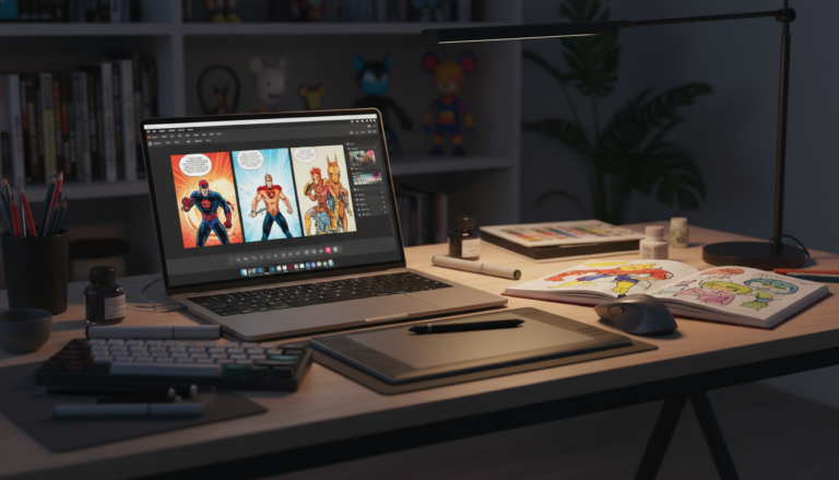
The good news is that how to draw a comic book character isn’t some secret talent reserved for professionals. It’s a process. You learn to move from idea, to structure, to expression, to finish. Some people do that entirely by hand. Others sketch traditionally and polish digitally. Some writers and hobbyists use AI tools to prototype characters fast, then refine from there. All of those paths are valid if they help you tell the story you want to tell.
If your bigger goal is making that character live inside an actual story, it helps to think beyond the single drawing. A strong character design works even better when it fits a clear scene, conflict, and page rhythm. If you want help on that side of the craft, this guide on how to write a graphic novel script is a smart companion.
What matters most right now is this. Don’t try to draw “perfectly.” Draw clearly. Build your character one layer at a time, the same way working comic artists do.
From Idea in Your Head to Character on the Page
Most beginners start in the wrong place. They try to invent anatomy, costume, pose, expression, and style all at once. That’s like trying to build a house while deciding where the doors go after the roof is already on.
A comic character gets stronger when you separate the job into smaller decisions.
Start with three questions:
- Who are they when nobody’s watching
- What do they want more than anything
- What visual trait shows that at a glance
That last question matters a lot in comics. Readers meet your character first with their eyes, not through a biography. A patient, disciplined hero might stand upright with clean shapes and organized costume lines. A reckless villain might lean forward, wear asymmetrical gear, and have a silhouette full of sharp breaks.
Practical rule: If you can describe your character’s core attitude in one short sentence, drawing choices get easier.
You also don’t need a giant equipment list to begin. A pencil and printer paper are enough. If you work digitally, a tablet and drawing app are enough. Fancy tools can help later, but they won’t replace good thinking.
A simple approach works best:
- Start with concept: personality, role, and tone come first.
- Build the body: use clear proportions and a pose with energy.
- Add identity: face, costume, hair, props, and textures.
- Finish with clarity: inks, color, and consistency.
That sequence keeps you from decorating a weak foundation. It also helps when a drawing feels “off.” You can back up one layer and fix the actual problem instead of endlessly redrawing details.
Building Your Character's Blueprint
Before you draw the final version of anything, make a design sheet. Professionals do this because memory is unreliable. What feels obvious in your head becomes inconsistent fast once you draw the character from different angles or across multiple pages.
That’s where a character blueprint comes in. It combines written notes with visual planning so your design stays stable.
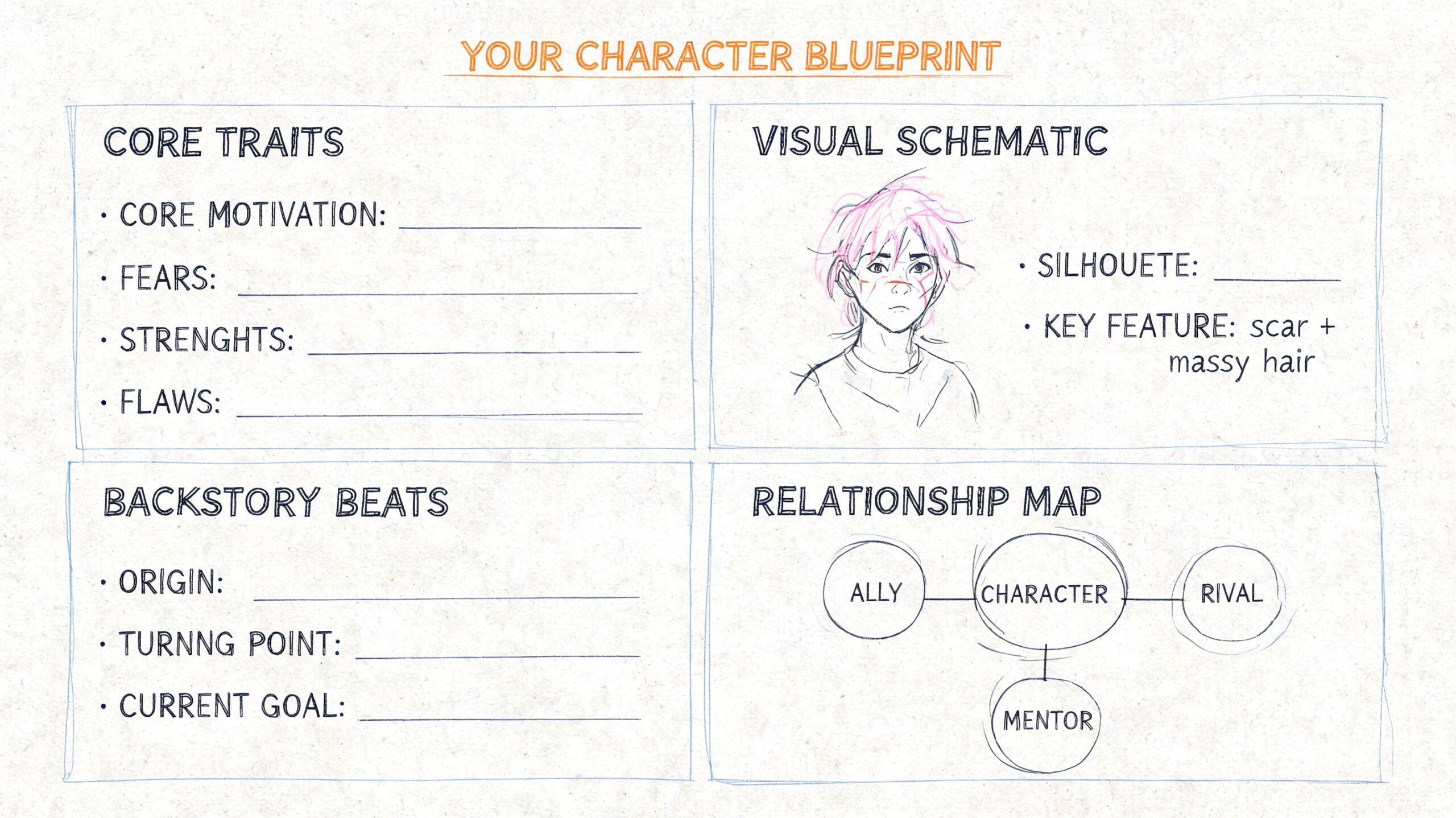
Start with story clues, not costume pieces
A lot of beginners ask, “What should my character wear?” A better question is, “What kind of life do they live?”
A few examples:
- A rookie hero: cleaner shapes, less gear, maybe something homemade
- A veteran detective: practical coat, simple shoes, tired posture, one signature accessory
- A cosmic warrior: larger shapes, fewer tiny details, symbols that read from far away
Write short notes under a few headings:
- Role in the story: hero, rival, mentor, trickster, antihero
- Temperament: calm, explosive, awkward, proud, sarcastic
- Physical impression: tall and narrow, compact and sturdy, graceful, heavy, twitchy
- Signature elements: scar, visor, braid, gloves, shoulder emblem, oversized boots
Those notes stop you from designing random cool stuff that doesn’t belong together.
Pick tools that match how you like to work
Traditional tools give you friction in a good way. A pencil lets you search. Ink forces decisions. Paper can make your hand feel more confident because the marks are direct and physical.
Digital tools give you flexibility. Layers, undo, selection tools, and brushes can speed up experimentation. If you like adjusting shapes after the fact, digital is forgiving.
Neither path is more legitimate. Use the one that helps you finish work.
A basic starter setup might look like this:
| Workflow | Useful tools | Why it helps |
|---|---|---|
| Traditional | Pencil, eraser, paper, fineliner or brush pen | Great for learning line control and decision-making |
| Digital | Tablet, stylus, drawing app such as Clip Studio Paint | Easy to resize, flip canvas, and keep clean layers |
| Hybrid | Pencil thumbnails, digital cleanup and color | Combines loose thinking with efficient finishing |
If you’re unsure, go hybrid. It removes a lot of pressure.
Make a turnaround sheet
A turnaround sheet shows your character from multiple views, usually front, profile, three-quarter, and back. Add a few facial expressions and, if needed, one or two action poses. This is one of the most practical habits you can learn early.
According to Clip Studio’s character turnaround guide, character turnarounds have been standard since the 1940s, can reduce design errors by up to 75% in long-form comics, and are required for 95% of pitches to major publishers like Marvel and DC.
That matters because comic characters don’t just stand still. They turn, crouch, run, shout, and appear in panel after panel from different camera angles. If you only know how to draw your hero from one “cool” view, you don’t fully know the design yet.
A useful turnaround includes:
- Front view: the cleanest read of proportions and costume layout
- Profile view: nose shape, jaw, chest depth, belt placement, hair volume
- Three-quarter view: often the most natural storytelling angle
- Back view: cape length, hair mass, seam lines, boots, backpack, armor panels
- Expressions: neutral, smile, anger, focus, shock
- Prop notes: weapons, watches, masks, gadgets, jewelry
Draw the plain version first. Then add costume details. If the body shape doesn’t work underneath, the design won’t hold up in motion.
Keep one page of non-negotiables
This is an insider habit that saves time. Make a mini list of traits that should never drift.
For example:
- left eyebrow notch
- gloves stop at mid-forearm
- boots have thick outer soles
- jacket collar always stands up
- hair parts to the right
- symbol sits slightly off center
You don’t need a giant design bible. You need a short list of things you’re likely to forget. That’s the difference between a character who feels intentional and one who mutates every time you redraw them.
Constructing the Figure with Confidence
A strong comic figure doesn’t begin with muscles. It begins with movement.
If your pose feels stiff, no amount of costume rendering will save it. Readers respond to energy first. They notice whether a character feels balanced, tense, aggressive, exhausted, elegant, or unstable before they study the details.
That’s why figure construction should start loose.
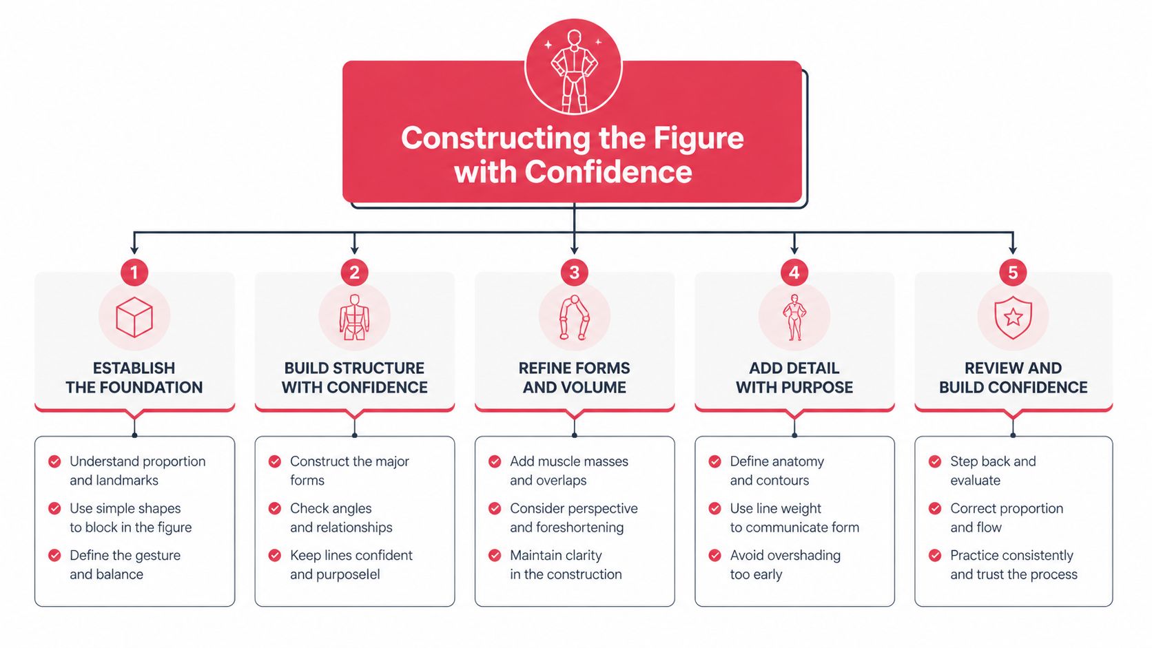
Begin with a gesture line
A gesture line is the action path running through the pose. It is the spine of the pose’s emotion. A charging hero might have a long forward curve. A proud queen might have a straighter, taller axis. A sneaky thief might have bends and angles that compress the torso.
Don’t start with the outline of the body. Start with the force.
Try this sequence:
- Draw one flowing line for the pose’s direction.
- Add a simple line for shoulders.
- Add a simple line for hips.
- Place the head as a tilted shape, not a finished face.
- Mark where the weight lands on the feet.
That gives you rhythm before detail.
If the stick figure already feels alive, the finished drawing usually will too.
Build the mannequin from simple forms
Once the gesture works, turn it into a rough mannequin. At this stage, beginners often tense up, but keep it simple. You are not drawing anatomy textbooks. You are placing boxes, cylinders, and wedges.
Use these rough form ideas:
- Ribcage: egg or barrel shape
- Pelvis: box or flattened wedge
- Arms and legs: tapered cylinders
- Hands and feet: blocky placeholders
- Neck: short cylinder
- Head: ball plus jaw shape
This approach helps you think in volume. Comics need bodies that can rotate in space, not flat symbols glued onto the page.
A common mistake is making the torso one long tube. Break it into ribcage and pelvis with space between them. That gap is where twist, bend, and personality happen.
Use the heroic proportion system
Western comics often use the 8-heads-tall proportion model for heroic figures. According to this tutorial on comic figure proportions, the model stretches realistic human averages by 6 to 7%, was popularized by artists like Jack Kirby in the 1940s, became standardized during Marvel’s Silver Age in the 1960s, and is taught in over 90% of comic art academies.
That sounds technical, but it’s easy to apply once you know the landmarks.
Here’s the practical version:
| Head unit | Landmark |
|---|---|
| 1 | Top of skull to chin |
| 2 | Chest or nipple line |
| 3 | Around the hip region |
| 4 | Bottom of pelvis |
| 4.5 | Widest part of thighs |
| 6 | Knees |
| 7 | Widest part of calves |
| 7.5 | Ankles |
| 8 | Bottom of feet |
This system gives comic characters that larger-than-life presence people associate with superheroes and action-driven storytelling.
A few useful notes:
- Broad shoulders help the figure feel powerful.
- Longer legs often make a design feel more heroic.
- A narrower waist increases contrast in the silhouette.
- Female and male pelvis shapes can differ, with female pelves often drawn shorter and wider, and male pelves taller and narrower in this model.
Don’t treat the system like a prison. Treat it like a reliable default. Once you can hit these landmarks consistently, you can stylize with confidence.
Turn structure into believable mass
This is the point where your drawing stops looking like a construction diagram and starts reading as a person.
Instead of tracing final outlines too early, wrap the mannequin with forms:
- define the shoulder cap over the upper arm
- show the thigh flowing into the knee
- let the calf sit lower on the leg, not centered
- taper the forearm toward the wrist
- give the torso front, side, and tilt
Think in overlapping forms. Overlap creates depth. A chest sits over the abdomen. A deltoid overlaps the upper arm. A boot wraps the ankle instead of ending in a flat line.
Here’s a quick self-check list when a figure looks wrong:
- Is the head too large for the body style?
- Do shoulders and hips tilt in a believable way?
- Does one leg carry more weight than the other?
- Do the hands hang too low or too high?
- Is the pelvis placed, or did you skip it?
Use pose families for easier practice
If full-body invention feels overwhelming, sort poses into simple categories and practice one category at a time.
- Standing poses: best for balance and proportion drills
- Action poses: best for gesture and line of action
- Conversation poses: best for subtle asymmetry and body language
- Landing or crouching poses: best for compression and force
That keeps practice focused.
You don’t need to draw every tendon. You need a body that looks like it could move, fight, stumble, laugh, and hold the costume you’re about to design. That’s the primary job of figure construction in comics.
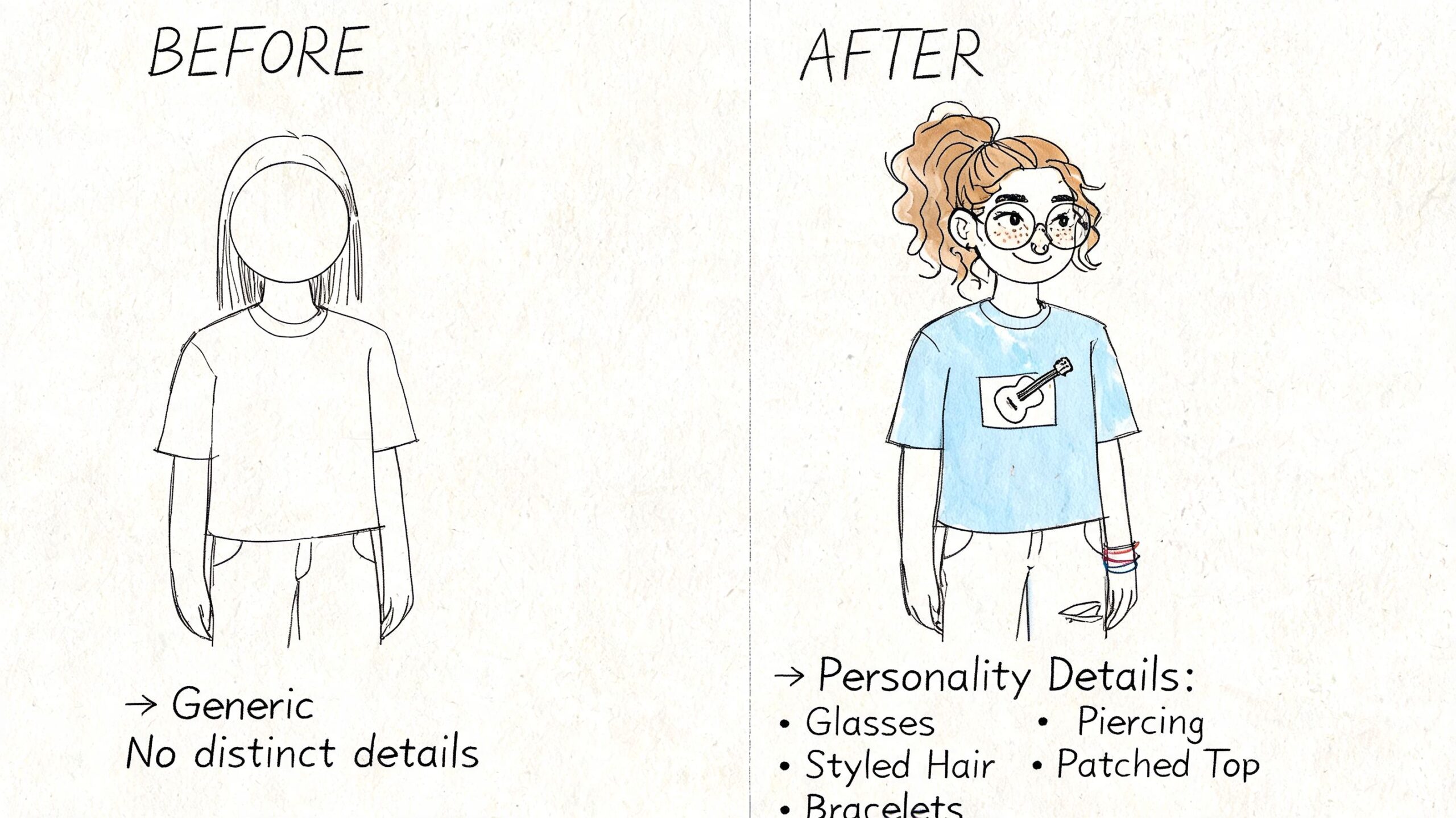
Adding Personality Through Defining Details
A solid figure gets your character on the page. Details make that character memorable.
Readers decide whether your design feels generic or alive through its details. The face, costume, hands, hair, and small accessories all work together to answer one question. Who is this person?
Build expressions from a neutral face
Most expression problems happen because the artist changes only the mouth. In comics, emotion usually comes from the whole upper face first.
Think about these parts as a team:
- Eyebrows: the fastest way to show tension, concern, confidence, or confusion
- Eyes: wide, narrowed, relaxed, hidden, focused
- Mouth: open grin, tight line, smirk, clenched teeth, slack jaw
- Cheeks and jaw: lifted for smiles, tightened for anger, dropped for surprise
A good practice method is to draw one neutral head, then duplicate it several times and change only one feature at a time. Raise the brows. Then lower them. Narrow the eyes. Tilt the mouth. You’ll start noticing which combinations create believable emotion and which ones fight each other.
Workshop note: Angry eyebrows with a smiling mouth can work, but only if you want menace or sarcasm. Mixed signals are powerful when they’re intentional.
Keep your character’s default expression in mind too. Some heroes always look composed. Some look like they’re one bad sentence away from starting a fight. That resting expression becomes part of their identity.
Let the costume explain the character
A costume should tell the truth about the person wearing it. It doesn’t need to be realistic in a strict sense, but it should feel internally consistent.
Ask these questions while designing:
- Does this person need to move fast?
- Are they trying to be seen or hidden?
- Would they repair their own gear?
- Are they wealthy, improvised, ceremonial, military, mystical?
Those answers shape the design better than “What looks cool?” on its own.
Here are three useful costume rules:
- Start with big shapes. Cape, jacket, armor mass, skirt shape, boot height.
- Limit your signature details. One emblem, one unusual seam pattern, one standout accessory often reads better than ten small ideas.
- Repeat design language. If the shoulder armor is angular, maybe the gloves and boots should echo that language too.
Beginners often overload costumes with random straps, panels, and buckles. If every area screams for attention, nothing stands out. Choose one focal area, usually chest, face, or silhouette.
Hands, feet, and hair without panic
These three areas scare beginners because they’re expressive and easy to overcomplicate. Simplify them.
Hands
Think of the hand as a mitten shape first, then split the fingers later. For action poses, clarity matters more than finger anatomy. A hand pointing, gripping, or open in surprise should read instantly.
Try this order:
- palm block
- thumb direction
- finger group shape
- individual fingers only if needed
Closed fists work well as a training exercise because they teach structure without too much detail.
Feet
Feet are not triangles stuck on the leg. Treat them like wedges with top, side, and sole planes. Make sure the foot points in a direction that matches the pose’s balance. If the feet feel wrong, the whole figure often looks unstable.
Hair
Hair is mass before strands. Draw the big silhouette first. Then break it into chunks. Then add a few accent lines for texture.
Different hair design choices change personality fast:
| Hair choice | Personality effect |
|---|---|
| Clean and flat | controlled, polished, reserved |
| Wild spikes | volatile, energetic, rebellious |
| Heavy curls | lively, dramatic, warm |
| Long straight shapes | elegant, calm, mysterious |
Add one unforgettable feature
A memorable character usually has one detail readers can recall immediately.
It could be:
- a broken nose
- star-shaped glasses
- one oversized gauntlet
- a stitched cape hem
- a mechanical knee
- a grin with one chipped tooth
This feature doesn’t need to dominate the design. It just needs to anchor memory.
A useful test is to hide the costume details and ask yourself, “Would I still recognize this character from the head shape, silhouette, and one signature trait?” If the answer is no, simplify and strengthen.
Comic design gets better when you stop decorating and start choosing. Every line should support identity.
Inking Coloring and Finalizing Your Art Style
The finishing stage is where many promising drawings get muddied. Not because the artist lacks talent, but because they rush. A clean finish comes from making deliberate decisions in layers.
Professional artists often rely on a staged workflow. According to this breakdown of comic art workflow stages, the process moves through thumbnails, roughs, pencils, inks, and colors so artists can catch problems early and avoid painful fixes after committing to darker, harder-to-change stages.
Ink with purpose
Inking isn’t tracing. It’s editing.
When you ink, decide which lines deserve attention and which should stay quiet. The main tool here is line weight, meaning the thickness or boldness of your lines.
Use heavier lines for:
- shadows and forms turning away from light
- foreground elements
- major outer contours
- places where one form overlaps another
Use lighter lines for:
- interior costume seams
- facial detail
- texture accents
- distant elements
That contrast creates depth fast. A jawline with slightly thicker shadow-side weight reads more solid than a perfectly even outline around the whole face.
Clean inks come from confidence, not speed. Pull the line you mean, then leave it alone.
If you work traditionally, rotate the page instead of twisting your wrist into awkward angles. If you work digitally, zoom out often so you can judge the overall read, not just tiny sections.
Color for mood, not decoration
Color should support the character’s identity and the tone of the story.
A simple way to choose a palette is to pick:
- one dominant color
- one support color
- one accent color
That keeps the design readable. Too many equal-intensity colors can make the character feel noisy.
Also decide where your light source is coming from before you shade. If the light is above and to the left, keep that logic consistent across the face, clothing folds, and accessories. Even stylized shading feels convincing when the light behaves consistently.
If you want to study how different visual approaches change mood, this article on creating stunning comic book style artwork offers a helpful style overview.
Compare styles before you commit
Different comic styles make different promises to the reader. You don’t need to lock yourself into one forever, but it helps to know what each style emphasizes.
Comparison of Popular Comic Book Art Styles
| Style | Line Work | Color Palette | Key Feature |
|---|---|---|---|
| Manga | Clean, expressive, often varied for emotion | Often minimal or monochrome, with selective accents | Strong focus on faces, speed, and mood |
| American Classic | Bold contours with energetic interior detail | Clear primary and secondary color relationships | Heroic impact and readable action |
| Noir | Heavy blacks, sharp shadows, selective highlights | Muted or limited palette | Drama through contrast and atmosphere |
| Graphic Novel | Flexible, often tailored to tone | Naturalistic or restrained | Story-first visual language |
| Fantasy | Decorative line, layered textures | Rich earth tones or luminous magic accents | Worldbuilding through costume and ornament |
Pick the finish that serves your character best. A gritty vigilante can disappear under bright, toy-like colors. A cheerful magical hero might lose charm in harsh noir shadows.
Your style develops as your decisions become more consistent. Not when every drawing looks the same, but when your choices start sounding like your visual voice.
The AI Shortcut Your Modern Creative Co-Pilot
Not everyone who loves comics wants to spend years studying anatomy, inking, and color. Some people want to tell a story, prototype a cast, make a gift, or visualize an idea quickly. That’s a valid creative goal.
AI tools can help with that.
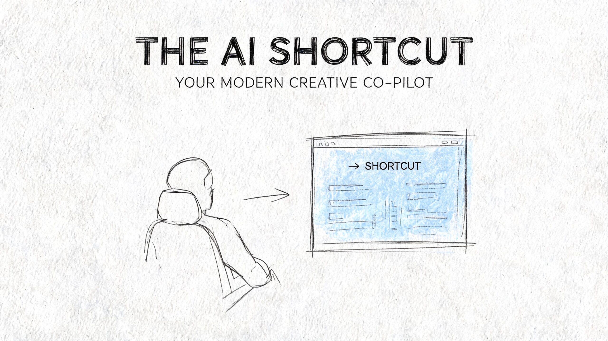
Think of AI as a creative co-pilot, not a replacement for all artistic judgment. It’s useful when you need fast visual exploration, alternate costume ideas, pose inspiration, or a first-pass version of a character concept. It’s also helpful for writers who can describe scenes clearly but don’t have the drawing skills to build them manually from scratch.
Here are some practical uses:
- Rapid prototyping: test whether a hero feels better in military gear, streetwear, or fantasy armor
- Gift creation: turn a friend or family member into a stylized comic character
- Pitch support: generate a visual direction before investing in a full custom art process
- Reference building: create rough inspiration for poses, moods, and environments
For artists, AI can be a sketch partner. You might generate options, borrow the broad idea, and redraw everything in your own hand. For non-artists, it can be the bridge between “I have a story” and “I have pages I can share.”
The smartest way to use AI is still the old-school way. Start with a clear character concept. Know the role, attitude, silhouette, and emotional tone you want. AI works better when your direction is specific.
If you’re curious about using images of real people as a starting point, this guide on turning photos into comic book art shows what that path can look like.
Manual drawing teaches control. AI speeds up experimentation. You don’t have to treat those as enemies. For many creators, they’re two tools solving different problems.
Your Mission Begins Now Practice and Create
The heart of comic character design is simple. Start with a clear idea. Build a strong figure. Add personality through expression and costume. Finish with line, color, and consistency.
That’s the full path, even if your first version is rough.
Don’t wait until you “feel ready.” Readiness usually shows up after repetition, not before it. Your early drawings are supposed to teach you where your weak spots are.
Try these practice exercises this week:
- Ten head challenge: draw ten circles and turn each into a different character head
- Three-emotion sheet: draw the same face as calm, furious, and delighted
- Pose study session: sketch people standing, sitting, and walking from life or photo reference
- Silhouette drill: fill a page with black shape-only character ideas, no interior details
- Costume remix: take one character and design three versions for different worlds
- Hand mini-page: draw fists, open hands, pointing hands, and gripping hands
- Turnaround practice: make one front, profile, and back view of your character
Your goal isn’t perfection. Your goal is to make the next drawing clearer than the last one.
If you stick with the process, your characters will start feeling less like guesses and more like people you know. That’s when drawing gets fun. The page stops fighting you, and your ideas begin showing up in a form other people can see.
Whether you draw every line by hand or use modern tools to speed up the journey, keep going. The character in your head deserves a page.
If you want to turn an idea, a photo, or a rough story concept into polished comic pages fast, PersonalizedComics gives you a practical shortcut. You can create one-of-a-kind comic books in multiple professional styles, prototype story ideas without advanced drawing skills, and even order a premium physical copy when you’re ready to hold your story in your hands.