How to Draw Comic Books: A Beginner’s Step-by-Step Guide
You’ve probably got one of three things right now. A cool character in your head, a scene you can already see like a movie, or a blank page that feels much louder than it should.
That’s a normal place to start.
Most beginners think learning how to draw comic books begins with anatomy, fancy rendering, or buying the right pen. It doesn’t. Comics are a storytelling medium first. A rough page with clear acting and readable panels will beat a beautiful page that confuses the reader every time.
The good news is that comic making isn’t magic. It’s a workflow. Professionals use a structured chain of decisions so they don’t have to reinvent the page every time they sit down. If you learn that chain, you can make real progress fast, whether you draw traditionally on paper, work digitally on a tablet, or use modern tools to speed up the parts that usually stop beginners cold.
From Big Idea to Beat Sheet
A comic usually dies long before the drawing goes bad. It dies when the creator doesn’t know what happens next.
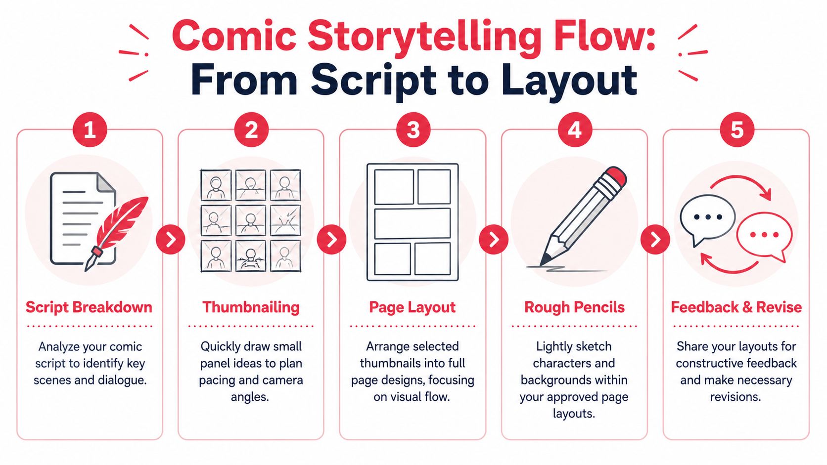
That’s why the first job isn’t drawing. It’s deciding what your story is about. A professional workflow starts with scripting, then thumbnails, then rough sketches, then inking, then digital finishing, and scripting is the stage that keeps projects moving. One guide to the comics process notes that scripting can boost completion rates by 3000% because it clarifies page breakdowns into a standard issue structure (comic creation workflow breakdown).
Start with a premise you can finish
Don’t open with your universe bible. Open with one sentence.
A workable premise sounds like this: a kid finds a haunted camera, a retired hero has to protect his daughter for one night, two friends sneak into a monster city after curfew. That gives you conflict, a point of view, and a direction.
If your idea keeps expanding, shrink it until it fits a short comic. That’s the discipline beginners need most.
Practical rule: If you can’t summarize the story in a few sentences, you’re not ready to draw page one.
Build a beat sheet, not a novel
A beat sheet is just the important story moments in order. It’s lighter than a full script and much easier to revise. For a short comic, list the turning points first, then worry about dialogue.
Try this sequence:
Opening situation
Show the ordinary world or the current problem.Disruption
Something changes. The character can’t ignore it.Escalation
The problem gets harder, stranger, or more personal.Decision
The character makes a meaningful choice.Climax
The biggest confrontation happens.Aftermath
Show what changed.
That’s enough to start. It doesn’t need to sound literary. It needs to be usable.
Think in pages, not scenes alone
Comics live and die on page turns and panel economy. A cool scene that takes too long to land will feel slow. A major reveal buried in the middle of a crowded page will lose impact.
When you write beats, ask:
What must the reader understand here
One core idea per beat keeps the page clean.What deserves a page turn
Surprises, entrances, and reversals hit harder when revealed after the turn.What can be shown instead of said
Good comics cut explanation wherever facial expression, body language, or environment can do the job.
If you want a cleaner script format before thumbnailing, study a simple graphic novel script approach and adapt only what helps you keep momentum.
Keep dialogue on a leash
Beginners overwrite because empty space feels scary. Resist that urge.
A comic page has limited room for art, balloons, and pacing. If a character speaks for half the panel, the image has less work to do. Shorter dialogue usually gives your page more energy, and it leaves room for acting.
A useful test is to remove every line that merely explains what the drawing already shows. If the character is running from a fire, they don’t need to say, “We have to get out of here, there’s a fire.”
They can say something with character instead. Or say nothing.
Visualizing Your Story with Thumbnails and Layouts
Once the script works, directing truly begins. Here, you decide what the reader sees first, what they feel, and how fast they move through the page.
Most beginners skip thumbnails because they want to get to the “finished art.” That’s backwards. Thumbnails are where the core thinking occurs. Finished art is the execution.
Thumbnail small so you can think big
A thumbnail is a tiny sketch of the page. Keep it loose. Stick figures are fine. Boxes are fine. Scribbles are fine if they tell you where the action goes.
What matters is that you solve these problems early:
Panel count
Too many panels slows reading and shrinks the art.Camera choice
Long shot, medium shot, close-up. Variety creates rhythm.Page flow
The eye should move naturally from panel to panel.
The point of thumbnailing is cheap failure. You want to discover weak pages when they take two minutes, not two hours.
Use grids until you know why you’re breaking them
A standard page structure gives you control. The classic grid works because it’s readable. It creates order, then lets you break that order for emphasis.
Here’s a simple comparison:
| Layout choice | What it does well | Where it fails |
|---|---|---|
| Even grid | Clear pacing, easy reading, steady rhythm | Can feel stiff if every page looks the same |
| Tall vertical panels | Great for falls, buildings, reveals, movement | Can crowd dialogue if overused |
| Wide horizontal panels | Good for landscapes, pauses, cinematic beats | Can flatten action if everything becomes a panorama |
| Splash or near-splash moments | Emphasizes impact and spectacle | Loses power if used too often |
Most beginners don’t need more complexity. They need better clarity.
A strong layout makes the reader feel guided, not managed.
Direct the eye on purpose
Comics aren’t animation. Nothing physically moves. You create movement by controlling sequence, shape, contrast, and placement.
Use these checks on every page:
Top-left entry point
Make the first panel obvious. Don’t ask the reader to hunt for where to begin.Balloon placement
Speech balloons should support reading order, not fight it.Value and detail control
The busiest area pulls attention. Save your highest contrast for what matters most.Clear silhouettes
If two characters overlap into a muddy shape, the moment weakens.
Perspective is not optional
Even stylized comics need believable space. Perspective is what stops a room from feeling like wallpaper pasted behind a figure.
A practical guide from Dirk Tiede emphasizes that mastery of perspective using vanishing points is a technical cornerstone for dynamic comic layouts, and that identifying the horizon line and vanishing points helps non-vertical elements recede naturally, avoiding the flat look that affects 75% of amateur panels (Dirk Tiede perspective guide).
If you’re roughing a room, street, or vehicle scene, find the horizon first. Then place the vanishing points and build your floor lines, walls, tables, doors, and windows from that structure. Don’t freehand perspective once the shot gets complicated. That shortcut usually costs more time later.
Test pages before committing
Before you pencil the full comic, choose two pages and rough them larger. One quiet scene. One action scene. If both read clearly, your visual language is probably sound.
If they don’t, don’t “push through.” Go back and fix the thumbnails.
That’s not wasted effort. That’s professional judgment.
Bringing Characters and Worlds to Life
Now you can draw for real. This is the stage often imagined when one thinks about making comics, but it only works smoothly when the earlier decisions are solid.
The goal isn’t to make every panel look like a poster. The goal is to make each panel readable, expressive, and consistent with the rest of the page.
Build characters from repeatable shapes
A good comic character isn’t just attractive or cool. They’re easy to redraw.
Start by reducing each character to a few simple forms. One might be built from squares and blunt angles. Another from circles and soft curves. A third from long triangles and sharp features. Those shape choices become your shorthand for consistency.
Use a small reference sheet with:
- Head front, side, and three-quarter view
- Neutral standing pose
- Key expressions
- Signature features, such as hair shape, jacket, glasses, or posture
That sheet saves you from reinventing the face in every panel.
If you want extra help designing characters that hold together from shot to shot, this comic book character drawing guide is a useful supplement to your own reference process.
Working habit: If a design takes too long to draw in panel three, it’s the wrong design for page twenty.
Pencil for decisions, not decoration
Penciling is where you solve acting, staging, and storytelling. Don’t treat it like a draft you can ignore. Bad pencils create bad inks.
When you pencil, focus on:
Gesture first
Action and body language matter more than costume details.Facial clarity
Push the expression enough that it reads at panel size.Environment support
Give the scene enough background to establish place, but don’t smother the characters.Light logic
Decide where the main light comes from before you ink heavy shadows.
This stage should feel exploratory but controlled. You’re locking in choices.
Why pros still draw larger
Traditional comic artists usually don’t draw at print size. They draw larger, then reduce the art for reproduction. In American comics, 11×17 inches remains the standard working size, and that oversized format sharpens linework and detail when reduced to final print dimensions, a practice that has held since the Golden Age of Comics (Brian Shearer on comic paper choices).
That larger surface gives your hand more room to place clean lines, subtle expressions, and tighter backgrounds. It also makes corrections less cramped.
A few practical tool choices still hold up well:
| Tool | Best use | Trade-off |
|---|---|---|
| 11×17 Bristol board | Traditional penciling and inking | Takes physical storage space |
| Micron pens | Controlled technical lines | Less variation than a brush |
| Brush pen or brush | Organic, lively line weight | Harder to master cleanly |
| Digital tablet | Easy revisions and file prep | Can tempt you into endless tweaking |
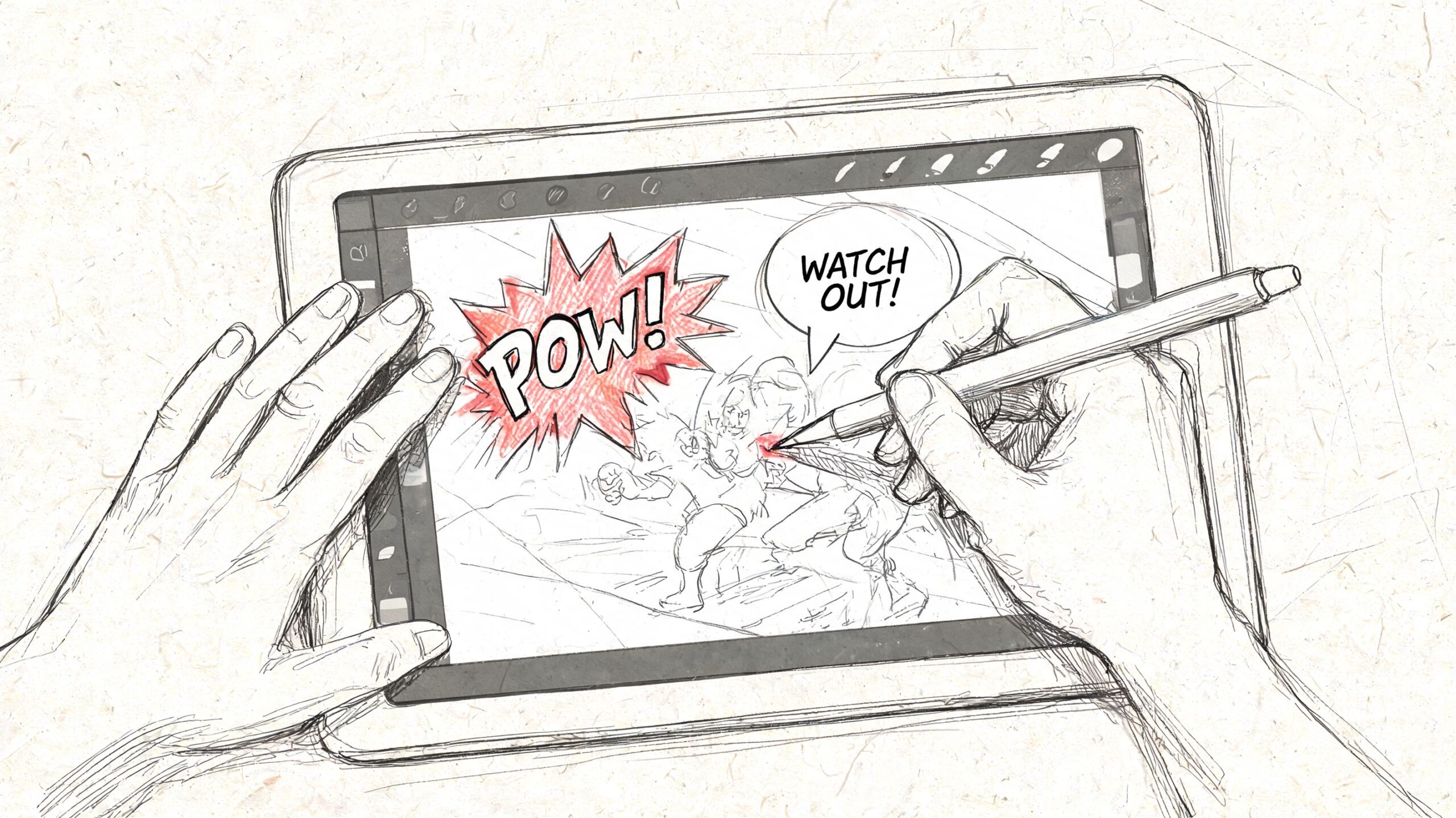
Ink with intention
Inking isn’t tracing. It’s editing.
You’re deciding which lines matter, where the eye should go, and how solid forms feel. Line weight does a lot of heavy lifting here. Thicker outer contours can separate a figure from the background. Thin interior lines can suggest texture without clutter.
A clean inking order helps. Borders and balloons first if you need the page architecture locked down. Then major figures. Then backgrounds. Then black fills and texture.
What doesn’t work is noodling every inch of the page with equal intensity. Uniform detail makes a page feel noisy. Good inks create hierarchy.
The Final Polish with Coloring and Lettering
A comic can have strong drawing and still feel amateur at the finish line. That usually happens in two places. Color with no control, and lettering with no discipline.
These final steps aren’t decoration. They tell the reader where to look, what to feel, and how to hear the scene in their head.
Color should support the story
Beginners often color every object locally and then stop. Blue shirt, brown table, green wall, done. That fills space, but it doesn’t create mood.
A stronger approach starts with scene intent. Is the page tense, nostalgic, sickly, warm, lonely, loud? Pick a restrained palette that supports that emotion, then use accents to control focus.
Try this order:
Flat colors first
Keep them simple and readable.Establish light direction
Add shadows consistently.Reserve the strongest contrast
Use it near the focal point.Adjust page harmony
Make sure one panel doesn’t accidentally overpower the rest.
If you work digitally, use layers with discipline. Too many effects can make the page feel plastic. Basic flats, shadows, and a few controlled highlights often read better than a stack of glow modes.
Lettering can save or sabotage a page
Readers forgive rough art faster than they forgive bad lettering. If balloons are confusing, they feel the page fighting them.
Good lettering follows a few hard rules:
Read in natural order
Balloons should guide the eye left to right and top to bottom.Leave breathing room
Crammed text feels stressful, even in calm scenes.Don’t cover acting
Balloons should sit where they help composition, not where they erase facial expression or hands.Shape balloons to the tone
Regular speech, whispering, radio chatter, and sound effects should not all feel identical.
If the reader has to stop and decode balloon order, the scene loses its rhythm.
Sound effects deserve the same care. They’re part image, part text. A heavy impact hit should look different from a tiny mechanical click. Match the shape and weight of the letters to the sound you want the reader to feel.
Prepare files like you mean to publish
Production mistakes are boring, but they can ruin a strong page. Before exporting for web or print, check the technical basics.
| Production area | What to watch for | Common mistake |
|---|---|---|
| Bleed | Extend art beyond trim edge where needed | White slivers at the page edge |
| Margins | Keep text and key art safely inside | Balloons too close to trim |
| Resolution | Export clean, print-ready files | Soft lines from undersized art |
| Page order | Confirm sequencing and spreads | A reveal landing on the wrong side |
Even if you’re only posting online, build the habit of clean file prep. Organized layers, named pages, and export consistency spare you a lot of avoidable pain.
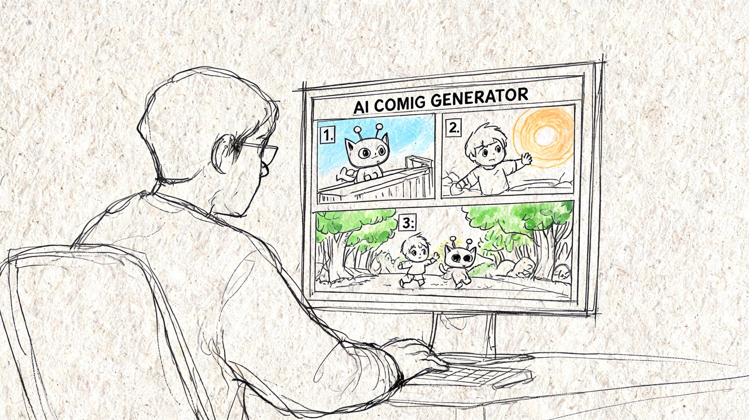
The Fast-Track When You Cannot Draw
Not everyone who wants a comic wants a drawing apprenticeship. That’s a real distinction, and it matters.
Some people want to make a birthday comic for a partner. Some want to prototype a graphic novel idea before hiring an artist. Some want to turn family photos into a playful story for kids. In those cases, the traditional route can be the wrong tool for the job, not because it lacks value, but because it asks for a lot of time and trained execution.
Where beginners usually get stuck
The hardest part for many hobbyists isn’t having ideas. It’s converting ideas into consistent pages.
One especially stubborn problem is photo-based character consistency. A cited summary of this beginner pain point notes that a 2025 DeviantArt survey showed 62% of hobbyists struggle with character consistency from photos, especially when trying to turn real people into repeatable comic characters across panels and styles (photo-to-comic character consistency discussion).
That tracks with what many beginners run into fast. A selfie might become a decent single portrait, but the moment the character has to act from multiple angles, wear different expressions, and appear across several pages, the whole thing starts drifting.
When an AI workflow makes sense
There’s no honor in suffering through the wrong process.
If your goal is to learn draftsmanship, draw by hand. If your goal is to tell a story, test a concept, or make a one-off personalized comic, an AI-assisted workflow can be a smart shortcut.
It works especially well for:
Gift projects
Turning real people into stylized comic characters without learning figure drawing first.Story prototyping
Checking whether a concept works as sequential art before investing in a longer production process.Educational or family projects
Creating something fun and readable without needing months of practice.Writers with visual ideas
Seeing scenes on the page when the writing is stronger than the drawing.
A practical way to think about it is this. Traditional methods teach craft depth. AI tools remove startup friction.
Use the shortcut strategically
The weak way to use AI is to let it replace thinking. The strong way is to let it handle bottlenecks while you still make the creative calls.
That means you still need:
- a clear premise
- a page-by-page sense of pacing
- dialogue that sounds like people
- visual judgment about what belongs on the page
For people who want a guided route from idea to finished comic without doing all the drawing manually, this beginner-friendly comic creation walkthrough can help map the process.
The tool doesn’t create taste for you. It gives your taste a faster way onto the page.
That’s the useful frame. Not artist versus machine. Goal first, workflow second.
Start Your Comic Creation Journey Today
The first comic you finish will teach you more than the ten you only imagine.
Keep the scope small. Make a short story. Limit the cast. Choose clarity over ambition when the two conflict. A finished rough comic is worth more than a gorgeous opening page with no ending behind it.
If you want to learn how to draw comic books the traditional way, start with script, thumbnails, clear pencils, and disciplined finishing. If your real goal is storytelling, gifting, or fast concepting, use modern tools without guilt. The best method is the one that gets the story told well.
What matters is finishing a sequence of pages that someone else can read and enjoy. That’s comics.
If you want the fastest path from idea or photo to a polished custom comic, PersonalizedComics lets you create page-by-page stories in multiple art styles without a subscription. It’s a practical option for gifts, prototypes, and personal projects when you want a finished comic more than a long technical learning curve.