Comic Book Style: A Guide to Creating Your Own Look
You’re probably here because you’ve had that exact moment. You open a comic, stare at a page full of energy, motion, and drama, and think, “I love this look. I have no idea how people make it.”
That reaction is normal. Comic pages can feel magical because they combine drawing, cinematography, design, writing, and rhythm all at once. For beginners, that mix can make the comic book style seem locked behind years of art training.
It isn’t.
Comic book style is a visual language. Like any language, it has patterns you can learn. A thick shadow means one thing. A tilted panel means another. A low camera angle can turn an ordinary person into a hero. Once you understand those choices, the mystery starts to disappear.
That’s the exciting part for non-artists. You don’t need to master anatomy, perspective, and brush control before you can start telling stories in this medium. Modern AI tools have lowered the barrier. If you can describe a mood, choose a style, and decide what should happen in each scene, you can begin creating something that feels recognizably comic book.
Your Guide to the Comic Book Style
A beginner usually doesn’t struggle because they lack imagination. They struggle because they don’t know what to look for.
You might love the sharp shadows in a noir page, the punchy color of a superhero cover, or the emotional close-ups in manga. But if someone asks what makes those pages work, the answer often comes out vague: “It just feels dramatic.” That feeling matters, but it’s only the surface.
Comic art works because artists make a series of deliberate choices. They choose where the eye goes first. They decide whether a moment needs silence, speed, or impact. They control how big a character appears, how crowded a panel feels, and how text sits on the page. None of that is random.
Practical rule: Don’t treat comic book style as one fixed look. Treat it as a toolkit for storytelling.
That shift changes everything. Instead of asking, “Can I draw like a professional comic artist?” ask, “Can I use framing, contrast, pacing, and expression to tell a scene clearly?” That’s a much more useful question, and one that proves much more encouraging.
Think of this guide as art class without the gatekeeping. We’re going to break the comic book style into understandable parts, use plain language, and keep circling back to one core idea: you can build a compelling comic page even if you’ve never considered yourself an artist.
What Defines the Iconic Comic Book Style
Comic book style didn’t appear out of nowhere. It grew out of a particular moment in publishing history, and that history explains why the style still feels so immediate today.
According to the history of American comics, the Golden Age of Comic Books (1938-1956) established the core visual and narrative conventions of modern comics. The boom began with Superman’s debut in Action Comics #1 in 1938, and monthly comic sales rose from under 1 million copies in 1938 to over 14 million by 1947.
That matters because mass readership shaped the art. Comics had to grab attention fast, read clearly, and communicate emotion at a glance. Artists responded with bold silhouettes, direct compositions, dramatic poses, and simple but powerful color choices. They weren’t just decorating pages. They were solving a storytelling problem.
Why the style looks bold
Early comic pages needed to read cleanly in print and appeal to a broad audience. That pressure pushed artists toward visual clarity.
A few traits became recognizable fast:
- Bold linework that made figures pop from the background
- Primary colors that felt energetic and readable
- Dynamic action poses that made even still images feel in motion
- Structured panel grids that kept stories easy to follow
- Speed lines and exaggerated anatomy that heightened action
If you’ve ever said a comic page feels “larger than life,” you’re responding to those choices.
Why the style still works
Comic book style is effective because it simplifies without becoming flat. It strips a scene down to what the reader needs most: who matters, what they feel, and where the action lands.
Comics aren’t trying to reproduce reality exactly. They’re trying to make reality readable, emotional, and memorable.
That’s why the style travels so well across genres and eras. Superhero books use it for spectacle. Horror uses it for tension. Slice-of-life stories use it for emotional focus. The surface changes, but the underlying logic stays the same.
For a beginner, this is freeing. You don’t need to copy one famous artist or one era. You need to understand the DNA: clarity, contrast, emotion, and motion. Once you grasp those, the comic book style stops looking like a secret club and starts looking like a set of learnable decisions.
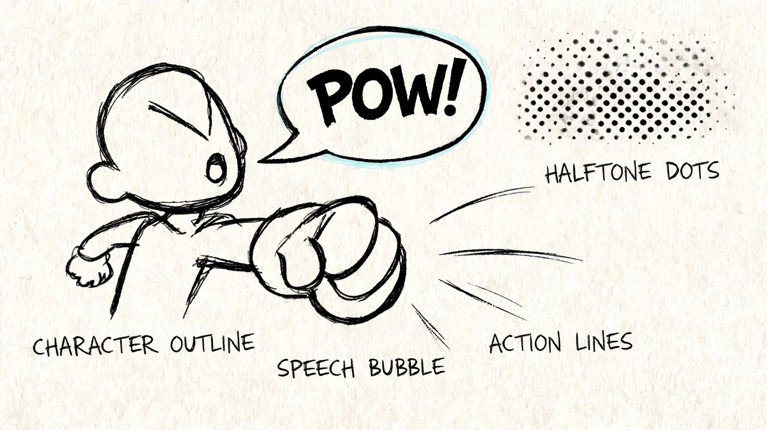
The Visual Language of Comics Deconstructed
A comic page works like a conversation between image and design. If one part is weak, the page can still function. If several parts work together, the page starts to sing.
This infographic captures the core pieces at a glance.
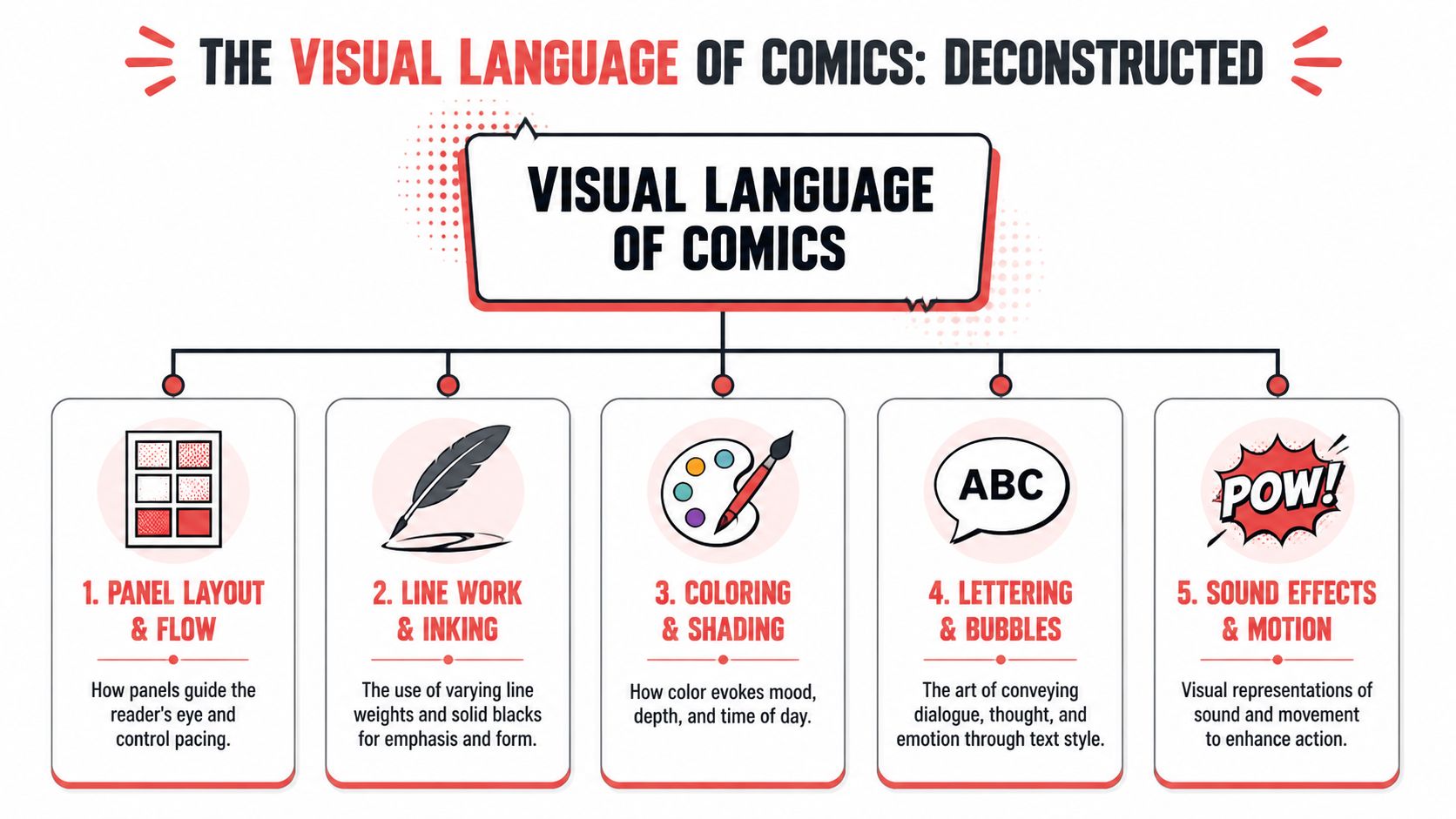
Panels, pacing, and reading flow
Panels are the sentences of a comic. A page layout determines how long the reader stays with a moment and how quickly they move to the next one.
A row of small panels can make a conversation feel measured and steady. One large panel can slow time down and say, “This moment matters.” A sudden narrow panel can create tension, like a pause before impact.
Beginners often think panel layout is only about fitting scenes on a page. Instead, it's about rhythm.
Try thinking this way:
- Small repeated panels create routine, dialogue, or suspense
- Wide panels feel cinematic and spacious
- Tall panels emphasize height, falling, or isolation
- Panel breaks and overlaps can make action feel unstable or explosive
If you’re using AI, describe the pacing, not just the objects. “Three tight reaction panels, then one large reveal” is more useful than “character in room.”
Linework, shading, and texture
Linework tells the reader what deserves attention. Thick outlines usually feel bold and graphic. Thin lines can feel delicate, quiet, or realistic. Heavy blacks add weight, mystery, and depth.
This is why two comics with the same subject can feel completely different. A detective standing under a streetlamp becomes noir with deep shadow shapes. The same figure becomes all-ages adventure with cleaner outlines and open lighting.
Texture matters too. Halftones, dot patterns, rough ink edges, and simplified shadow blocks all contribute to the comic book feel. Even when modern tools imitate those effects digitally, they still echo print traditions.
Key takeaway: If a page feels flat, the fix often isn’t “draw better.” It’s “increase contrast and decide what gets emphasis.”
Color, lettering, and sound
Color does more than decorate. It organizes space, suggests mood, and helps the reader separate foreground from background. Bright, high-contrast palettes feel energetic. Muted palettes feel reflective. Limited color can make a scene feel focused and intentional.
Lettering is another part beginners underestimate. Speech balloons, caption boxes, and sound effects aren’t extras. They are part of the drawing.
Consider what each element does:
| Element | What it communicates |
|---|---|
| Speech bubble | Spoken dialogue and tone |
| Caption box | Narration, time, memory, or commentary |
| Bold text | Emphasis or shouting |
| Jagged balloon | Electronic, angry, or unnatural voice |
| Sound effect text | Impact, movement, atmosphere |
A simple “BAM” can make a hit feel harder. A tiny “tap tap” can make a hallway feel tense. The words become visual objects.
Camera angles for emotion
This is one of the most useful pro techniques a beginner can borrow right away. As Rivkah LaFille explains in her guide to camera conventions in graphic novels, high and low angles suggest power relationships, while Dutch angles create unease.
That sounds technical, but the application is simple.
- Low angle. Looking up at a character makes them feel powerful, heroic, or intimidating.
- High angle. Looking down can make a character feel vulnerable, isolated, or overwhelmed.
- Side-on angle. Good for conversation, balance, and clarity.
- Dutch angle. Tilt the scene when something feels wrong, unstable, or tense.
If you’re making a birthday comic for a child, a low-angle pose can make them look like the star of their own superhero issue. If you’re telling an awkward school story, a high angle can make the hallway feel enormous and unfriendly.
AI proves especially helpful for non-artists. You may not know how to draw a dramatic perspective shot by hand, but you can ask for one clearly. “Low-angle hero shot, bold shadows, triumphant pose” is a creative direction, not an art degree.
Exploring Major Comic Book Style Genres
Once you understand the building blocks, it gets easier to see that “comic book style” contains many different flavors. They all use sequencing, framing, expression, and visual emphasis, but they remix those ingredients in very different ways.
If you want a broader survey of visual directions, this guide to different comic art styles is a useful companion. For now, focus on the emotional job each genre does.
A side by side style comparison
| Style Genre | Key Visual Characteristics | Emotional Tone | Best For Telling Stories About… |
|---|---|---|---|
| Classic American | Bold outlines, bright color, muscular poses, energetic action | Heroic, punchy, confident | Superheroes, adventures, big character moments |
| Manga-inspired | Expressive faces, dramatic angles, speed emphasis, emotional close-ups | Intense, heartfelt, kinetic | Coming-of-age stories, rivalries, fantasy, romance |
| Graphic novel | Flexible linework, grounded layouts, mood-driven color choices | Reflective, literary, human | Personal memoir, drama, social themes, character studies |
| Noir | Strong shadows, limited palette, moody contrast, urban atmosphere | Suspenseful, cynical, mysterious | Crime, thrillers, detective stories, moral conflict |
| Fantasy or retro-pop hybrids | Stylized design, decorative elements, playful exaggeration | Whimsical, heightened, imaginative | Quest stories, gifts, playful reimaginings of real people |
A common beginner mistake is choosing a style because it looks cool in isolation. A better approach is matching style to story mood. A sweet family story might feel stiff in hard-boiled noir. A detective mystery might lose tension in a bubbly all-ages palette.
Consistency matters more than complexity
Many hobbyists blend influences without realizing that consistency is what makes a comic feel finished. The ComicsGrid discussion of accenting techniques identifies eight methods of visual accenting: size, tilt, shape, spacing, overlap, frame, style, and position. For someone combining real photos with stylized art, those ideas are especially useful.
Here’s the beginner-friendly version. If one character looks painterly, another looks cel-shaded, and the background looks photoreal, the reader feels the mismatch immediately. The page stops feeling like one world.
Use these checks:
- Keep line treatment similar across characters and backgrounds
- Repeat shape language such as sharp angles for tense stories or soft curves for friendly ones
- Use overlap and framing intentionally so photo-based characters don’t feel pasted on
- Control spacing so busy details don’t fight the main subject
A polished comic page doesn’t need to be complicated. It needs to feel like every part belongs to the same story world.
That’s true whether you love superhero energy, quiet literary pages, or highly stylized genre mashups.
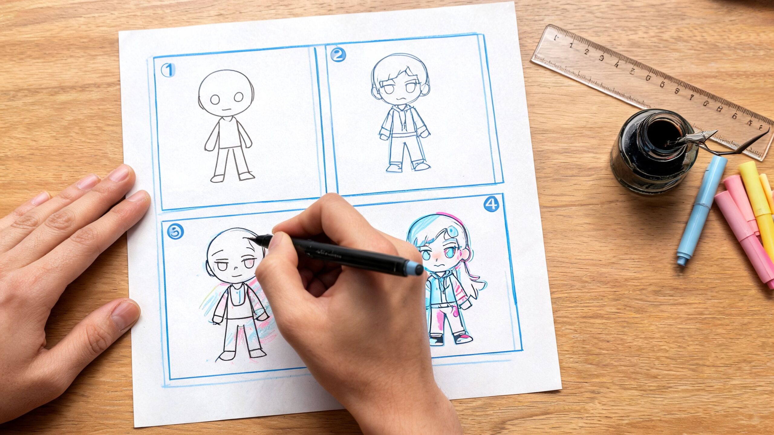
Practical Techniques for Creating Your Own Comic Look
Most beginners don’t need more inspiration. They need a process.
The good news is that comic book style becomes much easier when you stop trying to “make art” all at once and start making one decision at a time. Think scene, then shot, then mood, then text.
Start with a simple page blueprint
Before you worry about style, write the page in plain language.
Use a rough structure like this:
What happens first
“A kid opens a strange gift.”What changes
“The gift glows and surprises them.”What lands emotionally
“They realize it connects to a family memory.”
That gives you a visual arc. From there, choose moments that deserve panels. Don’t cram every detail into the page. Comics thrive on selection.
A useful beginner habit is writing short panel prompts instead of long paragraphs. “Close-up of hands opening box.” “Wide shot of room glowing.” “Reaction shot with stunned face.” Shorter prompts usually produce clearer visual storytelling.
Use text like a designer, not a novelist
A lot of first comics feel crowded because the creator writes prose where comic dialogue should be.
Keep these rules in mind:
- Short dialogue wins because the image is already doing part of the storytelling
- Captions should add context, not repeat what the art shows
- Sound effects add force when action needs extra punch
- Leave breathing room so bubbles don’t smother faces and gestures
If a character is clearly running, the caption doesn’t need to say, “She ran very quickly down the hall.” Let the art show the run. Use the text for what the art can’t say as efficiently, such as fear, irony, memory, or a hidden thought.
“Less text often creates more comic energy.”
Prompt for shots, not just subjects
When using AI, many people type only who is in the image. That leads to generic results. A better prompt includes viewpoint, mood, and page function.
Compare these two approaches:
- “Boy in superhero costume”
- “Low-angle hero shot of a boy in a homemade superhero costume, bold shadows, confident stance, classic comic book style”
The second prompt gives the system direction. It tells it how to frame the subject and what emotion to deliver.
You can also guide page flow with requests like:
- For reveals use “full-width panel” or “dramatic splash panel”
- For conversations ask for “side-on medium shots with clear speech bubble space”
- For tension try “tight close-up, deep shadow, narrow panel framing”
If you want more examples of how visual direction affects finished pages, this article on comic book style artwork is worth studying.
Respect print even if you start digital
A comic can look great on a screen and still run into trouble in print. That’s one reason professional page specs matter.
According to Automateed’s guide to comic book page size, the standard North American trim size is 6.625" × 10.25". For beginners, the main lesson is simple: keep important faces, dialogue, and action away from the edges.
When a page is trimmed, edge content is vulnerable. If a speech bubble sits too close to the border, part of it may feel cramped or visually risky. If a hand or word balloons into the edge carelessly, the page can look accidental instead of intentional.
That technical side can sound intimidating, but the creative takeaway is easy. Compose with a comfortable margin. Give your story room to breathe. Clean design almost always reads better than crowded design.
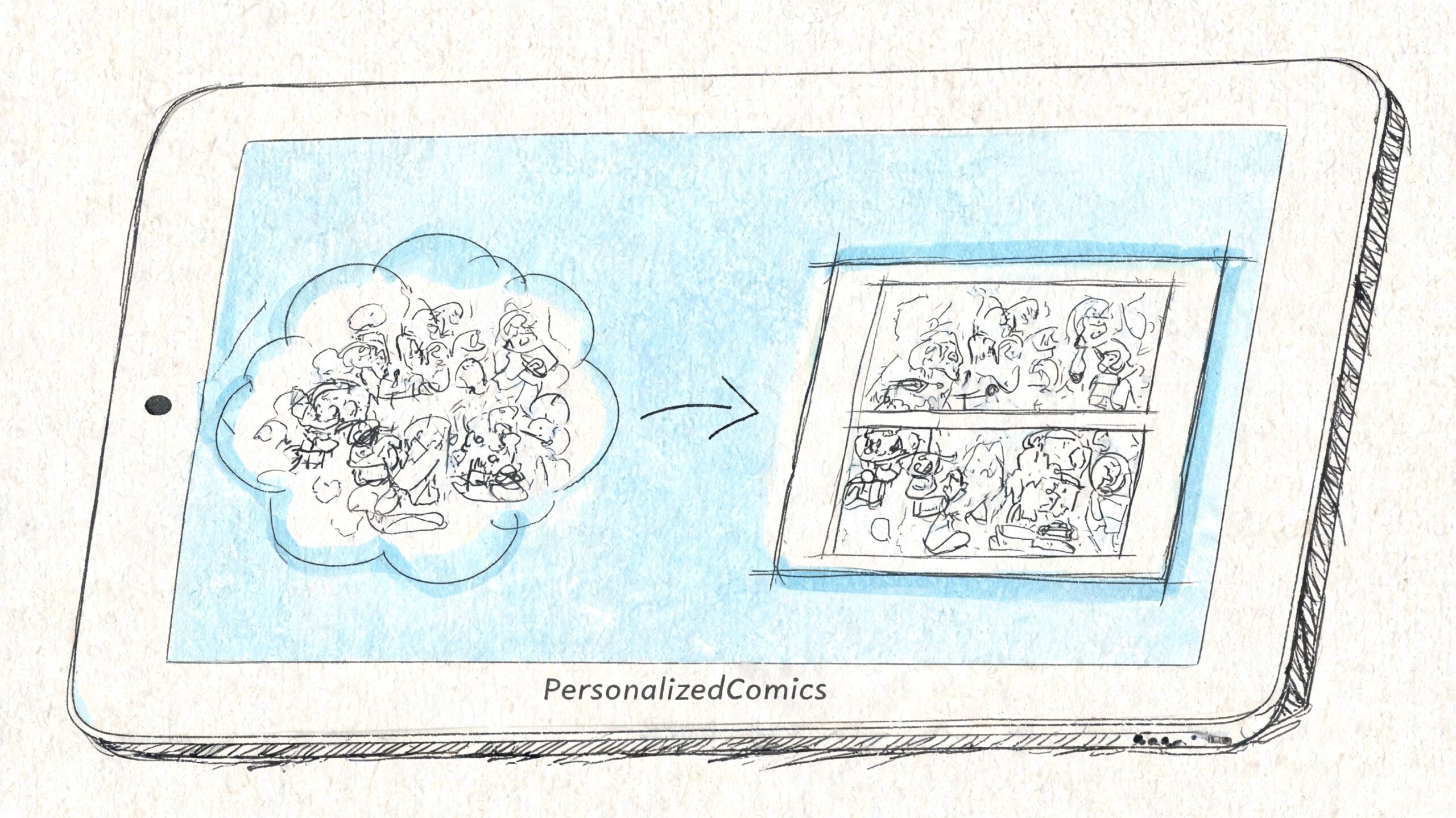
From Idea to Comic Page with PersonalizedComics
A lot of beginners freeze at the same point. They have a character idea, a gift concept, or a scene in their head, but the number of creative decisions feels overwhelming.
That’s where an AI comic tool becomes useful. It turns the process into a sequence of manageable choices rather than one giant artistic leap. Instead of drawing every panel from scratch, you decide the story, choose the visual direction, and guide the result.
Why this works for non-artists
The hardest parts of comic creation usually aren’t passion or imagination. They’re translation and execution. You know the birthday surprise should feel epic. You know the romance scene should feel soft and cinematic. You know the joke should land on the page turn. Turning that into finished art is the hurdle.
An AI-powered workflow helps by handling the rendering while you stay focused on direction:
- Choose an art style that fits the tone
- Upload photos or describe characters so the cast feels personal
- Write scene-by-scene prompts instead of drawing anatomy and perspective
- Adjust dialogue and narration until the page reads naturally
That makes comic creation feel closer to directing than to traditional illustration.
Digital idea, physical object
One of the most satisfying parts of making a comic is holding it in your hands. Format matters here. As Formax Printing explains in its overview of comic binding standards, saddle-stitch binding is the classic, cost-effective option for traditional comic presentation, while perfect binding suits longer, more premium graphic-novel-style projects.
That choice changes the experience of the final piece. A short, punchy gift comic feels right as a classic floppy-style booklet. A longer keepsake or collected story feels more substantial with a square spine and a book-like finish.
For hobbyists, that’s a huge advantage. You don’t need to treat your project as “just a digital experiment.” You can create something personal and then give it a form that matches the story’s scope.
If you want to see how people are turning personal ideas into finished projects, browse these examples of personalized comic books.
The leap from “I have an idea” to “I made a comic” gets much smaller when the tool handles the technical heavy lifting.
That’s why accessible comic creation matters. It opens the medium to gift makers, teachers, writers, parents, and fans who have stories to tell but never thought they had the right skills to tell them visually.
Now It Is Your Turn to Create
Comic book style isn’t a trick reserved for professionals. It’s a set of choices about clarity, emotion, pacing, and visual impact.
Once you can spot those choices, you can start using them. A low angle can make someone feel heroic. A shadow can create danger. A panel layout can stretch a moment or snap it forward. A consistent style can turn a personal memory into a world that feels complete.
That’s the fundamental shift. You’re no longer only admiring comic pages. You’re learning how they work, and that means you can begin making your own.
Start small. One page is enough. One joke, one memory, one gift story, one dramatic reveal. That’s all you need to practice the language.
If you’re ready to turn an idea into an actual comic, PersonalizedComics makes the process approachable. You can choose from eight art styles, upload photos or describe characters, and generate full comic pages without drawing skills. New users get four free credits, which is enough to start experimenting and make your first pages real.