Unlock Stunning Poster Comic Style Artwork
You’ve probably got a moment in mind right now. A birthday story that still makes your family laugh. A wedding memory that deserves more than a framed photo. A running joke between friends that would look amazing on a wall if it felt a little more alive, a little more cinematic, a little less generic.
That’s where poster comic style shines.
It gives you the punch of a poster and the storytelling energy of comics. Instead of making a full book, you build one focused piece of art that can capture a scene, a short sequence, or a whole vibe in a single composition. It works for gifts, room decor, event keepsakes, fan art, and personal memorabilia because it does two jobs at once. It looks good from across the room, and it rewards a closer look.
A lot of people freeze here because they assume comic art starts with drawing skills. It doesn’t have to. Instead, the starting point is choosing what the poster is trying to say, then shaping the visuals so the message lands clearly. That’s design thinking, not magic.
Unleash Your Inner Artist with Poster Comic Style
A friend once asked me what to do with a great travel memory that felt too small for a canvas print and too personal for a generic poster template. The answer wasn’t “make a scrapbook page” or “turn it into a photo collage.” It was turn the moment into a comic poster.
That idea usually clicks fast. A comic poster can show the missed train, the dramatic sprint, the coffee spill, and the final laughing selfie in one frame. It can turn a proposal story into a romantic sequence. It can make a graduation gift feel like a superhero origin panel. The format is flexible, but the effect is consistent. It makes memories feel intentional.
Why this format feels so strong
A poster asks for impact. A comic asks for progression. Put them together, and you get a piece that can hold attention in stages.
- From far away: bold shapes, a strong title, clear silhouettes
- From up close: expressions, dialogue, scene details
- On a second look: little story beats, hidden jokes, visual callbacks
That layered experience is why poster comic style feels richer than a standard print. You’re not only decorating a wall. You’re giving the viewer something to read.
There’s also a long visual tradition behind this. The modern comic strip format emerged in the early 19th century, with Rodolphe Töpffer credited as the originator. Those early sequential works established the narrative structure of comics, and Georges Columb later codified the familiar box-shaped panel system that became the standard visual grammar of the medium, as described in this history of statistical graphics and comics.
Poster roots matter too
Poster comic style also borrows from poster history, not just comic history. Posters became powerful visual communication tools through changes in printing, typography, and illustration. The poster evolved through color lithography, bold graphic composition, and later movements that emphasized clarity, hierarchy, and mass communication, as outlined in the Victoria and Albert Museum’s short history of the poster.
Practical rule: If your idea can be explained in one sentence and felt in one glance, it can probably become a strong comic poster.
That’s good news if you’re making your first one. You don’t need to produce a whole universe. You need one clear idea and a visual plan that supports it.
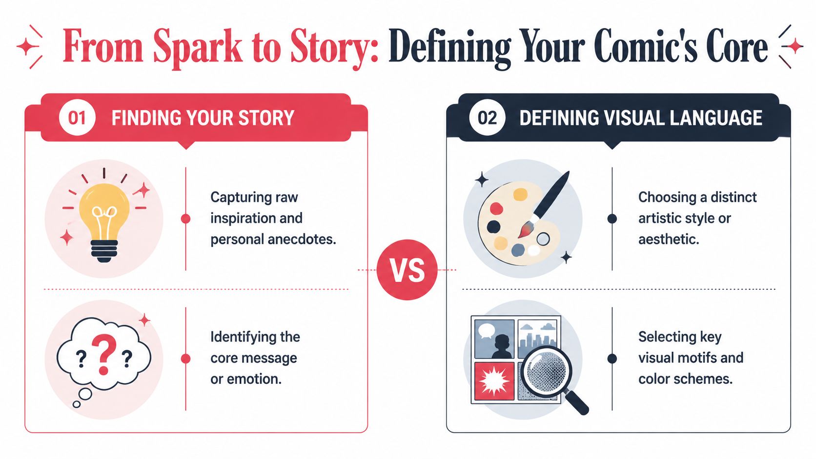
Finding Your Story and Defining Your Visual Language
The biggest beginner mistake is choosing the art style first.
That’s backwards.
Start with the story core. Ask what the poster is about. Not the event label. Not “our anniversary” or “my friend’s birthday.” The emotional point. Is it about chaos, tenderness, triumph, nostalgia, or comedy? Once you know that, your visual choices get much easier.
Find the smallest story that still feels complete
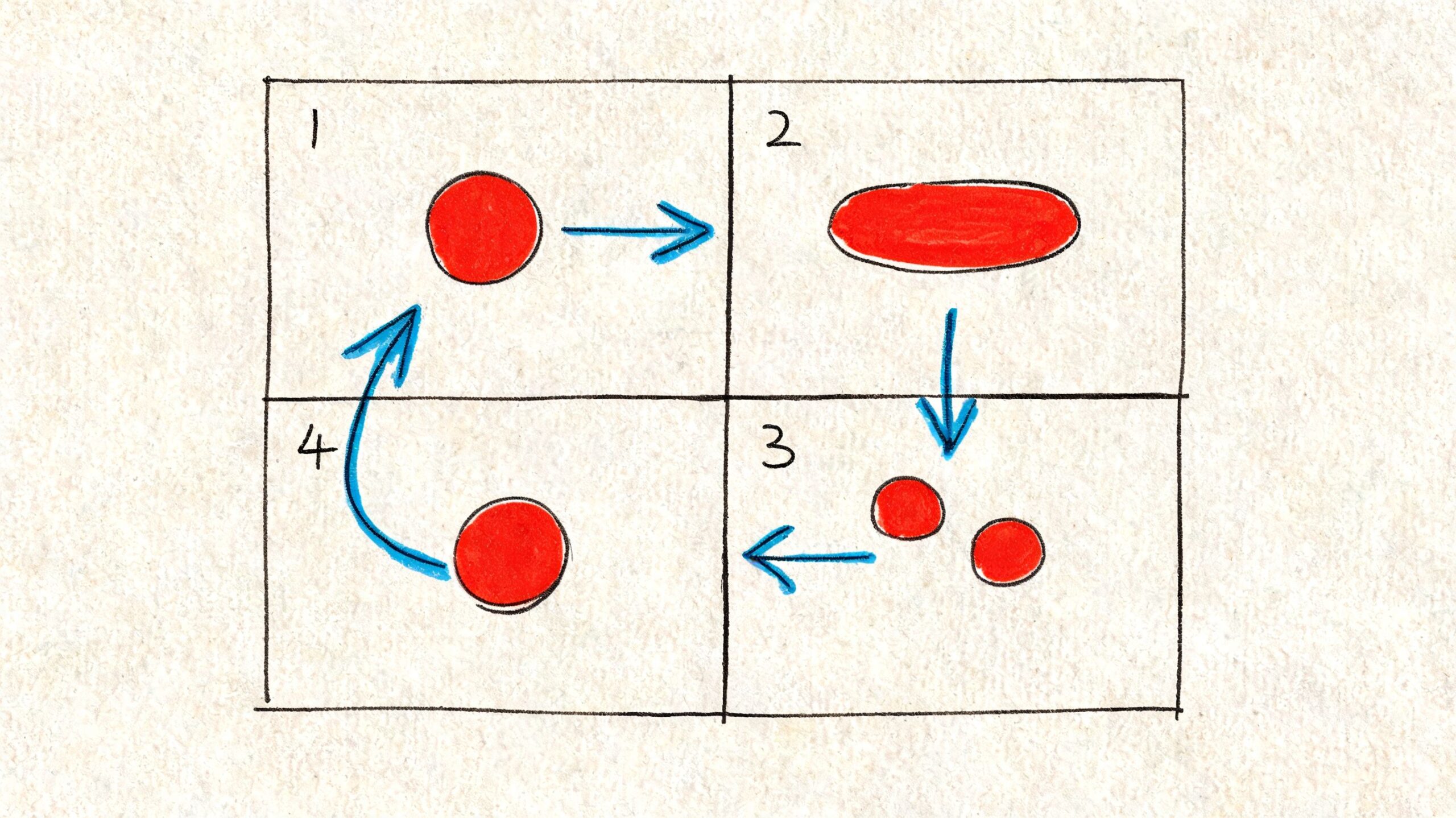
For a single poster, think in scenes, not sagas.
A strong poster comic story usually fits one of these shapes:
One iconic moment
A kiss under confetti. A surprise party reveal. A guitarist’s first show. This works well when the image itself carries most of the emotional weight.A short sequence
Three to five beats are often enough. Lost ring, frantic search, relieved laugh. Airport goodbye, text message, reunion hug. This format gives you movement without crowding the page.A transformation
“Before and after” is powerful in poster comic style. Shy kid to cap-and-gown graduate. New pet settling into the family. Cosplay prep turning into convention hero shot.
If you’re stuck, write these three lines:
- What happened
- Why it mattered
- What feeling should stay after someone looks at it
That last line is the one often overlooked. It’s the one that keeps the poster from feeling random.
Match the style to the feeling
Once the story is clear, pick a visual language that helps it.
Here’s a simple way to think about style direction:
| Story mood | Visual approach |
|---|---|
| Warm and nostalgic | softer edges, gentle colors, expressive faces |
| Bold and funny | punchy shapes, exaggerated reactions, energetic lettering |
| Dramatic and intense | deep shadows, strong contrast, sharp framing |
| Futuristic or edgy | graphic lighting, angular forms, sleek details |
| Whimsical and dreamy | decorative elements, flowing shapes, magical texture |
If you want a useful reference point for comparing aesthetics, this guide to different comic art styles is handy for seeing how style choices change tone.
Build a visual brief like a creative director
You don’t need fancy design jargon. You just need a short decision sheet.
Include things like:
- Main emotion: playful, bittersweet, epic, affectionate
- Character energy: realistic, exaggerated, elegant, mischievous
- Setting cues: city lights, cozy room, fantasy forest, school hallway
- Must-keep details: a red scarf, a pet cat, concert wristband, old camera
- Avoid: clutter, too much text, overly dark backgrounds, stiff poses
If the style fights the story, the poster feels off even when the artwork is technically polished.
That’s why a noir look might weaken a sweet family memory, while a retro pop approach could make it sing. On the other hand, noir could be perfect for a detective-themed birthday gift or a moody anniversary piece set in a rainy city.
When readers get confused here, it’s usually because they think style is decoration. It isn’t. Style is part of the storytelling. It tells the viewer how to feel before they read a single word.
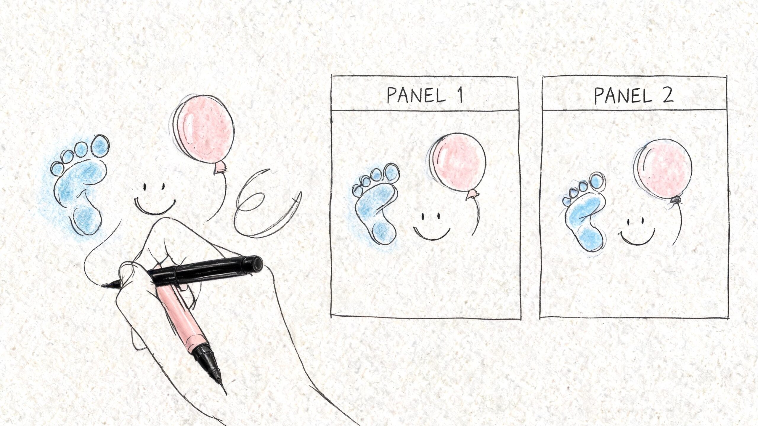
Designing Panels and Layouts That Tell a Story
A poster comic lives or dies by layout.
You can have a great idea, strong characters, and nice color, but if the viewer doesn’t know where to look first, the whole thing feels messy. Good layout fixes that. It guides the eye the way a film director guides a camera.
Professional comic artists use camera angles like worm’s eye views, bird’s eye views, and close-ups to shape storytelling, but there’s very little practical guidance for non-artists on how to apply those techniques. That’s why accessible tools matter. They can help automate composition choices so people can choose shots that support the emotional beat without formal training, as discussed in this camera-angle tutorial context.
Think like a movie editor
You don’t need a lot of panels. You need the right ones.
A simple poster might use:
- One large establishing panel to show the place and mood
- Two medium panels for interaction or action
- One close-up for the emotional payoff
That mix gives the viewer orientation, movement, and feeling. It also keeps the page from looking flat.
Here’s what each shot type does on a poster:
| Shot type | Best use on a comic poster |
|---|---|
| Establishing shot | shows location, weather, crowd, or overall mood |
| Medium shot | captures body language and conversation |
| Close-up | delivers emotion, surprise, or humor |
| Bird’s eye view | makes an event feel busy, planned, or dramatic |
| Worm’s eye view | adds power, excitement, or hero energy |
Break the grid on purpose
A lot of first posters use equal-size boxes because they feel safe. Safe is fine, but equal boxes often make every beat feel equally important. Real stories don’t work that way.
Try one of these instead:
- Hero top panel: a wide opening image across the top, with smaller panels underneath
- Center spotlight: one dominant middle image, surrounded by mini scenes
- Vertical descent: panels stacked to create momentum, useful for action or escalation
The trick is to let panel size reflect emphasis. Bigger panel, bigger moment.
A panel isn’t just a container. It tells the viewer how much attention a moment deserves.
Guide the eye without forcing it
Viewers usually scan a poster in a loose path. In English layouts, that often means left to right and top to bottom. You can support that flow with:
- Overlapping shapes that point toward the next panel
- Speech bubbles angled toward the next action
- Background lines like roads, light beams, or walls
- Color repetition that ties one beat to another
If you’re making a personalized memorabilia piece, clarity matters even more. The people in the poster already mean something to the viewer. Your job is to present them in a way that feels readable and memorable, not crowded.
One practical test helps a lot. Squint at your layout or shrink it down on your screen. If the reading order gets confusing at that size, the final poster will feel confusing too.
Mastering Characters Dialogue and Typography
At this stage, the poster stops being a layout exercise and starts feeling alive.
Characters carry the emotion. Dialogue carries timing. Typography carries voice. If any one of those feels off, the poster loses personality fast.
Turn real people into comic characters
When you base a poster on actual people, don’t chase photographic accuracy. Chase recognizable essence.
Look for:
- Distinct silhouette: hairstyle, glasses, jacket shape, hat
- Signature expression: smirk, raised brow, big laugh, calm stare
- Meaningful prop: skateboard, bouquet, game controller, camera
- Body language: slouchy, upright, animated, shy
A beginner often overloads character design with tiny details. Most of those details disappear at poster distance. Focus on the features people would notice in a sketch made from memory.
For personalized work, one useful rule is this: if a friend could identify the person from hairstyle, posture, and one accessory, you’re on the right track.
Write less dialogue than you think you need
Comic dialogue on a poster should feel quick and clean. Long speech balloons slow the eye and crowd the art.
Try these alternatives:
- Replace explanation with a reaction
- Cut setup and keep the punchline
- Use narration boxes for context, speech bubbles for emotion
- Let one silence panel do some work
For example, instead of:
“I can’t believe after all the traffic, missing the train, and spilling coffee on my shirt, we still made it to the concert on time.”
Use:
“We made it.”
“Barely.”
Then show the coffee stain.
That reads faster and feels more comic-like.
Typography does more storytelling than people expect
Speech bubbles, captions, and sound effects all need different voices. If they look identical, the page feels flat.
You want contrast between:
- Speech text for conversation
- Caption text for memory or narration
- Sound effects for impact words like BAM, WHOOSH, CLICK
- Title text for overall mood
Professional comic-style poster work also depends on deliberate inking choices. Varying line weight creates hierarchy, while cross-hatching or stippling can add texture. High-contrast shadows and highlights help direct attention and make the image readable, as described in this guide to comic art techniques and inking.
A useful translation for non-artists is simple: important things get stronger lines and stronger contrast.
A quick typography checklist
- Keep speech bubbles roomy: cramped text always looks amateur
- Choose readable fonts: save decorative fonts for titles or sound effects
- Match bubble shape to tone: round for normal speech, jagged for shouting or electronic voices
- Don’t center everything: left-aligned text is often easier to read inside captions
- Use sound effects sparingly: one strong effect is better than six weak ones
Text in a comic poster should sound like someone speaking, not someone writing an essay.
If your poster feels stiff, read every line out loud. Anything that sounds unnatural probably needs trimming.
Choosing a Palette and Adding Professional Polish
Color does more than make a poster attractive. It decides mood, focus, and unity.
A lot of beginners choose color the way they choose candy. They pick what they like one piece at a time. That usually creates a poster where every panel competes with the next. A stronger approach is to choose a small palette with a job to do.
Build the mood with fewer colors
Poster comic style often looks better when the palette is limited and deliberate.
Try thinking in roles instead of random swatches:
- Base color for the overall atmosphere
- Accent color for emotional emphasis or key props
- Dark tone for shadows and depth
- Light tone for highlights and focus
That structure helps your poster feel designed instead of accidental. It also keeps personalized posters from looking too busy, especially when they already include faces, outfits, and background details.
Understand cel-shading in plain language
A lot of comic-style polish comes from cel-shading. That means using clear steps of light and shadow instead of soft, realistic blending. It gives forms a cleaner, graphic look.
Professional 3D comic-style rendering often uses a four-layer composition of shadow, rim-light, mid-tones, and highlight. This layered method reduces unnecessary realism and creates the illusion of hand-drawn artwork while preserving consistency, according to this overview of comic-style cel-shading and layer composition.
For a beginner, that translates to this workflow:
| Layer role | What it does visually |
|---|---|
| Shadow | gives form and separates major shapes |
| Rim-light | outlines the edge facing light and adds punch |
| Mid-tones | hold the local color and most readable detail |
| Highlight | pulls the eye to faces, hands, and focal objects |
If you want more inspiration for how stylized finishes work in practice, this article on comic book style artwork is a useful visual reference.
Add polish without overworking it
The last stage isn’t about adding more stuff. It’s about removing distractions.
Check these areas:
- Background simplification: if it doesn’t support the story, mute it
- Highlight placement: reserve bright accents for the focal point
- Shadow consistency: keep the light direction believable
- Edge cleanup: make silhouettes clear at a glance
A polished comic poster often feels simpler than the rough draft, not more complicated. That surprises people, but it’s one of the most dependable design truths I know.
Exporting and Printing Your Comic Poster
Digital art can look great on screen and still print badly if the file prep is sloppy.
That’s frustrating, especially when the whole point of a poster comic style piece is to become a physical keepsake. Comic-style prints have a special charm, and there’s growing interest in turning personal stories and real people into stylized wall art and gift pieces, as noted in Shopify’s discussion of poster ideas and comic-style prints.
Prep your file like a print designer
Before you export, check these basics:
- Use a high-resolution file: low-res art gets muddy fast in print
- Keep layers or a master file: you may need edits later
- Export a print-ready version: PDF, PNG, or high-quality JPEG are common choices
- Check color mode with your printer: screens and print often handle color differently
If your reds, blues, or shadows look slightly different in print, that’s normal. Print has its own behavior. Test prints help.
Paper changes the feel
The same artwork can feel completely different depending on the stock.
| Paper finish | Best for |
|---|---|
| Matte | softer, art-print feel, reduced glare |
| Glossy | bold color and punchy contrast |
| Satin | balanced middle ground |
For a noir or dramatic poster, matte often feels elegant. For retro pop or bright action styles, glossy can make the colors snap.
One more thing matters more than people expect. Leave breathing room near the edges. Speech bubbles or faces pressed too close to the trim line can make a finished poster feel cramped.
If you want a broader walkthrough of print planning, this guide on creating and printing your own comic helps frame the production side clearly.
Frequently Asked Questions about Poster Comic Style
Some questions come up almost every time someone makes their first poster. Here’s a quick-reference guide.
| Question | Answer |
|---|---|
| Can a comic poster work with just one panel? | Yes. If the moment is strong enough, one image with smart typography and supporting design can still feel comic-inspired. |
| How many panels fit comfortably on one poster? | Fewer is usually better. If the story starts feeling cramped, reduce the panel count and keep only the strongest beats. |
| What if I’m not good at drawing faces? | Focus on silhouette, expression, and a few recognizable details. A clear stylized likeness works better than a stiff attempt at realism. |
| Should every panel have dialogue? | No. Silent panels often add rhythm and emotion. Use text only where it improves timing or clarity. |
| How do I stop the poster from looking cluttered? | Limit color variety, trim the dialogue, simplify backgrounds, and make one area clearly dominant. |
| Is poster comic style only for funny art? | Not at all. It can be romantic, dramatic, nostalgic, adventurous, or reflective depending on layout, style, and color choices. |
The simplest test is still the best one. Step back from your screen and ask, “What do I notice first, and what do I understand second?” If both answers are clear, your poster is doing its job.
If you want an easier way to turn photos, memories, and story ideas into polished comic-style art, PersonalizedComics is worth exploring. It’s built for people who want the feel of professional comic storytelling without needing to draw everything from scratch, whether you’re making a heartfelt gift, a fun wall poster, or a personal keepsake that tells a story.