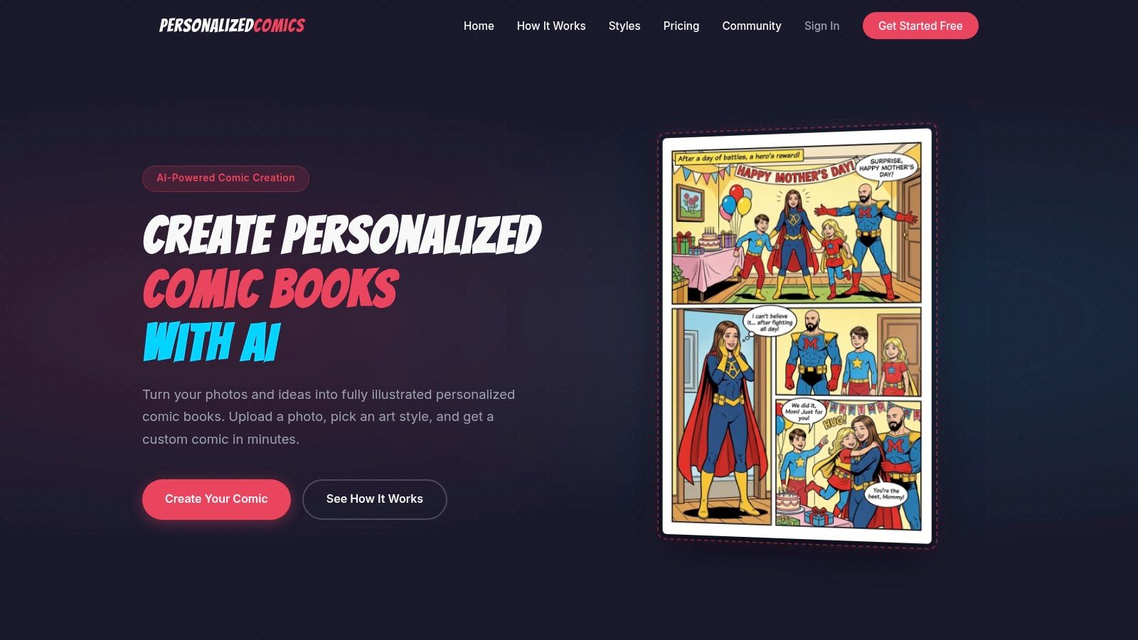
Create Your Custom Comic Book Poster with AI
You're probably here with a moment in mind, not just a decoration idea.
Maybe it's the photo of your daughter in a bike helmet that already looks like a superhero origin scene. Maybe it's an anniversary memory that deserves more drama than a framed snapshot. Maybe you want a retirement gift that feels funny, specific, and impossible to find on a shelf. A comic book poster works because it turns a personal memory into something larger than life, while still keeping the details that make it yours.
That's the sweet spot. Not generic fan art. Not a random character print. A poster that says, “This happened to us,” or “This is who you are,” in the language of comics.
The Magic of Making Your Own Comic Poster
A comic book poster holds two things at once. It's a piece of wall art, and it's a frozen story beat. One strong image can carry emotion, character, conflict, and even an inside joke if you build it well.
That storytelling power comes from a long tradition. The modern comic-book industry is widely traced to April 18, 1938, when Superman first appeared, triggering the Golden Age of Comics (1938 to 1954), as noted in this comic history overview. When you make a personal poster in that format, you're borrowing visual language shaped by nearly a century of heroic poses, bold covers, dramatic captions, and iconic reveals.
Why a personal poster lands harder
Mass-produced poster art can look great, but it can't carry your history. A personal comic book poster can.
It might feature:
- A private joke your family repeats every holiday
- A relationship milestone reimagined as a movie-style cover
- A confidence boost for a child who wants to see themselves as the hero
- A tribute image that honors a parent, friend, or mentor with style and warmth
That's why these posters often feel more like artifacts than products. They capture personality, not just taste.
A strong comic poster doesn't just show what someone looks like. It shows how they feel in the story.
Why comics work so well for gifts and keepsakes
Comics exaggerate in the best way. They make ordinary moments feel mythic. A coffee date can become a rooftop rendezvous. A graduation can become the final panel before a new saga begins. A pet can become the sidekick that steals the whole cover.
That visual exaggeration gives you freedom. You don't need a literal copy of reality. You need the emotional truth of the moment.
If you want inspiration for the kind of visual punch a great cover can deliver, this gallery of best comic book covers ever is a useful way to study mood, composition, and title treatment.
Conceptualizing Your Poster Story and Composition
Many creators get stuck before the art starts. They have too many ideas.
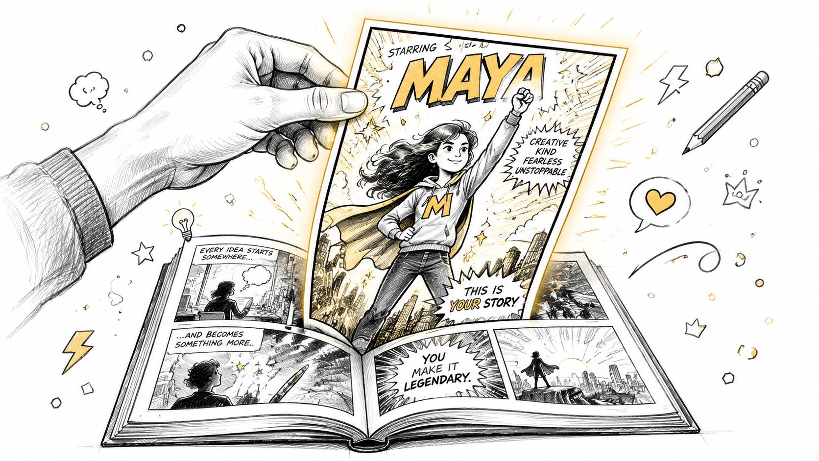
A comic book poster works best when you stop thinking in full biography mode and start thinking in one defining moment. Not the whole relationship. Not the whole birthday party. Not every detail from the trip. One scene.
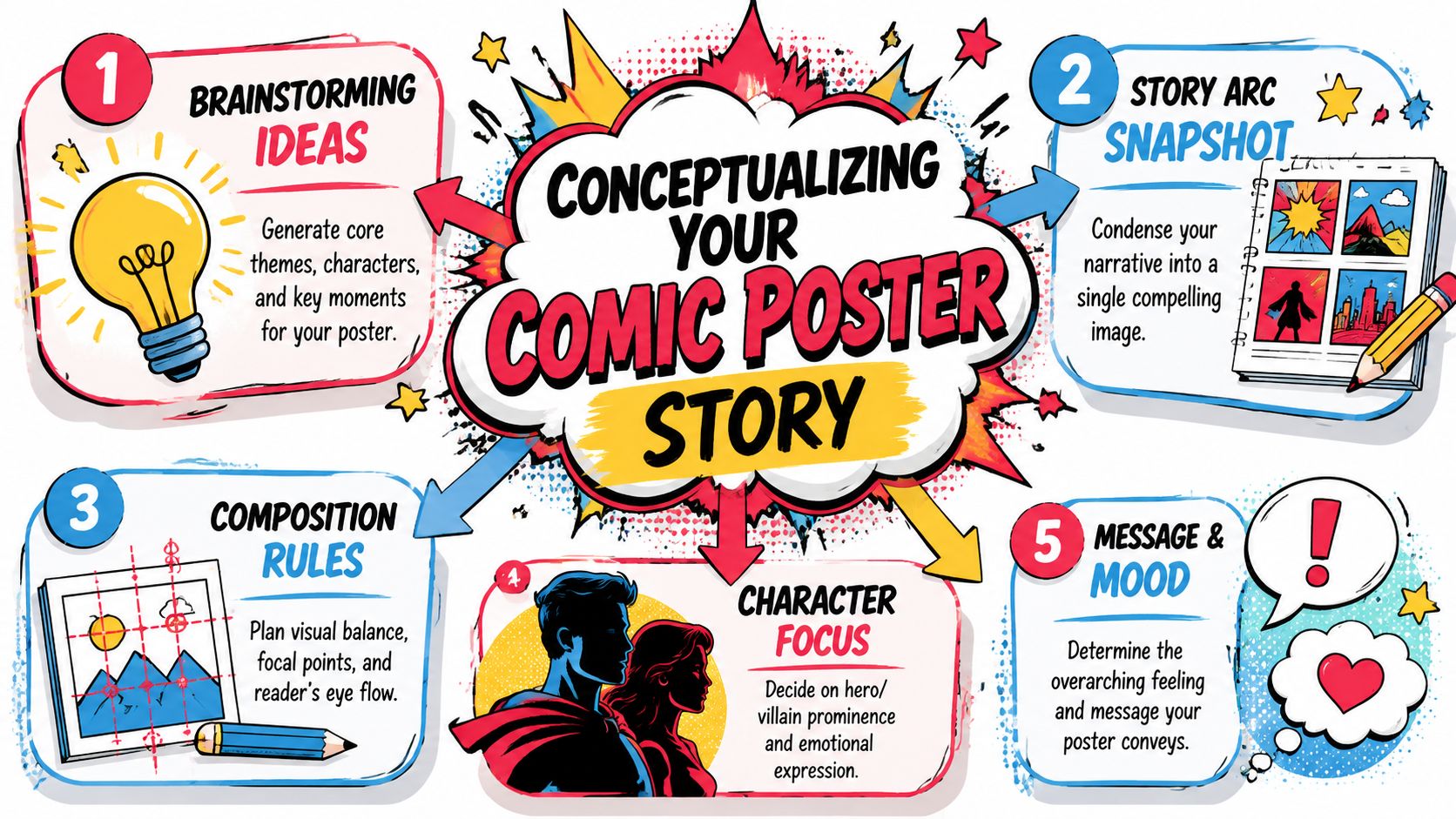
Pick the single moment that says everything
Start with a simple filter. Ask which of these fits your idea best:
The triumph moment
Someone has just won, arrived, escaped, or realized who they are.The relationship moment
Two people share a glance, a joke, a dance, or a stand-together scene.The transformation moment
A regular person becomes a hero, leader, explorer, or legend.The comedy moment
The whole poster depends on one funny contradiction. Serious art, ridiculous premise.
If you can name the moment in one sentence, you're ready.
Examples help:
- “She finally sees herself as brave.”
- “Our first apartment felt like a fantasy quest.”
- “Dad versus the backyard grill, final battle edition.”
- “The cat rules the house and knows it.”
Turn memory into a visual brief
A good poster prompt isn't long because it has many adjectives. It's good because it makes clear choices.
Use this four-part framework:
| Poster part | Question to answer | Example |
|---|---|---|
| Hero | Who is the center of attention | “A young girl with glasses and a red cape” |
| Action | What are they doing right now | “Standing on a stack of books with one fist raised” |
| Setting | Where does it happen | “A school hallway transformed into a cosmic command center” |
| Mood | What should the image feel like | “Bold, hopeful, playful” |
That's enough to anchor the whole composition.
Practical rule: If your concept needs a paragraph to explain, it's still too wide. Shrink it until the image has one clear emotional message.
Use camera language that gives the poster energy
A lot of beginners know what they want emotionally, but not visually. That's where camera angles help. Data from the 2025 Comic Creator Insights Report shows 71% of new graphic novelists struggle to define how niche angles like “worm's eye” translate in AI workflows. Mastering these terms gives you a real creative advantage.
Here's the plain-English version:
- Worm's eye view makes the subject look powerful because the viewer looks up at them.
- Two-shot frames two characters together, which is perfect for romance, rivalry, or friendship.
- Close-up highlights expression and works well when emotion matters more than scenery.
- Full bleed means the art runs to the edge, which makes the poster feel expansive and dramatic.
- Over-the-shoulder creates tension by putting us behind one character as they face another.
If you're making a retirement gift for a beloved teacher, a worm's eye angle can make them feel legendary. If you're making an anniversary poster, a two-shot usually communicates connection better than two separate portraits.
Keep composition simple enough to read fast
Posters don't get long attention at first glance. They get a scan.
Use a few layout habits:
- Place one focal point first. The eye should know where to land.
- Leave breathing room. Negative space helps the main subject feel important.
- Avoid equal emphasis everywhere. If everything shouts, nothing leads.
- Let the title support the image. Don't make the wording compete with the faces.
When people say a poster “looks professional,” they often mean this: the artist made a few strong choices and didn't dilute them.
Choosing Your Art Style and Generating Characters
Style changes the meaning of the same scene. A rooftop pose in noir feels brooding. In retro pop, it feels playful. In watercolor, it can feel nostalgic or tender.
That's why style selection shouldn't be the last click. It should match the emotional job of the poster.
Match the visual style to the story beat
Here's a practical way to think about the eight art styles often used in AI comic creation.
| Art style | Best fit | Visual feel |
|---|---|---|
| Manga | Youthful heroes, expressive reactions, dramatic energy | Sharp emotion, speed, motion |
| Classic American | Superhero covers, bold gifts, action scenes | Clean lines, iconic comic feel |
| Graphic novel | Mature stories, literary tone, character-driven posters | Grounded, cinematic, textured |
| Noir | Mystery, detective themes, moody romance | Shadows, contrast, tension |
| Watercolor | Family gifts, soft memories, sentimental scenes | Painterly, gentle, airy |
| Cyberpunk | Futuristic personas, gamer aesthetics, neon city settings | Electric, tech-heavy, vivid |
| Retro pop | Funny gifts, bright nostalgia, bold color humor | Punchy, playful, graphic |
| Fantasy | Epic quests, magical identities, storybook heroism | Mythic, ornate, adventurous |
A simple test helps. Ask, “If this poster were a movie trailer, what genre would it be?” That usually points you to the right style quickly.
Build characters from photos or from words
Creators of a comic book poster often fall into one of two camps. They either want recognizable likeness, or they want a fully invented persona.
If you're using photos, choose images that help the system read the person clearly:
- Use a clear face shot with good lighting
- Avoid heavy filters that flatten skin tone or facial structure
- Pick a photo that matches the age and mood you want in the final poster
- Include reference clothing or props only if they matter to the character
If you're describing an original character, focus on identity markers instead of stuffing the prompt with style words.
A useful prompt formula looks like this:
- character role
- age range
- key features
- outfit
- expression
- pose
- environment
For example: “A confident middle-aged librarian hero with silver-streaked hair, round glasses, a deep green coat, calm smile, holding a glowing book in a grand archive.”
Why AI changes the workflow so much
Traditional comic production follows a clear sequence: concept → plot → script → pencilling → inking → coloring → lettering → print, as outlined in this comic creation process guide. AI tools compress that chain dramatically, which is why someone with no drawing background can move from idea to polished poster concept far faster than a traditional manual workflow would allow.
That speed is useful, but consistency still matters. Keep one saved note with your chosen style, character traits, and mood words. Reuse it each time you regenerate. That small habit prevents the “same person, different face every version” problem.
For more practical character-building ideas, this guide to designing comic characters is a strong reference for balancing personality, visuals, and story role.
The best character prompts don't try to describe everything. They lock in the few details people instantly recognize.
Mastering Layout Typography and Dialogue
A comic book poster can fail even with beautiful art. The usual reason is crowding.
Too much text. Balloons in the wrong place. A title that crushes the image. Captions that read like a summary instead of a hook.

Treat the poster like one powerful panel
Even if your design borrows from comic covers, think of it as a single panel with premium real estate. Every element has to earn its place.
The eye usually wants to move in this order:
- title
- main character or face
- secondary action
- speech or caption
- small details
If your speech bubble blocks the face, or your caption hides the action, the reading order breaks. The poster feels clumsy even if the illustration itself is strong.
The lettering rule that saves beginners
Professional production guidance offers a very practical benchmark. Keep dialogue to about 25 to 26 words per balloon and reserve roughly 20 to 25% of a panel's top area for lettering, according to this comic lettering fundamentals guide. That guideline protects the art and reduces the chance that text will crowd the final print.
For posters, that rule is gold.
It means:
- one short line is often better than a mini speech
- one memorable caption can do more than three balloons
- titles and taglines should support the scene, not explain it to death
Write less, imply more
Compare these two approaches.
| Weak poster text | Stronger poster text |
|---|---|
| “I always knew that one day I would have to overcome my fears and become the protector of this city.” | “This city picked the right kid.” |
| “After 30 years of dedicated service, he finally retired from the office.” | “Final shift. Legendary exit.” |
| “Happy anniversary to the love of my life. Thank you for every adventure.” | “Still my favorite co-star.” |
The stronger versions leave room for the art to do its job.
Short dialogue feels more cinematic because the image carries part of the meaning.
Place text where the art can spare it
Most beginners drop text wherever there's empty space. That sounds logical, but it can damage the composition. Empty space often exists for visual balance, not because it's available for words.
A better method is to check these zones:
- Top band for title or narration
- Upper corner for a small balloon if it won't interrupt the focal point
- Side margin area if the background is simple and the character remains dominant
- Bottom strip for issue-style details, credits, or a short tagline
Avoid placing text over:
- eyes
- hands in action
- important props
- high-contrast areas where readability drops
Let typography match the tone
Typography in comic design isn't just readability. It's mood.
Use broad visual instincts:
- Bold block lettering fits superhero, retro, and action-heavy posters
- Clean sans serif styles feel modern and polished
- Hand-lettered or organic styles work for fantasy or watercolor moods
- High-contrast title treatments fit noir and mystery themes
The mistake to avoid is mixing too many voices. If the title screams pulp adventure but the speech bubbles look soft and whimsical, the poster can feel stylistically split.
A simple layout check before finalizing
Run this checklist before you send anything to print:
Squint test
Can you still tell what the focal point is?Read-aloud test
Does the dialogue sound like something a person would say?Distance test
If you step back, can you still read the title and one key line?Cover-up test
If you hide the text, does the image still tell a story? If yes, the layout is probably balanced.
That last test matters most. A comic book poster should never depend entirely on explanation. It should communicate first, then reward closer reading.
Preparing for Print and Ordering Your Poster
Digital art can look sharp on a bright screen and disappointing on paper if you rush the final step. Most problems come from assuming print will “just work.”
It usually does when the file was planned for print from the start. In traditional comic production, creators account for bleed and trim before the final artwork is locked, so important details don't get cut during printing. That print-first mindset matters for posters too, even if the process feels simple on the surface.
Know the print basics without getting technical
You don't need to become a print specialist. You do need to watch for a few practical issues.
- Resolution matters because posters are larger than screens. Fine details that look acceptable on a phone can look soft when enlarged.
- Color can shift in print. Very bright digital colors sometimes print a little differently, especially in neon-heavy scenes.
- Edges need breathing room. Keep faces, titles, and important props away from the trim line.
If you're reviewing a proof, zoom out and ask a plain question: does this still look intentional at full poster size?
Why archival quality matters more than most buyers realize
A comic book poster can be a novelty item, or it can be a keepsake. Those are different print decisions.
Recent 2025 industry surveys show 68% of consumers buying personalized comic posters as heirlooms are unaware of UV-resistant coating requirements, and 42% report unexpected fading within three years. That's why archival-quality printing matters for work meant to last.
If the poster is a gift for a wedding, memorial, graduation, or child's room wall, choose longevity on purpose.
Look for:
- Premium paper stock that feels substantial rather than flimsy
- Protective finish if the poster will hang in bright rooms
- Careful framing choices if it's meant for long-term display
A poster meant to become part of someone's life deserves better than bargain printing.
Ordering with confidence
People often hesitate at this stage because print feels irreversible. A good final review removes most of that anxiety.
Check three things:
- Names and dates for typos
- Speech balloon placement so nothing feels cramped
- Cropping around faces, hands, logos, and title text
If you want more inspiration for how comic-style poster designs translate into finished wall art, this article on poster comic style offers useful visual context.
One more practical note. If the poster is a gift, think about the room it's going into. A dark noir print may look elegant in an office, while a bright retro design might be better for a game room, classroom, or child's bedroom.
Creative Ways to Gift and Display Your Creation
The reveal changes the whole experience.
A comic book poster handed over in a mailing tube is still thoughtful. The same poster framed, wrapped, and paired with a small caption card feels like an event. Presentation tells the recipient that this isn't just wall art. It's their story, curated.
Turn the poster into a story object
One strong approach is to borrow from comic cover language.
Add small details such as:
- an “issue title” card tucked into the frame backing
- a fictional release date tied to an actual milestone
- a short blurb that reads like cover copy
- a custom plaque with the hero name, couple nickname, or team title
A retirement gift becomes “The Final Mission.” An anniversary print becomes “Issue One of Forever.” A child's birthday gift becomes the first annual cover in a growing series.
The poster feels bigger when the presentation continues the fiction.
Match the display style to the mood
A few examples show how flexible this can be.
For a romantic poster, a simple frame in black, gold, or wood usually lets the artwork lead. If the image is bright and playful, a cleaner modern frame keeps it from tipping into clutter.
For a comedy gift, lean in. Wrap it with a faux “classified file” label or “official hero dossier” envelope. Read the title aloud before they open it.
For kids, make the display interactive. Hang the poster at their eye level, not adult eye level. If it celebrates bravery, reading, kindness, or imagination, the wall placement becomes part of the ritual. They see themselves as the hero every day.
Start a tradition, not just a one-time surprise
Some of the most memorable uses of a comic book poster happen when the first one leads to another.
Families create yearly birthday covers. Friends make reunion posters for trips. Couples mark milestones as if each year is a new issue in an ongoing series. Teachers, coaches, and mentors receive farewell posters that the whole group signs on the back before framing.
That's the magic of personalization. The poster captures a single moment, but it also invites the next chapter.
If you're ready to turn a real memory, joke, milestone, or dream into a custom comic book poster, PersonalizedComics makes that process approachable even if you've never drawn a panel in your life. You can start with photos or a simple idea, shape the story visually, and create something that feels personal enough to gift, frame, and keep.