Design Your Custom Comic Book Cover: AI & Print Prep
You probably have the idea already.
A friend as a caped vigilante. Your partner on the cover of a romance thriller. Your kid as the star of a fantasy quest. Or maybe you wrote a real comic script and you need a cover that looks like it belongs on a shelf, not just in a camera roll.
That's a common hurdle. The concept is vivid, but the path from “fun idea” to a custom comic book cover that reads clearly, prints cleanly, and feels like a comic isn't obvious. Good covers don't come from enthusiasm alone. They come from a few disciplined choices about format, composition, character design, typography, and output.
Beyond the Idea The World of Custom Covers
The first mistake is treating every personalized cover as the same thing. It isn't.
A custom comic book cover can mean an original cover image built around your characters, your title, and your story concept. A variant cover usually refers to an alternate cover for an existing published series, which sits inside a publisher-controlled workflow. A blank sketch cover is typically a physical comic manufactured with a mostly blank front so an artist can draw directly onto it.
That distinction matters more than people expect.
Buyers often want the emotional satisfaction of personalization and the visual language of a collectible comic at the same time. Those goals can overlap, but they aren't identical.
Search results often blur those categories, which creates confusion between what looks cool and what fits collector expectations. That gap is real, especially when someone wants a personalized piece that still feels authentic to comic culture, as noted in this discussion of the custom versus variant versus sketch-cover distinction on YouTube.
Three formats that look similar but behave differently
| Format | What it is | Best use |
|---|---|---|
| Custom cover | Original art and design built around your idea | Gifts, portfolio pieces, indie concepts |
| Variant cover | Alternate cover for an existing title | Publisher-approved releases and exclusives |
| Blank sketch cover | Physical issue with space for hand-drawn art | Convention commissions, original sketches |
If you're making something for a birthday, anniversary, cosplay reveal, or framed display, a custom cover is usually the right lane. You care about likeness, mood, and presentation.
If you're trying to produce something that behaves like a market-facing comic release, the standards change. Publisher branding, issue conventions, print specs, and rights control all become much more important.
What professionals keep straight from the start
- Scope first: Decide whether this is a keepsake, a sample cover, or a release-ready asset.
- Audience second: A gift can lean personal and sentimental. A sellable comic cover has to read fast to strangers.
- Format third: Don't call something a variant cover unless it belongs to that publishing context.
That upfront clarity saves hours later. It changes how you crop the art, how much space you reserve for masthead and trade dress, and how strict you need to be about print prep.
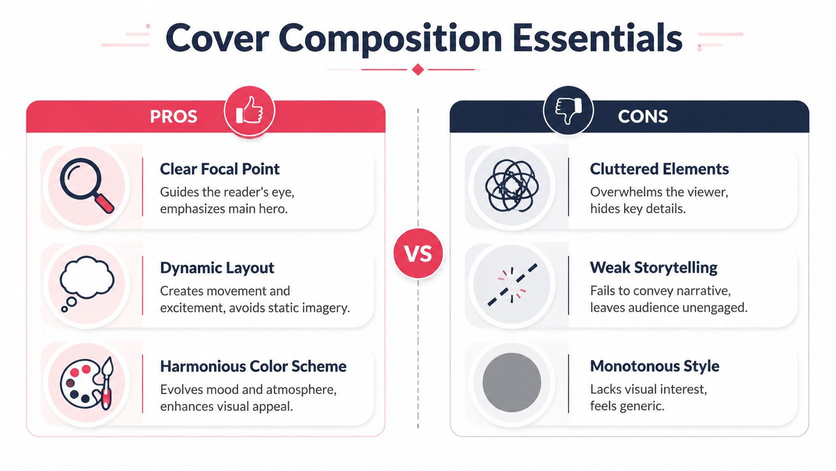
Laying a Strong Foundation Cover Composition and Style
Most weak covers fail before rendering starts. They don't fail because the art style is wrong. They fail because the visual idea is muddy.
A strong cover does three jobs at once. It stops the eye, explains what kind of story this is, and tells the viewer where to look first. If it can't do that in a quick glance, better line work or fancier effects won't rescue it.
Start with the read, not the detail
Expert cover guidance keeps coming back to the same technical choices: logo placement, clear silhouette or value separation, and a composition that avoids equal spacing or crowding at the edges, as explained in Clip Studio's cover design guidance on logo placement, value grouping, and readability.
That sounds technical, but the practical version is simple:
- Protect the title area: Don't let hair, weapons, or background effects fight with the masthead.
- Group your values: Squint at the image. If the hero, villain, and background all blend into one middle tone, the cover dies.
- Avoid centered sameness: A dead-center figure with equal empty space on both sides often looks static unless the concept is intentionally formal.
Build around one dominant idea
Pick one visual sentence for the cover.
Not “hero, city, villain, origin object, explosion, sidekick, title effect, and five Easter eggs.” One sentence.
Examples:
- The hero stands alone against impossible odds.
- Two rivals lock eyes before a duel.
- A family becomes a fantasy adventuring party.
- A noir detective hides guilt behind confidence.
Once you know the sentence, composition gets easier.
Practical rule: If someone can crop your cover to a tiny phone thumbnail and still tell who matters, the composition is probably working.
Match style to story tone
PersonalizedComics offers eight art styles: manga, classic American, graphic novel, noir, watercolor, cyberpunk, retro pop, and fantasy. Don't pick one because it looks flashy. Pick one because it amplifies the premise.
A quick decision guide helps:
- Manga works when expression, speed, and character energy matter most.
- Classic American suits superhero poses, punchy action, and bold title treatment.
- Graphic novel handles grounded drama and more mature tone well.
- Noir is useful for crime, mystery, moral tension, and shadow-heavy compositions.
- Watercolor fits softer sentiment, memory pieces, or whimsical storytelling.
- Cyberpunk favors neon contrast, tech textures, and urban futurism.
- Retro pop works for parody, high-color fun, and lighter nostalgic energy.
- Fantasy helps when costume design, magic cues, and worldbuilding need to read instantly.
For inspiration, it's worth studying why classic covers still hold attention in this roundup of famous comic book covers and what makes them memorable.
Common composition errors
- Tiny faces in a busy scene: Likeness disappears.
- Background louder than character: The setting steals the story.
- Everything touching the border: The page feels cramped before lettering even starts.
- Multiple equal focal points: The eye has nowhere to land.
Good cover design is less about adding visual excitement and more about removing confusion.
Creating Your Cast From Photos to Comic Characters
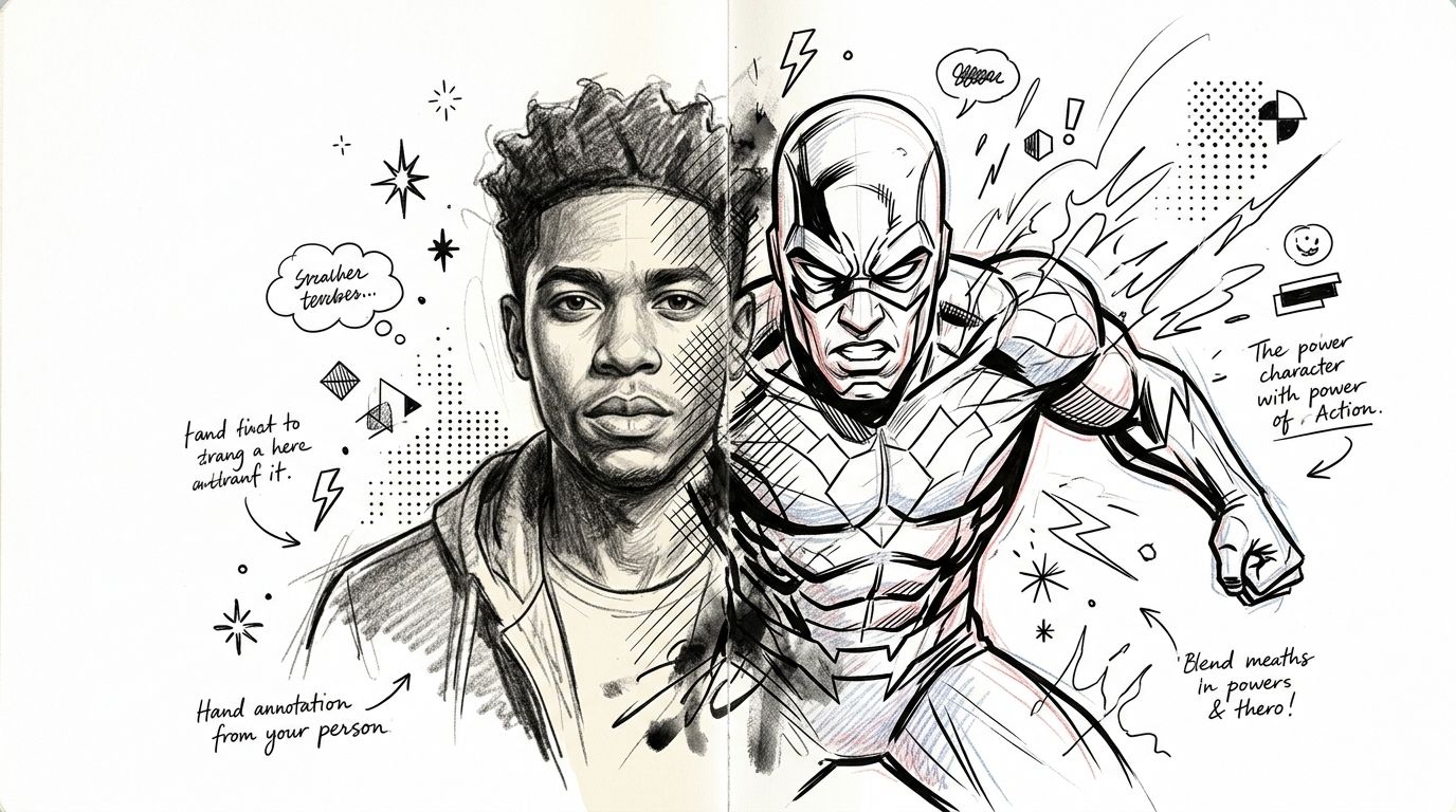
The most satisfying personalized covers usually hinge on one thing. The person still feels like themselves after stylization.
That's harder than people expect. If the source photo is weak, the final character will drift. The jawline changes. The expression flattens. The hair becomes generic. Then the cover looks “comic-like” but not personal.
The audience for this kind of work is broad enough to matter. In 2023, the US comic readership reached 45 million adults, and the readership has widened demographically, with women making up 46% of graphic novel readers and 52% of readers under 35 in 2022, according to WifiTalents' comic book industry statistics. That broader readership helps explain why personalized representation matters so much. More people want to see themselves in the frame.
Photo choices that translate well
Start with photos that already contain readable character information.
A goofy party snapshot can work, but only if the face is visible and the lighting isn't destroying the features. AI can stylize a face. It can't recover facial structure that was never clearly shown.
Use this filter before you upload anything:
- Clean lighting: Window light or even outdoor shade beats harsh overhead shadows.
- Readable angle: Front-facing or slight three-quarter views usually convert better than extreme angles.
- Natural expression: A real smile, focused stare, or confident smirk gives the final art something to build on.
- Distinct hair shape: Hair silhouette matters more than people realize in comic-style recognition.
- Simple background: If the photo is crowded, the model may borrow noise you didn't intend.
A relatable example
Say you're turning a family photo into a fantasy cover. One person is laughing with their head tilted back, one is half hidden behind another shoulder, and one is wearing sunglasses indoors.
That photo may be emotionally perfect. It's not ideal as design source material.
A better approach is to gather separate reference photos for each person, then define how they should appear in the final scene: one as a sword-bearing leader, one as a spellcaster, one as a rogue with a grin. The cover can still capture the family dynamic, but you're directing it instead of hoping the software guesses correctly.
For more hands-on examples, this guide on turning photos into comic book art is useful for thinking through source-image quality and stylization choices.
Prompt like a director, not a spectator
When you're generating characters from scratch, vague prompts produce vague people.
Compare these two approaches:
| Weak prompt | Stronger prompt |
|---|---|
| “Make a superhero” | “Athletic woman in her thirties, sharp bob haircut, gold visor, storm-themed armor, confident stance, standing on a rain-soaked rooftop, dramatic lighting” |
| “Fantasy guy” | “Broad-shouldered ranger with braided dark hair, weathered green cloak, scar across left eyebrow, holding a recurved bow, wary expression” |
The difference isn't length alone. It's specificity.
Keep identity cues separate from costume cues. Describe the person first, then the role, then the mood.
What usually works best in prompts
- Physical anchors: Hair, face shape, posture, age feel, signature accessory.
- Genre cues: Superhero, noir detective, space pilot, monster hunter.
- Costume logic: Functional details beat random ornament.
- Emotional direction: Defiant, hopeful, haunted, playful.
- Scene context: Rooftop, alley, throne room, ruined city, enchanted forest.
If the first result is close but off, don't rewrite everything. Change one variable at a time. Adjust expression, then pose, then costume complexity. That keeps you from chasing the image in circles.
The Digital Canvas Designing with PersonalizedComics
A custom cover usually falls apart at the same point. The character looks good in one generation, the background works in another, and the third version finally has room for the title. Then the process turns into random clicking. Good results come from treating AI the way a cover artist treats roughs. Test the big decisions first, then tighten what deserves polishing.
Traditional cover production still gives the right structure. Concept comes first. Then composition, then refinement, then finish. AI shortens those stages, but it does not remove them. The workflow described in this overview of comic book cover creation stages is still a solid mental model for cover work.
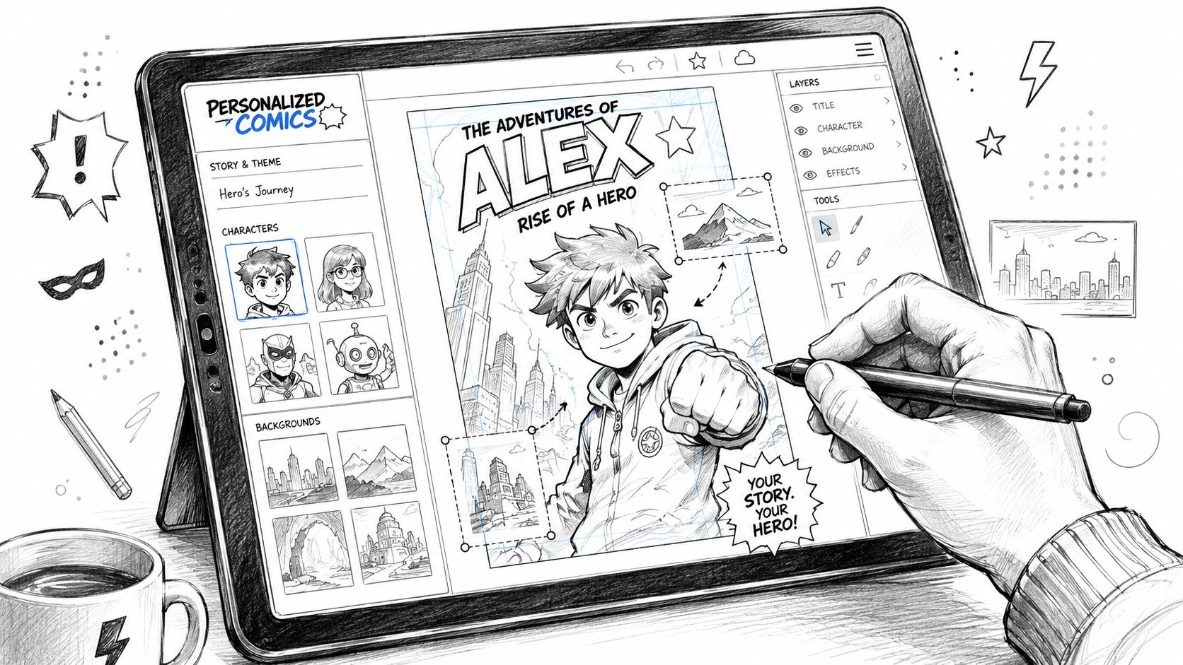
Use PersonalizedComics like a layout tool
PersonalizedComics works best when you approach it like an art director building options, not a person waiting for one perfect image to appear.
Start with style. That choice affects line quality, facial simplification, color contrast, and how dramatic the final cover feels. Change the style late, and you usually lose more than you save because the anatomy, costume rendering, and mood may all shift at once.
Then limit your reference images. Two or three strong photos usually outperform a pile of mixed snapshots. If one image is sharp, one is badly lit, and one hides the jawline, the generator often blends those problems into the result.
Prompts need order. Put the subject first, then costume, then setting, then emotional tone. A prompt such as “Teen heroine with curly hair, blue flight jacket, moonlit rooftop, determined expression, graphic novel style” gives the system a cleaner chain of priorities than a long, decorative paragraph.
Generate broadly before you refine. Early rounds should answer bigger cover questions. Is the pose readable? Does the face carry the right identity? Is there clean space for the masthead and any corner box or issue text? If those answers are weak, surface detail will not save the piece.
Judge structure before polish
New users often zoom in too early. They inspect fingers, fabric folds, and tiny accessories before checking whether the cover reads in one second.
Use a faster review pass:
- Readability: The main idea should register immediately.
- Likeness: The face should feel like the intended person, not just a generic hero.
- Pose clarity: Silhouette and body language should communicate attitude fast.
- Title space: The top third needs enough breathing room for trade dress.
- Value separation: The character should stand apart from the background in light and dark shapes.
That checklist catches the problems that matter. If these fundamentals work, cleanup is productive. If they do not, regenerate with tighter direction.
Regenerate for concept problems. Edit for finish problems.
This decision saves time.
Regenerate when the image misses the assignment:
- The face does not resemble the person.
- The camera angle weakens the character.
- The composition crowds out the masthead.
- The mood lands in the wrong genre.
Edit when the foundation is already there:
- Costume details need clearer emphasis.
- Background elements are too busy.
- A hand, prop, or facial feature needs correction.
- Color contrast needs to be stronger.
I use a simple rule on cover mockups: never ask one generation to solve ten problems at once. Lock the read and the pose first. After that, fix the details that survive print size.
A three-pass workflow for non-artists
A short iteration loop keeps the process under control:
| Pass | Focus | Ignore for now |
|---|---|---|
| Pass one | Character identity and composition | Texture, tiny accessories |
| Pass two | Costume logic, mood, setting | Final typography decisions |
| Pass three | Cleanup and print-oriented polish | New experimental concepts |
This sequence matters because AI images can look finished before they are designed well. A glossy result with weak composition is still a weak cover.
Used properly, AI does not reduce your role. It shifts your job toward selection, direction, and correction. That is real authorship, and it is the difference between a fun output and a cover that looks ready for print.
Polishing Your Masterpiece Typography and Technical Specs
A cover stops being “art on a rectangle” when typography and print prep lock into place.
Amateur work often slips in these aspects. The illustration may be strong, but the title floats awkwardly, the subtitle fights the character's face, or the file reaches the printer without enough bleed. Those errors are preventable.
Typography that behaves like comic typography
Pick a title style that belongs to the genre.
A noir mystery can carry condensed, high-contrast lettering. A superhero cover usually wants something bolder and more immediate. A fantasy title can handle ornament, but only if the letterforms stay readable at small size.
A few practical rules help:
- Use one dominant title font: Don't mix several decorative display faces.
- Create hierarchy: Title first, subtitle second, credits last.
- Keep contrast strong: If the title sits on busy art, add shape, outline, or value separation.
- Respect faces: Don't bury eyes or expressions under text effects.
Preflight checks before print
Technical guardrails matter because print is unforgiving. Even a strong cover can come back looking careless if the file wasn't prepared correctly.
Use this checklist before export:
- Resolution: Make sure the image is prepared at print quality, not just screen quality.
- Bleed: Extend art beyond the trim so you don't risk white edges after cutting.
- Safe area: Keep titles, logos, and important facial features away from the trim edge.
- Color mode: Confirm what your printer expects so colors don't shift unexpectedly.
- File format: Deliver the format your print provider requests, not the one that happens to be easiest to save.
A printer can't fix a file that was designed too close to the edge. Trim variation is normal. Your safe area is not optional.
What to keep off the chopping block
If you want the cover to feel professional, reserve and protect these zones:
| Area | What belongs there |
|---|---|
| Top band | Masthead, issue-style branding, logo |
| Center | Main figure or story moment |
| Lower third | Supporting copy, tagline, secondary effects |
That structure isn't mandatory, but it works because it supports how people scan a comic cover. They read the title, register the central drama, then absorb the supporting details.
Typography should frame the art, not apologize for it and not overpower it.
Bringing It Home Printing and Sharing Your Cover
A finished cover still needs a destination. That destination changes the right production choices.
A framed gift, a glossy poster, a mock comic for a convention table, and a release-ready cover file all ask for different standards. This is one reason buyers get confused. A custom cover can be a fast emotional product or a careful publishing asset, and those aren't the same job. Independent guidance notes that custom covers can take 1 to 4 days while broader comic projects take longer, and that gifting versus publishing leads to very different expectations around revisions and print readiness, as described by Make Me A Comic.
Picking the right output path
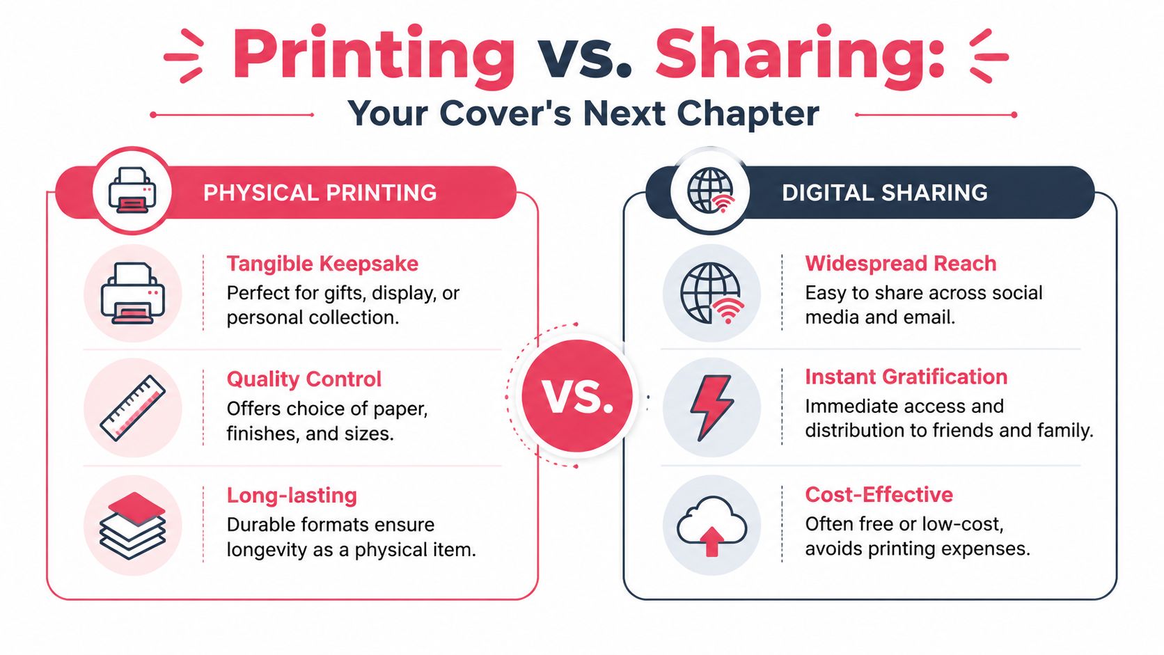
Here's the practical comparison:
| Option | Where it works | Trade-off |
|---|---|---|
| Home printing | Test prints, casual display, draft proofs | Paper, color, and finish control are limited |
| Local print shop | Posters, framed gifts, short-run presentation pieces | You need to communicate specs clearly |
| Premium comic printing | Physical comic-format keepsakes or polished portfolio samples | File prep needs to be cleaner and more deliberate |
| Digital-only sharing | Social media, email, creator portfolios | No tactile presence, and compression can hurt detail |
If this is a gift
Lean into the emotional job.
A gift cover doesn't need collector-grade mimicry unless the recipient specifically wants that. It needs strong likeness, genre fun, and a format that looks good in hand. A framed print or polished comic-format cover can do that well.
Good choices for gifts:
- Glossy print for display
- Comic-style cover with personalized title
- Bundled digital file for sharing with family
If this is for publishing or portfolio use
Be stricter.
You need consistent margins, clean typography, proper print prep, and a format that looks intentional beside professional work. Treat every shortcut as visible.
For readers comparing formats and print paths in more depth, this guide to creating and printing your own custom comic book is a useful next step.
Sharing online without flattening the work
Digital sharing has its own craft. A cover that prints beautifully can look weak online if the crop is wrong or the text gets too small.
Use these habits:
- Export a platform-friendly version: Keep a web copy separate from the print master.
- Check thumbnail readability: Shrink it down and see whether the title and main figure still read.
- Avoid over-compression: Fine line work and gradients can fall apart fast.
- Post context with the image: Tell people whether it's a gift cover, concept cover, or comic project sample.
The best home for your cover is the one that matches its purpose. A personal keepsake should feel personal. A publishing asset should hold up under scrutiny.
A custom comic book cover succeeds when the idea, the artwork, the typography, and the output format all agree on what the piece is trying to be.
If you want a straightforward way to turn photos or character ideas into a polished comic-style cover, PersonalizedComics lets you choose from eight art styles, generate illustrated comic visuals from prompts or reference images, and order a premium physical comic copy if you want the final piece in print.