Create Custom Comic Book Covers That Wow: A Full Guide
You open the proof on your screen and the art looks great. Then you picture it as a real comic in your hands and start noticing the problems. The title is crowding the character's forehead, the logo gets muddy at thumbnail size, and the artwork runs too close to the trim.
That gap between a cool illustration and a cover that prints well is what catches first-time creators.
Custom comic book covers work because they turn a private idea into a physical object fast. A gift feels collectible. A character concept feels published. A family joke, campaign hero, or short script suddenly has the visual authority of something you would spot on a comic shop wall. But covers have a job beyond looking good. They need to sell tone, genre, and focus in a single glance, and they need to survive production without falling apart.
I have seen strong art weakened by small production mistakes. Safe area ignored. Title treatment added too late. Contrast that looked fine on a backlit monitor but printed flat. Those are normal mistakes, especially if you approach the cover like a poster instead of a printed product.
A good custom cover balances two disciplines. Illustration creates the emotional pull. Production design makes sure the file holds together in print, at thumbnail size, and on the finished book.
If your goal is a full comic package instead of a single cover mockup, it helps to study how a complete custom story-driven comic project comes together. The strongest covers usually grow from a clear story promise, not just a flashy pose.
Your Story on the Cover
A friend sends you a photo, a character sketch, or a rough story idea and says, “Could this look like a real comic?” That question usually sounds like an art problem. In practice, it is also a cover design and production problem.
A custom cover gives a personal idea the weight of a published object. It can turn a birthday surprise into a keepsake, a couple into the stars of their own romance issue, or an original hero into something that feels shelf-ready instead of stuck in a sketchbook. The strongest results come from treating the cover as both storytelling and packaging. It has to create interest fast, and it has to hold together once titles, issue marks, trim, and print requirements enter the file.
I treat the cover as the book's promise. Instead of summarizing every plot point, it should focus on the clearest signal about the story. Who matters here? What mood are we entering? Why would someone pick this up?
If you are building more than a one-off image, it helps to see how a full personalized comic book project is developed. Good covers rarely begin with decoration. They begin with a story promise strong enough to support a physical book.
Why the cover carries so much weight
Readers make decisions fast. On a comic shop wall, in a crowdfunding thumbnail, on a convention table, or in a print proof on your desk, the cover gets a split second to communicate genre, character, and tone.
That speed is exactly why custom comic book covers work for personal projects. The format is already familiar, so the viewer brings expectations with them. A private joke feels collectible. A memorial piece feels ceremonial. A self-insert adventure feels finished enough to share.
A good comic cover makes someone want the explanation.
There is a business side to that familiarity too. Comics remain a widely recognized visual form, so even highly personal projects benefit from a language people already know how to read. That matters if your goal is a gift, a short-run print piece, or a proof-of-concept for something bigger.
What first-time covers often get wrong
Two common mistakes I see are easy to spot once you know them.
The first is building a beautiful character illustration with no cover architecture around it. The pose may be strong, the rendering may be polished, but there is no room for the title, no hierarchy, and no obvious focal path for the eye. The second is leaving production decisions until the art is finished. That is when the logo ends up across the forehead, the top text gets cramped, and the final file has to be patched together instead of designed properly from the start.
A better approach is simple:
- Start with one story beat: Choose a moment that suggests the larger story.
- Pick one emotional driver: Danger, awe, romance, mystery, humor, grief, triumph.
- Plan for the physical format: Front cover space, spine width, back cover content, bleed, and trim affect the layout early.
- Protect negative space: Open areas give typography room and make the cover feel intentional.
That last point gets ignored a lot. Empty space is not wasted space on a comic cover. It is where the title lives, where the eye can rest, and where the design avoids looking amateur once it is printed.
A custom comic book cover should look exciting on screen. It also needs to survive the boring realities of production. If the story promise is clear and the file is built with the finished object in mind, the cover will feel professional before anyone even opens the book.
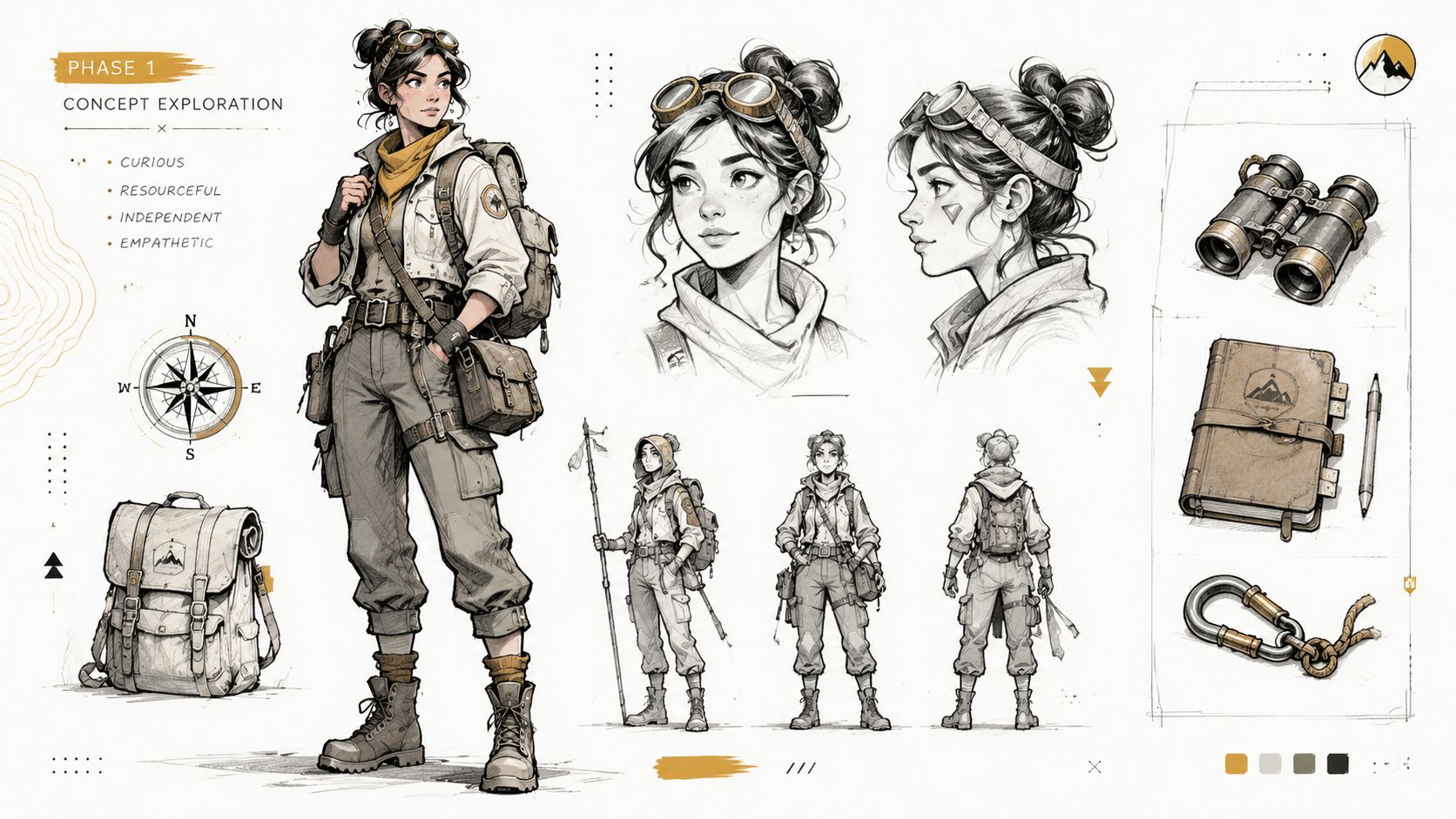
Phase 1 Concept and Character Design
Before you worry about logos, issue numbers, or print specs, decide what the cover is about. Not generally. Specifically.
If your answer is “my character looking awesome,” keep digging. That can be part of the solution, but it's not yet a concept. A concept is closer to “a rookie explorer discovering something dangerous,” “a couple framed like a golden-age romance comic,” or “a vigilante standing alone after the fight.” Those are usable directions.
Pick the tone before the pose
Art style isn't decoration. It tells the reader how to interpret the image.
The same character can feel completely different depending on the visual language around them. Heavy shadows and limited color push the cover toward noir. Big action lines and bright contrast suggest superhero adventure. Clean faces, expressive eyes, and controlled silhouettes can push the image toward manga influence. Painterly rendering can make the project feel like a fantasy graphic novel or prestige edition.
When people skip this choice, they often end up with mixed signals. The character design says “serious sci-fi thriller,” while the title treatment says “lighthearted parody.” That tension can work if it's intentional. Usually it isn't.
A useful way to lock this down is to write a one-line style statement before any art starts:
- “Classic American hero cover with bold action and strong silhouette.”
- “Soft romantic cover with vintage comic energy and warm palette.”
- “Dark, moody detective cover with limited color and hard shadows.”
- “Manga-inspired adventure with expressive faces and dynamic motion.”
If you need inspiration for building a stronger visual identity from the ground up, this guide to comic character design is a useful companion.
Build from reference, not guesswork
If the cover features a real person, reference photos matter more than generally assumed. Don't send a random selfie and hope for the best. Artists and image systems both need clarity.
Use photos that show the person in a way that supports adaptation into comic form:
- Clear lighting: Even light helps define facial structure. Harsh shadows hide useful information.
- Readable expression: Neutral, determined, smiling, worried. Pick the emotion you want reflected in the final cover.
- Useful angles: A straight-on view plus a three-quarter angle gives much more to work from than one filtered snapshot.
- Distinctive details: Glasses, hairstyle, jacket, jewelry, scars, or signature accessories help the character feel specific.
- Separate costume reference: If the cover includes a hero outfit, provide that separately rather than expecting it to be invented from a casual portrait.
If the character is original, replace photos with a short but vivid brief. Don't write a biography. Write visual instructions.
Bad brief: “She's cool and strong and adventurous.”
Better brief: “Young explorer, practical outdoor jacket, worn boots, goggles pushed up on forehead, confident expression, carries a weathered map case, more curious than aggressive.”
Practical rule: The artist or tool can only solve the problems you've actually named.
Decide what makes the character cover-worthy
Not every good character makes a good cover character. Covers reward clarity, contrast, and quick recognition.
Ask these questions:
What is the instantly recognizable trait?
Cape, helmet, guitar, lantern, detective coat, glowing hand, impossible sword.What emotional state should the reader feel first?
Defiance, wonder, dread, joy, menace.What visual shape defines them from a distance?
Broad shoulders, oversized hair, long coat, dramatic weapon, unusual posture.What detail should be removed, not added?
If a belt has twelve gadgets and none affect the read from a distance, simplify it.
That last point matters. On custom comic book covers, too much costume detail often muddies the silhouette. Readers don't admire tiny design choices first. They read the whole shape.
Use a short concept checklist
Before moving on, make sure you can answer these without hesitation:
| Question | Good sign |
|---|---|
| Who is this cover about? | One clear central figure or relationship |
| What is happening? | A single dramatic beat |
| What tone does it promise? | Genre is obvious at a glance |
| What visual references support it? | Photos, mood images, costume cues |
| What must remain recognizable? | Face, outfit, prop, symbol, pose |
If those answers still feel fuzzy, keep refining here. Composition gets easier when the concept has spine.
Phase 2 Cover Composition and Layout
Once the concept is solid, composition decides whether the cover lands or stalls. At this stage, you stop thinking like a character designer and start thinking like a director. You're arranging attention, not just objects.
The biggest layout mistake I see is trying to give every element equal importance. Covers don't work that way. One thing gets top billing. Everything else supports it.
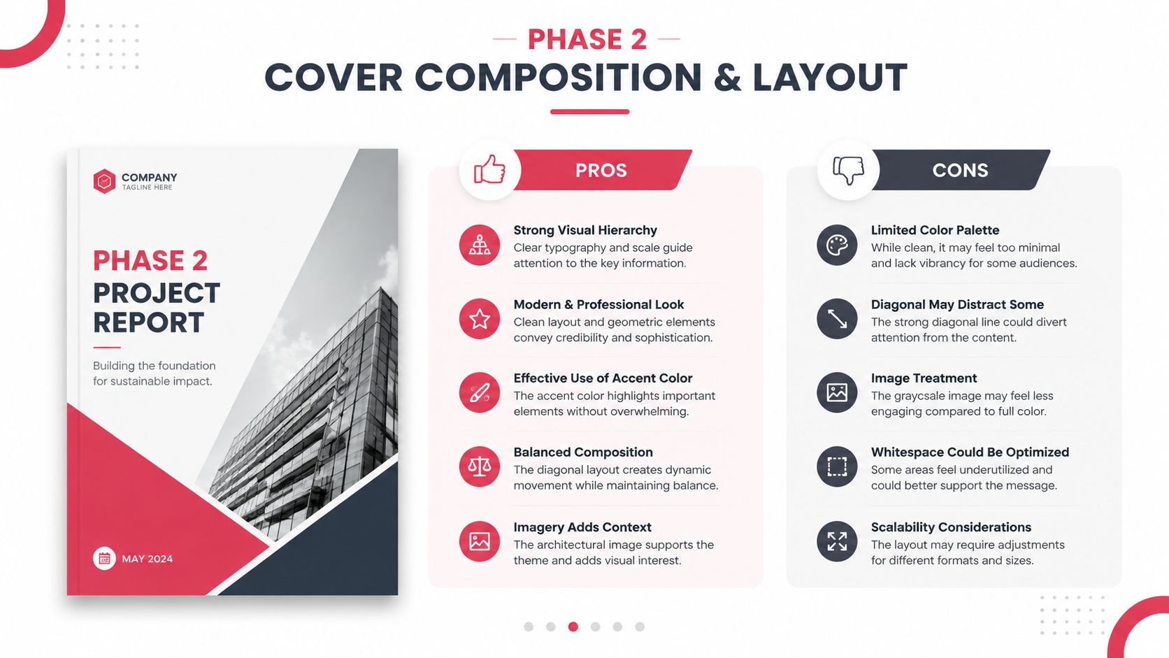
Put the focal point to work
A comic cover needs a dominant read. In plain terms, a viewer should know where to look first without effort. Usually that's the face, the action, or the central conflict.
A simple way to test this is to shrink the design until it's thumbnail-sized. If the main read disappears, the composition needs work. If your eye darts around without settling, the hierarchy isn't clear enough.
Use these principles to tighten it up:
- Lead with one primary subject: One hero, one villain, one embrace, one confrontation.
- Group secondary elements: Supporting cast should read as support, not competition.
- Use directional cues: Capes, weapons, smoke, eye lines, buildings, and light rays can all point toward the focal area.
- Control contrast: The strongest contrast should usually sit near the most important story beat.
Design the front as a selling surface
The front cover has to do fast work. It introduces the character, the genre, and the emotional charge of the story. That job became even more important historically as comic publishing evolved. Comichron notes that publishers reduced issue page counts from 64 to 48 and then to 32 pages, with 32 pages becoming the floor for a standard issue as cover prices rose over time. That shift helps explain why the cover became such a significant value signal for readers.
That lesson still applies. Whether your comic is a gift, a one-off print, or a prototype, the cover has to earn attention immediately.
A practical front-cover formula looks like this:
Top zone for brand elements
Title, issue styling if you want it, creator names if needed.Center zone for the strongest image
Character, action beat, or relationship.Lower zone for support
Subtitle, tagline, environment, effects, or secondary figures.
Clarity beats cleverness on a first read. A reader should understand the emotional pitch before they admire the details.
Treat front, spine, and back as one package
A lot of custom comic book covers fail at the wraparound stage because the front was designed first and everything else got squeezed into the leftovers. That's backwards. Even a single-copy personal comic benefits from package thinking.
Front cover
The front should carry the hero image and the strongest title treatment. Don't overcrowd it with plot summary text.
Good front-cover content often includes:
- A clear title
- One key visual moment
- Optional issue-style dressing, if you want a classic comic feel
- A short tagline, only if it adds punch
Spine
The spine is tiny, but it matters if the book will sit on a shelf. Keep it readable and simple. If the title becomes unreadable at a small size, shorten the display version or simplify the type.
Back cover
The back cover shouldn't feel like an afterthought. It can hold a short blurb, a teaser image, character silhouettes, faux ad styling, or a continuation of the wraparound art. What it should not do is become a dumping ground for everything that didn't fit on the front.
A quick layout gut-check
If you're unsure whether the composition is working, test these comparisons:
| If your cover feels… | Try this |
|---|---|
| Busy | Remove one character or background layer |
| Flat | Increase size contrast between focal subject and support elements |
| Confusing | Strengthen one dominant light source or gesture |
| Weak at thumbnail size | Simplify silhouette and raise contrast |
| Professional but lifeless | Add a stronger implied story beat |
Composition is where a custom cover starts feeling publishable. Not because it gets more complicated, but because every part starts doing a specific job.
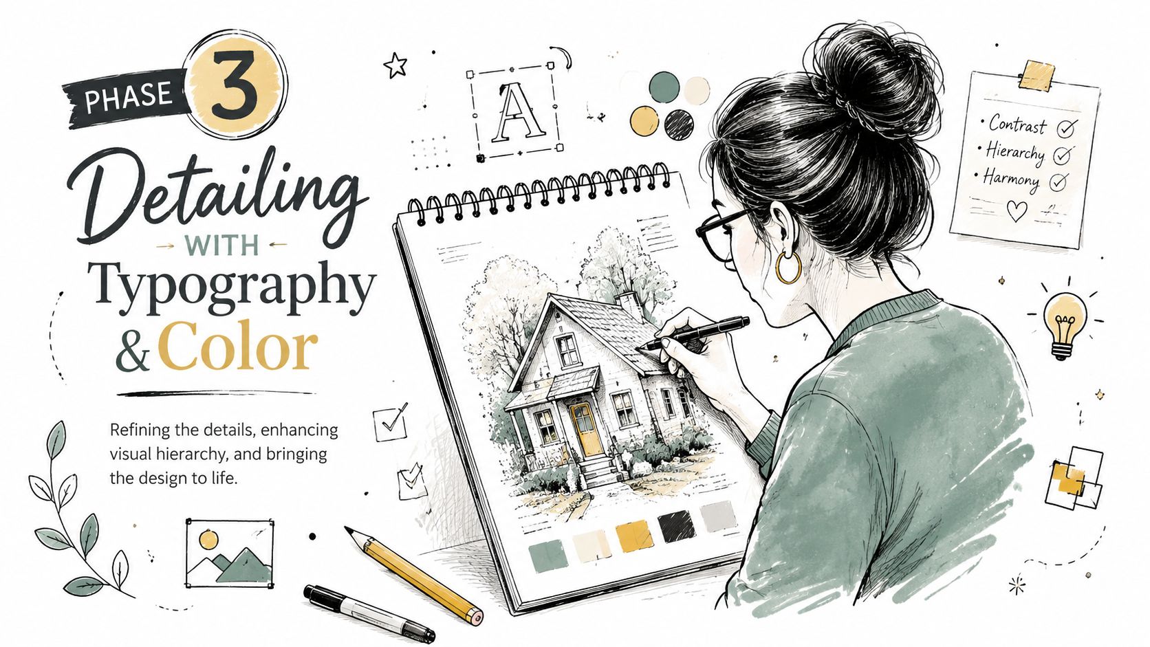
Phase 3 Detailing With Typography and Color
This is the stage where a promising cover either sharpens into a book cover or drifts back into “nice illustration.” The difference usually comes down to typography and color. Both are narrative tools. Neither should be treated as decoration added at the very end.
That production order mirrors professional practice. A standard comic cover workflow moves from brief to rough sketch, then to inking, coloring, and final typography placement before print. That sequence matters because each layer depends on the structure beneath it.
Typography sets the genre before the reader notices
People often say, “I just need a comic font.” That's usually the wrong question. You need a title treatment that belongs to this story.
Sharp, angular lettering gives a different promise than rounded retro type. Tall condensed forms feel different from thick, blunt letterforms. A horror cover, a romance cover, and a cosmic adventure cover shouldn't all wear the same typographic voice.
Think about type in three layers:
The main title
This is the brand. It should be legible, distinctive, and strong enough to hold its place over the art.Secondary text
Subtitle, tagline, creator names. These should support, not compete.Publishing furniture
Issue indicators, faux price box, edition labels, or universe markers if you're using them for style.
A common mistake is pushing all type to the top because “that's where comic titles go.” Sometimes that's right. Sometimes the art needs a lower lockup, a title integrated into the environment, or type boxed against negative space. Placement should follow readability, not habit.
Color does the emotional heavy lifting
Color can rescue a simple drawing or weaken a great one. What matters most is not how many colors you use, but how clearly the palette supports the mood.
A few reliable pairings:
- Warm reds and yellows suggest action, danger, heat, bravado.
- Cool blues and violets push mystery, distance, melancholy, science fiction.
- Muted earthy palettes can make a book feel historical, grounded, or literary.
- High-key candy color supports comedy, retro pop, and playful energy.
- Restricted palettes often make a cover feel more intentional than fully saturated everything.
If your cover includes a personalized character based on a real person, be careful here. Beginners often chase likeness through tiny facial detail when color would do more of the emotional work. Better skin separation, stronger costume contrast, and a cleaner background often produce a more convincing result than over-rendering.
Design note: If every part of the cover glows, nothing glows.
Make the text and art cooperate
The final pass is where covers either snap together or start fighting themselves. Look for these friction points:
Title versus face
If the title cuts through the most expressive part of the character, the cover loses emotional force. Move the title, reduce the head size slightly, or adjust the pose.
Palette versus readability
Beautiful atmospheric color can make type disappear. If the logo sits on similar values, it won't matter how good the font choice was.
Effects versus focus
Lens flares, smoke, crackle energy, speed lines, halftones, gradients. All useful. All dangerous in excess. Effects should frame the focal point, not bury it.
A cleaner finishing checklist
Before locking the design, ask:
- Can I read the title quickly?
- Does the color palette match the story promise?
- Is the most important face or action still dominant?
- Does any text feel pasted on rather than designed in?
- Would this still work if I printed it and viewed it at arm's length?
That last test catches a lot. Covers live in physical space, not just zoomed-in files.
Phase 4 The Technical Print-Ready Checklist
Many otherwise strong custom comic book covers falter at the print stage. The art looks polished on screen, the title is in place, the composition feels resolved, and then the printed copy arrives with soft detail, awkward trimming, or mandatory publishing elements shoved into the wrong spot.
That isn't a taste problem. It's a production problem.
For print output, the most actionable benchmark in the available guidance is simple: export the cover at 300 DPI and reserve layout space early for the barcode, ISBN, and publisher details so those elements don't collide with the artwork. That rule is not optional if you want a file that behaves like a real cover.
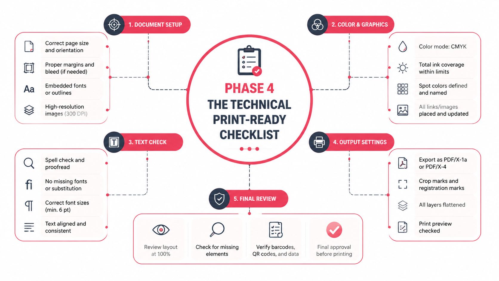
Understand the parts the printer cares about
Printers don't evaluate your concept. They evaluate your file.
That means you need to think in zones, not just visuals.
Trim area
This is the final cut size of the cover. Anything beyond it may be removed in production. If your title or a character's eye sits too close to the edge, you're gambling.
Bleed
Bleed is the extra artwork that extends past the trim so the printer can cut cleanly without leaving a white edge. If your background color or image stops exactly at the trim line, even a small shift in cutting can show an unwanted border.
Safe zone
The safe zone sits inside the trim. Keep critical text, faces, logos, and important story details here. If it absolutely must survive trimming, don't push it to the edge.
Files don't fail in printing because the idea was weak. They fail because someone treated the edge of the document like a suggestion.
Resolution and color mode
The 300 DPI export standard is the one technical benchmark you should lock in early, not after the artwork is finished. If you build low and try to rescue the file later, the result usually looks soft or artificially sharpened.
Color mode gets more confusing because different tools and printers handle it differently. Screens display color differently than paper does, so a file that glows on a monitor may print flatter or darker. The practical lesson is to review print proofs carefully and avoid making delicate color decisions based only on a bright backlit display.
Here's a simple rule set that keeps most first-time creators out of trouble:
- Start large enough for print.
- Keep your working file organized in layers if possible.
- Test title readability at reduced size.
- Avoid tiny details that only exist for zoomed-in viewing.
- Leave required publishing zones open from the beginning.
If you're planning to move from concept to a physical copy, this walkthrough on how to print your own custom comic is a useful next read.
Print-ready cover specs at a glance
| Specification | Recommendation | Why It Matters |
|---|---|---|
| Resolution | 300 DPI | Helps preserve sharpness for print output |
| Barcode and publisher area | Reserve space early in the layout | Prevents important art or text from being blocked |
| Trim awareness | Keep critical elements away from edges | Reduces risk of awkward cutting |
| Bleed | Extend background art beyond trim | Helps avoid white slivers at the edge |
| Safe zone | Place title, faces, and key text inside it | Protects important content during trimming |
| File review | Check at full size and reduced size | Catches readability and detail problems |
| Spine planning | Design it with the full wrap, not afterward | Keeps the package cohesive |
| Export check | Review the final file before upload | Prevents avoidable print errors |
Common file mistakes that ruin otherwise good covers
Some errors show up over and over:
The title is too close to the edge
It may survive on one copy and look cramped or clipped on another.The barcode area lands on a face or major prop
This is a planning failure, not a printer failure.The art was built for screen first
It looked crisp online but doesn't hold up in print.The background stops at the trim
That creates risk at the edge.The spine was ignored until export day
Then the wrap feels patched together.The file was never tested small
So the title vanishes and the focal point weakens.
A final pre-flight checklist
Before uploading anything, do this in order:
View the full wrap at actual scale
Check front, spine, and back together.Confirm the export is set to 300 DPI
If it isn't, fix that before delivery.Inspect every edge
Make sure background elements extend cleanly.Check the safe placement of text and faces
Nothing essential should ride the trim.Verify reserved publishing space
Barcode and publisher details need breathing room.Print a rough proof if you can
Even a basic home print reveals problems your screen hides.Read the cover from arm's length
If the title and focal point don't hold, revise.
This is the least glamorous part of the process, and it's the part that separates a nice image from a cover that feels professionally made.
Phase 5 Ordering and Using Your Custom Comic
The first time you hold a printed comic with your own custom cover on it, you notice something digital previews can't deliver. Weight. Finish. Scale. The little pause before someone opens it. That's when the project stops being “a design file” and becomes an object with social life.
A gift version works differently from a shelf copy, and both work differently from a prototype for a larger project. The ordering step should match the use case. If it's a keepsake, presentation matters. If it's a pitch piece, readability and polish matter more than novelty. If it's for an event, consistency across copies matters most.
Where custom covers become memorable
One of the best uses is the personal gift that doesn't feel disposable. A birthday comic cover with the recipient as the lead character feels playful, but it also feels considered. The same goes for anniversaries, graduations, retirements, and inside-joke friendship gifts. The comic format gives sentiment some structure. It doesn't just say “I thought of you.” It says “I built a world around you.”
Writers use custom comic book covers differently. A cover can function as a prototype for a larger graphic novel idea, helping you test genre, branding, and character appeal before developing full interiors. If the cover still feels uncertain, the project probably needs more concept work. If the cover clicks immediately, that's useful information.
Smart non-gift uses
Custom covers also work well outside the usual “present” context.
- For streamers and creators: A comic-style cover can become promotional art, channel branding, or merch-adjacent visual material.
- For classrooms or youth groups: Students engage quickly with a format that feels collectible and story-driven.
- For cosplay and events: A physical comic prop with a personalized cover can enhance a costume or booth setup.
- For family archives: Turning a shared story into a comic cover gives memory a visual hook people keep.
The cover often outlives the original occasion because people display it. That changes how carefully it should be designed.
When you order, don't rush just because the design is done. Review the final file one more time with fresh eyes. Most regrets happen in the last mile.
Frequently Asked Questions
Do I need to be good at drawing to make a custom comic cover?
No. You need good decisions more than drawing skill. Strong covers come from clear concepts, usable references, disciplined composition, and clean production habits. A weak idea drawn beautifully still makes a weak cover.
Should I put every cool detail on the cover?
Usually not. That's one of the most common beginner mistakes. Many public guides focus on the illustration side, but creator advice on cover-making consistently pushes in the opposite direction: a strong cover should be attention-grabbing, uncluttered, and readable from a distance, rather than overloaded with detail as discussed in this creator-focused cover advice.
If you're deciding between “add more” and “make it clearer,” clarity is usually the professional move.
What if I want multiple characters on the cover?
That can work, but one relationship or conflict should still dominate. Ensemble covers often become messy because each character is given equal visual weight. Let one figure lead and let the others support.
Where should the title go?
Where it reads best and interferes least with the art. Top placement is common, but it isn't mandatory. The essential rule is that the title should feel integrated, not pasted over the image as an afterthought.
Can I use a custom comic cover as a real printed book cover?
Yes, if you build the file for print and account for production needs early. That includes space for required publishing elements and enough technical discipline that the physical result matches the design intent.
Why does my cover look better on screen than in print?
Screens are bright, paper isn't. Fine detail, subtle contrast, and glowing colors often look stronger on a monitor than they do in print. That's why print-minded simplification usually produces a better physical result than endless detail.
Is the front cover enough, or should I design the full wrap?
If you're printing a physical book, design the full wrap. A polished front with a rushed spine and empty back feels unfinished. Even simple back-cover treatment can make the whole piece feel intentional.
How do I know when the cover is done?
When the main read is clear, the title is legible, the story promise is obvious, and nothing important is fighting for attention. Not when you've filled every inch.
If you want to turn your idea into a finished comic without needing drawing skills, PersonalizedComics makes that process much easier. You can turn photos and story ideas into fully illustrated comic pages, choose from multiple art styles, and order a physical comic with a premium finish. It's a practical option if you want your custom cover to become part of a complete, personalized book instead of staying as a standalone concept.