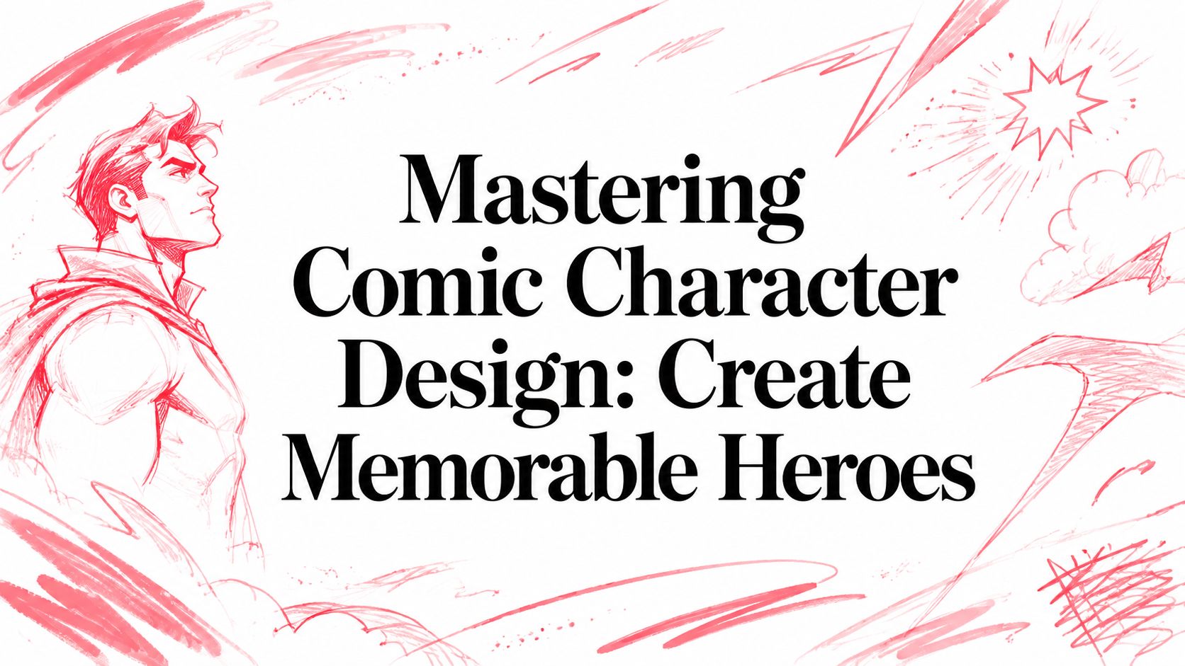
Mastering Comic Character Design: Create Memorable Heroes
You probably have a character in your head already. Maybe it's your best friend as a space captain, your kid as a masked hero, or a grumpy talking corgi who solves crimes. The problem usually isn't imagination. It's that the leap from idea to a character you can use in a comic feels huge.
A lot of people get stuck because they think comic character design starts with drawing skill. It doesn't. It starts with decisions. Who is this person, what do they want, how do they move through the world, and what should a reader understand about them in a split second?
That has been true for a long time. A key milestone came in 1867, when Ally Sloper's Half Holiday appeared in Britain as the first weekly comic to feature a regular character, which made visual identity and repeatability central to the medium, not just the joke on the page, as noted in the history of comics overview. Once characters started returning, artists needed designs readers could recognize instantly and redraw consistently.
That's still the job today. The tools have changed. The principles haven't. If you want better characters, whether you sketch them yourself or generate them with AI, you need stronger inputs. Good comic character design is built from story logic, shape, clarity, and restraint. The flashy rendering comes later.
Great Characters Begin with Great Ideas
The most common mistake beginners make is trying to invent a look before they invent a person. They chase hair, armor, cool jackets, glowing eyes. Then they wonder why the character feels flat.
A strong design usually begins with a simple dramatic idea. Not a pile of traits. A core tension. The idealistic rookie detective who can't stop breaking rules. The knight who looks terrifying but hates violence. The schoolteacher who becomes a monster hunter because she's tired of feeling powerless. Those ideas generate visual choices naturally.
Start with the story pressure
Ask what force is pressing on the character. Comics love pressure because pressure creates expression, posture, and memorable behavior. A character under stress reveals who they are faster than a neat bio ever will.
Here's a quick filter I use when testing a character premise:
- What do they want right now
A present-tense goal gives the design direction. - What blocks them
Obstacles create contrast between intention and appearance. - What do they refuse to admit
Hidden conflict often creates the most interesting visual contradiction. - Why would a reader remember them after one page
If the answer is only “they look cool,” the concept probably needs work.
Design is recognition plus meaning
The reason recurring characters changed comics so much is simple. Once a hero appears again and again, the design has to carry memory. Readers need to recognize the face, silhouette, outfit, attitude, and emotional signal quickly. That's why comic character design isn't decoration. It's visual storytelling under repetition.
A comic character isn't a single illustration. It's a performance that has to survive panel after panel.
That's good news if you don't consider yourself an artist. You don't need to start with polished anatomy. You need a clear idea strong enough to guide every later decision. When the concept is solid, the design process becomes less mysterious. You're no longer asking, “What looks awesome?” You're asking, “What makes this person readable, distinctive, and true to the story?”
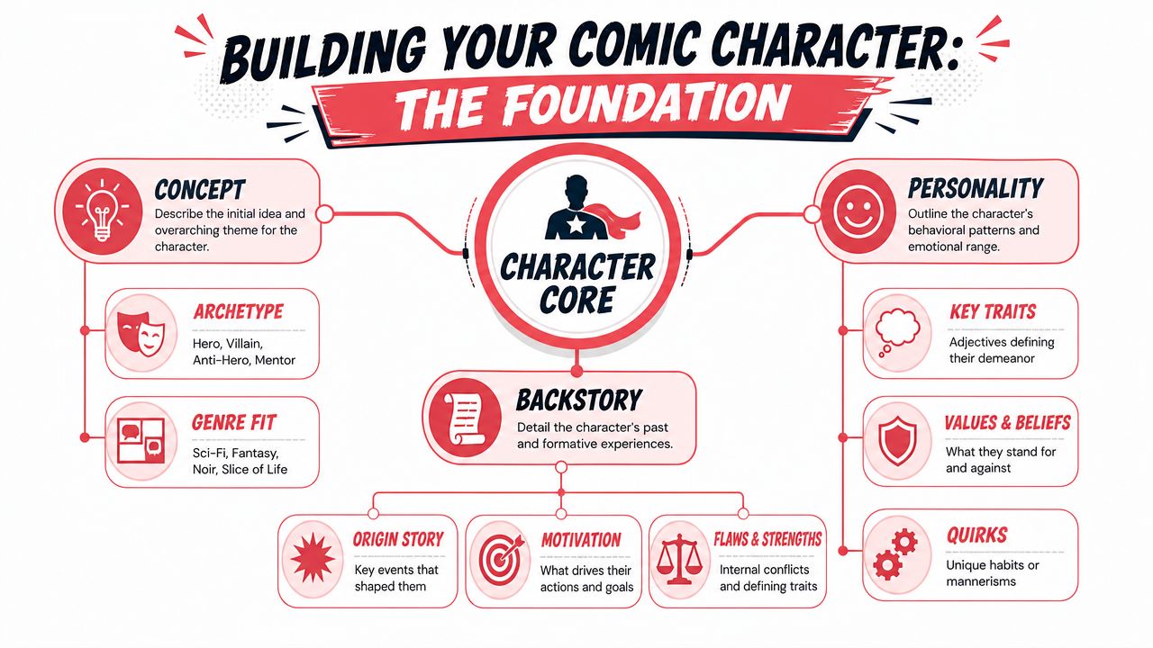
Laying the Foundation with Concept and Backstory
Before you choose a costume, decide what kind of life the character has lived. Backstory isn't filler. It changes the way a character stands, reacts, and occupies space. A person raised in strict military order won't move like a chaotic street magician. A character who hides fear with jokes won't emote like someone who confronts everything head-on.
That difference matters because readers don't just read faces. They read behavior.
Practitioners in comics point out that strong designs should be individually identifiable, emotionally expressive, and avoid same face syndrome, where different cast members start collapsing into similar facial and body types. One practical solution is grounding each design in distinct personality and backstory, as discussed in Kelci Crawford's character design guidance for comics.
Build the inner profile first
You don't need a giant dossier. You need the details that affect visible choices. I usually focus on five areas.
Role in the story
Are they the lead, the rival, the mentor, the wild card, the emotional anchor? Story role shapes how much visual force they need.Primary motivation
What are they chasing? Safety, revenge, approval, freedom, control, belonging, truth?Fear or wound
What do they avoid? What old hurt still influences present behavior?Moral style
Do they act directly, manipulate, hesitate, bluff, charm, or explode?Social presentation
Do they want to be seen, overlooked, admired, obeyed, or left alone?
These aren't abstract writing exercises. They affect design immediately. A character who wants to disappear might dress in practical layers and close their posture. Someone desperate for recognition might choose dramatic shapes, louder contrast, or a signature accessory that demands attention.
Ask questions that change the drawing
Generic questions produce generic designs. Better questions force visual consequences.
Try these:
- What does this character always carry, even when they shouldn't?
- What part of themselves do they try to hide?
- What emotion do they show most easily?
- What emotion is hardest for them to show?
- What would their room look like if nobody cleaned it first?
- What kind of weather feels like them?
Those answers often produce better design notes than broad labels like “strong” or “cool.” “Always carries a broken lucky charm” is useful. “Confident” is too vague unless you know how that confidence appears.
Separate biography from function
A mistake I see often is overbuilding lore that never reaches the page. It's fine to know where your character went to school or what happened in childhood, but in comic character design the key question is whether that history changes visible behavior.
A practical way to test this is to split notes into two columns:
| Internal fact | Visible effect |
|---|---|
| Grew up in a household where mistakes were punished | Holds stiff posture, controlled gestures, precise grooming |
| Lost trust in authority | Skeptical facial expressions, keeps distance from uniforms or symbols |
| Loves old monster movies | Wears retro pins, dramatic poses, playful dark humor |
If a backstory detail has no visible effect, it may still help your writing, but it shouldn't dominate the design.
Distinguish the whole cast, not just one hero
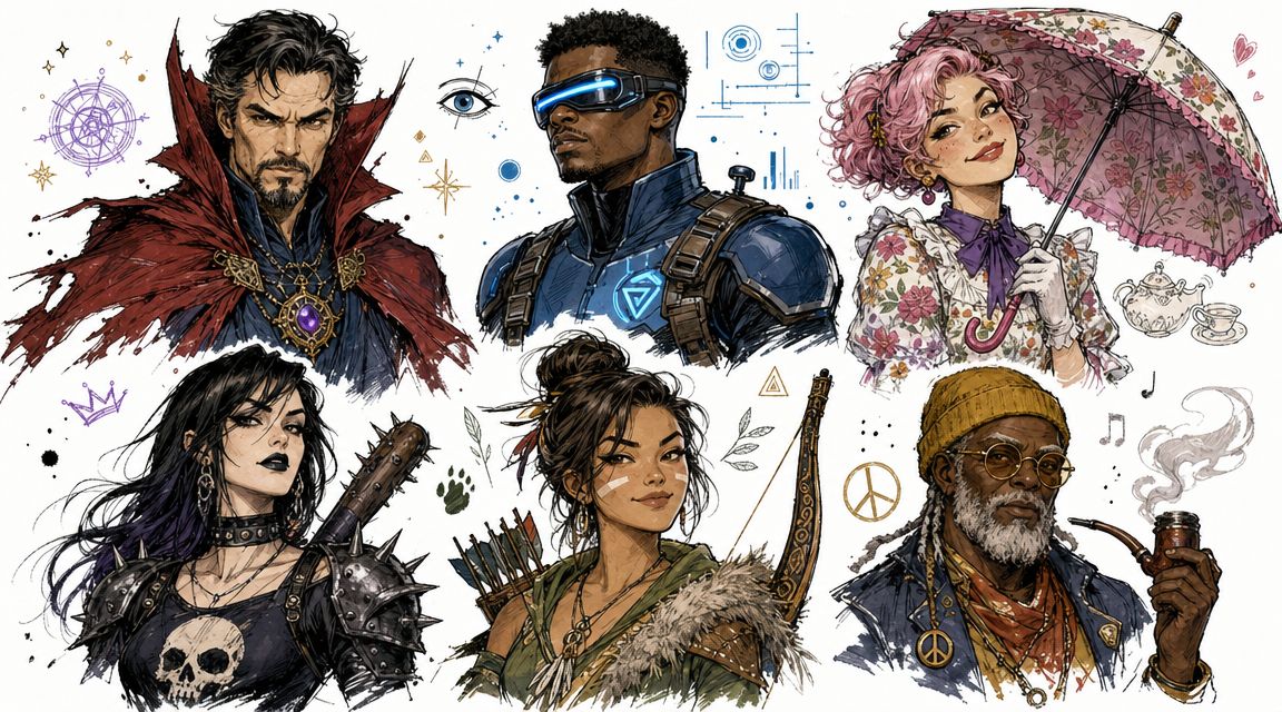
Beginners often pour all their creativity into the lead character and then design everyone else as variants of the same person. That's how a cast starts feeling cloned.
A better approach is to define each major character by contrast. If your hero is open and impulsive, make the partner guarded and methodical. If one character is tall, angular, and compressed, another might be broad, soft, and expansive. Contrast in personality creates contrast in faces, body language, and costume logic.
Practical rule: if two characters could swap expressions, hairstyles, and outfits and still look too similar, the underlying design isn't distinct enough.
That principle applies whether you draw by hand or build prompts for AI. If you want sharper scene writing too, it helps to develop the story side alongside the visual side. A beginner-friendly breakdown of plot and character beats can help at this stage in this guide to writing a story for beginners.
Create a one-paragraph character brief
Before moving on, write one tight paragraph that combines identity, conflict, and visible energy. For example:
A retired stunt performer turned vigilante. Charming in public, obsessive in private. Dresses like she's still ready for impact. Hides a bad knee and worse guilt. Moves with old confidence that slips whenever children are in danger.
That paragraph is already doing design work. It suggests posture, wardrobe, expressions, and even pacing. That's the core foundation. Once that exists, the visual choices get much easier.
Forging a Legend with Silhouette and Shape Language
If a character doesn't read in silhouette, details won't save them. Readers don't experience every drawing as a clean full-body showcase. They see cropped panels, action beats, shadow, distance, speed, clutter, speech balloons, and fast page turns. A strong silhouette survives all of that.
Independent comic artists repeatedly stress that comics are not pin-ups. Characters need to be redrawn over and over, from different poses and angles, which is why simple shapes and clear silhouettes outperform ornamental complexity in actual production, as Nilah Magruder explains in her discussion of character design and consistency.

Think in masses before details
When I rough out a character, I don't begin with eyelashes or belt buckles. I block in the biggest visual masses first. Head shape. Torso shape. Limb rhythm. Hair mass. The outer contour of coat, cape, armor, or tools.
That outer contour is what the eye catches first. A reader should be able to identify the character from the overall shape even before internal details become clear.
A weak silhouette often has these problems:
- Balanced everywhere
Nothing dominates, so the figure feels generic. - Too many small protrusions
Tiny accessories muddy the outline. - No posture logic
The character stands like a mannequin instead of a person. - Same body architecture as everyone else
Different outfits, same underlying read.
A strong silhouette usually has one or two major statements. Broad shoulders and a narrow lower half. Huge hair and compact body. Long coat with heavy boots. Curved, springy posture against a rigid cast.
Use shape language on purpose
Shape language gives emotional direction to form. It isn't a rigid code, but it's a useful shorthand.
| Shape tendency | Common visual feel | Good uses |
|---|---|---|
| Circles and rounded forms | Warmth, softness, friendliness, youth | Sidekicks, gentle leads, approachable mentors |
| Squares and blocky forms | Stability, weight, reliability, stubbornness | Tanks, authority figures, grounded heroes |
| Triangles and sharp forms | Speed, threat, cunning, aggression | Rivals, villains, unstable antiheroes |
Most memorable designs mix these, but one family of shapes usually dominates. That dominance creates identity. If every character uses the same angular body, same tapered jaw, same narrow waist, and same spiky costume logic, your cast starts to blur.
Run the squint test
One of the fastest design checks is the squint test. Shrink the character down, squint your eyes, and ask what remains readable.
Can you still tell:
- who this character is
- what kind of energy they bring
- what major shapes define them
- whether they differ clearly from the rest of the cast
If the answer is no, the design is still relying too much on internal detail.
Here's a simple comparison:
| Weak approach | Strong approach |
|---|---|
| Tight jacket covered in gadgets, average stance, standard hair | Long asymmetrical coat, forward-leaning posture, heavy scarf shape |
| Standard superhero proportions with minor costume tweaks | Distinct torso-to-leg ratio and instantly readable shoulder line |
| Tiny prop details intended to communicate personality | One large signature prop integrated into silhouette |
Pose is part of silhouette
Silhouette isn't only the body. It's the body in attitude.
A nervous scholar and a reckless brawler shouldn't stand the same way. The scholar may tuck elbows in, protect the chest, and angle the head forward. The brawler might lead with the sternum, plant feet wide, and leave limbs open. The outline changes because the psychology changes.
Most forgettable designs don't fail because the costume is boring. They fail because the pose tells you nothing.
AI-generated characters often face a similar problem. The rendering can look polished, but the silhouette is generic because the prompt focused on surface style instead of body architecture and attitude. If the underlying shape isn't distinctive, the result looks interchangeable with dozens of other characters.
A silhouette exercise that works
Take your top three characters and reduce each to solid black. No facial features. No interior costume lines. No color. Then put them side by side.
Ask:
- Would a reader know which is the lead?
- Do they feel like they belong to the same world without looking related by accident?
- Is each outline readable from a distance?
- Have small accessories replaced larger form decisions?
If the design fails, don't add more. Subtract. Push the body type. Simplify the hair mass. Enlarge one key prop. Change the posture. Cut two details so one can matter.
That's the hidden discipline in comic character design. Strong characters often become stronger when you remove the things that looked impressive in isolation but weakened the read on the page.
Defining a Look with Costume Color and Props
Once the big shape works, costume, color, and props give the character identity at a closer range. From these elements, readers start picking up profession, status, habits, loyalties, and contradictions. It's also where many designs go off the rails because creators try to make every inch of the character say something.
A costume should communicate. It shouldn't explain the entire character by itself.
Comic character design guidance warns against overloading detail because the design must remain practical to draw repeatedly. Costumes, gadgets, and armor should be tested for repeatability, especially across close-ups, action, and emotional scenes, as described in Clip Studio's advice on designing comic characters.
Dress the life, not the mannequin
The best costume choices come from function plus personality.
A detective's coat shouldn't only look dramatic. It should suggest weather, habits, access, class, or self-image. A fantasy warrior's gear should hint at what they do. Fast fighters need mobility. Ceremonial characters can carry weight and symbolism. A vain character maintains their look differently from a practical one, even if both wear formal clothing.
Good questions to ask:
- What does this character need to do while wearing this?
- What part of the outfit is practical and what part is self-expression?
- What looks maintained, damaged, inherited, improvised, or stolen?
- Would this costume still make sense in a quiet scene, not just a splash page?
That last question matters. Many designs look fine in heroic poses but become absurd when the character sits at a table, runs downstairs, or has to cry.
Build a restrained color plan
Color is powerful because it creates memory fast. But too many colors flatten the effect.
I like to think in layers:
Base color family
The dominant read. Dark neutrals, warm earths, cold metallics, bright primaries, muted pastels.Accent color
The note that pulls the eye. A scarf, visor glow, gloves, insignia, lining.Support neutrals
The stabilizers that keep the palette from getting noisy.
The point isn't to follow a universal formula. It's to keep the visual idea coherent. A disciplined palette helps readers remember the character and helps artists maintain consistency panel to panel.
Let props carry narrative weight
Props work best when they reveal habit, need, or emotional attachment.
A prop can be:
- Professional
Notebook, med-kit, wrench, badge, instrument case - Symbolic
Family ring, old photograph, broken charm, ceremonial blade - Behavioral
Toothpick, umbrella, gloves always half-removed, headphones - Structural
Cane, backpack, oversized weapon, lantern, drone companion
The strongest props usually do more than one job. They shape silhouette, support story logic, and create memorable repetition. If a prop only looks cool but never seems tied to the character's behavior, it may be decorative clutter.
Use subtraction to find the iconic version
A useful exercise is to design the character once at full enthusiasm, then strip it back. Remove half the accessories. Simplify layered patterns. Cut one secondary color. Reduce armor segments. Replace three small motifs with one big idea.
Here's what that process often reveals:
| Overbuilt version | Cleaner version |
|---|---|
| Multiple belts, glowing insignias, segmented armor on every limb | One dominant chest or shoulder shape plus clear boots and gloves |
| Hair ornaments, cape clasps, pouches, tech lines, patterned fabric | A single signature accessory with stronger silhouette impact |
| Four competing color accents | One accent and support neutrals |
The cleaner version usually reads better, draws faster, and stays more consistent.
Design-by-subtraction: if removing a detail doesn't damage recognition or story, it was probably earning less than it cost.
That's especially important if you're designing a superhero persona or gift comic based on a real person. A personalized character works better when you capture a few defining elements instead of drowning the design in references. If you want ideas for that kind of transformation, this guide on how to customize a superhero is a useful creative jump-start.
Make choices that survive production
Comics are a long game. The outfit has to survive dialogue scenes, action, shadows, funny expressions, and redraws when you're tired. A design that depends on tiny ornament or perfect symmetry often breaks under actual page work.
That's why professional-looking comic character design often feels surprisingly selective. The artist isn't holding back because they lack imagination. They're making sure every visible choice earns its place.
Bringing Characters to Life with Expressions and Poses
A finished design sheet can still produce dead panels if the character doesn't know how to act. Comics live in the gap between one pose and the next. Expression, posture, and gesture are what turn design into personality.
One of the most useful habits is building a small reference sheet before you start pages. A practical workflow is to begin with a front-facing character sheet, then add profile and three-quarter views to catch proportion drift and head-turn problems. Putting multiple characters on one lineup sheet also helps compare scale and avoid accidental clone-like similarities, as shown in this comic character workflow demo.
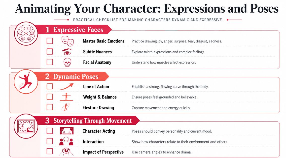
Build a performance guide
Think of your reference sheet as less of a model sheet and more of a performance guide.
For each character, define:
- Neutral stance
How they stand when nothing dramatic is happening. - Default facial set
Relaxed mouth, brow tension, eye openness, head tilt. - Stress response
Do they shrink, flare up, smile through it, go still, overtalk? - Gesture habits
Finger tapping, chin lifting, slouching, pointing, fidgeting with sleeves. - Action pose
One pose that captures their core physical energy.
At this point, the character starts feeling castable. You're not just saying what they look like. You're deciding how they behave on camera.
Don't chase every emotion equally
Every character can show anger, joy, fear, and surprise. But they shouldn't all show them the same way.
One character's anger may explode outward. Another's may tighten the jaw and sharpen the eyes while the body goes still. A cheerful character might have broad expression range, while a guarded one reveals emotion in smaller shifts. Those differences matter more than perfect rendering.
Here's a compact way to think about expression range:
| Emotion | Open character | Guarded character |
|---|---|---|
| Joy | Wide smile, lifted posture, visible hands | Small smile, softer eyes, brief release in shoulders |
| Anger | Forward lean, exposed teeth, active arms | Tight mouth, lowered brow, compressed stance |
| Fear | Recoil, widened eyes, defensive hands | Frozen posture, minimal movement, avoidance of eye contact |
Use poses to reveal psychology
A pose isn't just an anatomy challenge. It's a statement about confidence, burden, social status, and intention.
A leader may occupy space without apology. A guilty character may look like they're always folding inward. A comic relief character often benefits from asymmetry and off-balance rhythm. A dangerous calm villain may be more unsettling when they barely move at all.
Some of the best acting in comics happens in the shoulders, hands, and spine, not the face.
That's why pose libraries help so much. When you know a character's usual body language, you can push or break it at the right dramatic moment. The stoic warrior slumps once. The anxious sidekick finally stands tall. Those changes land because the baseline was clear.
A practical starter sheet
If you're building your own sheet, include these views and tests:
- Front view for proportions and clothing placement
- Profile view to reveal nose, chin, hair mass, neck angle
- Three-quarter view because comics live here
- Four facial expressions that reflect the character's most likely emotional beats
- One full-body action pose
- One interaction pose such as sitting, leaning, or talking with someone else
If you want extra help building those references, a beginner-friendly process for pose and consistency is covered in this article on how to draw comic characters.
The point isn't perfection. It's repeatability. Once you know how the character smiles, braces, points, and collapses, every future panel gets easier.
Translating Your Vision for AI with PersonalizedComics
AI gets blamed for generic character design when the actual problem is usually generic input. If you feed a tool a thin idea, you'll get a polished version of a thin idea back. If you feed it a strong concept with controlled visual language, you'll get output that's much closer to something usable.
That's why traditional comic character design principles matter even more with AI. They give you specificity. Specificity is what separates “cool cyberpunk hero” from a character who is integral to your story.
Write prompts like a character designer, not a shopper
Many weak prompts read like shopping lists. They stack style words and visual buzzwords but don't define personality, shape, or function.
Compare these two approaches.
Basic prompt
- Futuristic detective, noir style, cybernetic eye, cool coat, dramatic lighting
That might generate something slick. It probably won't generate someone memorable.
Better prompt
- Middle-aged futuristic detective with a tired, disciplined presence. Tall, narrow silhouette with a long weathered trench coat and one oversized shoulder panel. Keeps hands in pockets unless cornered. Expression usually restrained, with heavy-lidded eyes and a skeptical mouth. One visible cybernetic eye, not flashy, built for forensic scanning. Palette kept to charcoal, muted blue, and a small amber accent. Feels capable, private, and emotionally worn.
The second prompt carries concept, posture, silhouette, costume logic, and emotional tone. It gives the system decisions to work with.
Use a prompt structure that mirrors real design work
A reliable prompt framework looks like this:
| Prompt element | What to include |
|---|---|
| Character core | Role, personality, conflict |
| Body and silhouette | Height feel, build, posture, dominant shapes |
| Face and expression | Age impression, key features, default emotional tone |
| Costume | Function, wear level, signature pieces |
| Color direction | Dominant palette and limited accent notes |
| Story mood | Genre, atmosphere, emotional framing |
You don't need to make every prompt huge. You do need to make it intentional.
If you're transforming a real person, preserve the right traits
When using a photo as inspiration for a comic character, people often focus too much on exact realism. That usually leads to awkward results. Better outcomes come from identifying the person's most recognizable traits, then translating them into the design language of the comic.
Focus on:
- Face landmarks
Brow shape, smile shape, nose profile, cheek structure, hairline - Behavioral read
Warm, reserved, mischievous, intense, playful - Physical rhythm
Upright, bouncy, grounded, loose, compact - Signature details
Glasses, curls, beard shape, favorite jacket, posture habit
Then adapt those traits to the story concept. If the person becomes a fantasy ranger, the goal isn't photorealistic duplication. It's recognizable transformation.
Style choice should support the concept
One of the easiest ways to weaken a character is choosing a style that fights the story. A light, whimsical design can work in a horror comic if the contrast is intentional, but accidental mismatch usually creates confusion.
Think in terms of fit:
- Manga for expressive rhythm, stylized emotion, kinetic clarity
- Noir for moral tension, heavy mood, strong light-dark reads
- Classic American for bold heroic readability
- Graphic novel for grounded storytelling and nuanced acting
- Cyberpunk for dense world texture and high-tech identity
- Fantasy for mythic atmosphere and symbolic costume design
The style isn't just a filter. It changes what kinds of design choices will read best.
Iterate by changing one variable at a time
When output misses the mark, don't rewrite everything at once. Adjust one category per pass.
If the result feels bland, strengthen silhouette language.
If it feels noisy, cut secondary details.
If it looks emotionally off, rewrite the default expression and posture.
If it doesn't resemble the intended person, describe the facial landmarks more clearly and simplify the costume so the face can do more work.
AI becomes much more useful when you treat the first result as rough casting, not final art. The strongest workflows still come from human judgment. You decide what the character means. The tool helps you visualize and refine faster.
That is the bridge between classic design theory and modern generation. The timeless part is still the thinking.
Refining Iterating and Printing Your Final Character
Your first generated pages are drafts. Good drafts, maybe. Still drafts. The fastest way to improve them is to review them like a comic artist, not like someone grading a magic trick.
Check the pages for consistency first. Does the face stay recognizable across angles? Does the costume simplify well in smaller panels? Do the poses fit the character, or are they defaulting into generic action stances? If something feels off, name the exact problem before changing the prompt.
A short review checklist helps:
- Recognition
Can you identify the character instantly in close-up and full body? - Readability
Are silhouette, costume, and expression clear at comic page size? - Consistency
Do hair shape, proportions, and key accessories stay stable? - Acting
Does the body language match the scene's emotion? - Print readiness
Do colors and line detail still read cleanly when viewed as a physical page?
When you revise, keep the changes narrow. Ask for a stronger three-quarter view. Simplify armor seams. Reduce accent colors. Make the smile more restrained. Those focused edits usually work better than a complete reset.
For final output, review the comic both on screen and at a print-like size. Some pages that look dramatic digitally become muddy on paper if the contrast is weak or the detail is too fine. If you're making a keepsake, gift, or portfolio sample, a printed copy rewards clarity. Clean silhouettes, disciplined color, and controlled detail always hold up better than overloaded design.
The satisfying part of comic character design is that the character stops being hypothetical. They become usable. They can act, react, carry scenes, and survive a whole book.
If you're ready to turn a character idea, a photo, or a story concept into an actual comic, PersonalizedComics is a practical way to do it without needing traditional drawing skills. You can choose from multiple art styles, transform real people into comic characters, generate complete pages, and order a premium physical copy when you want the final result in your hands.