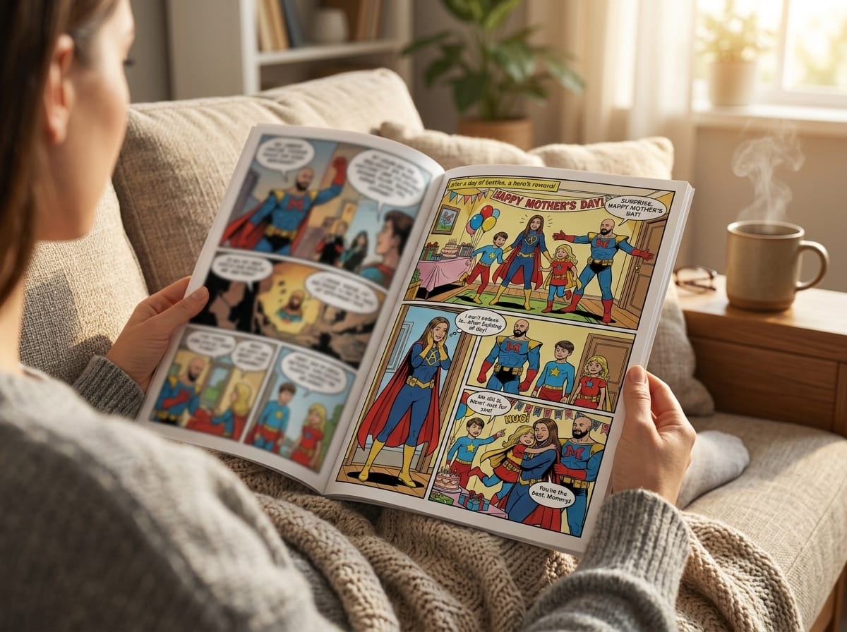
That moment trips up a lot of new creators.
Comic book page size sounds like a small setup detail, but it affects almost everything that comes after it. It changes how roomy your panels feel, how much dialogue fits without crowding the art, how your book prints, and whether the finished comic feels like a standard shelf-ready issue or something intentionally different. If you're using AI tools, it matters there too. A smart generator can help you make pages fast, but the page still has to read clearly and print cleanly.
I've seen beginners make the same mistake over and over. They start drawing first and decide the format later. That's a little like building a house before choosing the lot. You can do it, but you'll spend a lot of time fixing preventable problems.
Let's make this simple.
Why Page Size Is Your First Big Decision
Most new creators treat page size like picking paper at the end of the process. In practice, it's closer to choosing the stage your story will perform on. A cramped stage changes the acting. A wide stage changes the blocking. Comic pages work the same way.
A standard comic page doesn't just hold art. It controls storytelling density. Guidance on common comic sizes notes that most comics use 4 to 6 story panels per page on a standard 24 to 32 page count, and that these choices are also shaped by store rack fit and the economics of 8- and 16-page printing forms rather than pure artistic preference, as outlined by PrintSafari's overview of common comic sizes.
That single idea clears up a lot of confusion. Page size isn't just visual. It's practical.
Why beginners feel stuck here
You might be asking one of these questions:
- Should I use a standard U.S. comic size? That's usually the safest choice if you want a familiar print result.
- Can I pick a larger page so my art has more room? You can, but that may affect printing, shelving, and pacing.
- Can I use a digital-first layout? Yes, if screen reading is your main goal. But print and digital don't reward the exact same decisions.
A horror comic, a gag comic, and a manga-inspired romance might all tell great stories, but they don't always want the same page behavior. Tight, dialogue-heavy scenes need breathing room in a different way than action-heavy splash sequences.
The real reason this decision comes first
Page size influences:
- Panel count: Smaller pages can make crowded layouts feel noisy faster.
- Lettering comfort: If balloons and captions fight the art, reading becomes work.
- Print compatibility: Standard sizes exist partly because printers and sellers need repeatable formats.
- Reader expectation: A familiar size signals “comic book” before a reader even opens it.
Practical rule: Choose your final format before you draw page one. Fixing a weak panel is easy. Rebuilding an entire book for a different trim size is not.
If you're undecided, start standard. You can always break rules later, once you know which rule you're breaking and why.
Decoding The Language Of Print
Printers use a small set of terms that can feel intimidating at first, but the process is simple once you see how a page moves from screen to paper. You draw one version. The printer trims it down to the finished size. Those few cutting decisions affect whether your page looks clean, crowded, or slightly off.
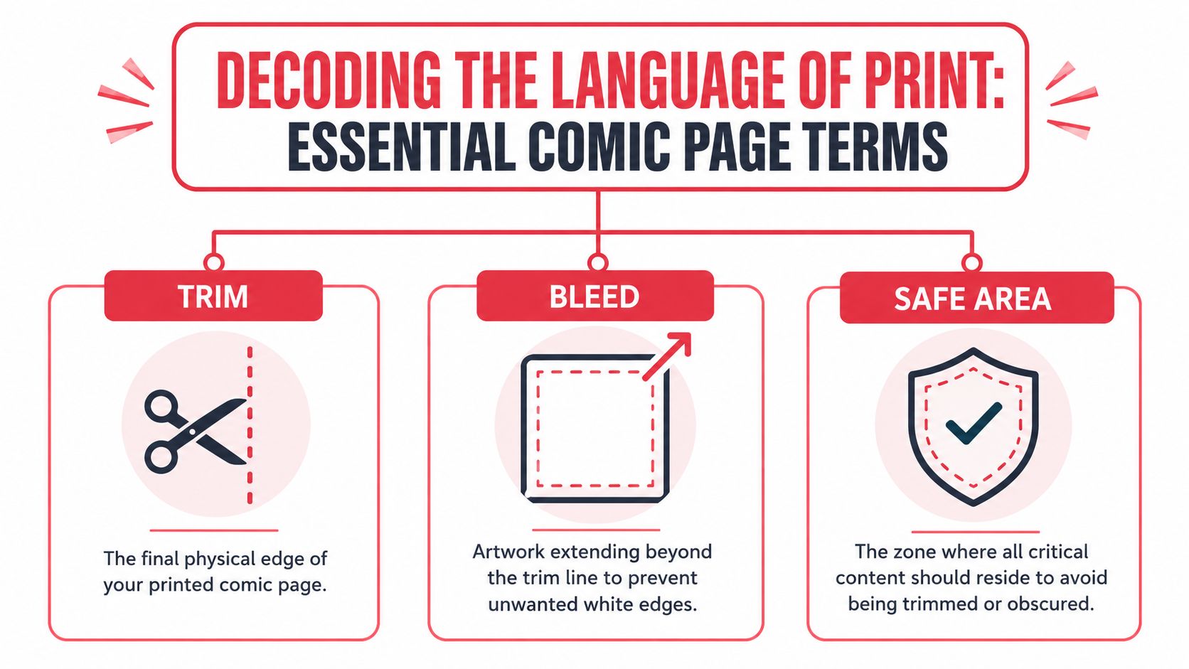
A good way to remember the system is to separate the page into three jobs. One line marks the final page edge. One area gives the printer extra art to cut through. One area protects your important story content.
Trim
Trim is the final physical edge of the printed page.
This is the finished size your reader holds. If your comic is being printed as a standard American issue, trim refers to that intended finished page size, not the larger working file you build in your art program.
That distinction matters because printers cut stacks of paper, not one perfect sheet at a time. Small shifts happen. So trim is a target line. It is not a safe place for dialogue, captions, or a character's eyes.
Bleed
Bleed is the extra artwork that extends past the trim line.
Here's the practical reason it exists. If a background color stops exactly at the trim edge and the cut lands slightly inside that line, the reader may see a thin white strip of paper. Bleed gives the cutter room for minor movement without creating that mistake.
So if your sky, shadows, speed lines, or borderless panel are meant to run all the way to the page edge, extend them beyond trim. New artists often think their export looks oversized. In print terms, that usually means the file is set up correctly.
This also matters in modern workflows. If you use AI tools to generate comic art, the model may create beautiful edge-to-edge images but ignore bleed and safe margins. You still need to format that art for print, or the final book can lose details at the edges.
Safe area
Safe area is the zone where your important content should stay.
Keep speech balloons, captions, faces, hands, sound effects, and other story-critical details inside it. Background texture can drift closer to the edge. Reading information should not.
Safe area protects the reading experience, not just the file. A balloon trimmed too close to the edge feels amateurish. A character's expression clipped by the cutter can weaken the whole beat of a scene. Page size shapes storytelling at this level, because the smaller and tighter the page, the more carefully you need to protect readable space.
Put anything the reader must understand comfortably inside the safe area.
A simple way to remember it
Use this shorthand:
- Trim is where the page ends
- Bleed is extra art past that edge
- Safe area is where key story content stays
If you keep those three zones clear in your head, print setup gets much less mysterious. Your pages will also survive the trip from digital file to physical comic without losing the details that make the story work.
Standard Comic Book Sizes Around The World
When people ask about comic book page size, they usually want one number. The honest answer is that the “right” size depends on what kind of comic you're making and what reading experience you want.
The one format with a clearly defined mainstream standard is the U.S. comic book. The modern American comic book page settled into a standardized trim size of about 6.625 x 10.25 inches, or roughly 16.8 x 26.0 cm, as described in BoxesGen's comic dimension guide. That's the format most readers picture when they think of a floppy superhero issue.
Other formats exist, and creators talk about them all the time, but they're often discussed more by feel than by strict manufacturing numbers. That's useful. When you're choosing a format, the reading feel matters as much as the ruler.
The main formats and how they feel
| Format Name | Typical Trim Size (Inches) | Typical Trim Size (CM) | Common Use / Genre |
|---|---|---|---|
| Standard American Comic | 6.625 x 10.25 | 16.8 x 26.0 | Superhero comics, single issues, mainstream U.S. print books |
| Manga Tankobon | Varies by publisher | Varies by publisher | Manga collections, black-and-white serialized work, character-driven stories |
| European Album | Varies by publisher | Varies by publisher | Bande dessinée, large scenic art, prestige hardcovers |
| Digest | Varies by publisher | Varies by publisher | All-ages books, compact collections, humor and educational comics |
Standard American comic
This is the most practical starting point for many creators.
It's familiar, shop-friendly, and built around a long-standing print workflow. Because so many mainstream comics use the same proportions, artists, letterers, and printers all tend to think naturally in this space. If you're making something inspired by superhero books, action comics, or traditional single issues, this size feels “correct” almost immediately.
It also encourages disciplined storytelling. You can fit strong action, dialogue, and close-ups on the page, but you can't be sloppy with spacing.
Manga tankobon
Manga collections often feel more compact in the hand. Even without locking onto exact dimensions here, you can learn a lot from the format logic.
A smaller-feeling page encourages cleaner staging, stronger silhouettes, and more deliberate use of black, white, and screen tone. It also rewards rhythm. Quiet reaction shots, vertical beats, and emotional pacing often feel natural in this format.
If your story depends on intimate character moments more than splash-heavy spectacle, this style of format may be a better creative reference than a U.S. floppy.
European album
European albums often feel more luxurious and spacious.
Creators who want wide scenic backgrounds, architectural detail, or a premium presentation often think in this direction. A larger page can make the reading experience feel slower and richer. The downside is that once you increase size, every weak drawing decision becomes more visible too.
A big page is like a big stage. Great when the performance is ready for it. Less forgiving when it isn't.
Digest
Digest-size comics feel compact, portable, and approachable.
They're often a good match for younger readers, comedic pacing, or gift-style books where convenience matters. They can also work well for creators who want a book that feels less like a periodical and more like a keepsake. That keepsake quality is why smaller formats show up so often in personal gift projects, like the custom books in this roundup of gifts for a brother-in-law, where the book is meant to be kept rather than racked.
A page format sends a message before page one. Standard says familiar. Large says premium. Compact says accessible.
Which one should you choose
If you want the safest path, use the standard American comic book page size. If you want a smaller, more intimate reading rhythm, study manga-style pacing. If you want art-forward presentation, think album. If you want portability, think digest.
The best choice is the one that supports your story without forcing the reader to notice the format first.
Essential Specs For Print And Digital Files
A comic page can be the right trim size and still fall apart at the finish line.
You export the file, send it off, and then the printed copy comes back with soft line art, colors that lost their punch, or dialogue sitting too close to the edge. The page size was not the problem. The file setup was. That is why specs matter so much. They decide whether your story survives the trip from screen to paper.
Resolution and why beginners confuse it
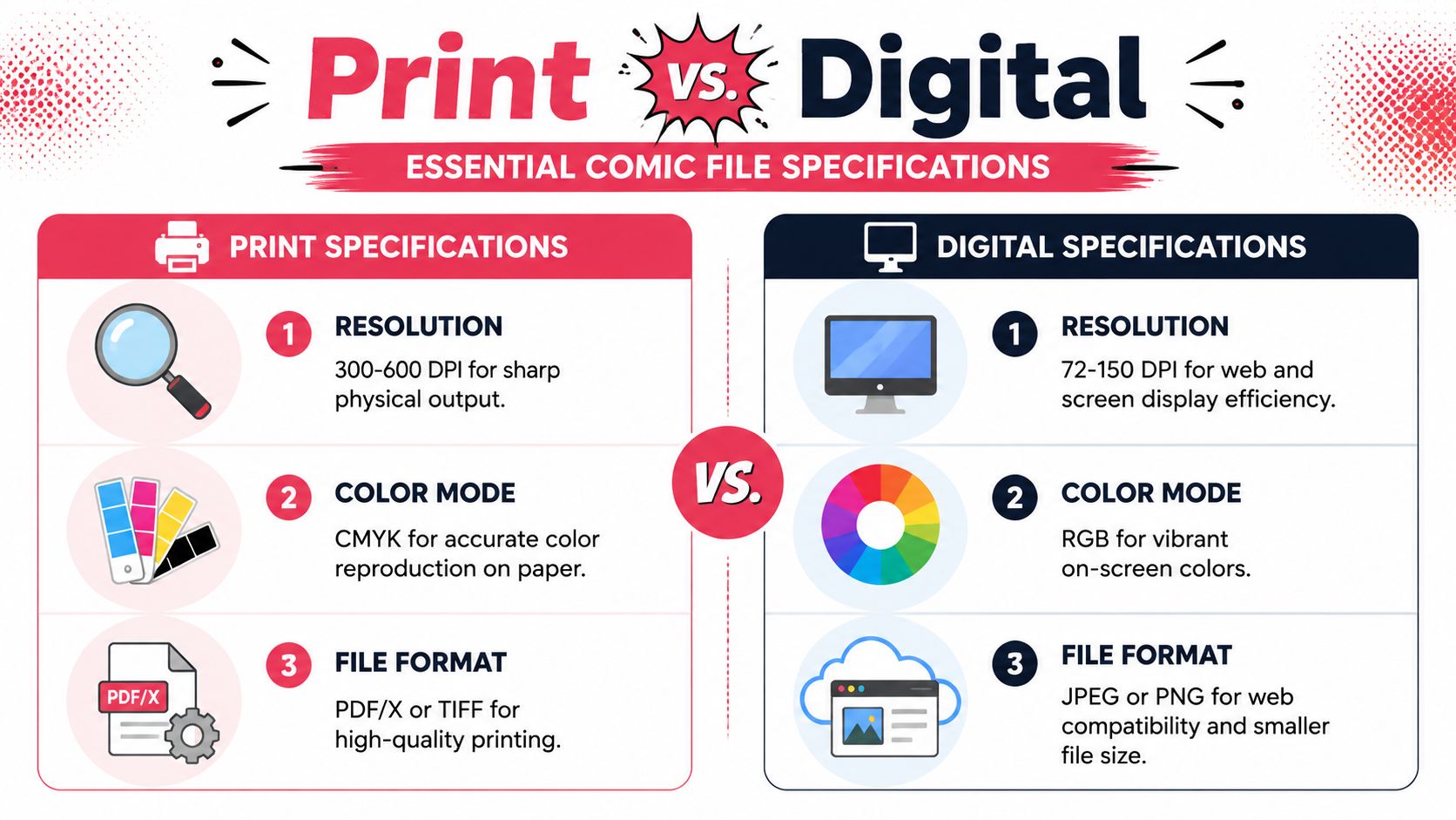
Resolution is really about how much visual information your page contains.
For print, your file needs enough detail to hold clean lines, solid blacks, and readable lettering on paper. For screens, the job is different. The page has to look sharp on a monitor or phone without becoming heavy and slow to load. Those are two different destinations, so they need two different exports.
A good habit solves a lot of problems. Build your master page at print quality first. Then export smaller digital versions from that master.
That workflow works like drawing with original art and making copies from it. If the original is strong, the copies can be tuned for different uses. If the original is small or compressed, you cannot magically add missing detail later.
Color mode and why your printed page looks different
Screens show color with RGB light. Printers reproduce color with CMYK ink.
That gap trips up a lot of new creators because the same page can look bright and electric on a tablet, then calmer and flatter on paper. Saturated blues, intense greens, and glowing effects are often the first places where the difference shows up. If your book is headed to print, choose colors with the printed page in mind while you work, not only at export time.
This matters for storytelling, not just file hygiene. A horror page that depends on murky shadow tones or a superhero splash built around a blazing energy effect may read differently once it is printed. The format changes the mood. The file settings need to support the feeling you want the reader to get.
Bleed and safe area are part of storytelling insurance
Bleed and safe area sound technical, but they protect the reading experience.
Bleed is the extra image area that extends past the trim so your art still reaches the edge after cutting. Safe area is the zone where important content should stay so a minor trim shift does not clip a word balloon or a character's face. As noted earlier, standard comic templates account for both. Your file should too, from the first rough layout.
Do not leave this for the end. If a caption sits too close to the edge, the problem is not only mechanical. It changes how the page reads. A reader should be following the scene, not noticing that a sound effect nearly got chopped off.
Source files and export files
Keep three versions of your page in mind.
- Working files are your editable masters with layers, lettering, and effects intact.
- Print exports are the production-ready files you send to a printer.
- Web exports are lighter, screen-friendly versions for phones, tablets, and websites.
That split matters even more now that many creators mix hand drawing, digital painting, and AI-assisted workflows in the same project. You may generate concepts fast, but the final page still needs disciplined file handling if you want reliable print results.
If you plan to make a physical book, this guide to creating and printing your own comic helps connect file prep decisions to the actual printing process.
Build your master page for the hardest job first. Printing is usually the hardest job.
A simple decision rule
Use this shortcut if the technical terms start blurring together:
- Printing a comic book? Build a high-quality master file, keep text safely placed, and choose colors that will reproduce well on paper.
- Posting a webcomic only? Focus on phone readability, clear lettering, and lighter exports.
- Doing both? Build the master for print, then export digital versions from it.
That order saves redraws, protects your page design, and gives you more freedom later.
How To Set Up Your Comic Page Template
A good template is boring in the best possible way. You make it once, trust it, and stop thinking about it while you draw. That frees your attention for acting, pacing, and composition.
Most professional-looking comics feel clean partly because the artist didn't reinvent the page setup every time.
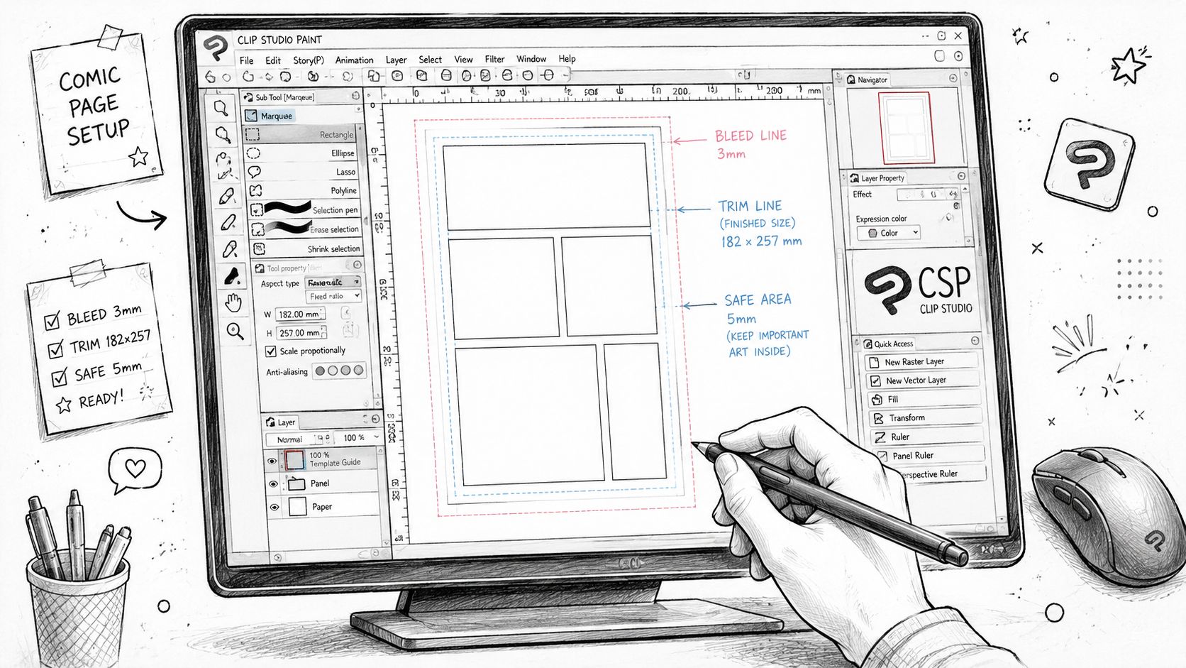
Start with the final printed intent
Pick your target trim size first. If you're aiming for a standard U.S. comic, use that as your destination and build the template around it. Then add your bleed and mark your safe area with guides on separate non-printing layers.
Name those layers clearly. Something like:
- Guides trim
- Guides bleed
- Guides safe
- Panels
- Art
- Letters
That sounds basic, but clean files save real headaches later.
Why artists draw larger than print
Many comics are drawn at an original art size of 11 in × 17 in and reduced before press, which improves line fidelity and lettering legibility during downscaling, according to Walsworth's comic production guide.
This is one of those old-school habits that still makes sense in digital work.
When you draw larger, your curves have more room to breathe. Brush lines feel smoother. Tiny mistakes shrink. Lettering gets cleaner after reduction. It's similar to sanding wood before painting. The final surface looks tighter because the work happened at a more forgiving scale.
A practical setup workflow
Try this sequence in Clip Studio Paint or Photoshop:
Create the canvas
Build the page around your intended print format, including bleed.Add guide layers
Mark trim, bleed, and safe area. Lock those layers so you don't move them by accident.Place a panel grid layer
Keep it editable. Early pacing changes are normal.Add a lettering test
Type a sample balloon before you start drawing. If it already feels cramped, your panel plan is too dense.Save as a reusable template
Don't start every page from scratch. Duplicate the template and rename for each page.
The mistake that sneaks up on beginners
New artists often draw a beautiful page, then realize the dialogue sits too close to the edge or the gutters are too thin for clear reading. That happens because they built art first and structure second.
A template flips that around. It gives you rails to run on.
If you want help thinking through pacing before you lock the page, a comic panel layout generator can help you test arrangement ideas before you commit to the final art.
Your template should answer technical questions before your story asks emotional ones.
One extra mentor note
Keep one “messy” exploratory file and one “clean” production template.
The exploratory file is where you play. Thumbnail wildly. Test splash pages. Break grids. The production template is where you execute. Mixing those roles in one file creates chaos fast.
AI Comics And Printing With PersonalizedComics
AI has changed the entry point for making comics. A creator who couldn't draw a figure yesterday can now build sequences, scenes, and stylized pages quickly. That's exciting, but it doesn't erase the basics. It just changes where your attention goes.
If an AI system builds the page for you, you still need to judge whether the page reads well. You still need to notice if text sits too close to edges, if panels feel crowded, or if detail gets muddy when printed. The tool may accelerate creation, but the reader still experiences the result one panel at a time.
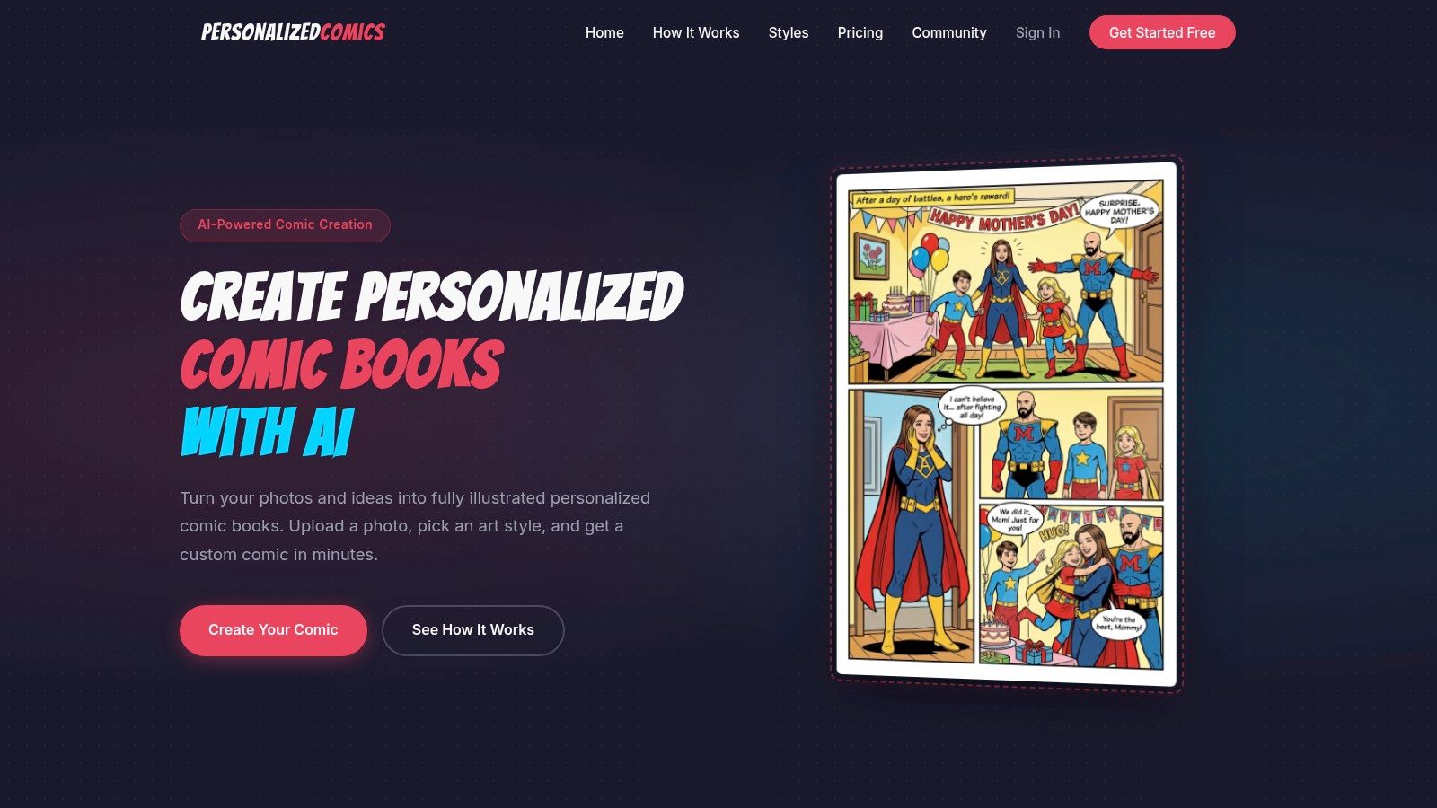
Here's a look at the platform in action.
What AI handles well
AI comic tools are strong at reducing setup friction.
They can help with character consistency, style direction, rough composition, and page generation speed. That's especially useful for gift projects, prototype stories, classroom exercises, and creators who care more about storytelling than hand-drawing every line.
For many people, AI removes the “blank page tax.” Instead of staring at an empty canvas, you get a first draft you can react to.
What still needs your eye
Even with automation, you should review each page for practical print concerns:
- Text placement: Make sure balloons and captions don't drift toward the edge.
- Facial clarity: Tiny expressions can disappear when printed small.
- Background density: Overly busy panels can flatten out on paper.
- Reading order: Check that panel flow is obvious without guesswork.
AI is good at giving you material. It's not always good at knowing which detail matters most to a human reader.
How page size affects AI-generated comics
Traditional knowledge about comic book design remains valuable. If the generated comic is intended for a print format that feels like a standard comic book, the storytelling should respect that space. A page overloaded with small panels and long speech bubbles may look acceptable on a monitor when zoomed in, but feel cramped in the hand.
That's why it helps to think like an editor, not only like a prompt writer.
Ask simple questions:
- Would this page still read cleanly if I held it like a printed comic?
- Does the dialogue fit naturally inside the panels?
- Is the focal point obvious at a glance?
Choosing styles with print in mind
Some styles print more forgivingly than others.
High-contrast looks, clean silhouettes, and strong shape design usually survive reduction better than pages full of tiny decorative detail. Painterly pages can look beautiful too, but they need careful checking so important faces, props, and word balloons don't blend into the texture.
If you're creating a personal story, gift comic, or prototype graphic narrative, browsing examples of personalized comic books can help you evaluate how different art directions feel as finished pages rather than just as isolated images.
AI can generate pages fast. Your job is to protect readability, pacing, and print sense.
The best mindset for AI-assisted creation
Treat AI like a very fast collaborator who doesn't understand your priorities until you enforce them.
That means you can use it to draft, experiment, and iterate. But you still make the final calls on pacing, spacing, and emotional clarity. In other words, the machine can help build the comic, but you're still directing the read.
That's a healthy balance. It keeps the speed without giving away judgment.
Frequently Asked Questions About Comic Page Size
How many panels should I put on a page
Start with the moment, then choose the panel count that lets that moment breathe.
As noted earlier from PrintSafari, many comics use 4 to 6 story panels per page as a practical baseline. That range works because it usually leaves enough room for readable art, dialogue, and clear eye flow. A tense pause may need only a few larger panels. A fast chase or a joke with quick beats may need more, as long as the reader can still follow the page without stopping to decode it.
A comic page works a lot like editing film. More cuts speed things up. Fewer cuts slow the reader down and give a moment more weight.
Can I just use Letter or A4 paper
Yes, but do it on purpose.
Letter and A4 are office-paper systems. Comic trim sizes come from printing and retail habits. They solve different problems. If you sketch on Letter or A4, that is fine for drafting, thumbnails, or a home printout. If you want the finished book to feel like a standard comic, set up your file for comic trim size early so your borders, balloons, and panel shapes are built for the final page.
That choice affects more than measurements. It changes how crowded the page feels, how much text fits comfortably, and how expensive the book may be to print.
Do all comics have to stay standard size
No. Standard sizes are common because they make printing, shelving, and reader expectations easier to manage.
Creators break those rules all the time for art books, webcomics, zines, deluxe editions, and experimental stories. The tradeoff is practical. Once you leave standard formats, printing can cost more, templates become less predictable, and the reading experience changes. A tall page can make action feel grand. A tiny page can make every panel feel intimate or cramped, depending on how you design it.
Page size is a storytelling choice first, and a production choice right behind it.
What matters most for a beginner
Pick a standard size, keep text and key art inside the safe area, and build one template before you draw page one.
That simple setup prevents the beginner mistakes that hurt comics most often. Cropped word balloons, crowded panels, and pages that looked good on screen but shrink badly in print. It also makes AI-assisted workflows easier to control, because every generated page has a clear frame to fit inside.
If you want to turn an idea, memory, or gift concept into a finished comic without drawing everything by hand, PersonalizedComics is worth a look. It lets you create custom comic pages from your photos and story ideas, then turn them into a polished printed book.
Smaller page sizes have one more perk worth knowing at the holidays: a mini comic is compact enough to fit inside a Christmas stocking, which earns it a spot in our guide to stocking stuffers.
Filed under Comic Craft