Personalized Comic Book Covers: A How-To Guide for 2026
You're probably here because you want the cover to feel bigger than a gag gift.
Maybe it's for a birthday and you want someone to look like the star of their own superhero debut. Maybe it's for an anniversary, and the cover needs to carry an inside joke, a shared memory, or a version of your relationship that feels mythic. Maybe you're testing a comic concept and need the cover to look credible enough that people stop and take it seriously.
That difference matters. A personalized cover can be a novelty, or it can feel like a real object with emotional weight. The strongest personalized comic book covers don't just swap a face into a template. They tell a story in one frame, then hold up when printed, framed, gifted, or kept.
From Idea to Iconic Cover in Minutes
You open the proof and the face is right, the costume is right, the colors pop, and the cover still feels flat. That usually happens because the image has a subject, but no story.
Strong personalized comic book covers sell a moment. The hero is arriving too late, making a last stand, hiding a secret, or sharing a joke that means something to two people and no one else. That sense of narrative is what turns a novelty image into something worth printing, framing, and keeping.
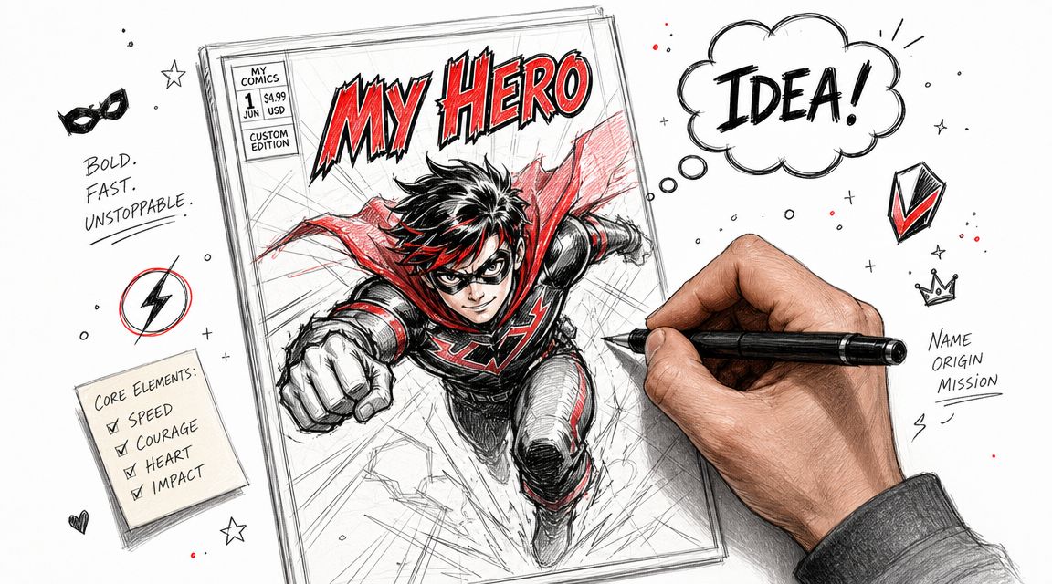
Clients often start by asking which photo to upload. Start one step earlier. Decide what single scene the cover needs to imply. Once that is clear, the pose, expression, background, title, and color choices stop fighting each other.
What makes a cover feel collectible
A lot of online advice ends at the mockup stage. That is the gap. A cover can look polished on a phone and still disappoint in print if the file is soft, the text sits too close to the trim, or the composition collapses at full size. I recommend building for print from the first draft and treating 300 DPI as the working baseline. The point is simple. If the piece is meant to live on a wall or in a comic bag, it has to hold up as a physical object.
Practical rule: If you want someone to frame it, gift it, or keep it with their comics, design it as print artwork first, then let the digital version follow.
That changes the decisions you make. Effects matter less. Readability, edge safety, clean silhouettes, and image quality matter more. The result feels closer to a real issue someone might have picked up at a shop, even if you never touched a drawing tablet.
Where AI helps, and where judgment still matters
PersonalizedComics helps turn photos and a rough idea into comic-style art without requiring illustration skills. The advantage is not speed alone. It is the ability to test different visual directions and then choose the one that fits the emotion of the cover.
That trade-off matters. AI can generate drama fast, but it can also flatten everything into the same generic intensity if you feed it vague inputs. Better results come from giving it a clear role to play.
Use this filter before you generate anything:
- Name the story beat. Origin, reunion, showdown, rescue, team-up, farewell.
- Choose the dominant emotion. Wonder, menace, humor, pride, tenderness.
- Judge every choice by print quality. If the face, title, or focal action gets muddy at size, revise it.
That is the fastest route from idea to cover. You are not just swapping a face into comic art. You are building a one-frame story with enough emotional weight and technical polish to feel real.
Choosing Your Core Concept and Art Style
Bad covers feel assembled. Strong covers feel inevitable.
That usually comes down to the core concept. Before you choose filters, poses, or colors, decide what kind of comic this is pretending to be. The cover should suggest a world beyond the frame. If the viewer can guess the genre and the emotional stakes in one glance, you're on the right track.
Pick the story engine
A useful shortcut is to write a one-line cover premise before you do anything else. Keep it concrete.
Examples:
- Birthday superhero cover: “She discovers her powers on the night the city needs her.”
- Anniversary noir cover: “Two ex-lovers reunite to solve the case that changed everything.”
- Kid fantasy cover: “He opens the attic door and finds a kingdom that knows his name.”
- Friend group comedy cover: “Four idiots, one road trip, zero good decisions.”
If your premise sounds like back-cover copy, that's fine. It gives the image something to do.
Match the art style to the emotional promise
The platform offers eight styles. Don't choose by personal taste alone. Choose by fit. The right style makes the same character read as brave, vulnerable, dangerous, funny, or wistful.
PersonalizedComics Art Style Comparison
| Art Style | Key Characteristics | Best For |
|---|---|---|
| Manga | Expressive faces, dynamic motion, clean linework, heightened emotion | Teen heroes, rivalry stories, coming-of-age arcs, dramatic transformations |
| Classic American | Bold silhouettes, iconic poses, high-energy action, familiar superhero feel | Birthday hero covers, team-ups, comic-shop style gifts, larger-than-life concepts |
| Graphic Novel | Grounded rendering, cinematic framing, mood-driven scenes | Literary concepts, serious gifts, memoir-inspired covers, grounded drama |
| Noir | Heavy shadows, tension, mystery, urban atmosphere | Anniversaries with intrigue, detective themes, moody portraits, retro crime stories |
| Watercolor | Soft edges, painterly color, warmth, dreamlike tone | Family gifts, sentimental moments, whimsical fantasy, keepsake framing |
| Cyberpunk | Neon contrast, tech textures, futuristic settings, high visual intensity | Gamers, streamers, sci-fi concepts, edgy alter-ego covers |
| Retro Pop | Flat shapes, punchy color, playful attitude, vintage energy | Comedy gifts, friend-group covers, bright nostalgic concepts |
| Fantasy | Epic settings, magical props, ornate costumes, mythic storytelling | Children's adventures, D&D-inspired gifts, quests, romance with a heroic tilt |
What works and what usually misses
Some combinations make immediate sense. Others fight each other.
A noir style can make an anniversary cover feel intimate and grown-up if the story has secrecy or unresolved tension. It won't help if the objective is lighthearted celebration. Watercolor can make a child's fantasy cover feel special and tender. It may undercut a joke-heavy parody that needs punch and exaggeration.
The style should amplify the idea, not rescue a weak idea.
A practical test helps. Ask whether the style still fits if you remove the person's face from the concept. If the answer is no, the cover may be relying too much on recognition and not enough on story.
Three concept prompts that usually lead to better covers
- The turning point: What has just happened, or what is about to happen?
- The signature prop: What object instantly explains the character's role?
- The emotional temperature: Should the image feel explosive, eerie, tender, or triumphant?
Once those answers are clear, you'll make cleaner choices everywhere else. You won't be throwing in city skylines, lightning, capes, roses, daggers, and explosions just because they look “comic-ish.” You'll be building a cover around one readable idea.
Preparing Your Photos and Cover Text
The artwork only gets as good as the inputs you give it.
Most first drafts fail for a simple reason. The source photos are inconsistent, or the text doesn't support the image. If the goal is a polished cover, gather your materials the way an art director would. The AI can interpret. It can't guess what matters to you if the inputs are muddy.
Choose photos that are easy to translate
For personalized comic book covers, clean facial information usually beats dramatic photography. A clear expression gives the system something reliable to stylize.
Use these filters when picking images:
- Clear lighting wins. Soft, even light works better than nightclub shadows or blown-out sunlight.
- Front-facing or slight angle is safer. Extreme profiles can look stylish in a photo but harder to transform consistently.
- Match the expression to the genre. A playful grin helps comedy. A calm, focused face helps heroic or noir concepts.
- Avoid visual clutter. Busy backgrounds, hats hiding the forehead, or hair covering half the face can create awkward results.
- Pick the most recognizable version of the person. Not the most glamorous. The one friends and family instantly identify.
If you want more practical guidance on getting a photo ready for stylized transformation, this walkthrough on turning photos into comic book art is worth reviewing before you upload anything.
Write cover text that sounds like a real comic
A cover without good text often feels unfinished, even if the art is strong. The title, tagline, issue details, and fake credits create context. They tell the viewer what kind of object they're looking at.
A simple cover text stack might include:
- Main title with a strong rhythm
- Subtitle or tagline that hints at the conflict
- Issue marker for authenticity
- Creator credits for fun
- Small corner details like a price box or special-event label if the layout supports it
Here are stronger approaches than the usual “Happy Birthday, Mike” dropped on top of an image:
| Element | Weak Version | Stronger Version |
|---|---|---|
| Title | Mike the Hero | Captain Mike |
| Tagline | Birthday Edition | One night. One choice. One unforgettable origin. |
| Issue label | Issue 1 | Issue #1 The Awakening |
| Credits | By Sarah | Written by Sarah, Cover Art by The Birthday League |
Text ideas that add personality fast
A few small touches make the whole piece feel more complete:
- Use creator credits as a private joke. “Written by Mom” or “Created by The Chaos Committee.”
- Add a pull-line if the concept supports it. Something short at the top that teases the story.
- Keep titles punchy. Two to four words usually land harder than long explanatory phrases.
- Let the tagline do the setup. The title names the myth. The tagline suggests the conflict.
If every line of text explains the joke, the cover loses mystery. Give the viewer enough to lean in.
The strongest text doesn't just label the image. It creates the illusion that this comic exists beyond the frame, with a whole issue waiting behind the cover.
Composing a Dynamic Comic Book Cover
Most covers don't fail because the art is bad. They fail because everything shouts at once.
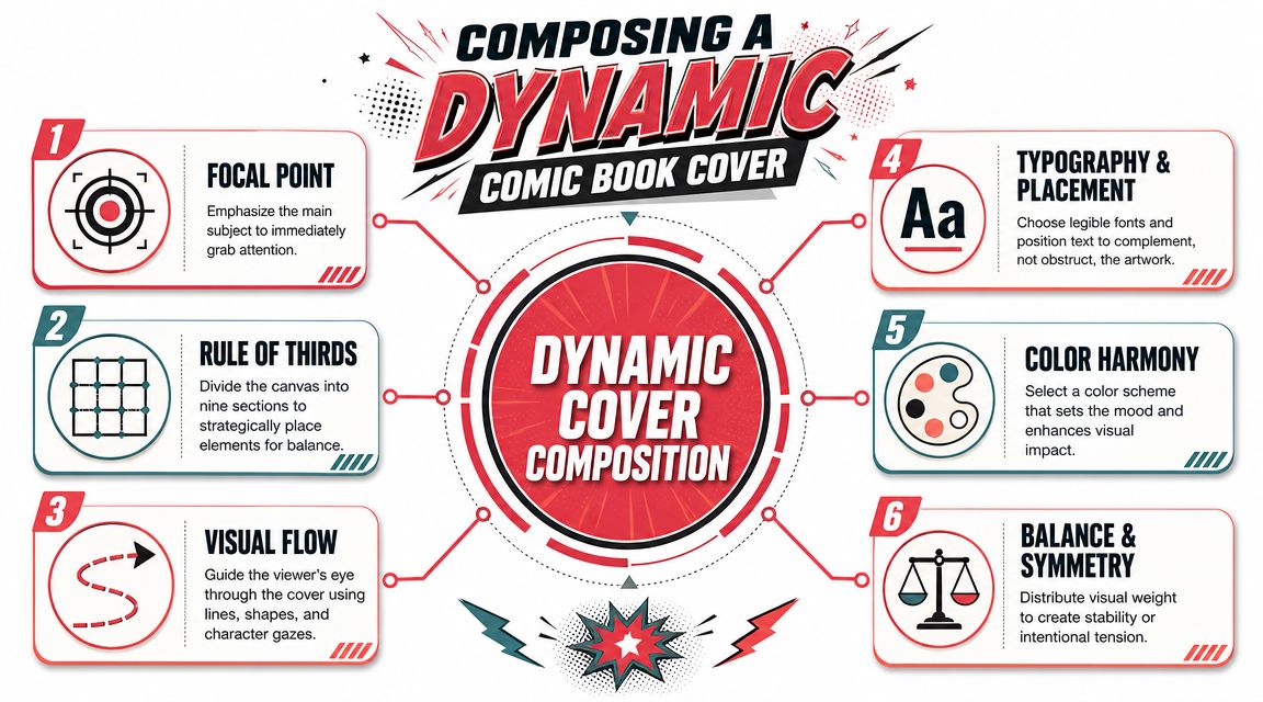
A comic cover has one job. It needs to stop the eye, establish a focal point, and make the viewer understand the tone within seconds. That's true whether the design is a sincere superhero tribute or a playful custom gift. Good composition makes the cover feel intentional.
Start with the hero shot
The main figure should do most of the storytelling. Don't shrink them to make room for more stuff. A cover usually gets stronger when the central character is bigger, clearer, and more confident.
A few layout instincts help immediately:
- Make one subject dominant. Even in a duo cover, someone should read first.
- Let the pose suggest action or tension. Looking over the shoulder, reaching forward, bracing for impact, clutching a key prop.
- Separate the figure from the background. If the values blend together, the cover turns muddy fast.
A professional workflow for covers starts with a spec check, then moves through sketching and final art. Guidance for comic cover creation also emphasizes strong foreground and background separation, controlled negative space, and keeping important elements away from the edge in order to improve shelf impact, as outlined in this guide to creating a comic book cover.
Use negative space like a pro, not like empty filler
New designers often treat empty areas as wasted space. On covers, that instinct causes clutter.
Negative space gives the title room to breathe. It makes the face easier to read. It helps the viewer process the image at thumbnail size. If you fill every corner with smoke, buildings, debris, symbols, or extra characters, the main idea gets weaker.
Three places to protect:
- Top band for the masthead
- One clean zone around the face or focal prop
- Outer edges where trim and bleed create risk
Arrange text so it supports the art
The masthead should feel integrated, not taped on afterward. If the title fights the face, the face usually loses.
Try this mental hierarchy:
| Cover Element | Priority | Placement Note |
|---|---|---|
| Main character | Highest | Usually centered or offset on a strong vertical |
| Title logo | High | Top third, with enough contrast to read fast |
| Supporting text | Medium | Use sparingly, avoid crossing key facial features |
| Issue details | Low | Corners or small bands where they add authenticity |
A useful reference point is to study famous comic cover composition choices and notice how often the strongest covers are built around a single dominant read rather than a pile of ideas.
Good cover composition isn't about adding more. It's about deciding what the viewer should notice first and protecting that decision.
A quick self-critique before export
Before you call the cover done, shrink it on your screen.
If the title disappears, the contrast is weak. If the face turns into a blur, the focal point isn't clear enough. If your eye bounces around without settling, the layout needs simplification. That tiny-preview test is one of the easiest ways to catch problems before print.
Mastering Print Specs for a Professional Finish
A cover can look excellent on screen and still disappoint on paper. That gap usually comes from specs, not creativity.
People notice print quality immediately. Soft details, clipped text, or a thin white edge around the border can make a personalized cover feel homemade in the wrong way. If you want a finished piece that feels legitimate, the file has to respect print constraints from the beginning.
Know the physical target
The most common U.S. comic-book format is 6.625 x 10.25 inches, and matching that size helps a custom cover feel like a real comic rather than a generic poster crop, according to this reference on common comic book sizes.
That size affects more than dimensions. It changes how large the title should feel, how much room the face occupies, and how tightly supporting elements can sit near the edge. Designing for a known comic format usually produces better-looking proportions than improvising on a random canvas.
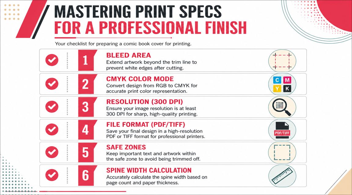
The print checklist that actually matters
These are the technical points that cause most preventable problems:
- Resolution at 300 DPI. For commercial printing, 300 dpi is the common benchmark, and low-resolution files often trigger warnings or visible softness in print, especially on detailed covers, as discussed in this comic cover production walkthrough.
- Bleed around the trim. Extend backgrounds and full-bleed art beyond the final cut line so trimming doesn't reveal white edges.
- Safe zones for text. Keep titles, faces, and small details away from the outer edge.
- High-resolution export. Printers usually want a high-resolution PDF or image package that matches their specs.
- Color awareness. A file may look vivid in a digital workflow but still need print-aware handling before output.
If you're planning to order a physical copy, this guide on printing your own custom comic book helps connect design decisions with print preparation.
Common mistakes that make a cover look cheaper than it should
A few errors show up again and again:
| Mistake | What Happens |
|---|---|
| Using a screen-ready image | Fine on a phone, soft on paper |
| Centering every element | The cover feels static and crowded |
| Placing text too close to edges | Trimming threatens legibility |
| Ignoring silhouette | The character blends into the background |
| Overloading effects | Print muddies the image and weakens the focal point |
The fix usually isn't dramatic. Increase separation. Simplify the background. Pull text inward. Re-export at proper quality. Those small corrections are often what turn a decent custom piece into something frame-worthy.
Ordering and Gifting Your Creation
A strong personalized comic cover changes the moment it leaves the screen. On a monitor, it reads as a design. In someone's hands, it becomes a gift, a keepsake, a reveal, or a pitch artifact that has to feel intentional.
That last part matters. A cover with a clear story usually gets a stronger reaction than a simple face-swap, because the recipient can see why they are the hero, villain, partner, or lead character in this specific world.
The handoff should support that story. A romantic anniversary cover deserves a different presentation than a funny retirement spoof or a mock first issue for a creator brand. I usually advise clients to decide on the delivery format before ordering the final version, because presentation affects size, finish, and even how much text belongs on the cover.
A few formats work especially well:
- Framed as cover art. Best for designs with one strong focal figure, readable title treatment, and enough breathing room around the edges.
- Paired with a short written note. Good for birthdays, weddings, and family gifts where the emotional context adds weight.
- Used as the front of a longer custom comic. Best when the cover sets up an actual story inside rather than standing alone.
- Packaged like a collector piece. A backing board, protective sleeve, and issue card make the object feel more deliberate and giftable.
Small presentation choices carry a lot of emotional weight. A sleeve and board can make a one-page print feel like a collectible. A frame can shift the same artwork toward display piece instead of novelty.
Personalized covers also work outside gift-giving. Writers use them to make a pitch feel more real. Streamers and small creators use them as event visuals or branded merch concepts. Parents, teachers, and youth organizers use them for milestones, school projects, and celebrations because the comic format gives people a role to step into.
That use case sits inside a much larger comics culture. According to Grand View Research's comic books market report, the global comic book market was valued at USD 19.05 billion in 2025 and is projected to reach USD 37.15 billion by 2033, with an 8.9% CAGR from 2026 to 2033. Personalized covers work because they borrow the visual language of an established collectible format, then make it personal.
For ordering, keep the process disciplined. If PersonalizedComics gives you starter credits, use them to test concept first, not to generate random variations. Once the character role, title, and tone feel right, then order the final version or buy more credits for alternates. That sequence usually saves money and leads to a cleaner result.
If you are gifting multiple copies, order one proof for yourself before committing to extras. Check the crop, title readability, skin tones, and whether the emotional read matches the occasion. The best custom cover gifts feel polished enough to keep, not just funny enough to open once.
Frequently Asked Questions
Can I make a good cover if I can't draw?
Yes. The key skill isn't drawing. It's choosing a clear concept, a usable photo, and text that supports the image. Most weak custom covers come from fuzzy direction, not lack of illustration ability.
Should the cover be funny or serious?
Pick one primary mode. You can blend humor and heroism, but one should dominate. If both compete equally, the tone gets muddy.
How many people should appear on the cover?
Fewer is usually better. One person is easiest to make iconic. Two can work well if the relationship is the story. Large groups need very disciplined composition or they start to feel cramped.
What if my first version feels off?
Don't rebuild everything at once. Change one variable at a time. Try a clearer photo, a shorter title, a simpler background, or a stronger focal pose. Small revisions usually reveal the underlying issue.
Is a digital file enough?
It depends on the purpose. If the goal is social sharing, maybe. If the goal is a keepsake, framed gift, or collector-style object, design and export with print in mind from the start.
If you're ready to turn an idea, a few photos, and a strong concept into a finished comic-style piece, PersonalizedComics is a practical place to start. You can test a cover concept, refine the story angle, and build toward something that feels personal on screen and worth keeping in print.