Most advice gets this wrong because it starts with tools instead of source photos. If your faces aren't readable, your angles don't match, or your panel flow is loose, the finished pages will feel messy no matter how polished the effect looks.
Why Photo Comics Deserve More Respect Than They Get
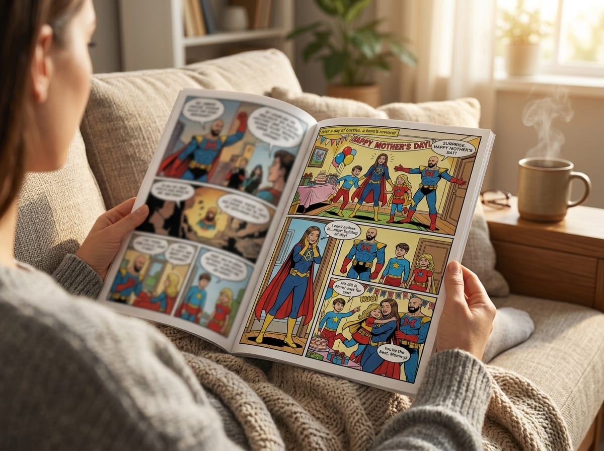
A lot of people still treat photo comics as a novelty, something between a scrapbook and a social media gag. That reading misses the point. A photo comic book sits inside the larger comics tradition, because it uses the same visual language, panel order, dialogue balloons, and narration devices that comics already made familiar long before photo-based storytelling became common.
That history matters. Scholars commonly trace the first American-style true comic book to 1933 with Famous Funnies: A Carnival of Comics, and the first modern superhero-era breakout to 1938, when Superman appeared in Action Comics #1 (photo comics history). Photo comics emerged after those conventions were already established, so the medium inherited a mature grammar instead of inventing one from scratch.
The commercial backdrop was large enough to support that kind of experimentation. Britannica notes that American comic books reached 18 million copies per month in 1943, represented one-third of total magazine sales, and had sales valued at $72 million (Britannica on the comics industry). That scale helps explain why photo-based formats could find an audience inside an already serialized print culture.
Practical rule: If you think in panels first and photos second, the result feels like comics. If you think in photos first and hope the captions will rescue it, it usually feels like a slideshow.
That's why the format works so well for gifts, family stories, and educational projects. It keeps the recognition value of real people while borrowing the pacing and emotional beats of comics. In practice, that combination is what makes the format feel memorable instead of gimmicky.
Preparing Your Photos for Comic Conversion
Good photo comic pages start with source images that already have panel logic. A face has to stay readable after stylization, the subject needs a clear pose, and the frame should leave room for cropping without cutting off hands, hair, or the edge of a gesture. Busy backgrounds can still work, but they are usually the first thing that makes a panel feel crowded once captions and speech balloons go in.
Choose images for readability, not just sentiment
A beautiful photo is not always a usable comic panel. Group shots with awkward spacing, tiny faces, or harsh backlighting often cause problems later, because the conversion step still has to preserve identity while simplifying the image into comic language. If the face carries the story, use the image where that face is easiest to read, not the one that feels most emotionally loaded.
Consistency matters just as much. A few strong angles of the same person usually help more than a pile of dramatic variety, because a comic page depends on recurring visual recognition from panel to panel. If your only options are a wide horizontal group shot and a phone selfie taken from above, you will spend more time forcing the layout than shaping the story.
Clean the frame before you build the page
Crop with intention. Rotate images so eyes and horizons feel stable, then trim away dead space that does not help the panel. If a wide photo needs to become a vertical panel, leave enough room to crop without losing context or cutting off the subject's expression.
Lighting matters too. Photos with strong contrast usually stylize more cleanly than flat, muddy images, because the conversion process has clearer edges to work with. A practical example of that idea is this photo-to-comic guide, which shows why image selection and cleanup come before layout if you want the final page to hold together.
Organize your files before you open any page builder. Group images by character, scene, or sequence, and name them in story order if you can. That small bit of discipline saves time later when you are matching dialogue to expressions and trying to keep a scene visually consistent.
Think like a page designer before you think like a user
The most common mistake is uploading everything and hoping the tool sorts it out. Comic pages do not reward random photo ordering. If a page needs a close-up, an establishing shot, and a reaction panel, choose photos that can support those beats.
Face readability, angle choice, and crop room matter more than sheer volume. A photo comic built from real photography has different constraints than one built from blank illustration panels, so the source material has to do more of the work up front. The preparation workflow in edge-preserving comicification workflow fits that reality, because the image has to survive style conversion without losing the features people need to recognize.
If you want a faster path, use the image set to shape the story instead of forcing the story onto weak photos. That usually produces cleaner pages and fewer repairs later in the build.
Choosing Art Styles and Planning Your Story
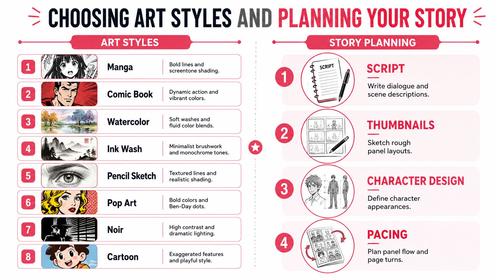
Style choice changes how people read the same photograph. A manga treatment can sharpen emotion and motion, while noir pushes shadow and mood, and watercolor softens the whole piece into something gentler and more reflective. The wrong style doesn't just look off, it changes the storytelling temperature of the page.
PersonalizedComics, for example, presents a set of eight styles that covers manga, classic American, graphic novel, noir, watercolor, cyberpunk, retro pop, and fantasy. You can see how that range maps onto different story needs in their style overview, which is useful if you're deciding whether your project should feel playful, cinematic, or sentimental (different comic art styles).
Match the style to the story, not to trendiness
A family vacation comic usually doesn't need heavy noir treatment. A milestone gift often works better when the faces stay warm and recognizable, and when the style doesn't overpower the people in the photos. By contrast, a mystery or revenge story can benefit from sharper contrast and a more dramatic visual language.
That same logic applies to dialogue. If the style is detailed and busy, the lettering has to stay tighter and cleaner. If the style is airy or painterly, there's a little more room for captions, but only if the panel composition leaves actual space for them.
Write for balloon space before you polish the script
Crowding happens fast. A page that looks fine in a text document can fall apart once the speech balloons are placed over shoulders, faces, and background detail. Keep the dialogue short where possible, and treat every line as something that has to live inside a picture, not beside it.
The best balloon is the one you don't have to fight for.
That rule is especially important with photo comics, because your “art” already contains real-world detail. If every panel is loaded with text, the page stops breathing. Scripting needs to respect the image instead of trying to explain it.
Use camera angles that support recognition
Photo comics differ from drawn comics in a practical way. Comic-angle advice often celebrates variety, low angles, Dutch angles, and dramatic close-ups, but uploaded photos come with real constraints. If the face is too small, the background too busy, or the framing too inconsistent, the page can lose readability long before it gains drama.
A more useful approach is to favor stable, clear angles unless the scene really needs tension. For gift comics and family stories, face readability usually matters more than spectacle, because the reader wants to recognize people first and admire the style second. If the angle choice makes the subject harder to identify, it's the wrong angle.
Building Pages in Your Comic Creation Tool
The page-building stage is where a photo comic either holds together or starts to feel forced. Import the prepared photos, place them into panels, add text, and keep revising until the page reads in order without confusion. If the reader has to pause and decode the sequence, the layout still needs more work.
Start with the panel grid, not the text
Panel planning and dialogue space need to be decided early. Build the page so each panel has a clear job, then place the text where it does not crush the image or cover an important expression. In photo comics, the source art already carries real detail, so the layout has to protect it instead of fighting it.
The image treatment also matters. A photo-to-comic workflow usually applies style transfer first, then keeps edges and key details intact so faces, hands, and object boundaries stay readable rather than turning into a soft filter effect. Over-smoothing is the failure mode to avoid, because once facial identity disappears, captions cannot recover it. That point shows up in discussions of edge-preserving comicification workflow, but the practical lesson is simple: keep the people recognizable.
Build each page in rounds
The first pass should stay rough. Place the panels, drop in placeholder dialogue, and check whether the story still makes sense when read left to right and top to bottom. Only after that should you tighten the speech, refine the narration, and shift photos inside the frames.
A simple production sequence usually works better than trying to perfect one panel at a time:
- Import and place photos. Put the strongest image in the panel that carries the emotional peak.
- Set balloons and captions early. Leave enough room for text so you are not shrinking art later.
- Check the visual rhythm. Alternate close views and wider views only when the story needs them.
- Revise for readability. If a face or action beat gets lost, replace the image rather than forcing the layout to carry it.
Poor framing shows up fast. If a panel cuts off an important hand gesture, a character's eyes, or the edge of a prop that matters to the scene, the page feels unfinished even when the styling looks polished. That is a real trade-off with uploaded photos, since you cannot redraw around a bad crop the way you can in a hand-drawn comic.
A practical size reference helps too, especially if you are planning print or sharing files across devices. Comic book page size guidance gives a useful baseline for how much room a page has once panels, captions, and margins all compete for space.
One useful tool choice
A platform like PersonalizedComics can handle the conversion and page assembly for users who want photos transformed into comic pages with panels and lettering in one workflow. The tool matters less than the discipline behind it, though, because the same layout problems still show up if the source material is weak.
The test is whether the page reads clearly when you step back from it. If it does not, add fewer effects and fix the photo choice, the framing, or the dialogue length first.
Exporting and Printing Your Photo Comic Book
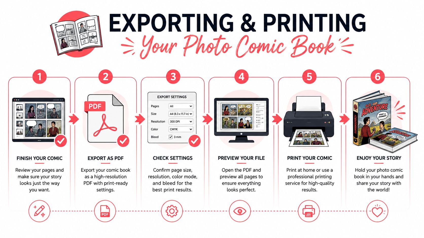
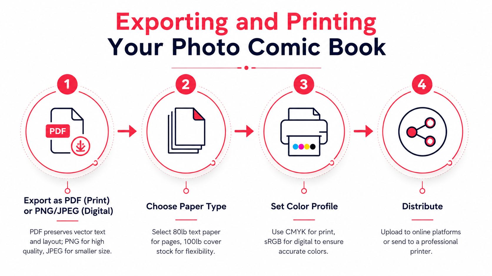
Export files for the job you need. PDF keeps page order, text placement, and margins stable for print, while PNG or JPEG is better for sharing online or in messages where file size and quick viewing matter more than production consistency. If the goal is a readable story on paper, choose the format that preserves the layout. If the goal is fast circulation, choose the format that travels easily.
Digital files travel fast, print files need discipline
PNG works well when you want strong image quality online. JPEG makes sense when smaller file size matters more than preserving every edge. For print, PDF is the safer choice because it keeps the page sequence and lettering in place, which avoids the kind of output mistakes that happen when a layout gets rebuilt by a different app or printer.
Resolution still matters even when the pages begin as photos. A 600 DPI scan target is commonly recommended for crisp line retention in print workflows, as noted in comic-making guidance. For photo comics, that same standard helps text, speech balloons, and image edges stay readable after export, especially if the source material already has soft focus or mixed lighting.
Paper, binding, and when to print
A physical copy works well when the comic is meant to be kept, gifted, or displayed. Digital files suit fast circulation, easy revision, and casual sharing with friends or classmates. Print gives the project more weight as an object, while digital keeps editing and distribution simple.
Home printing is worth testing before you commit to a full run. Colors can shift, margins can tighten, and dark panels may lose detail on consumer printers. If the book matters as a keepsake, professional printing usually reduces the risk of handing over something that looks like a draft instead of a finished gift.
Size and layout shouldn't be guessed
Page dimensions change how much dialogue each panel can hold, and they also affect whether faces feel clear or too small. Comic book page size guidance is worth checking before you lock export settings, because size choices affect legibility, print cost, and panel spacing at the same time.
The practical question is whether the finished object justifies the extra work. For a birthday gift, anniversary keepsake, or class showcase, print usually earns its place. For a quick draft or prototype, a digital PDF is often enough.
Real-World Uses for Your Photo Comic Book
A photo comic book works especially well for memory-making. A wedding weekend, a family trip, a graduation, or a group milestone becomes a story object that feels more deliberate than a loose stack of prints. People hold onto it because the pages do something a normal album does not, they sequence the memory and give it a clear order.
That same structure makes the format a strong gift. The payoff comes from recognition, not from exact artistic polish. If the faces stay readable and the story stays organized, the recipient sees themselves and their moment inside a finished narrative instead of a pile of snapshots.
Teachers and youth groups can use it for the same reason. Comics make events, lessons, and personal experiences easier to follow because the page controls pacing and attention. When students help shape the sequence, the exercise becomes part writing, part visual thinking, and part editing, which usually produces better discussion than a standard worksheet.
Writers use the format in a different way, but it is just as practical. A photo comic can act as a visual prototype for a graphic novel script, especially when the goal is to test pacing, scene order, and dialogue density before paying for full illustration. It is a working middle step, not the final form.
The best first draft is the one that shows where the story breaks.
That is usually how the strongest projects improve. The first version exposes bad crops, awkward dialogue, or a style that does not fit the material. The second version usually feels much stronger because the creator has already seen what fails on the page.
If you are making one for someone else, keep the revision loop in mind. Change styles if the tone is wrong, reshoot photos if the faces are too small, and cut dialogue if the page feels crowded. A finished photo comic book does not need to be perfect on the first pass, it just needs to get clearer every time you touch it.
If you want a faster path from personal photos to a finished photo comic book, try PersonalizedComics. It turns uploaded photos and story ideas into comic pages with panels, speech balloons, and print-ready output, which makes it a practical option for gifts, prototypes, and keepsakes.
Filed under Making Your Comic