Visual Storytelling Techniques to Master Your Comic
You've got a story in your head already.
Maybe it's a birthday gift comic starring your partner as a space captain. Maybe it's a short superhero origin for your kid. Maybe it's the opening scene of a graphic novel you've wanted to make for years. The words come easily. Then you hit the visual part and stall out. What does the first panel look like? How close should the camera feel? Should the moment be funny, tense, warm, or strange?
That stuck feeling is normal. Most beginners don't struggle because they lack imagination. They struggle because visual storytelling techniques feel invisible until someone points them out. A good comic artist isn't just drawing characters. They're guiding your eye, controlling time, shaping emotion, and deciding what matters in each moment.
Comics have been doing this for a long time. A foundational historical fact about visual storytelling in comics is that the modern comic-book format crystallized in the late 1930s with publications like Action Comics #1 in June 1938, which helped establish sequential images, panel layout, and visual motifs as core narrative tools. That matters because comics taught generations of readers how to understand a story through pictures first, then words.
If you've never drawn before, that history should feel encouraging, not intimidating. The craft is old. The tools are new. You still need to think like a storyteller, but you no longer need to render every face, background, and action pose by hand. If you want a practical starting point for turning an idea into pages, this guide on how to make a comic is a useful companion to the visual principles below.
Beyond Words Telling Stories with Pictures
A comic works when the reader understands the scene before reading every balloon.
That's the power of visual storytelling. If your hero opens a door and steps into a ruined throne room, the reader should feel the shift immediately. The angle of the shot, the size of the room, the crack in the crown, the way light falls across the floor. Those choices do narrative work. They aren't decoration.
Why beginners get stuck
New creators often try to make the art explain everything at once. They add too much dialogue, too many details, too many ideas in one panel. The page gets crowded, and the story loses force.
A stronger approach is simpler. Ask one question per panel: What should the reader notice first? If you can answer that, you can build the image around it.
Practical rule: A panel should deliver one clear beat before it delivers extra information.
That's why comics remain such a strong format for modern creators. A panel can carry action, mood, character, and setting in a single glance. The reader doesn't need a paragraph telling them someone feels trapped if the composition already shows a tiny figure boxed in by towering walls.
What pictures can do that prose can't
Pictures compress information beautifully. In one image, you can show:
- Character status: A confident stance reads differently from slumped shoulders.
- Relationship tension: Two people placed far apart inside the same frame already suggest distance.
- Worldbuilding: Clothing, props, signs, weather, and architecture hint at genre fast.
- Emotional emphasis: A close-up on a hand shaking can matter more than a speech.
Beginners often have a breakthrough. You stop asking, “How do I draw this perfectly?” and start asking, “How do I show this clearly?”
That shift changes everything.
The Three Pillars of Visual Narrative
Film directors think in camera, editing, and mood. Comic artists do something very similar, but we do it on a page. If you want a simple mental model, keep these three pillars in mind: composition, pacing, and emotion.
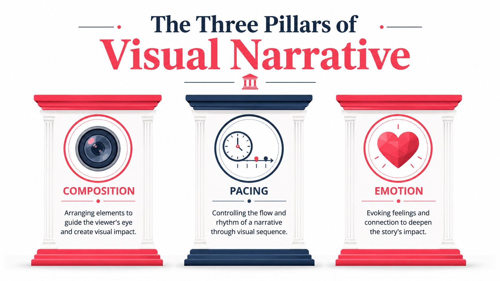
Visual clarity matters fast. Michigan Creative notes that visual content is far more likely to be consumed than text-only content, and that viewers often form a first impression in about 0.05 seconds. In comic terms, that means your page has to read quickly before its full message is absorbed.
Composition guides the eye
Composition is where you place things inside the frame. It decides what the reader sees first, second, and last.
If a villain is the most important element, composition should support that. Bigger silhouette. Stronger contrast. Better placement. Less clutter around them. Readers shouldn't have to hunt for the point of the panel.
Pacing controls time
Comics don't move unless the reader moves. That's why panel size, spacing, and sequence matter so much. A large panel can feel like a pause. A rapid series of tight panels can feel like quick cuts in an action scene.
Pacing is the secret clock inside the page.
Emotion shapes memory
You can draw the same event in two different moods and get two different stories. A reunion under soft evening light feels tender. The same reunion in harsh backlight and deep shadow can feel uneasy or tragic.
Here's a quick map:
| Pillar | Main job | Reader effect |
|---|---|---|
| Composition | Direct attention | Helps the page read clearly |
| Pacing | Shape rhythm | Controls tension and release |
| Emotion | Build atmosphere | Makes scenes felt, not just understood |
A comic page is never just showing events. It's teaching the reader how to feel about those events.
Beginners often think they need dozens of advanced tricks. You don't. If you can learn to control where the eye goes, how fast the page moves, and what the moment feels like, you're already working like a storyteller.
Directing the Eye with Composition and Framing
Most composition advice sounds stiff until you use it in a story. Then it clicks. These aren't art-school rules meant to trap you. They're tools for telling the reader, “Look here first.”
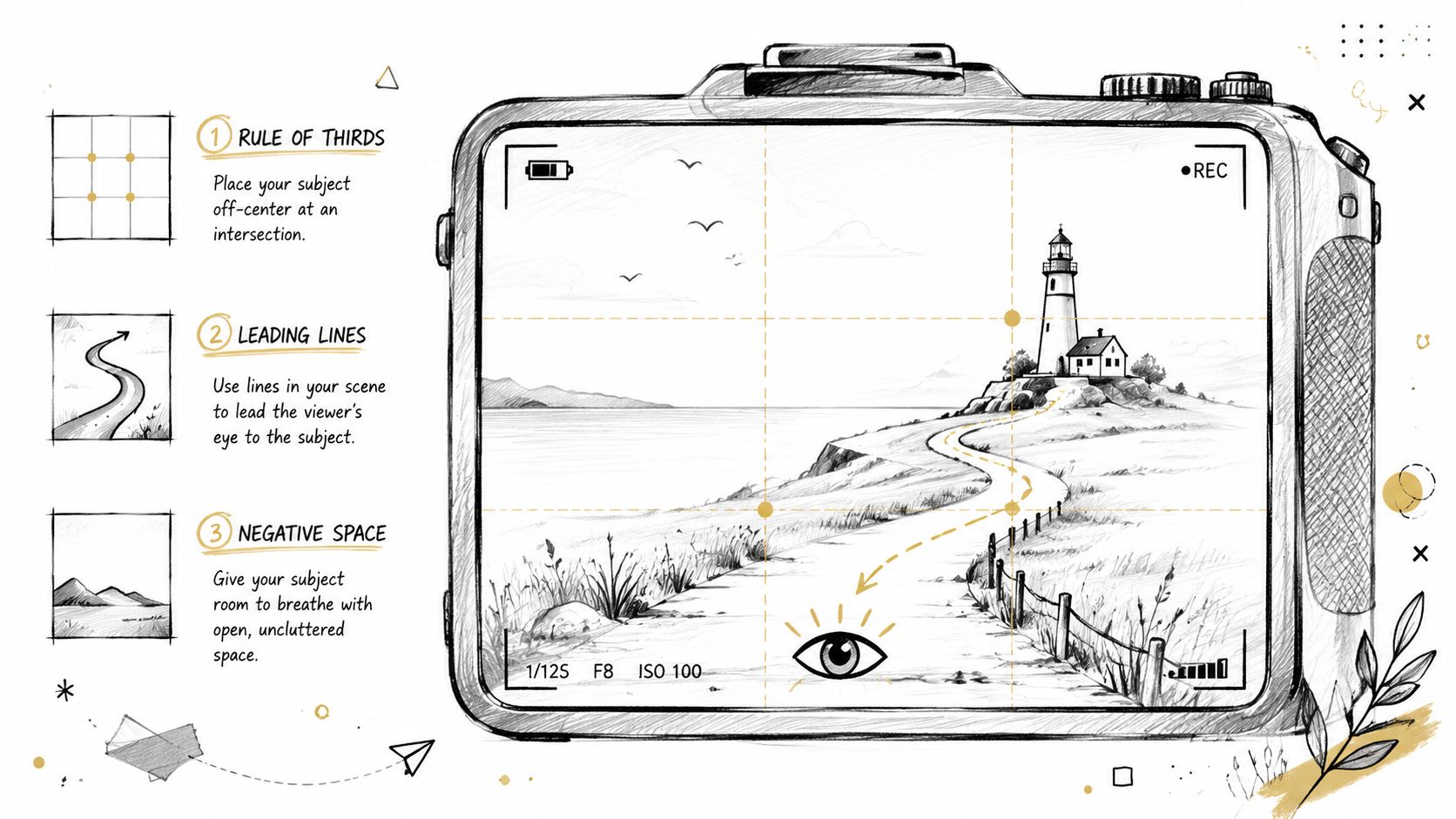
Sessions College explains that techniques such as the rule of thirds, leading lines, and framing direct visual hierarchy and help viewers decode the story faster. The same guidance recommends a clear message and minimal text. That's comic craft in a sentence.
Three composition tools that matter right away
The rule of thirds gives you a simple starting grid. Place a face, object, or action point off-center and the panel often feels more alive than if everything sits dead in the middle.
Leading lines do exactly what they sound like. A hallway, sword, road, staircase, or even a row of windows can point the eye toward the important part of the scene.
Negative space is the empty area around a subject. Beginners often fear empty space, but it's powerful. A lone figure in a wide silent panel can feel isolated before they say a word.
Here's how each tool behaves in practice:
- Rule of thirds: Useful when you want balance without stiffness.
- Leading lines: Great for entrances, reveals, confrontations, and movement.
- Negative space: Ideal for loneliness, suspense, awe, or a punchy focal point.
Shot choice changes meaning
Comics borrow heavily from film language.
An establishing shot shows where we are. A medium shot shows interaction. A close-up shows emotion. If you use a close-up too early, the reader may not understand the context. If you stay too wide for too long, the emotional beat can feel distant.
Try this simple sequence:
- Wide shot: The hero enters the abandoned carnival.
- Medium shot: They notice a flickering carousel.
- Close-up: Their eyes widen.
- Insert shot: A child's balloon string moves with no wind.
That's visual storytelling without a line of explanation.
When a panel feels weak, the problem often isn't the drawing. It's that the shot is wrong for the moment.
A prompt mini tutorial for comic creators
If you're using AI to generate comic visuals, be direct about framing. Don't ask for “a dramatic scene” and hope the image understands your story beat. Ask for the camera language you need.
Try prompts like these:
- For fear: “Dramatic close-up of a worried face, eyes reflecting red warning lights, tight framing, minimal background.”
- For discovery: “Wide establishing shot of a ruined temple in jungle fog, small character at lower edge of frame.”
- For confrontation: “Medium shot of two rivals facing each other across a broken bridge, strong leading lines from the bridge rails.”
If you want more examples of how shot language affects finished comic visuals, this guide to comic book style artwork gives you useful style direction.
Controlling Time with Pacing and Panel Transitions
A comic page is a rhythm machine. The reader hears that rhythm with their eyes.
If every panel is the same size, the story can feel flat even when the art is strong. If every moment is big and loud, nothing feels big and loud. Pacing comes from variation.
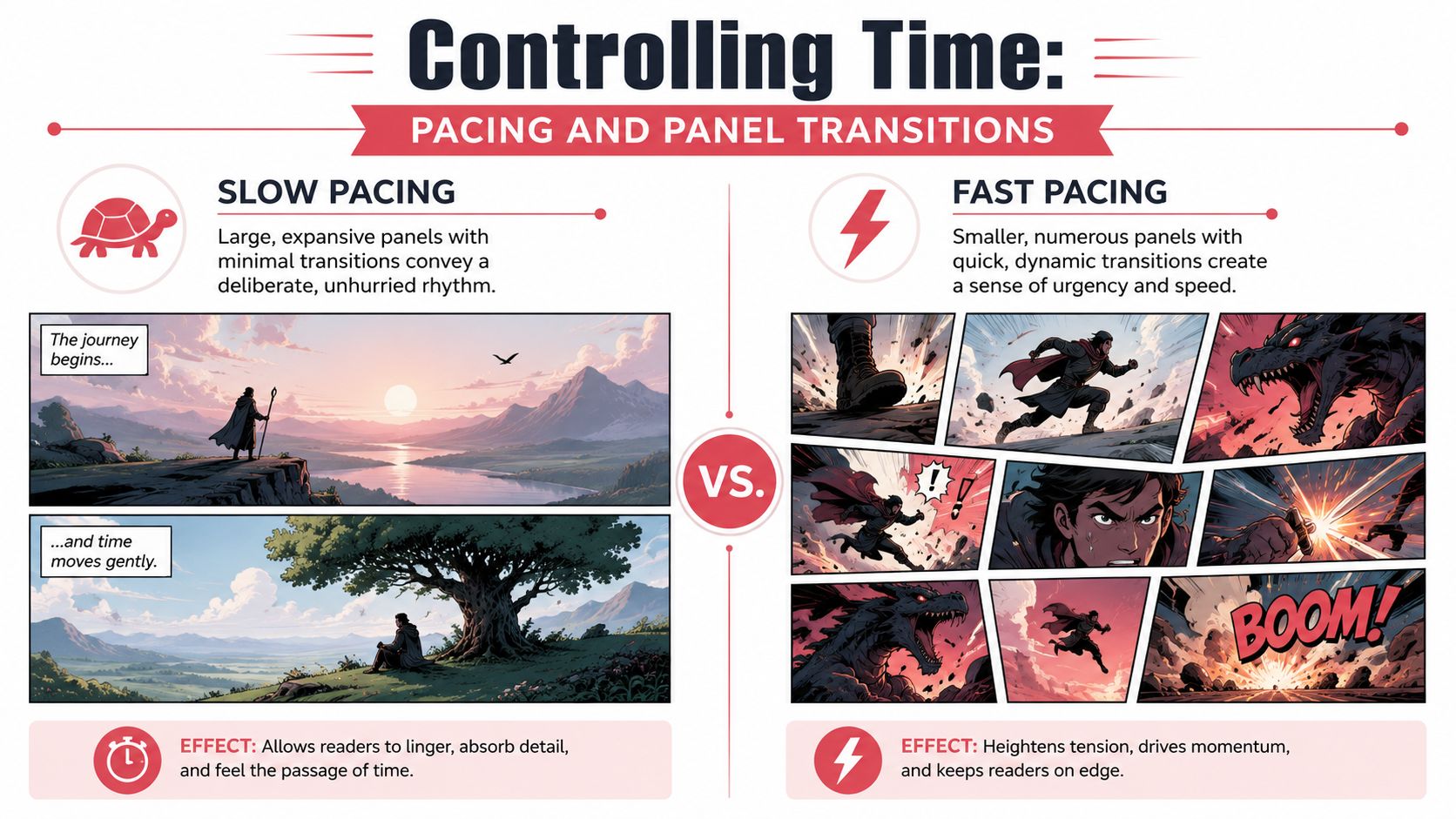
Panel size is time pressure
Large panels slow the reader down. They signal importance, scale, or emotional weight. A silent splash of a city skyline, a first kiss, or a dragon reveal often needs room.
Small panels speed things up. They create a staccato beat. Footsteps. Blows landed. Glances exchanged. Buttons pressed in panic.
A simple comparison helps:
| Layout choice | Typical effect |
|---|---|
| One large panel | Pause, emphasis, spectacle |
| Three medium panels | Balanced progression |
| Many small panels | Urgency, tension, quick action |
Transitions create the invisible motion
The reader fills in what happens between panels. That invisible action is where comics become magical.
A few transition types matter most to beginners:
- Action to action: A character throws a punch, then the punch lands.
- Subject to subject: We stay in the same scene but shift focus, from hero to villain.
- Scene to scene: We jump in place or time, such as from a rooftop chase to a police station later that night.
- Moment to moment: Very small shifts, like eyes narrowing, fingers tightening, breath catching.
If your sequence feels confusing, the transition may be too abrupt. If it feels slow, you may be showing tiny changes that don't deserve separate panels.
A suspense example
Suppose your character hears something behind a door. Here are two ways to pace it.
Fast version
- Hand on doorknob.
- Door swings open.
- Monster lunges.
Slow suspense version
- Long hallway shot with the door at the end.
- Close-up of the hand stopping before the knob.
- Extreme close-up of the knob turning.
- Thin sliver of darkness as the door opens.
- Silence.
- Reveal.
Same event. Different emotional result.
Small changes in panel count can turn a plain event into dread, wonder, or comedy.
A layout prompt for AI-assisted comics
When generating comic pages, describe the rhythm, not just the content. That's the missing step for many beginners.
Try language like this:
- State the purpose: “Build suspense before the reveal.”
- Describe panel count: “Use five narrow panels followed by one large reveal panel.”
- Define the transitions: “Show hand, knob, opening gap, eye reaction, silence, then creature reveal.”
- Control text load: “Minimal dialogue, one sound effect only.”
If you want help thinking in page structure, a comic panel layout generator can help you visualize how rhythm changes with layout choices.
Building Atmosphere with Color Lighting and Perspective
Atmosphere is where your comic starts breathing.
You can tell the same story beat with the same character and the same dialogue, then make it feel romantic, sinister, nostalgic, or heroic by changing color, light, and viewpoint. That's why atmosphere isn't extra polish. It's part of the storytelling.
Color sets emotional weather
Think of color as emotional weather inside the scene.
Warm colors often feel energetic, affectionate, urgent, or celebratory. Cool colors often feel distant, reflective, lonely, or calm. That doesn't mean red always means anger or blue always means sadness. It means the palette nudges the reader toward a feeling.
Use color intentionally:
- Warm palette: reunion, triumph, memory, comedy, festival scenes
- Cool palette: mystery, grief, night scenes, isolation, aftermath
- Limited palette: focus, stylization, dream sequences, noir mood
If you're creating a cyberpunk chase, neon reflections and deep shadows can make the world feel electric and unstable. If you're making a family keepsake comic, softer color relationships may support warmth better than hard contrast.
Lighting tells the reader what matters
Lighting is attention with emotion attached.
High contrast can make a scene feel dangerous or dramatic. Soft light can make a conversation feel intimate. Backlighting can turn a character into a silhouette and add mystery. Side lighting can make a face look conflicted because one side falls into shadow.
Here's a useful shorthand:
| Lighting choice | Story effect |
|---|---|
| Soft, even light | Calm, open, gentle |
| Hard contrast | Drama, danger, intensity |
| Backlight or silhouette | Mystery, reveal, mythic tone |
| Dim ambient light | Unease, secrecy, melancholy |
Perspective changes power
Perspective is one of the fastest ways to shape status.
A low-angle shot makes a figure seem dominant, imposing, or legendary. A high-angle shot can make that same figure seem vulnerable, lost, or defeated. A straight-on eye-level shot feels more neutral and human.
This is especially useful when a character changes over the course of a story. If they begin timid and end confident, your camera can support that arc.
A character doesn't need to say “I'm scared” if the page places them small beneath a towering ceiling and cold overhead light.
A mood prompt you can actually use
When writing prompts for AI-generated comic scenes, combine setting + light + color + perspective + mood.
For example:
- “Dystopian city alley at night, neon signs reflecting in puddles, cool blue and magenta palette, low-angle view, tense atmosphere.”
- “Quiet kitchen at sunrise, warm light through curtains, gentle shadows, eye-level framing, nostalgic family mood.”
- “Noir detective office, single desk lamp, heavy shadow, cigarette smoke, high-contrast black and white, suspicious tone.”
Those prompt ingredients tell the image generator how the scene should feel, not just what objects belong in it. That's the leap from illustration request to storytelling direction.
Adding Depth with Symbolism and Typography
Once your panels read clearly, you can start layering meaning into them. Comics then become richer without becoming harder to understand.
Two of the most useful tools are symbolism and typography. One lives inside the image. The other shapes how the words behave on the page.
Symbolism gives your story an echo
A symbol is a visual element that carries extra meaning. It might be an object, a recurring shape, a piece of weather, or a background detail that appears at key moments.
Suppose your story is about a character learning to trust again. You could use a cracked watch, a wilted plant, or a stray dog that slowly gets closer in each appearance. None of those elements need to be explained outright. Their repetition does the work.
Good symbolism has three qualities:
- It's visible enough to notice
- It repeats with purpose
- It supports the emotional core of the story
If you place a raven, broken mirror, or childhood toy in a panel once, it may just look decorative. If you return to it at turning points, it becomes part of the narrative language.
Typography is acting
Beginners often treat text as an afterthought. In comics, text performs.
A shaky balloon shape can suggest fear. A large jagged sound effect can slam into the panel like part of the artwork. A small whispered line placed low in the frame can pull the reader inward.
Think of the text layer as a second performer on the page.
| Text element | What it can signal |
|---|---|
| Speech balloon shape | Calm, panic, whisper, electronic voice |
| Letter size | Volume, emphasis, urgency |
| Narration box style | Memory, commentary, distance, mood |
| Sound effect design | Impact, texture, motion |
Writing for better visual results
If you're scripting for an AI-assisted comic tool, write dialogue and effects with visual restraint.
Try these habits:
- Keep balloons short: One strong line is easier to place cleanly than a long speech.
- Use sound effects selectively: “THUD,” “CLICK,” or “CRACK” works better than filling every panel with noise.
- Separate narration from dialogue: If the scene needs both, make sure each serves a different purpose.
- Write subtext into the image: If the art shows panic, the dialogue can stay calm and tense.
The strongest comic pages let image and text cooperate, not compete.
Your AI-Powered Workflow for Visual Storytelling
You have a good story idea, clear characters, and no drawing background. That can still become a readable, emotionally strong comic if you approach the process like a director setting up a scene.
Professional comic storytelling usually begins with a simple sequence. Decide who the story is for, clarify the emotional goal, then break the action into visual moments before worrying about finished art. IED recommends this planning order because it reduces ambiguity in the final composition.
That method fits AI comic creation well. The tool can generate the artwork. You still shape the reading experience.
Start with the reading goal
Before you generate a page, answer three questions:
- Who is this comic for?
- What should they feel at the end of the scene?
- What is the one point each page must communicate?
These answers act like a compass. A birthday comic for a friend may call for warm expressions, familiar details, and light page rhythm. A detective scene may need heavier shadows, tighter panels, and shorter lines of dialogue. Same tool, different direction.
Beginners often jump straight to style selection because that feels concrete. But style is the costume. Story purpose is the actor inside it.
Convert writing into beats the AI can stage
A sentence like “two characters discuss their future” is too broad for strong panel design. It tells you the topic, but not the visible actions.
Break the moment into beats instead:
- They sit across from each other in silence.
- One character stares at the coffee cup.
- A hand reaches across the table.
- Eye contact finally happens.
- The reply changes the mood of the room.
Now you have panel material. Comics read best when each panel captures a shift. A beat is that shift. It works like a drum hit in music. The reader feels movement from one image to the next, even in a quiet scene.
Use AI for rendering. Keep the directing decisions for yourself
PersonalizedComics fits neatly into this workflow. It can turn photos or written character descriptions into comic pages, offer different art styles, and generate panels, speech bubbles, narration, and sound effects from your inputs. Your job is to provide the judgment that gives those outputs structure. You choose the beats, the camera distance, the mood, the page rhythm, and the amount of text.
A practical workflow looks like this:
- Define the concept: gift comic, memoir, parody, romance scene, classroom story
- Choose a visual style: noir, manga, watercolor, fantasy, and so on
- Describe characters with intent: appearance, attitude, relationships, role in the scene
- Outline page beats: what each panel must reveal or change
- Add camera language: close-up, wide shot, overhead view, low angle, silhouette
- Cut extra dialogue: leave room for expression, body language, and setting details
That last step matters more than many beginners expect. In an AI-powered comic tool, stronger prompts do not always mean longer prompts. Clear prompts usually beat crowded ones.
Revise like a cartoonist
The first version is a draft. That is normal.
Comic artists thumbnail, test, and adjust because visual storytelling depends on how the page reads in sequence, not on how attractive one panel looks by itself. AI speeds up the drawing phase, but the craft still lives in revision.
Use a simple production loop:
- Generate the page
- Read it in order
- Notice where your eye goes first
- Check whether the intended feeling comes through
- Rewrite the panel description or prompt
- Generate again with clearer direction
If a scene feels flat, the problem is often specific. The camera may be too distant. The panel order may hide the emotional turn. The text may be explaining what the art should show. Those are directing problems, and they can be fixed.
If you're ready to turn an idea into pages, PersonalizedComics gives new users a free 3-page preview comic to start. That is enough to test your pacing, framing, and mood choices on real pages and see how your story reads when images carry the scene.